WHAT THEY DO
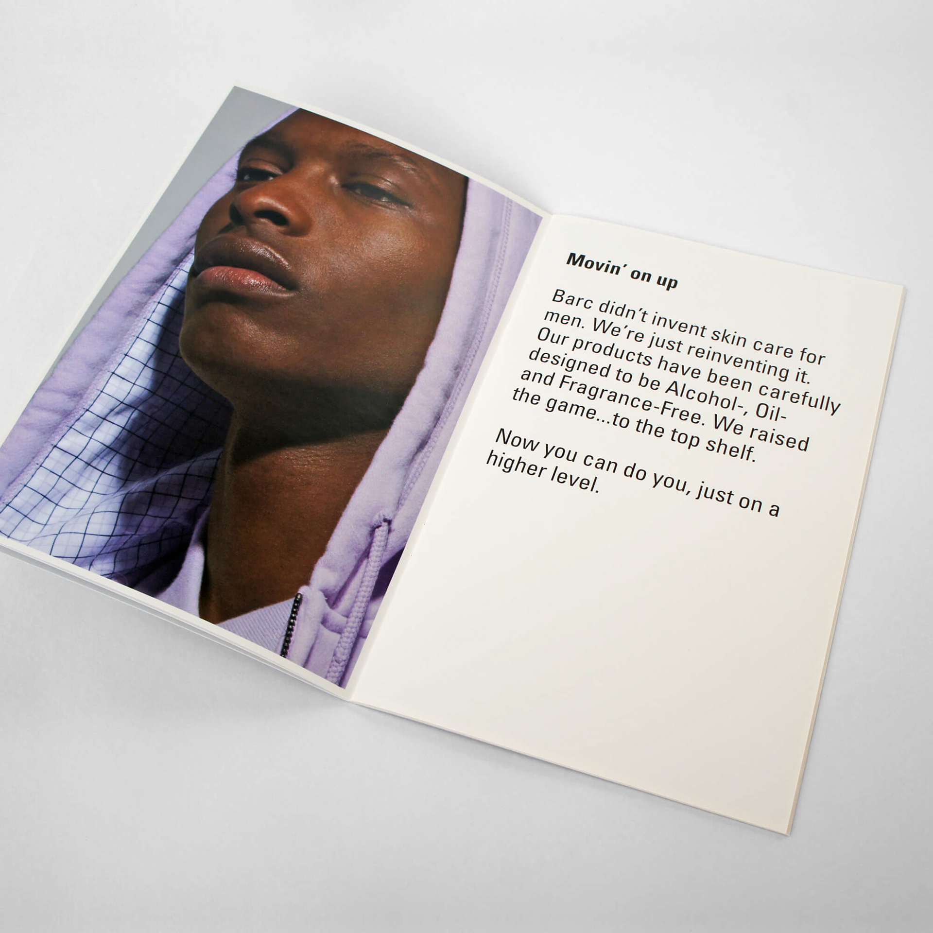
Barc is a new, specially formulated line of top shelf skin care products dedicated to helping you look and feel your best at all times. It was created and tested to service the specific skin care needs of men of color.
Barc is a new, specially formulated line of top shelf skin care products dedicated to helping you look and feel your best at all times. It was created and tested to service the specific skin care needs of men of color.
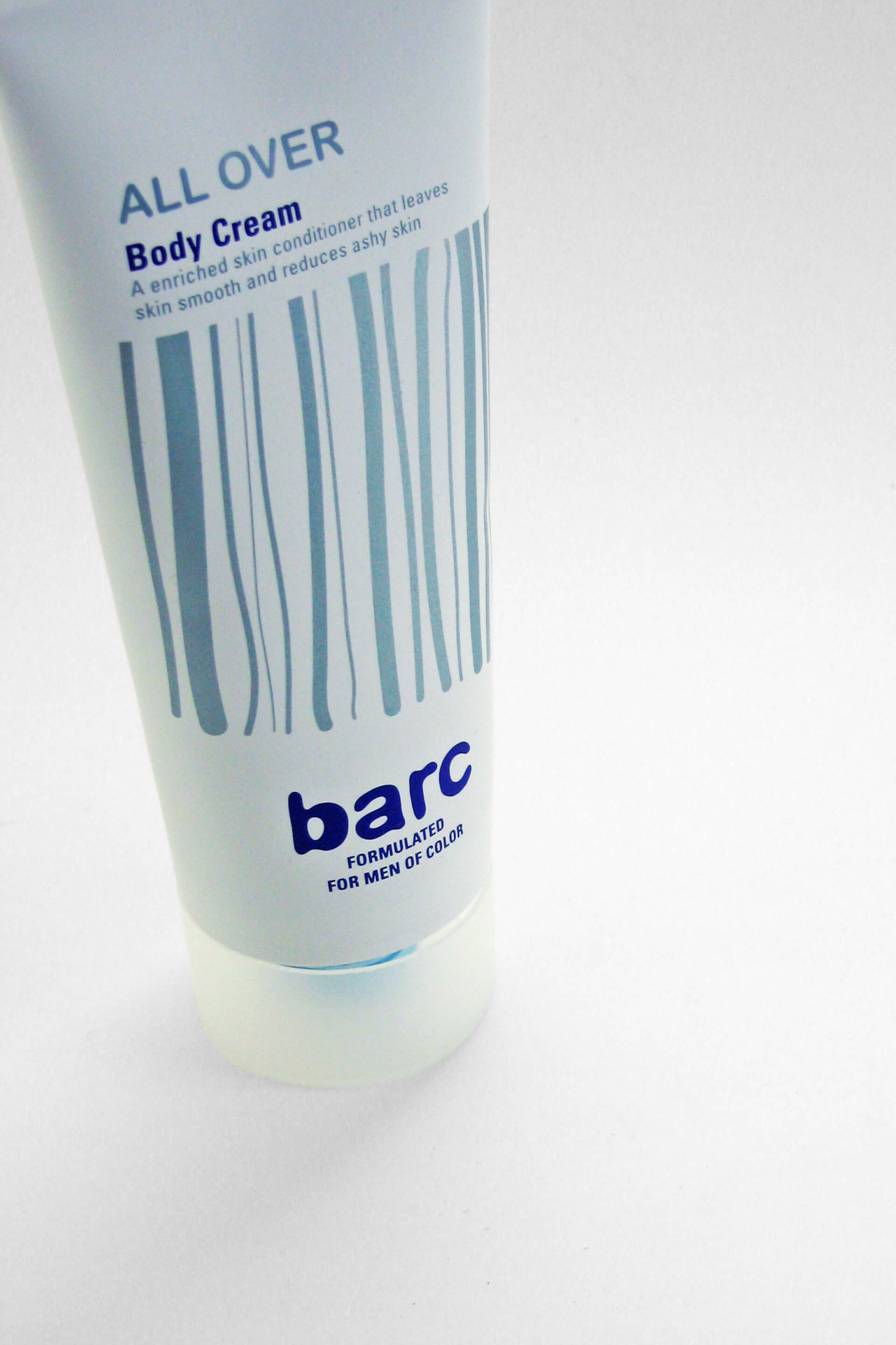
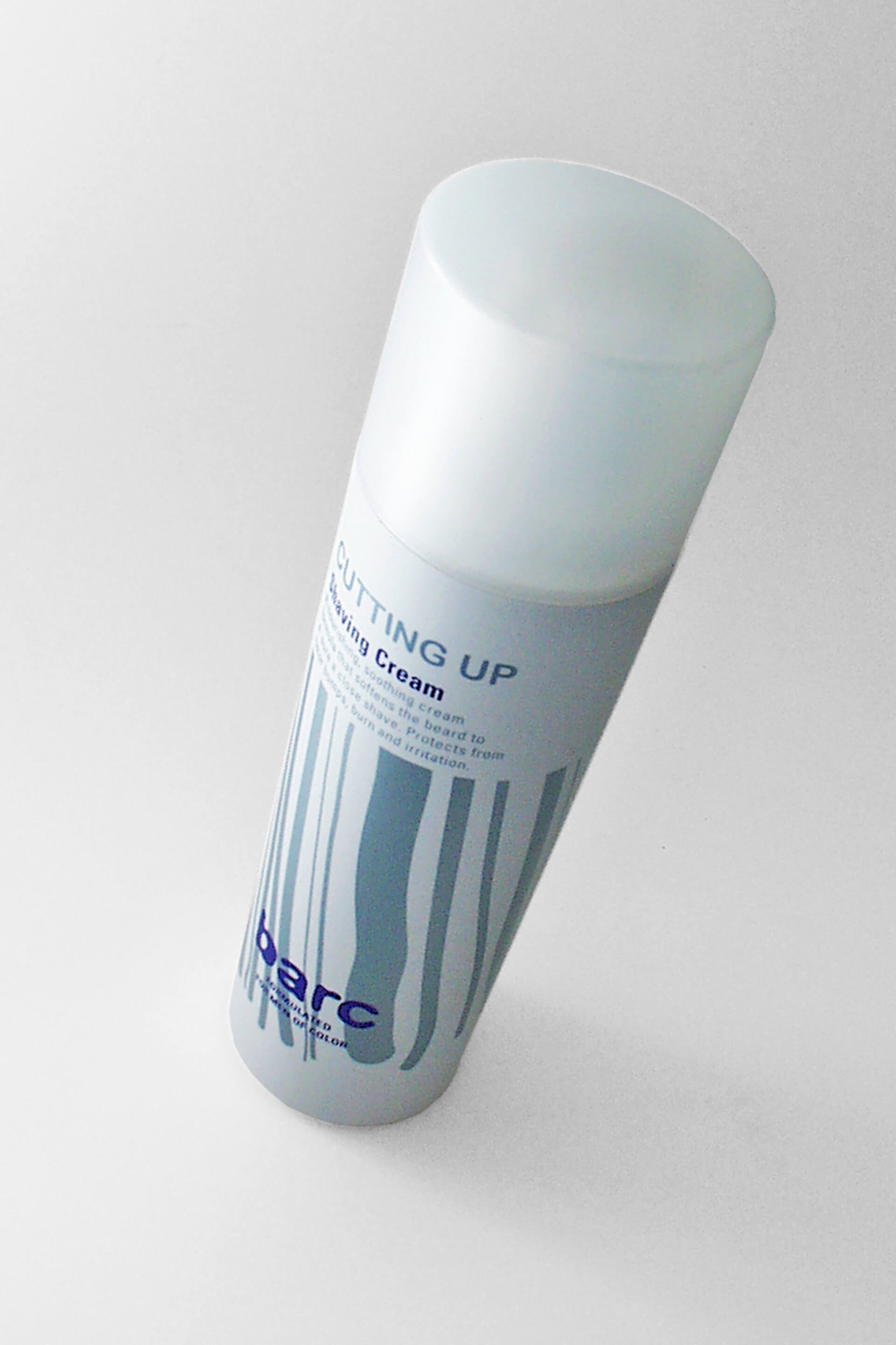
The skin care active ingredient Salix Natural ß-OH Extract is derived from willow bark. Based on the formula the skin care line had a name, “Barc” with a c.
WHAT WE WERE ASKED TO DO
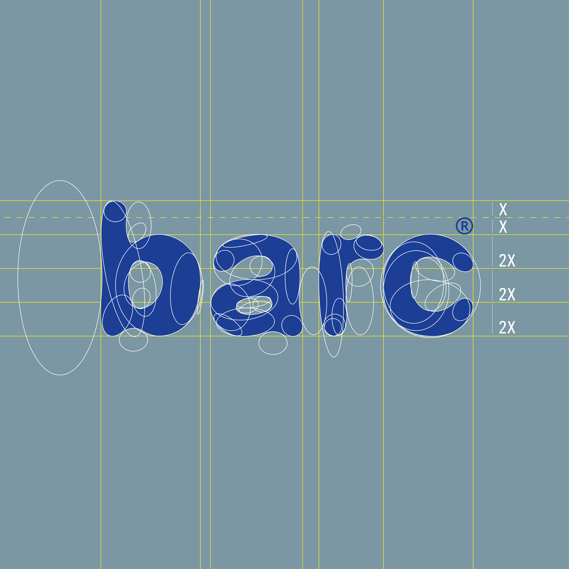
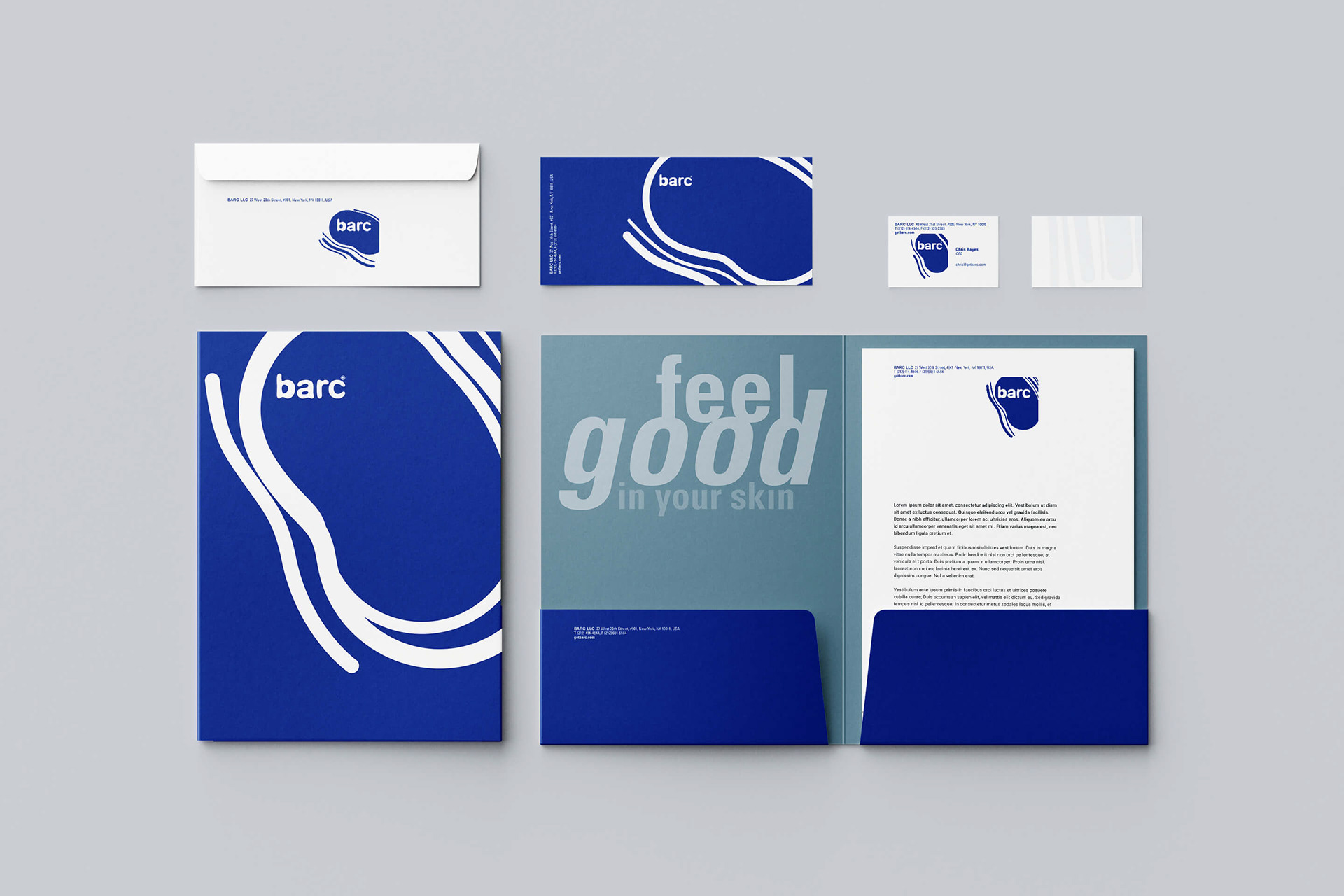
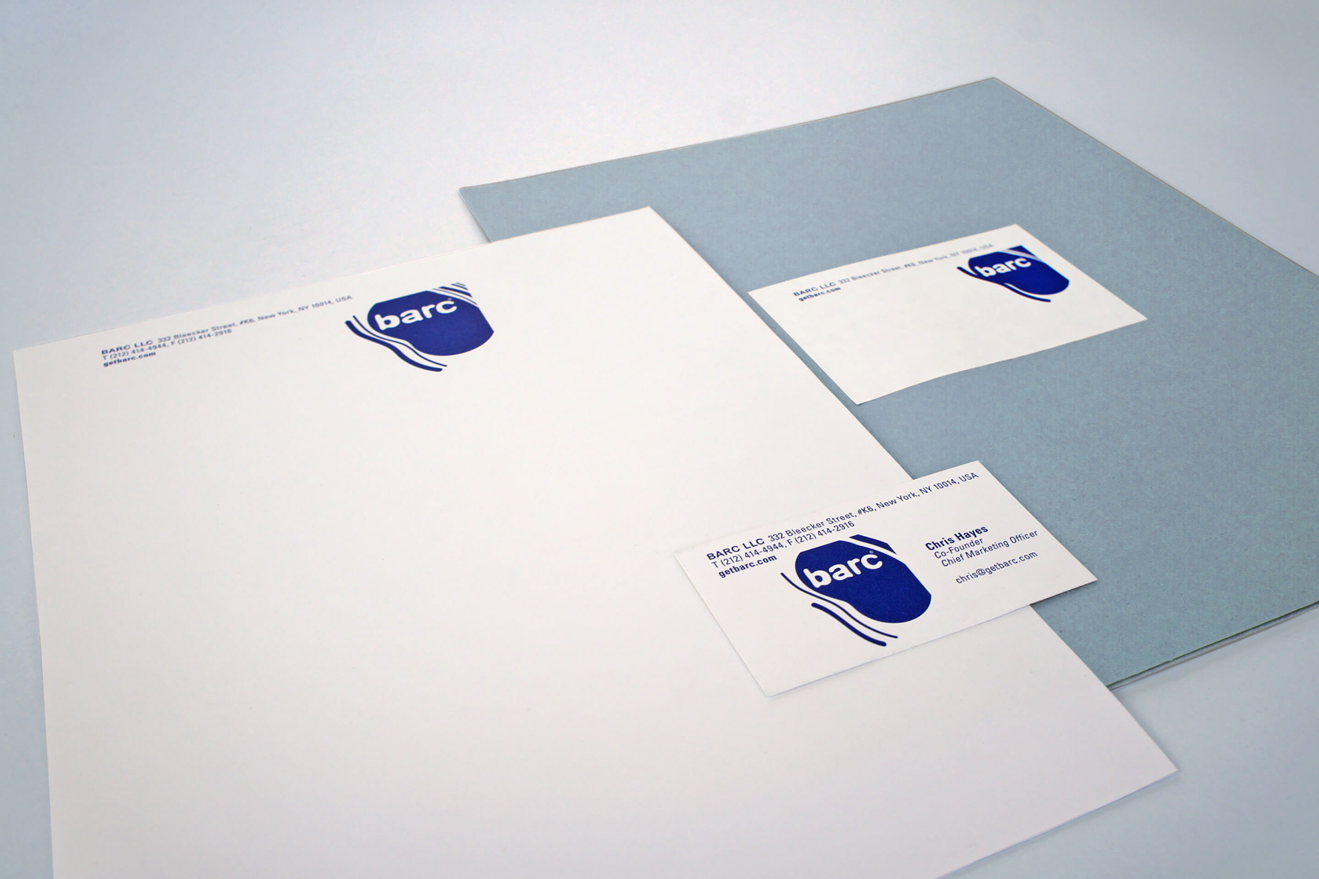
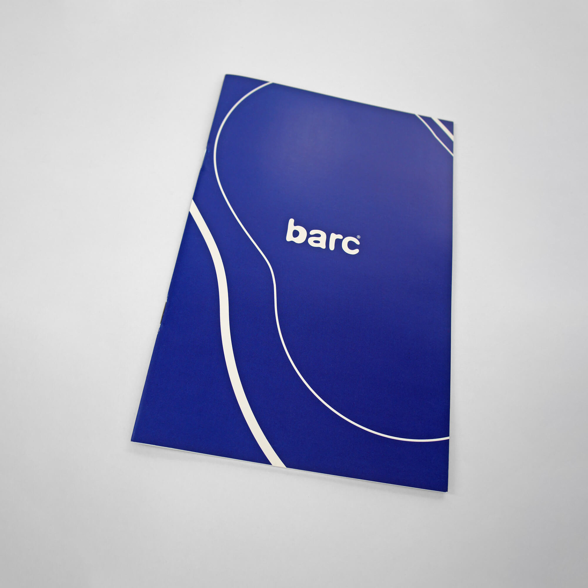
We created the logo from a sketch on paper and made it the starting point for the entire branding. Free drawn shapes on a simple, clean base. The photography would show bold, clear images and provide the perfect backdrop for the Barc message.
We took the tree bark graphic “skin” idea and developed a changing shape to contain the logotype. It should become a distinct identity mark to keep the Bark logotype easy to read.
STRATEGY AND DESIGN: TREE BARK
The main ingredient is taken from the willow tree bark and the company name has its origin from bark, it was clear the identity would tie into the same story.
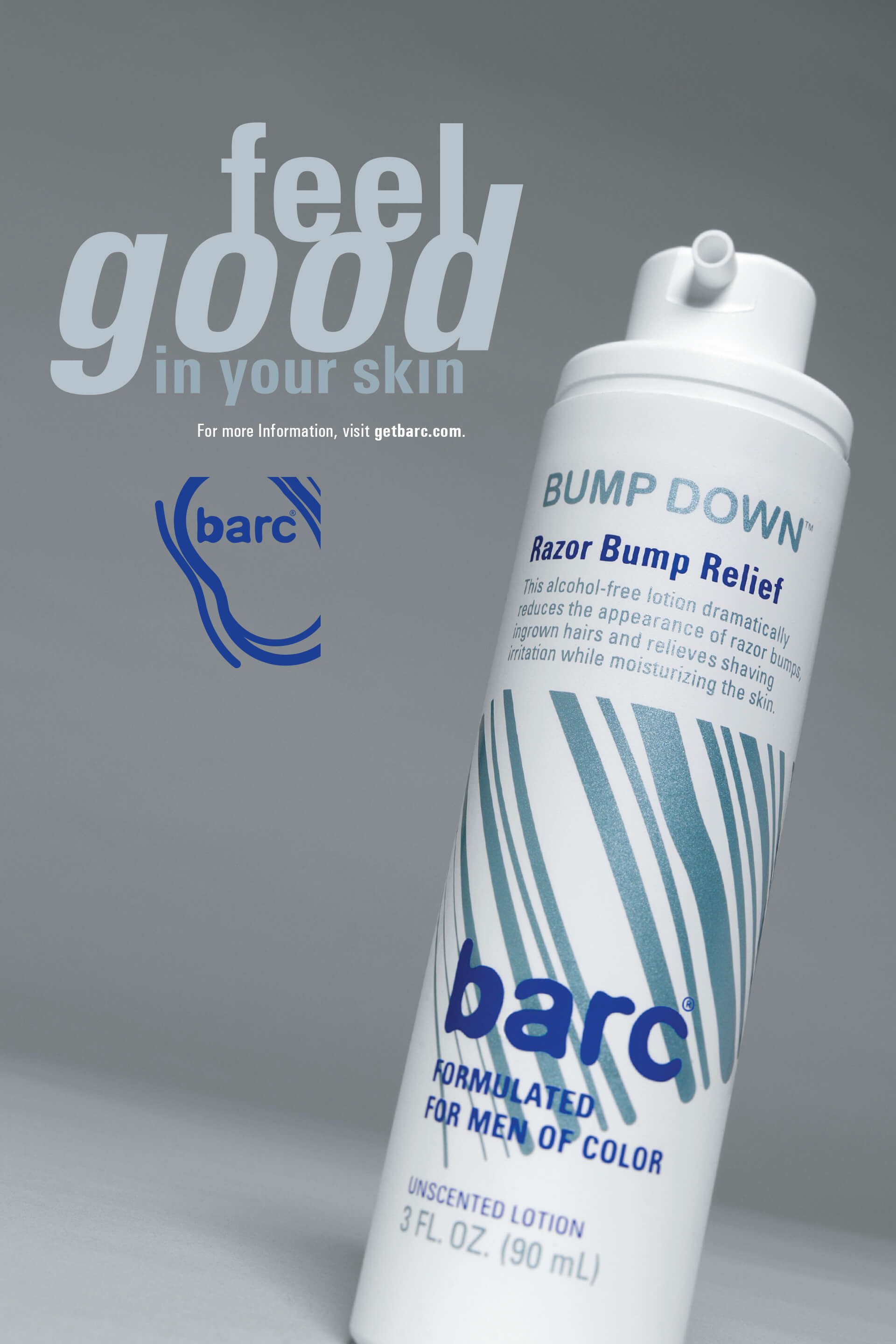
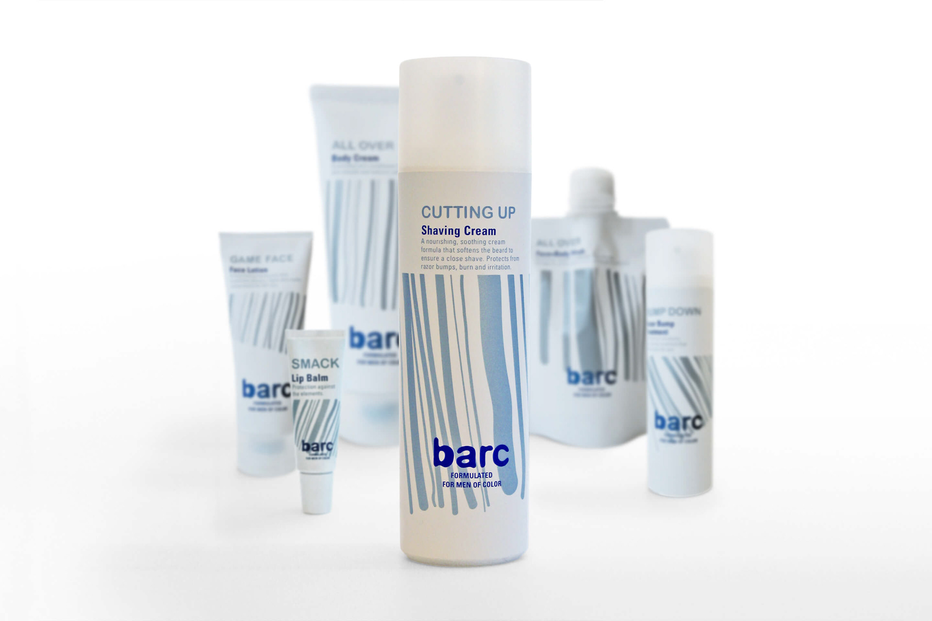
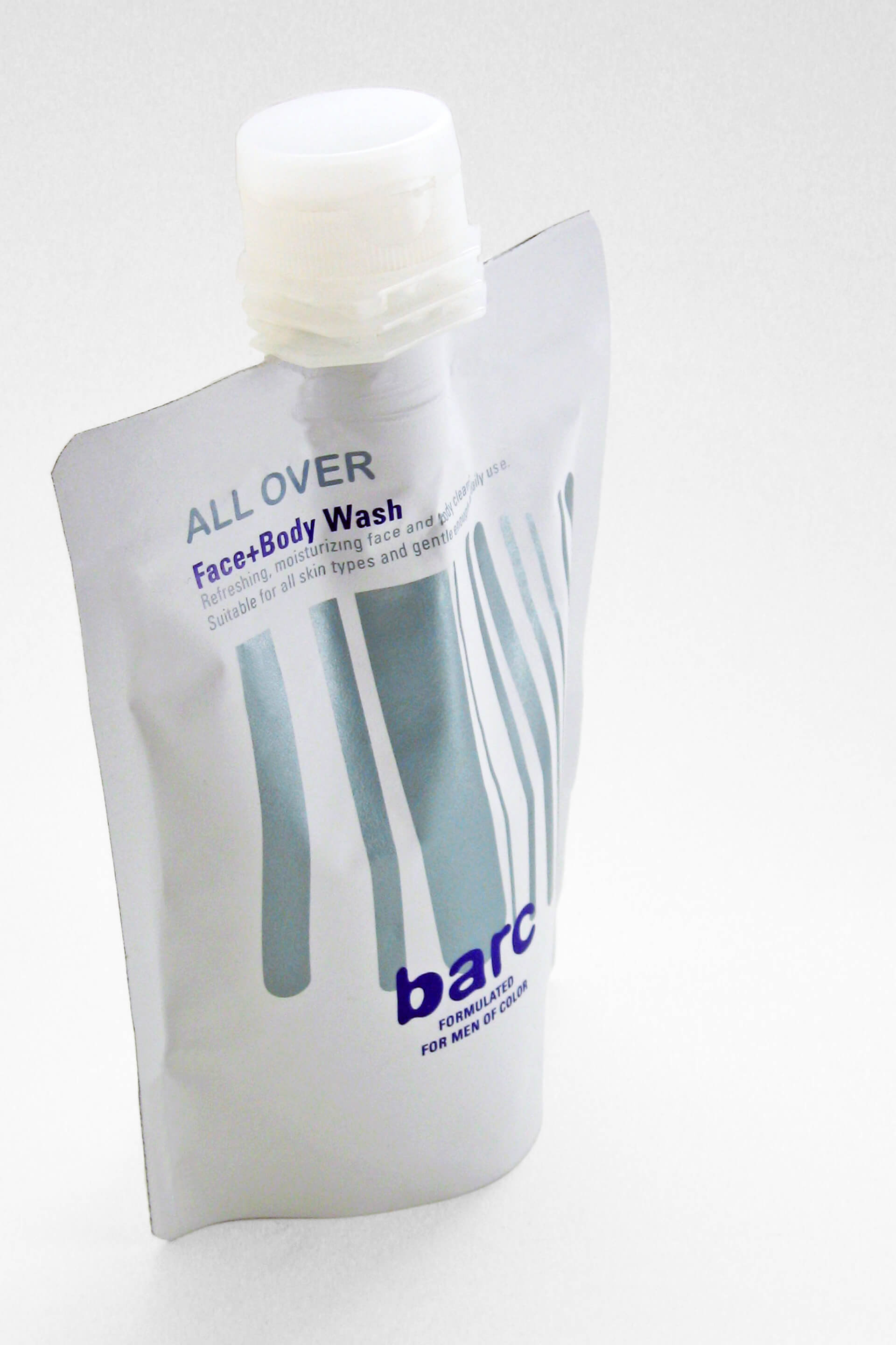
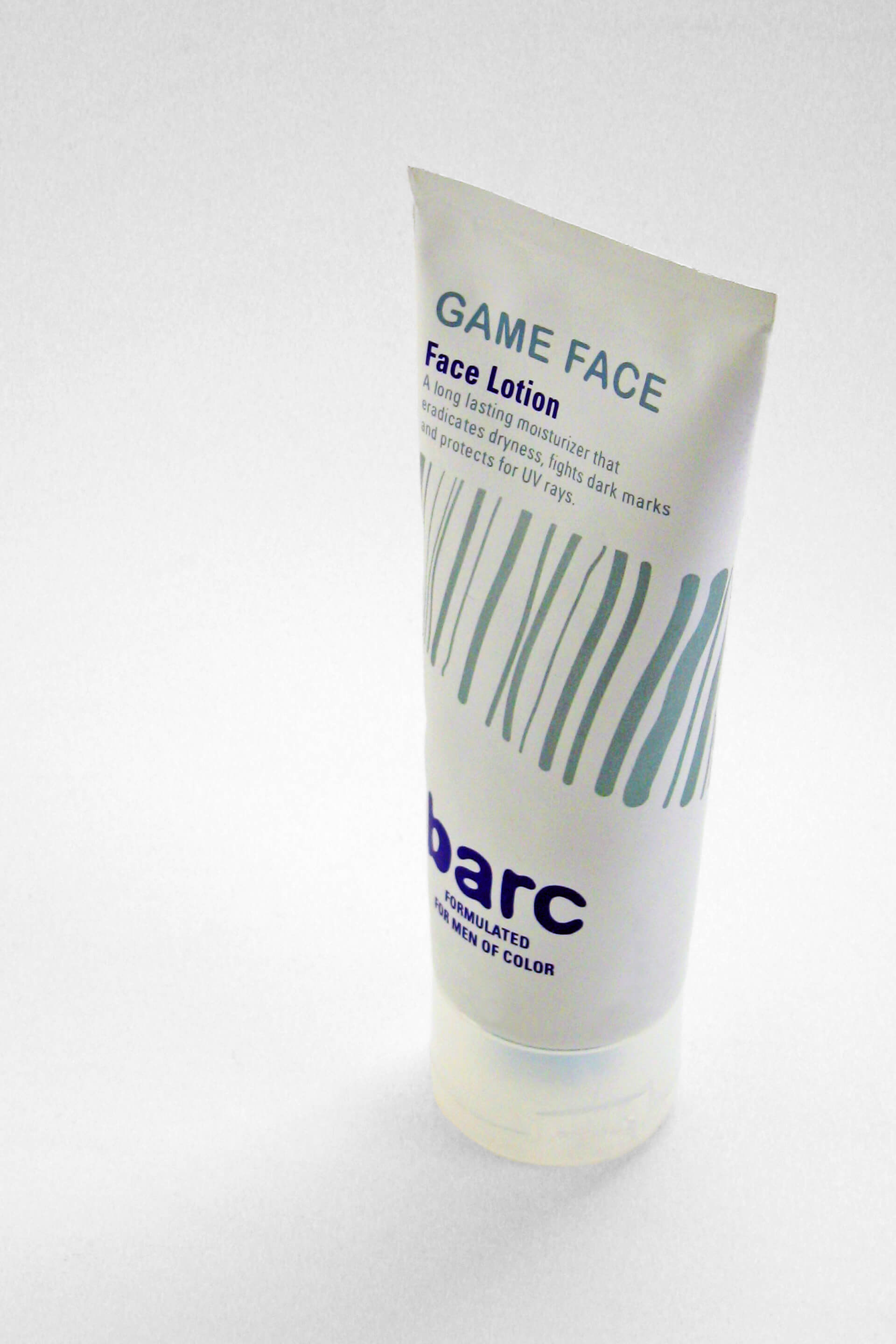
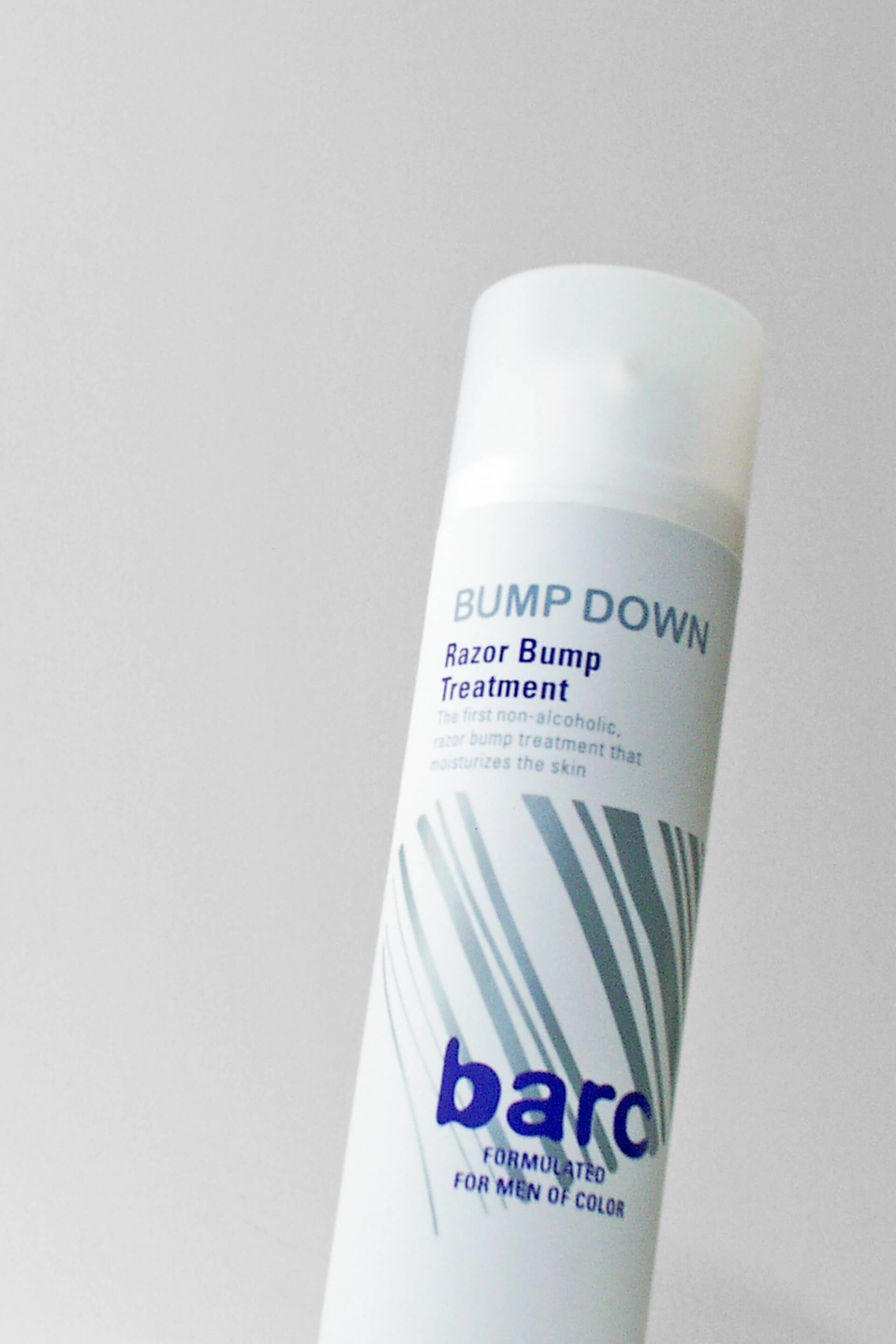
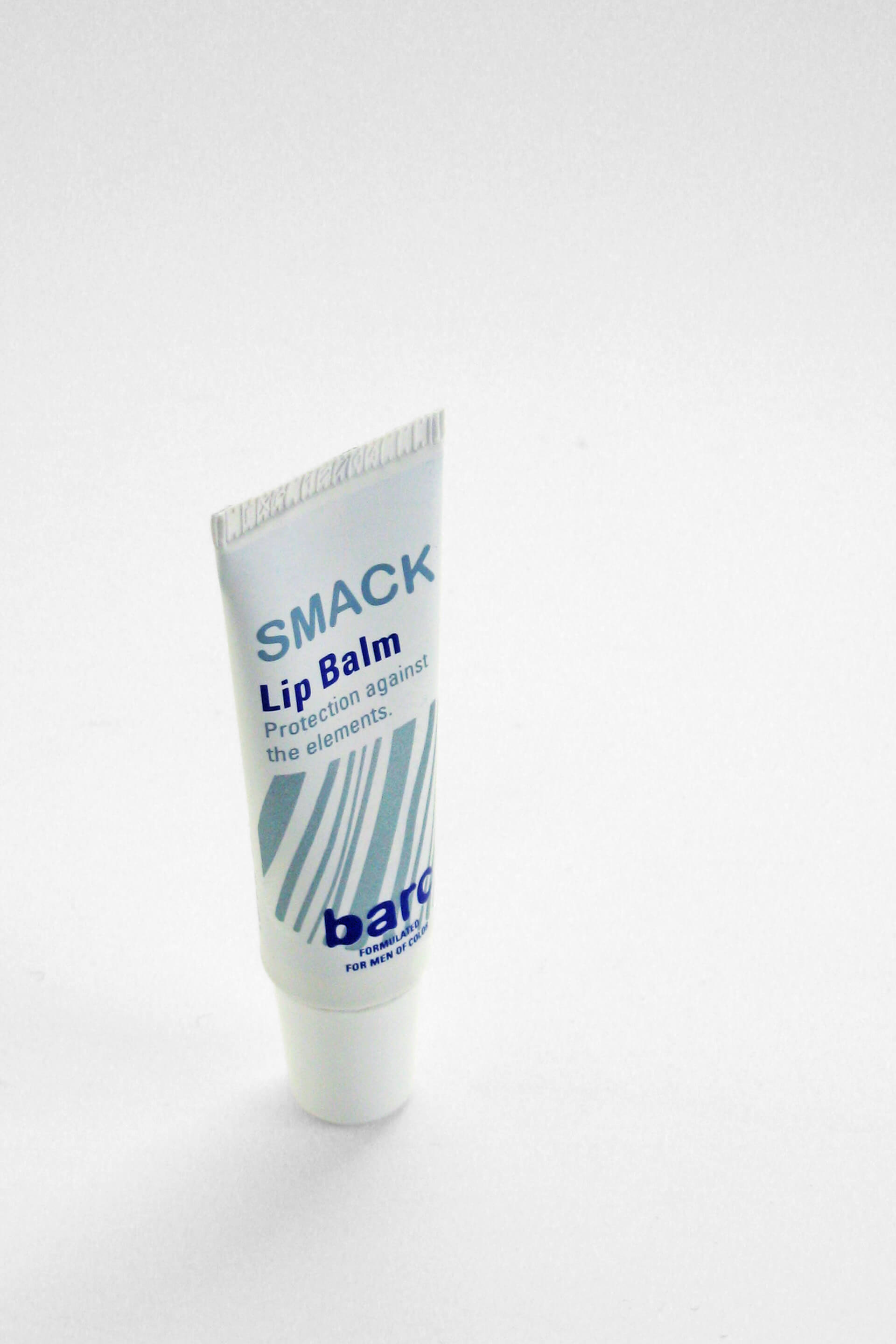
For the packaging we took the idea of tree bark. Bark – the skin – is the individual identity of each tree. We created abstract graphic “skins” of hand drawn lines for every single product. Applying this idea, each product has their own identity within the Barc product line. With a unique graphic code and specific container shape the different products are visually part of the complete Barc skin care family.
We researched container shapes, closures, designed container graphics and created all secondary packaging. New high-tech materials were sourced in combination with iconic shapes to define a masculine brand. Matt metallic color schemes, taken from automotive-grade color and finishing techniques amplified the idea. Yet, the off-white base color is giving the packaging a fresh, light, and clean look. For better grip and natural feel we used soft touch, silicon infused inks and created an almost skin-like container surface.
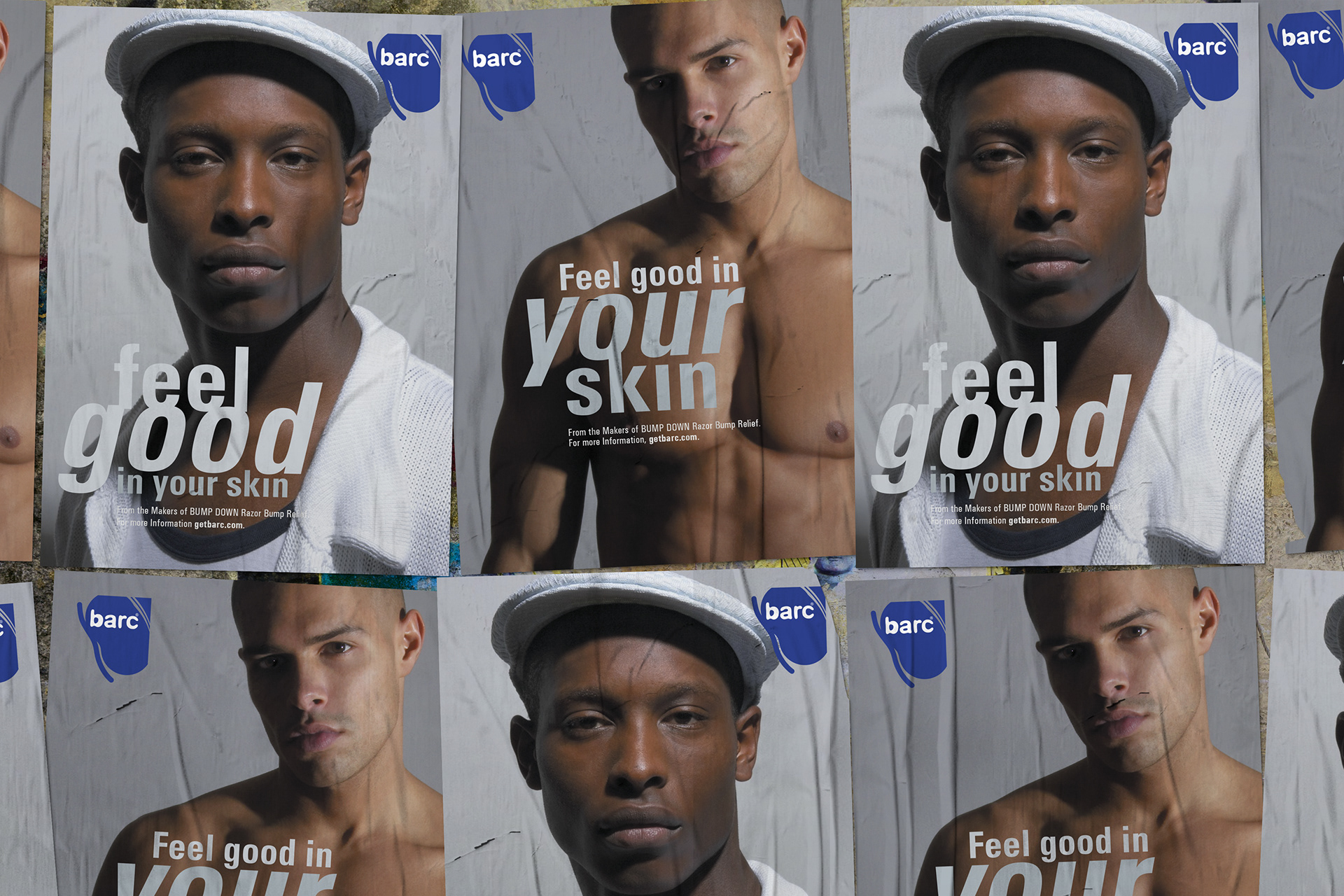
BRANDING ADDITIONAL ITEMS
Once the Barc identity was established additional material was designed to brand the company.
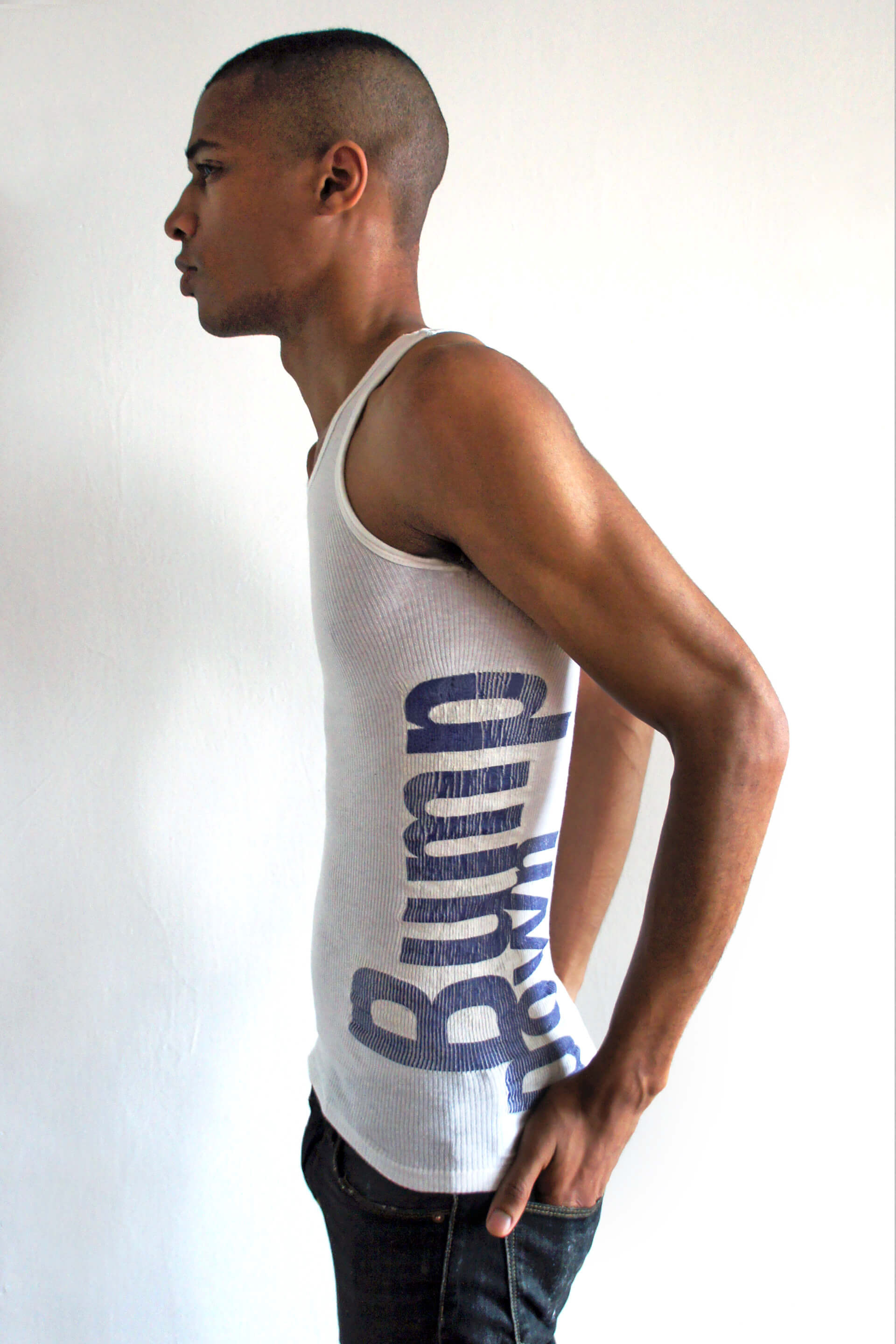
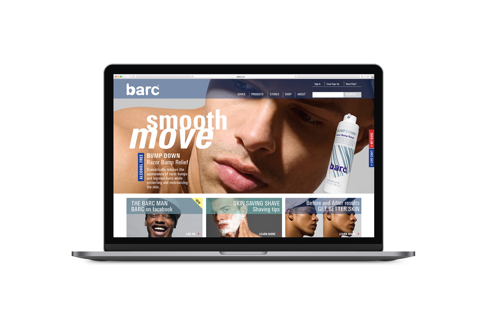
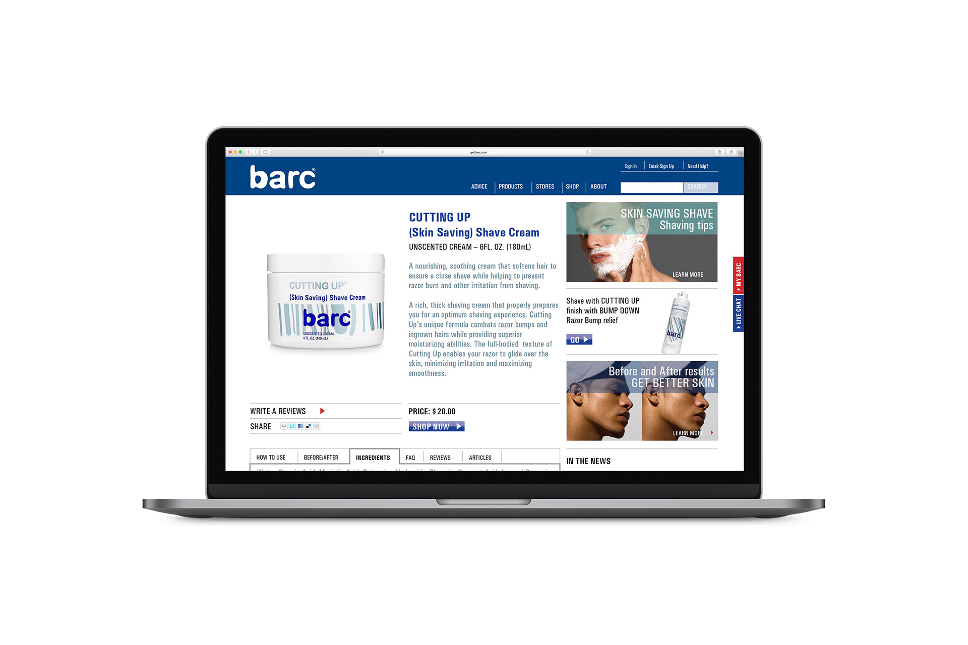
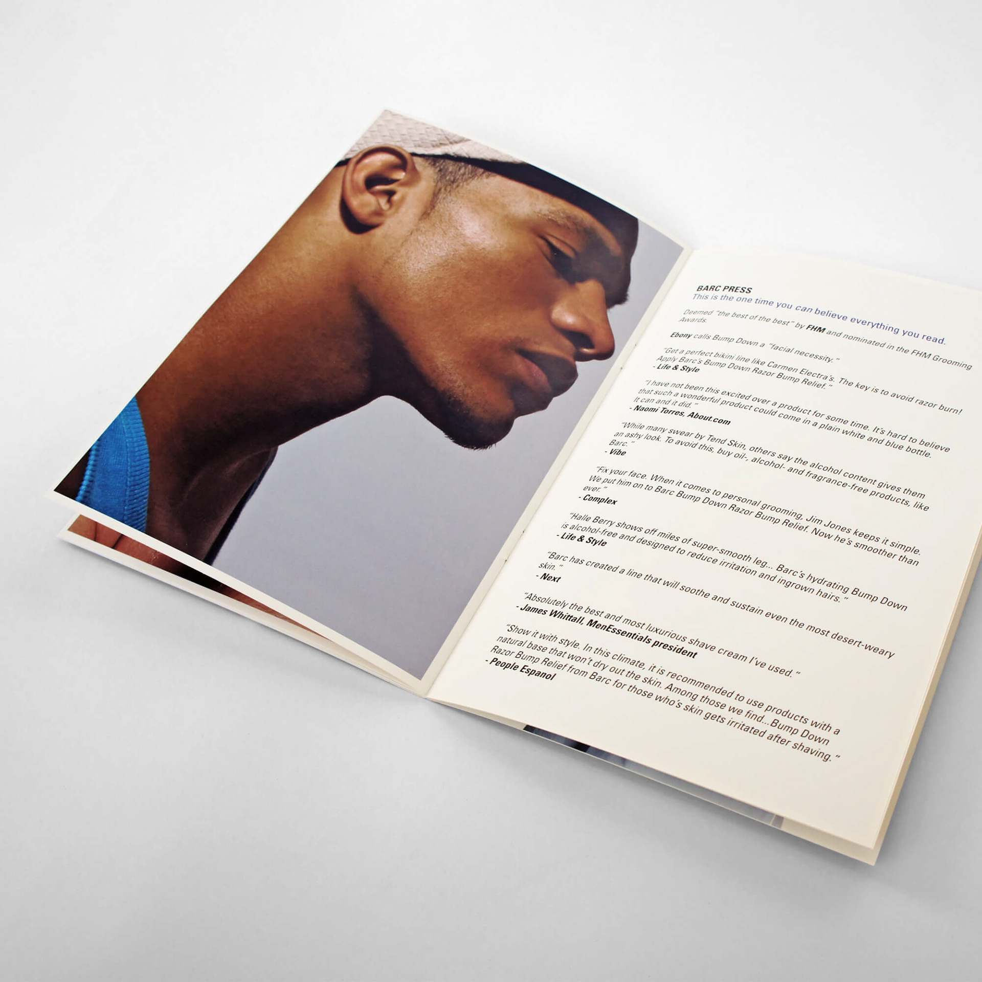
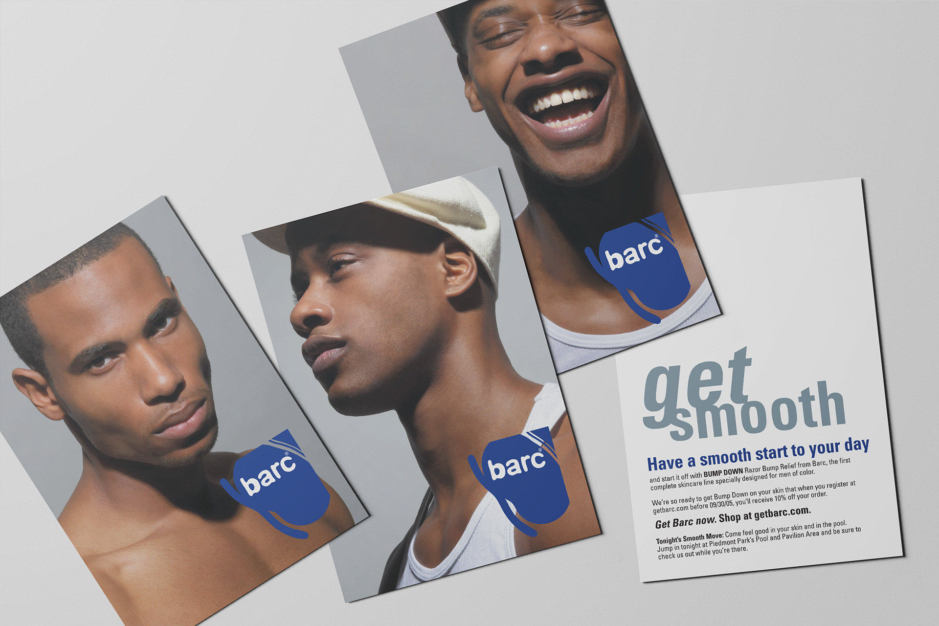
From posters, ad campaigns, brochures, sell-sheets, postcards to T-shirts and the website, a streamlined visual process made sure the Barc brand was cohesive and spoke a unified language.