EXPERIENCE DESIGN
Experience design is not driven by a single design discipline. Instead, it requires a cross-discipline perspective that considers multiple aspects of the brand. A great design experience must be self-explanatory and emphasizes on an user journey from step to step in minimalistic manner.
Experience design is not driven by a single design discipline. Instead, it requires a cross-discipline perspective that considers multiple aspects of the brand. A great design experience must be self-explanatory and emphasizes on an user journey from step to step in minimalistic manner.
Digital Creative Agency Services – IPG asked xSITE to create an unique environment for their agency pitch presentation to JPMorgan Chase & Co.
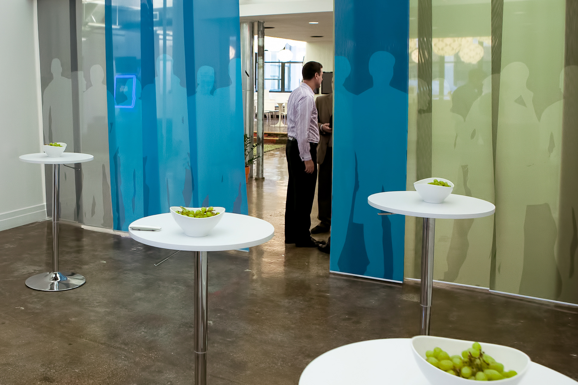
The idea was to use the HUGE Brooklyn offices for the three hour meeting. After evaluating the space it made sense for us to utilize several areas of the office, to create a journey of different aspects. A walking experience that would merge the communal space with two big meeting rooms and the connecting corridors.
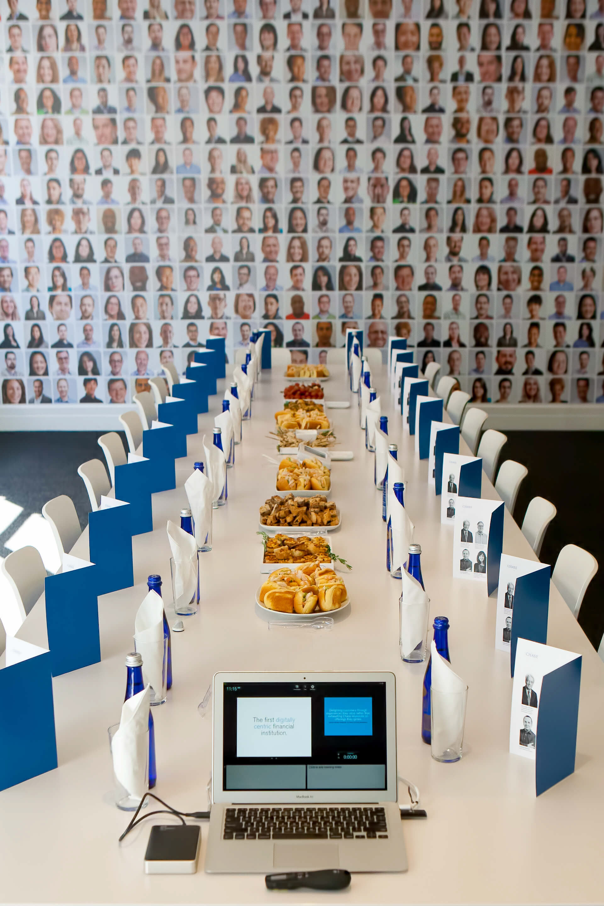
PRESENTATION SPACE
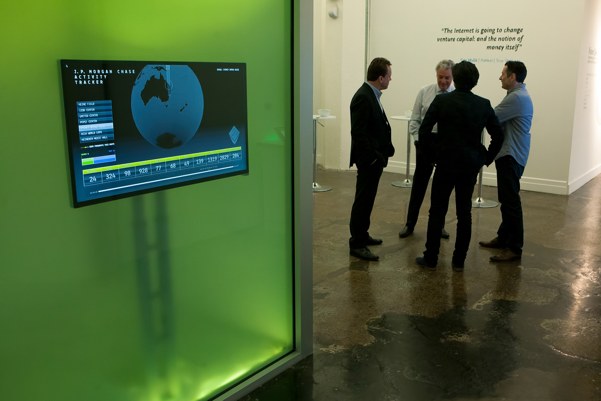
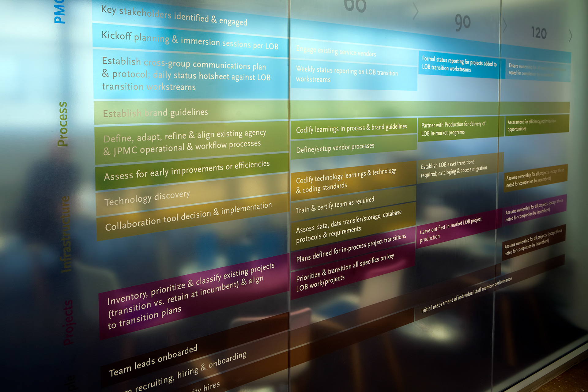
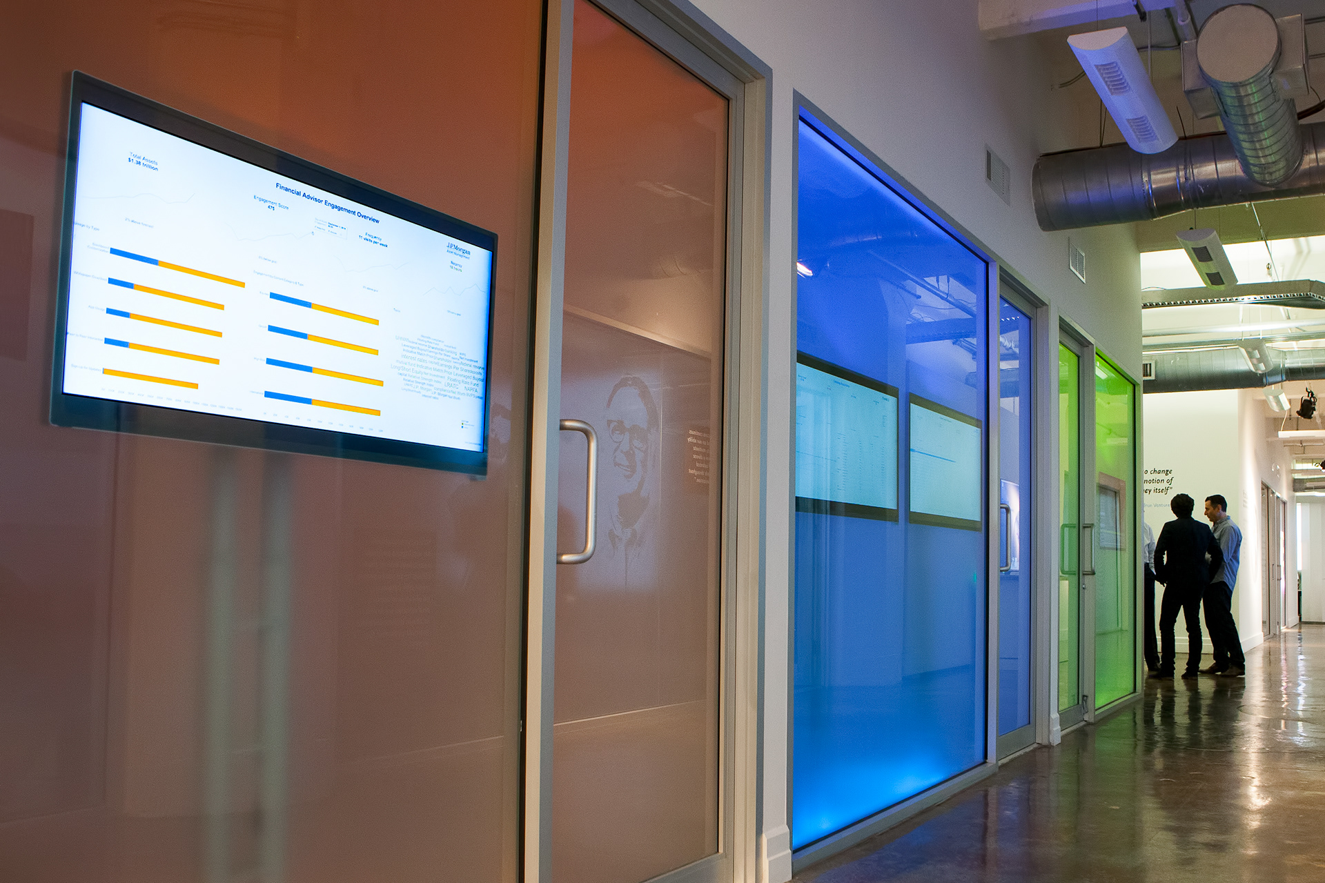
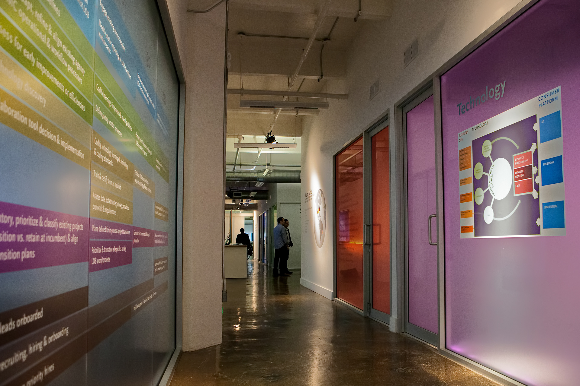
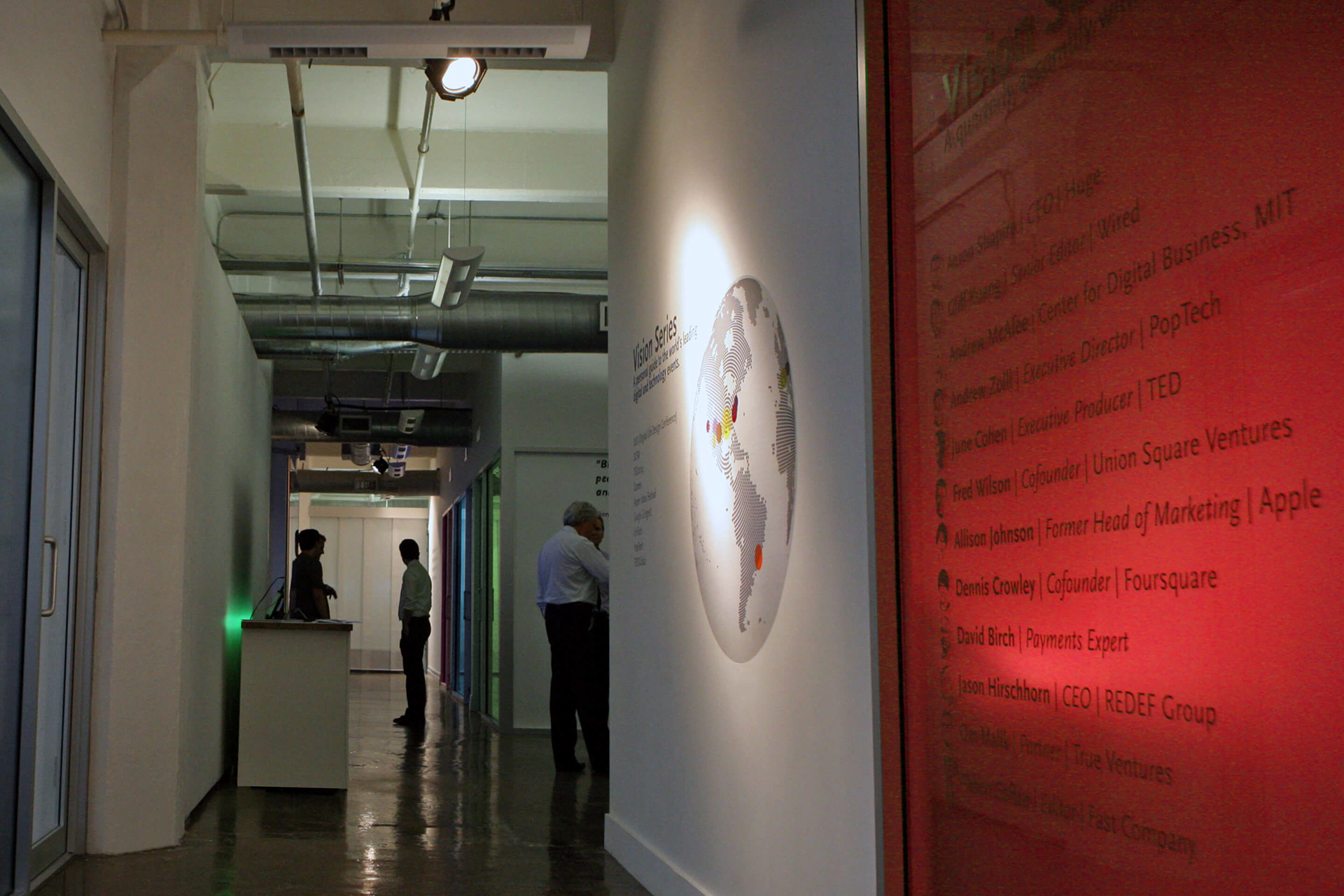
The presentation was divided into six different phases; (1) the introduction, (2) the JPMorgan digital presentation, (3) a corridor [I] walk with interactive driven showcase hotspots, (4) the Chase digital presentation, (5) a corridor [II] walk with large diagram examples, and (6) the conclusion to complete the presentation circle.
The presentation was divided into six different phases; (1) the introduction, (2) the JPMorgan digital presentation, (3) a corridor [I] walk with interactive driven showcase hotspots, (4) the Chase digital presentation, (5) a corridor [II] walk with large diagram examples, and (6) the conclusion to complete the presentation circle.
Using the two identity colors schemes of JPMorgan Chase & Co, the emphasis was to work with colored light in soft transient tones to show a high-tech flexible world.
To find the right illumination we teamed up with Philips Hue wireless lighting system. Exploring the product we found a simple, clever and playful way to generate individual color hues in different areas of the entire presentation. From a soft green glow under the JPMorgan digital presentation meeting table to color light box containers for the interactive display hotspots. The new Philips Hue is working with Apple wireless technology and light color settings can be controlled through Siri voice control, music, or custom preset color hue programs.
For instance we were able to have the green underneath the meeting table while entering the room in a strong hue. Once everyone was seated the light was dimmed to a very soft, light green tone – hardly noticeable. We also liked the idea of having the interactive display hotspots in sensitive mood boards, per hotspot slowly changing in color, hue and tone.
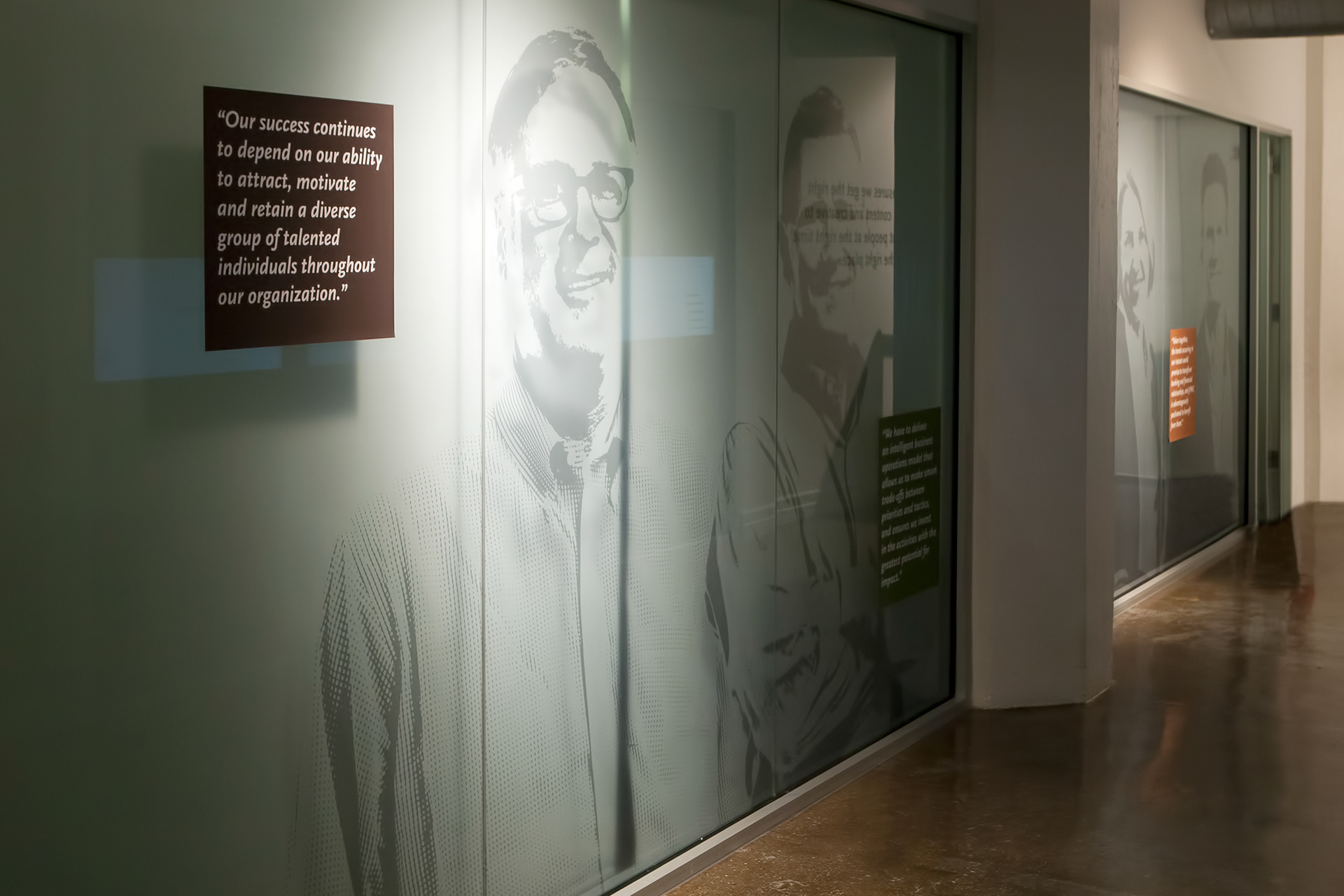
Other treatments were applying translucent DuratransT graphics for diagrams and graphs on glass, silkscreen on fabric and traditional wall vinyl.
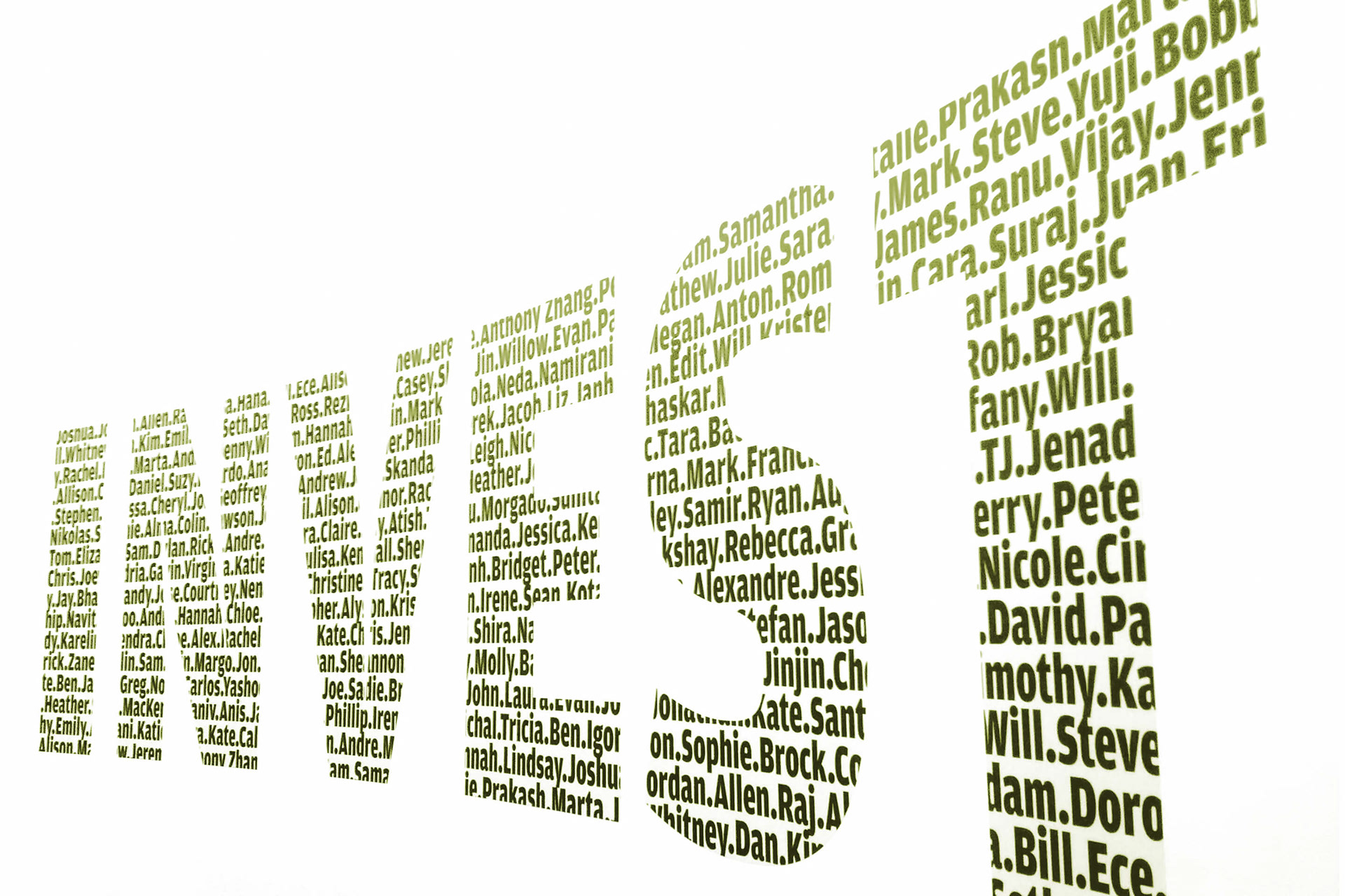
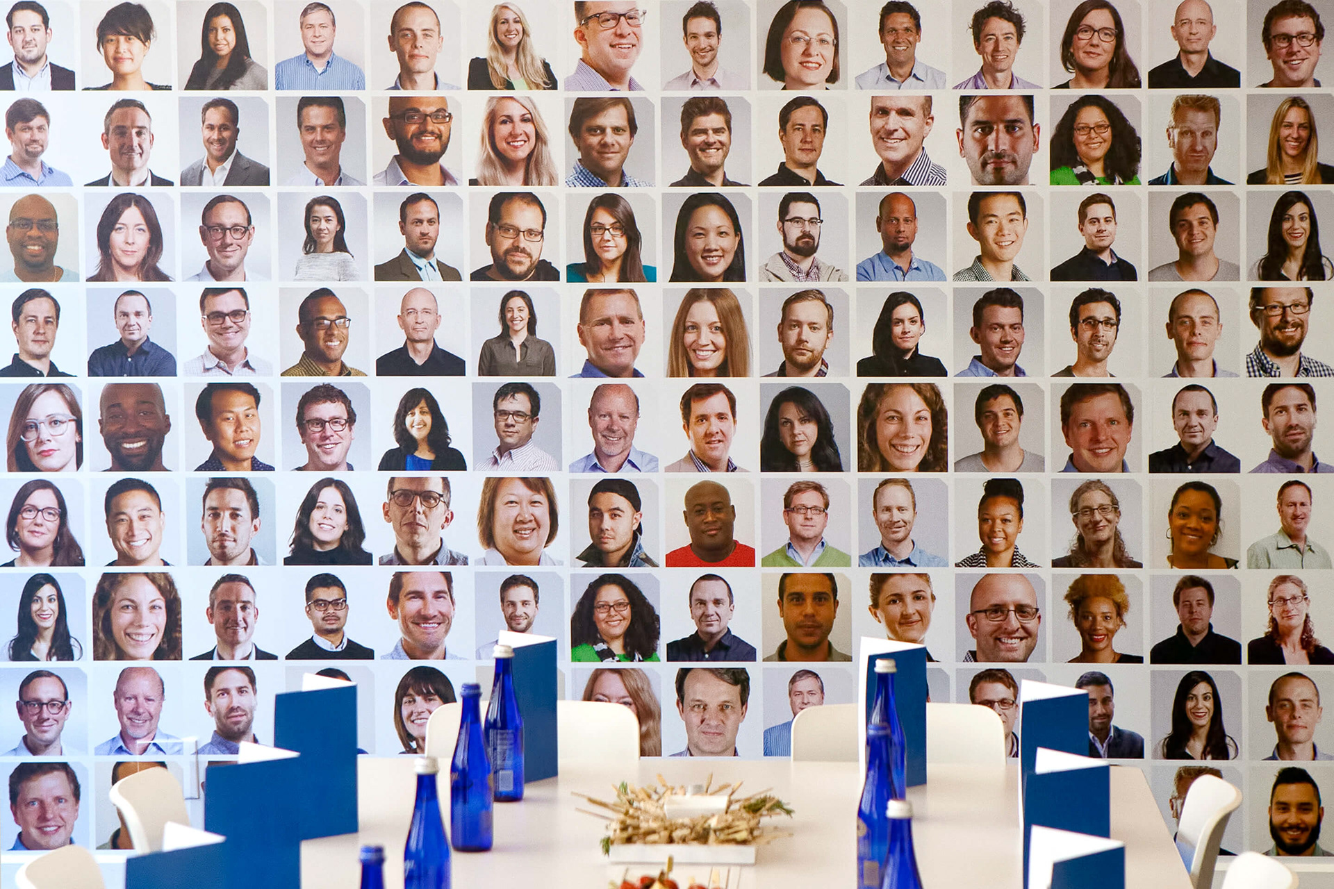
The presentations focus had a strong human aspect, working with “people,” the people of IPG. Throughout the presentation text, portraits and other means of human interaction was the focal point to reiterate this message.
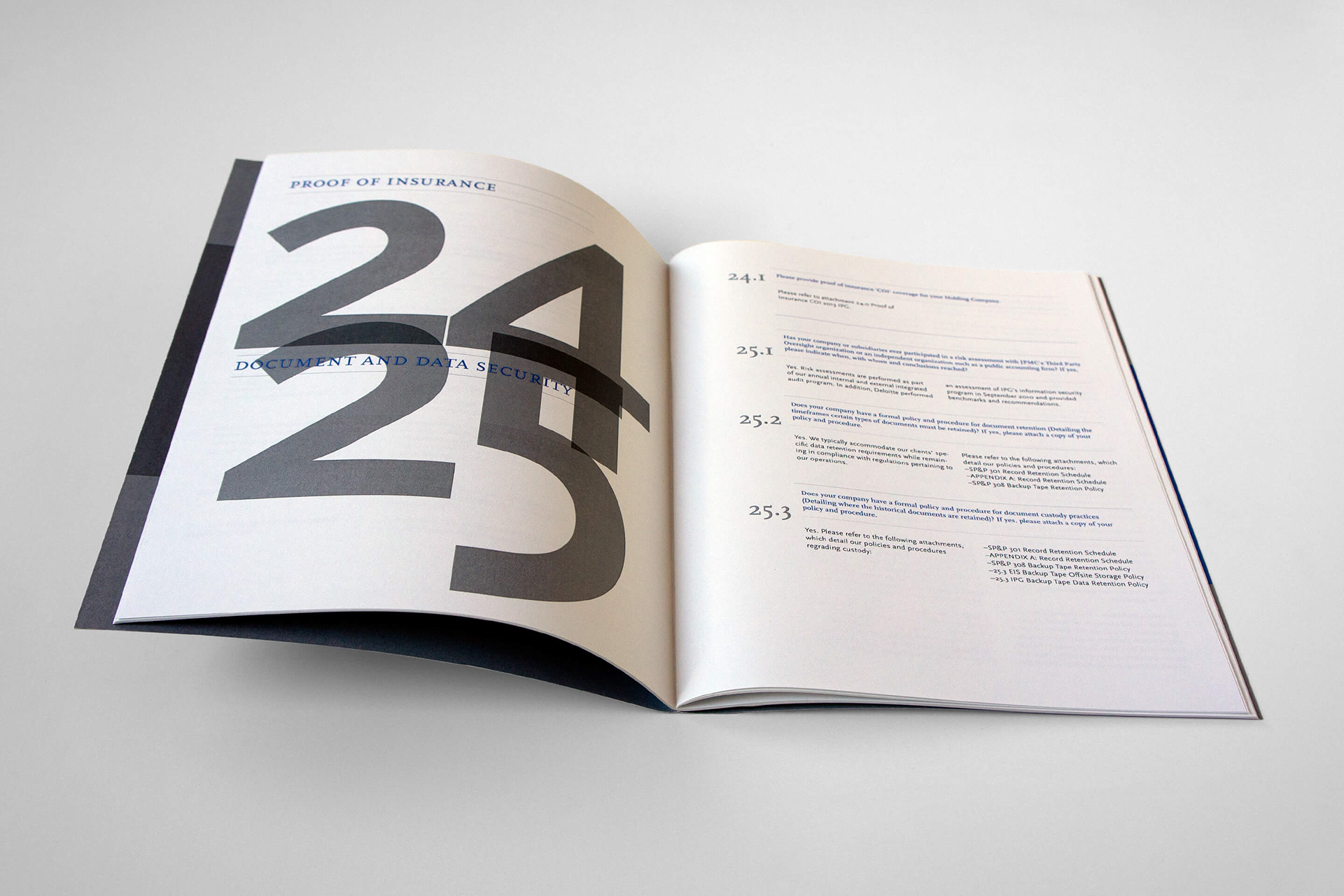
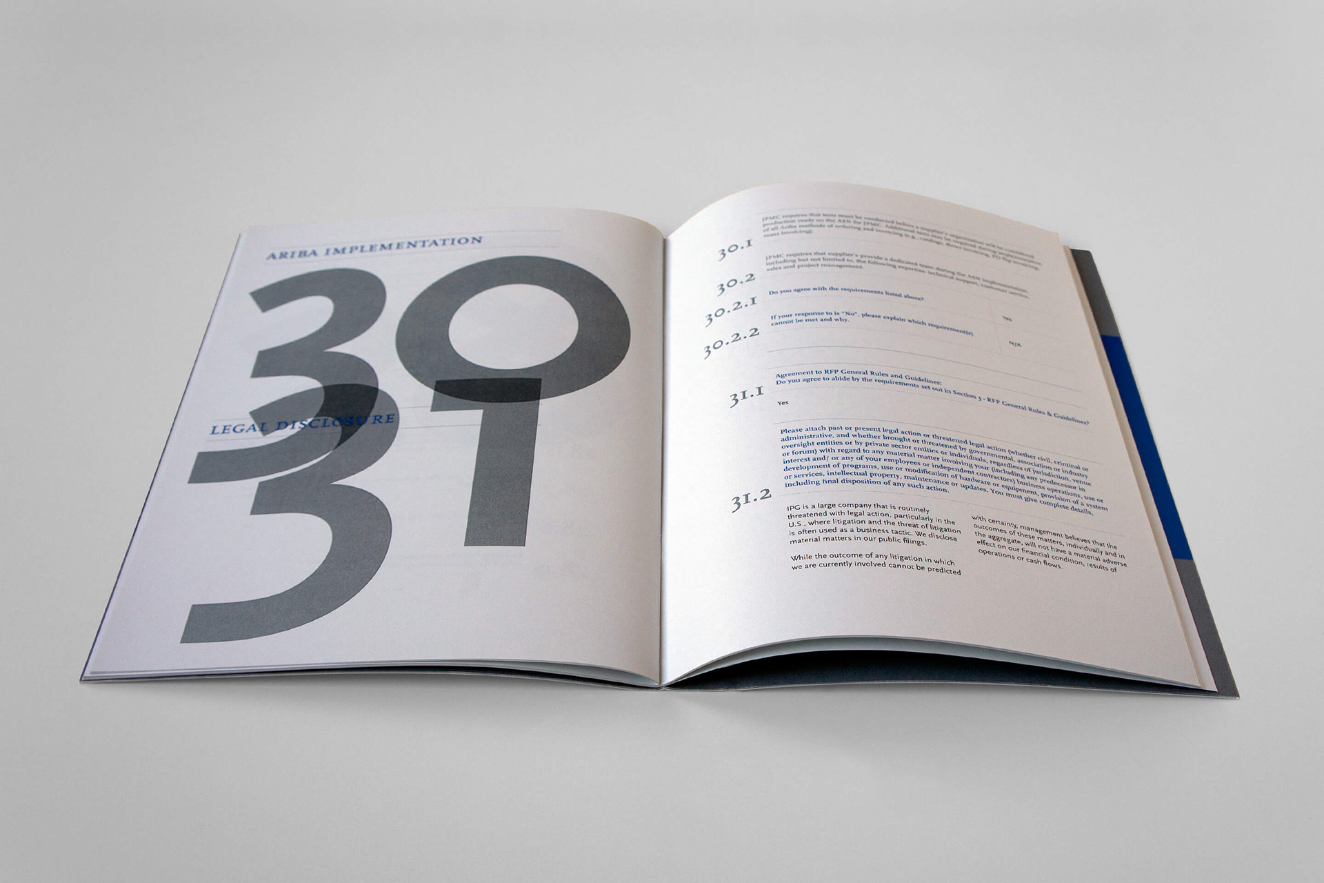
INFORMATION KIT
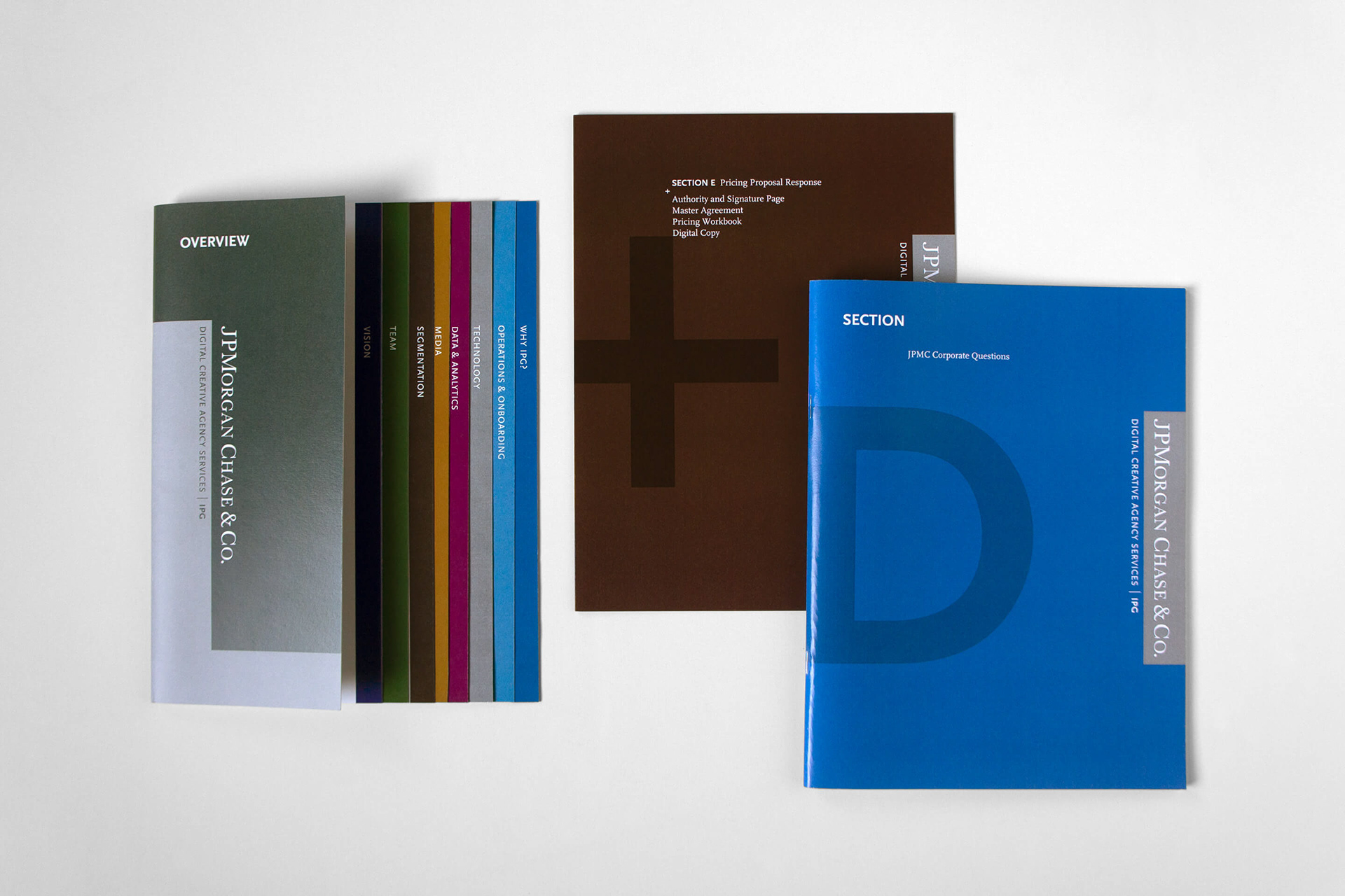
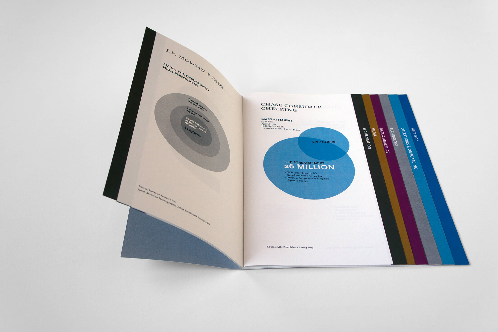
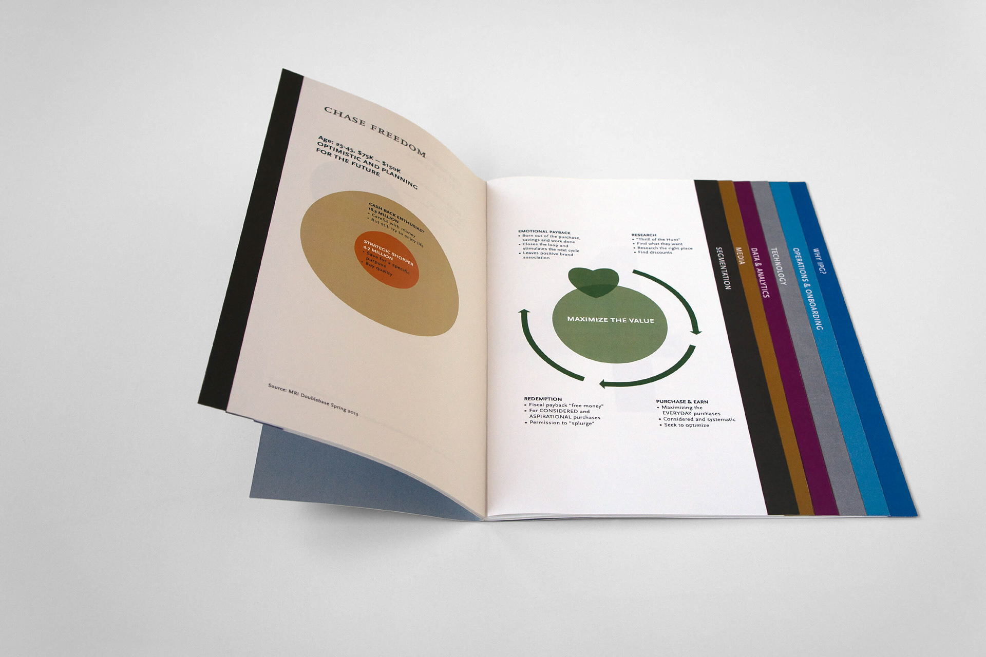
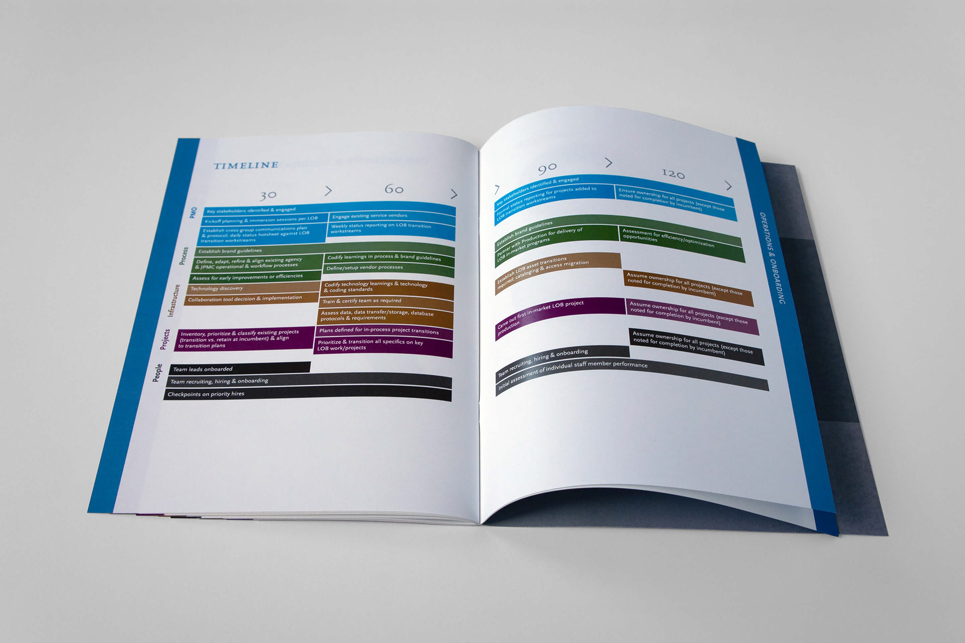
Apart from the experience presentation, the client was given in depth informative material in four brochures. The printed brochures were packaged in an aluminum slim box with an identifying sticker.
Apart from the experience presentation, the client was given in depth informative material in four brochures. The printed brochures were packaged in an aluminum slim box with an identifying sticker.