GETTING THE RIGHT MESSAGE ACROSS
LubbeVlieger is a consultancy specialized in the development and management of communication processes in urban planning. Especially in projects where different interests are simultaneously served or where policy is translated into action, and getting the right message to the public and media, LubbeVlieger brings clarity and consults in a broad range of areas.
LubbeVlieger is a consultancy specialized in the development and management of communication processes in urban planning. Especially in projects where different interests are simultaneously served or where policy is translated into action, and getting the right message to the public and media, LubbeVlieger brings clarity and consults in a broad range of areas.
Advising in both the private and the public sector the participatory processes are aimed at activating networks in urban planning. Strong in the analysis and strategy formulation of large-scale projects, LubbeVlieger has an extensive experience in complex social issues. Communication as an integral activity are often starting points to convert strategies into effective programs.
COMMUNICATION
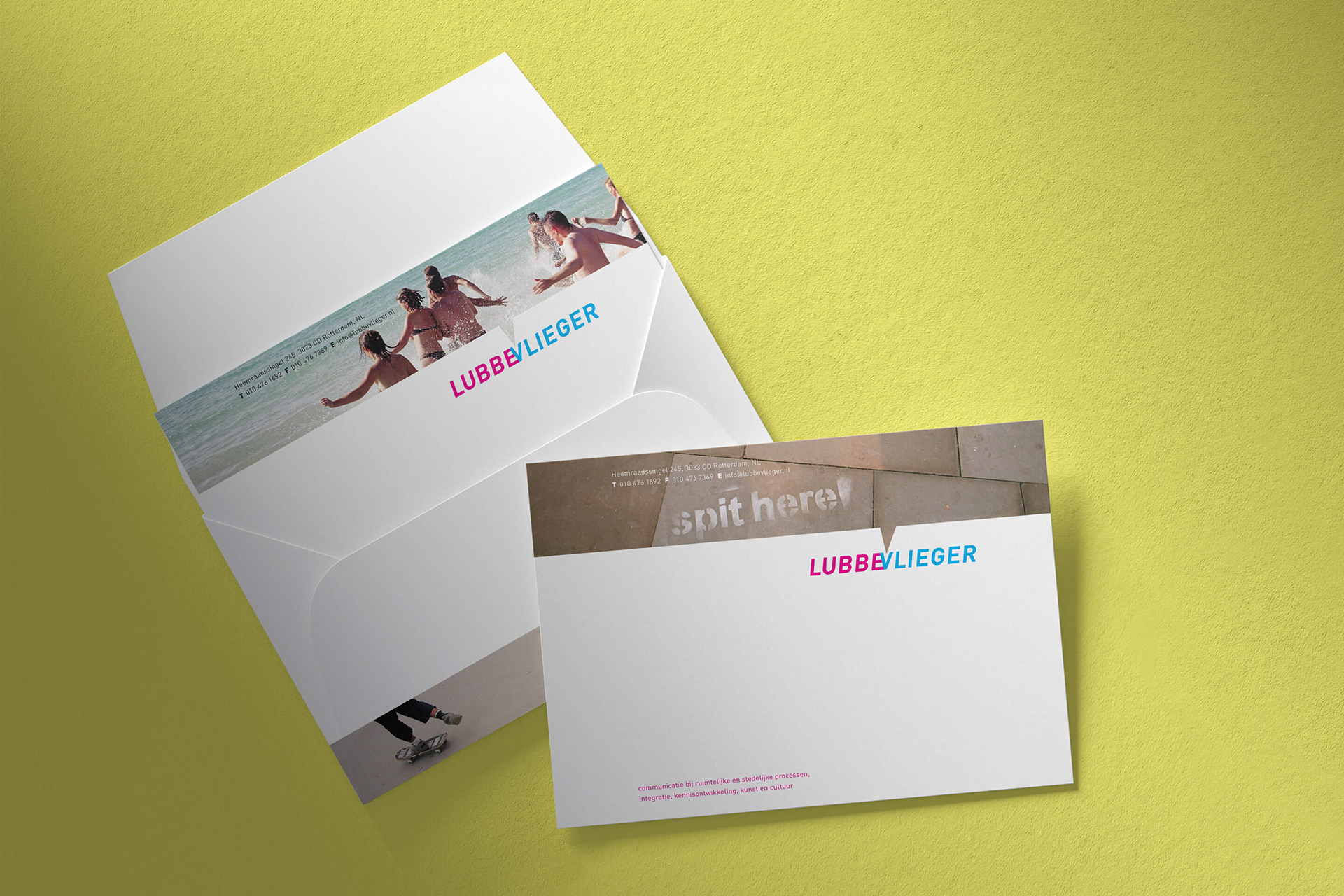
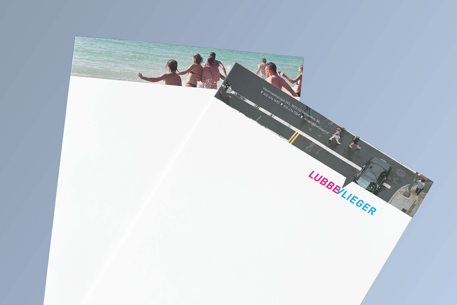
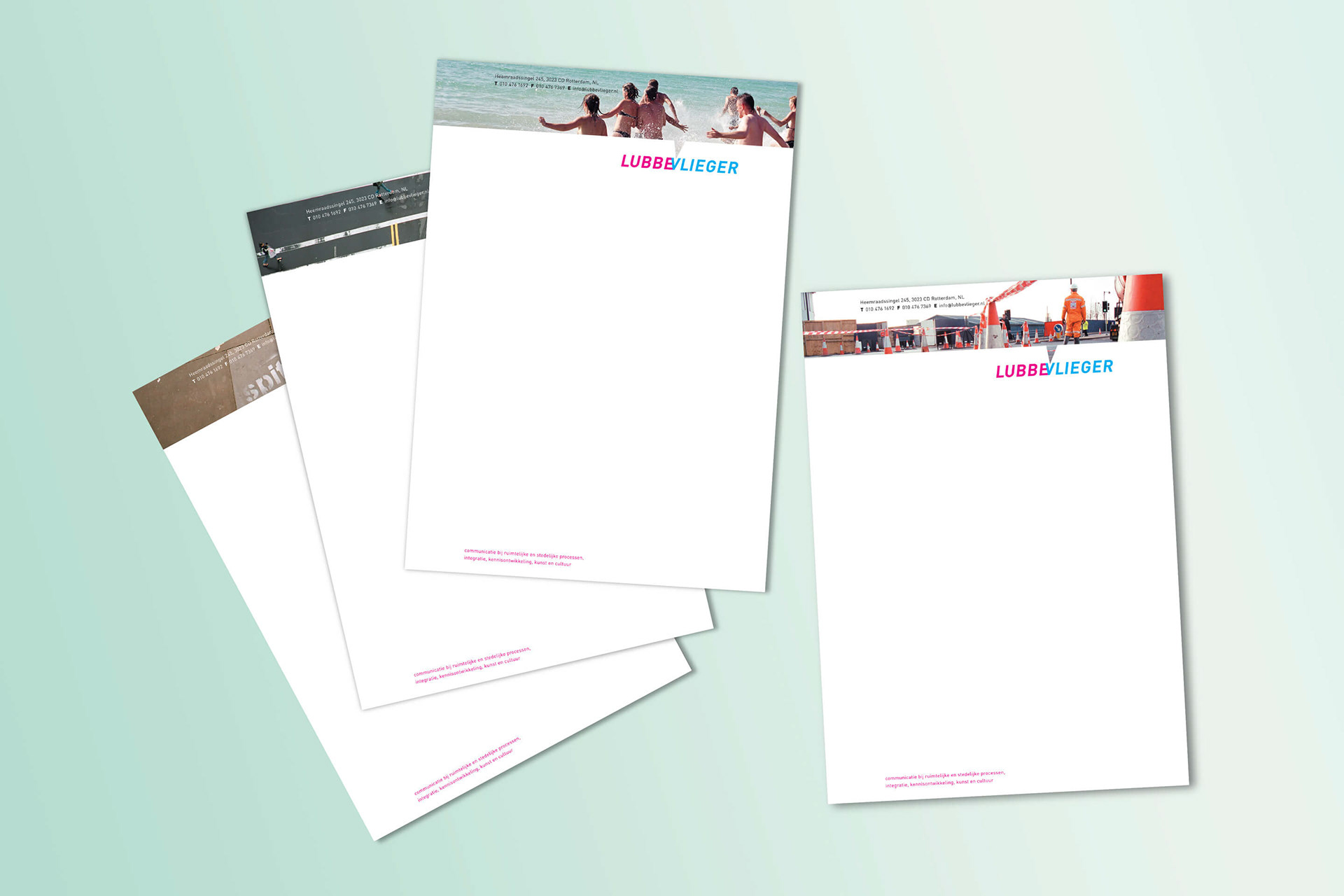
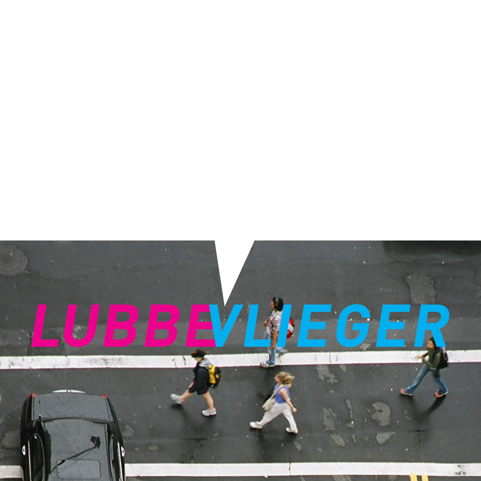
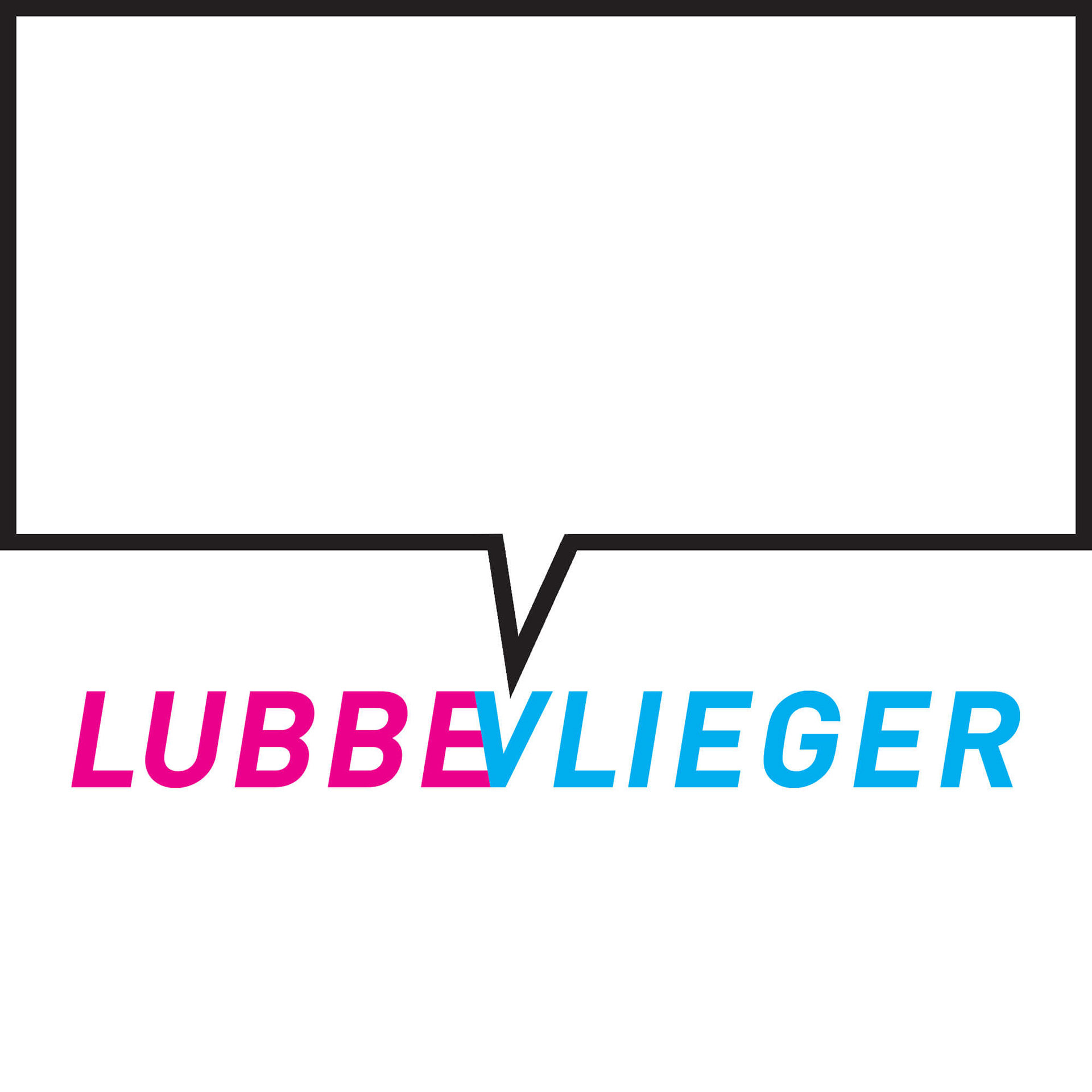
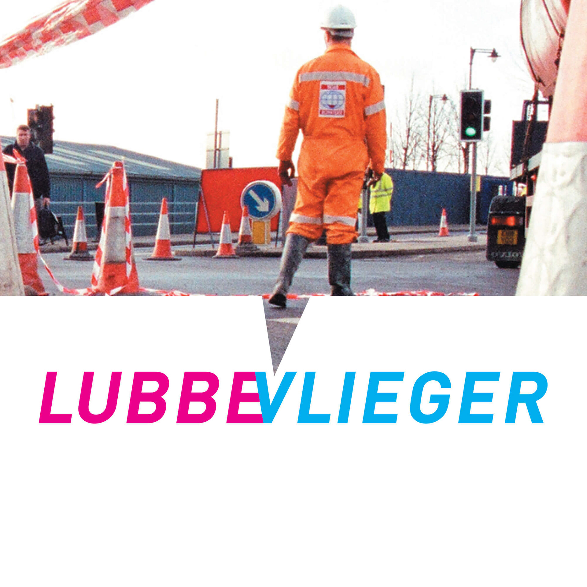
Getting the right message across in questions around urban planning was our focus with the result of an image driven design discourse. The discipline of urban planning is the broader category that includes different sub-fields such as land-use planning, zoning, economic development, services, environmental planning, and transportation planning. To cover all these different areas it seemed pictures would fit best to deliver a simple solution and to visualize "communication". In addition we needed a typographical treatment for the company name. The name LubbeVlieger is a combination of the two founders last names, Serge Lubbe and Anneke Vlieger. Merged together we added two colors for a subtle distinction, "LUBBE" in magenta and "VLIEGER" in cyan.
A PICTURE IS WORTH A THOUSAND WORDS
Images of urban development can trigger strong emotions, the right image is keen.
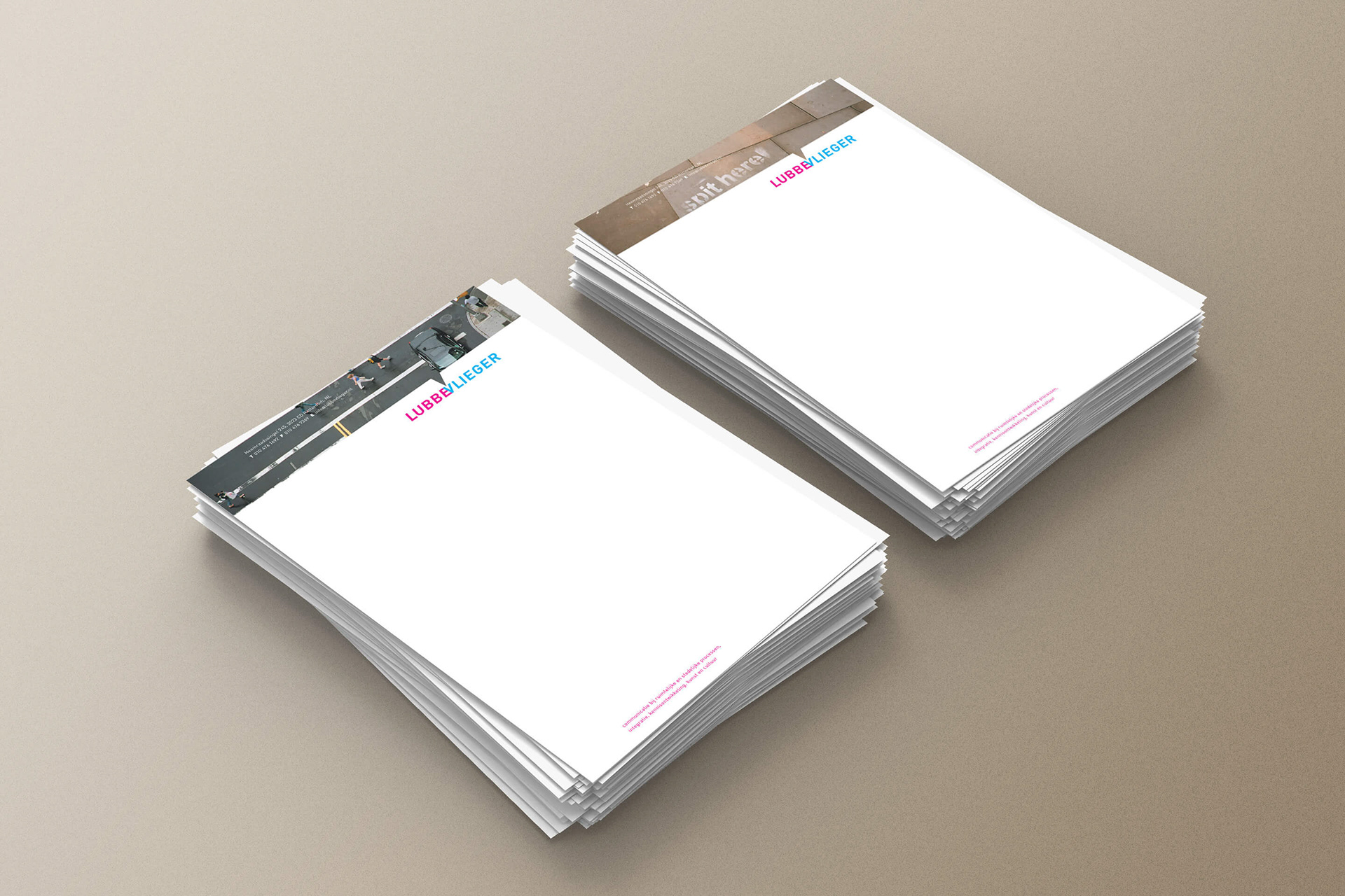
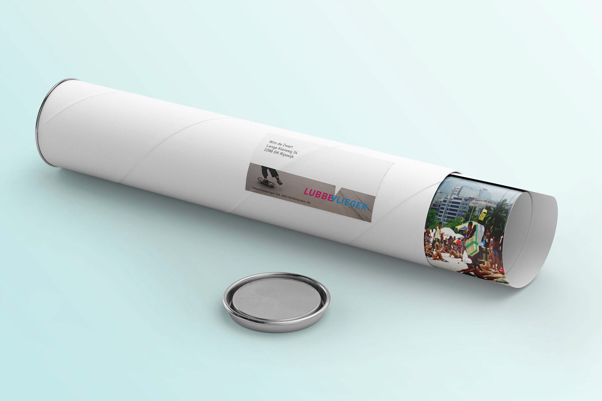
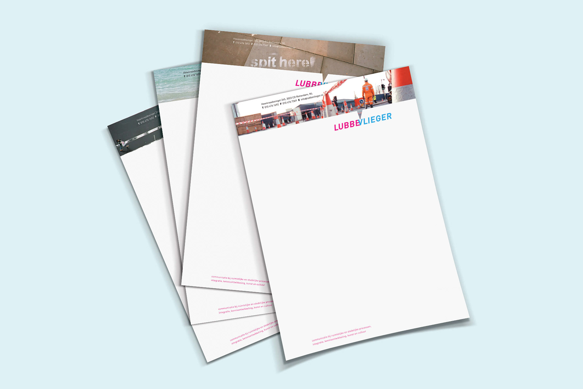
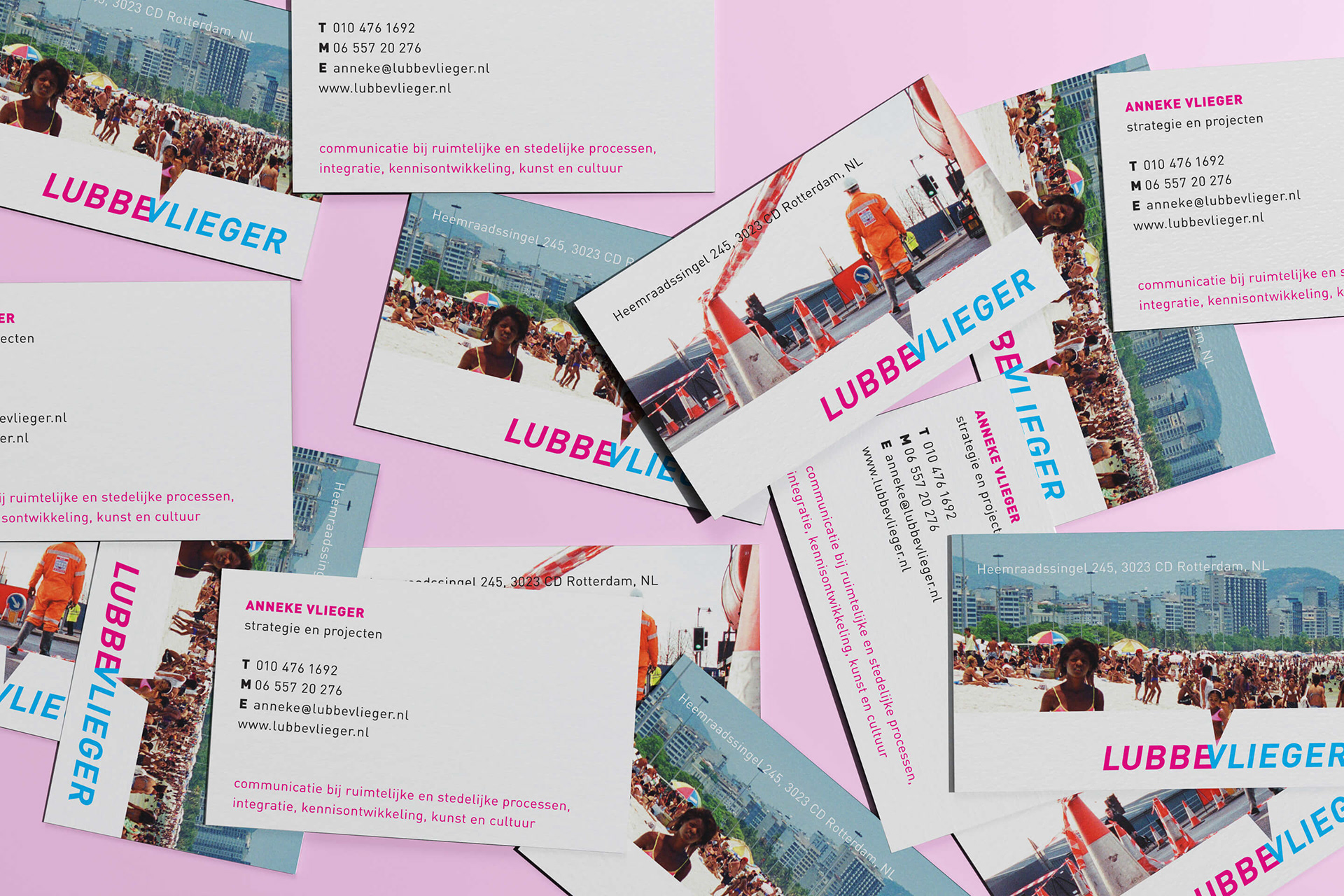
LubbeVlieger provides, among other things, communication for regional and urban processes. In the common sense of communication words are the main vehicle to deliver the message. We took another approach and made the picture the communicator. Fun and real day to day life imagery were chosen to brand the company. Walking over a busy street or having fun running down the beach, it is all about a community with people at the center. To connect the dots we created the speech bubble graphic – a well known illustration attribute in comics – to symbolize and to contain the words you need to communicate. At the same time the speech bubble tip put an emphasis on the letter V, the center of the company logo.

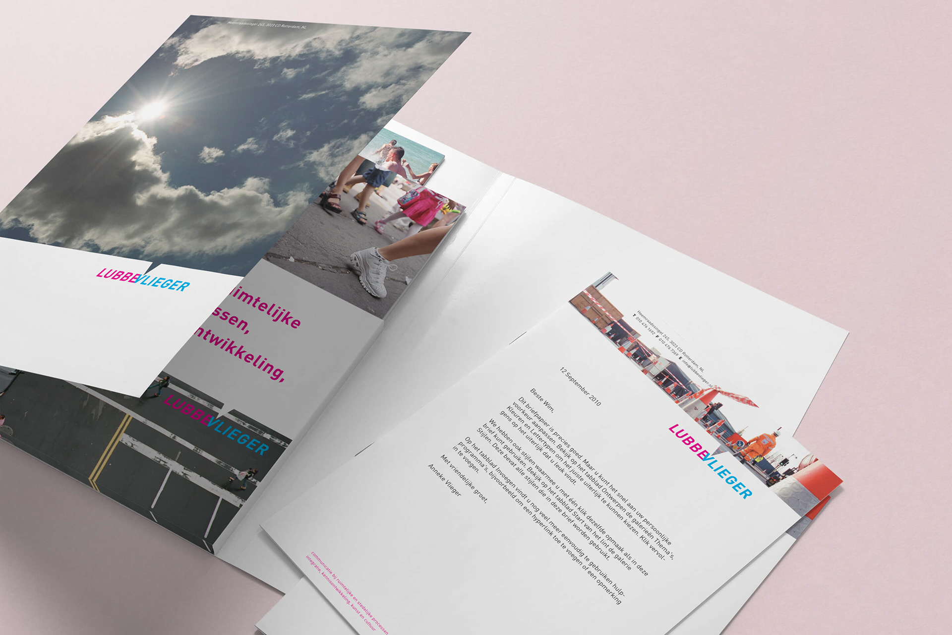
IDENTITY APPLICATION
For the collateral items a variety of urban settings were chosen to reflect the spirit of LubbeVlieger. At times several images were used for the same item. For example one person could have their business card in several image options, to give one particular card depending on the person. In other examples a simple line was sufficient to anchor the visual identity.