

A METICULOUS PROCESS OF CONFIGURATION
Cady Noland is an American sculptor, printmaker, and installation artist who primarily works with found objects and appropriated images.
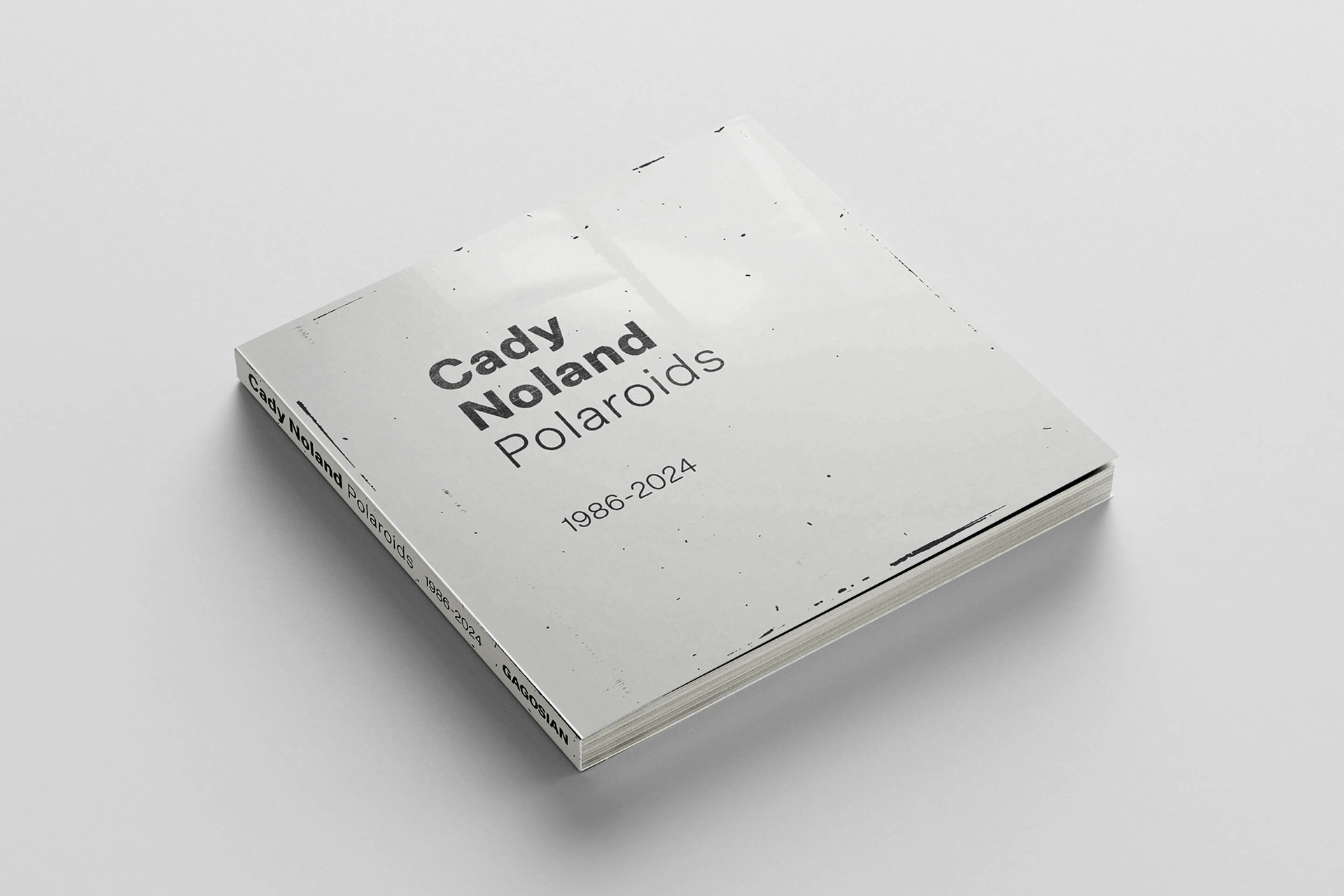
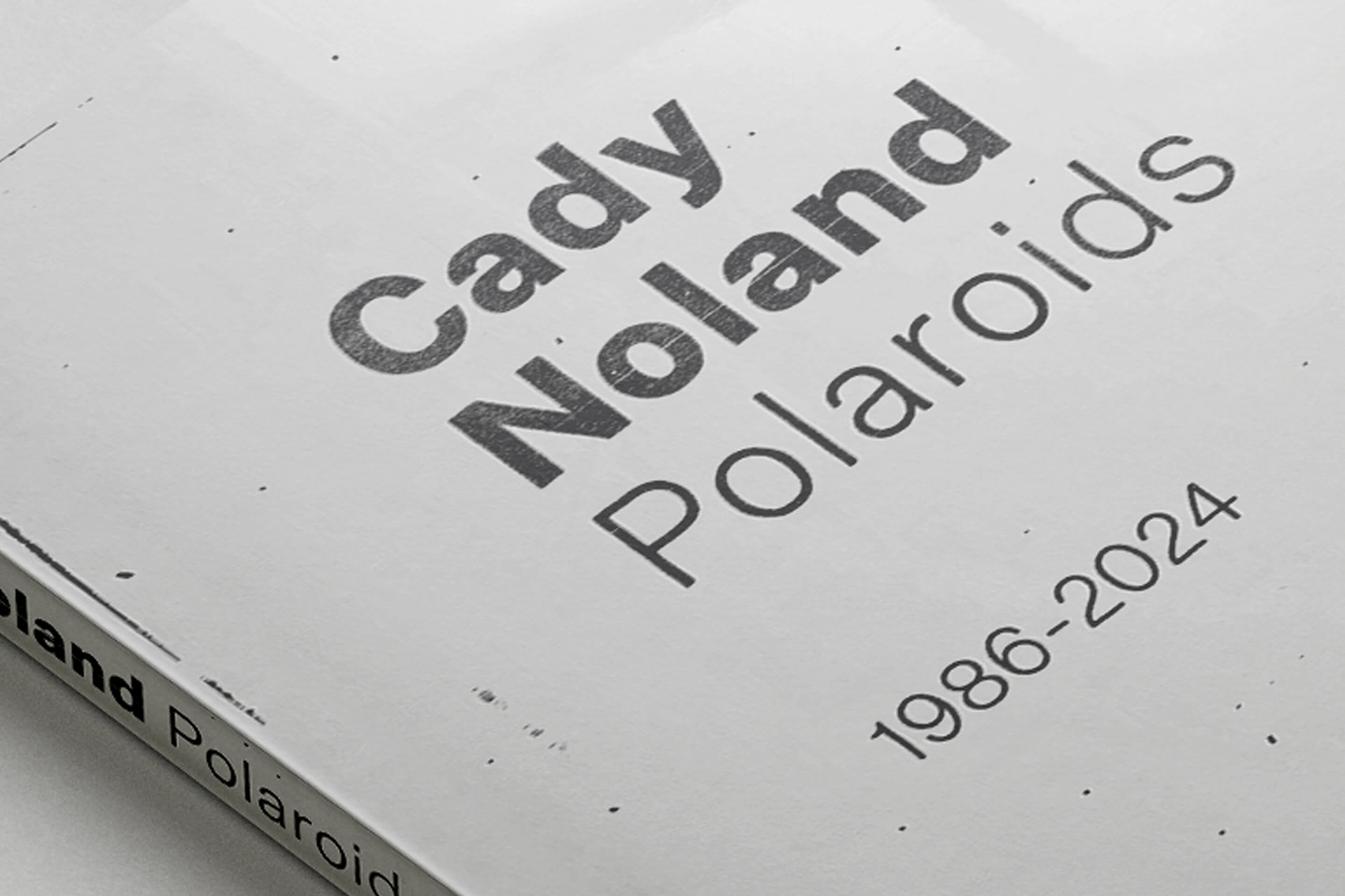
In conjunction with the opening of her new exhibition at Gagosian, the gallery published Cady Noland: Polaroids 1986–2024. This 118-page monograph offers unique insight into Noland's sculptural process, featuring Polaroids she took while developing her work over four decades.
Cady Noland is an American sculptor, printmaker, and installation artist who primarily works with found objects and appropriated images.
In conjunction with the opening of her new exhibition at Gagosian, the gallery published Cady Noland: Polaroids 1986–2024. This 118-page monograph offers unique insight into Noland's sculptural process, featuring Polaroids she took while developing her work over four decades.
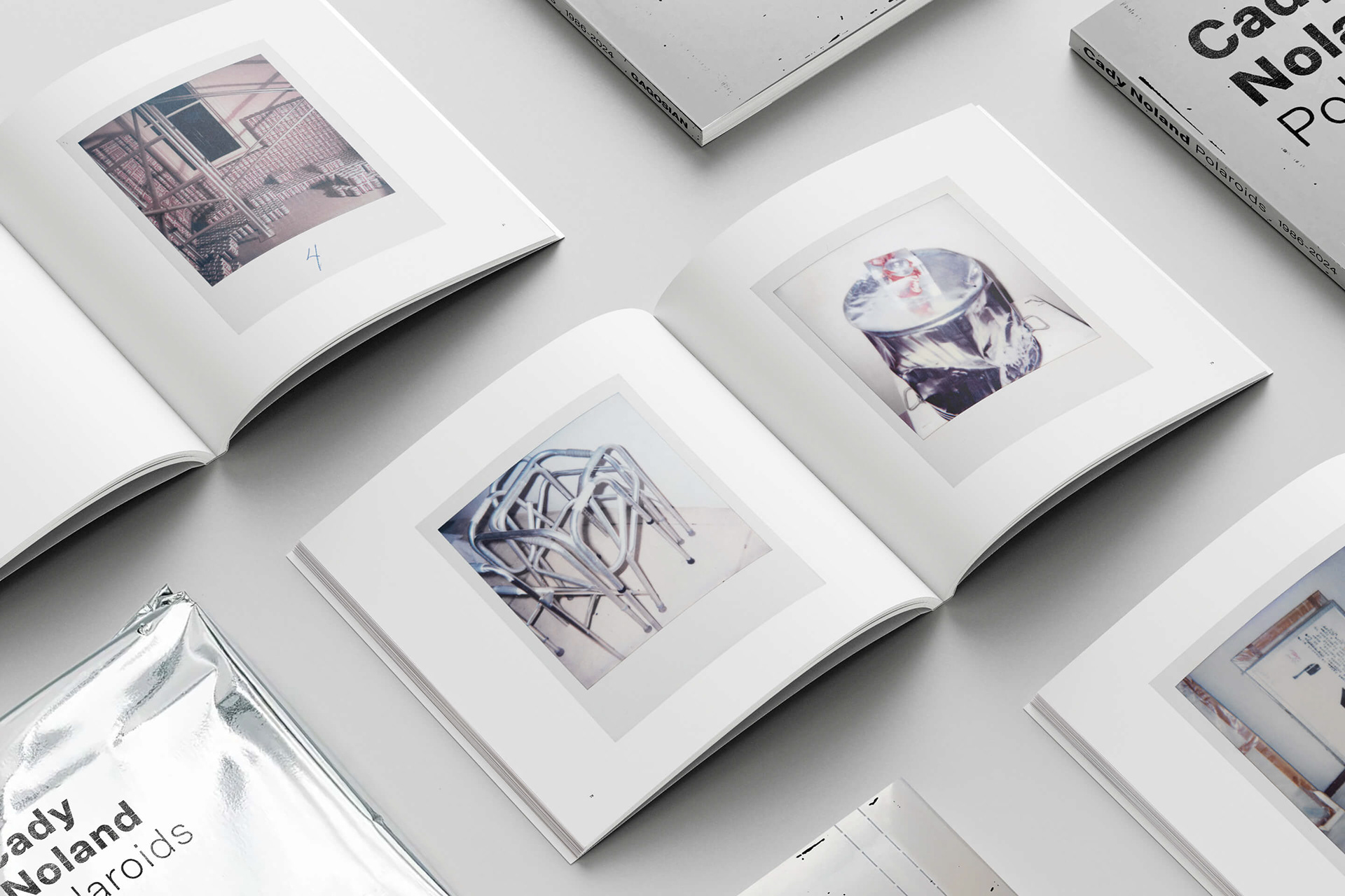
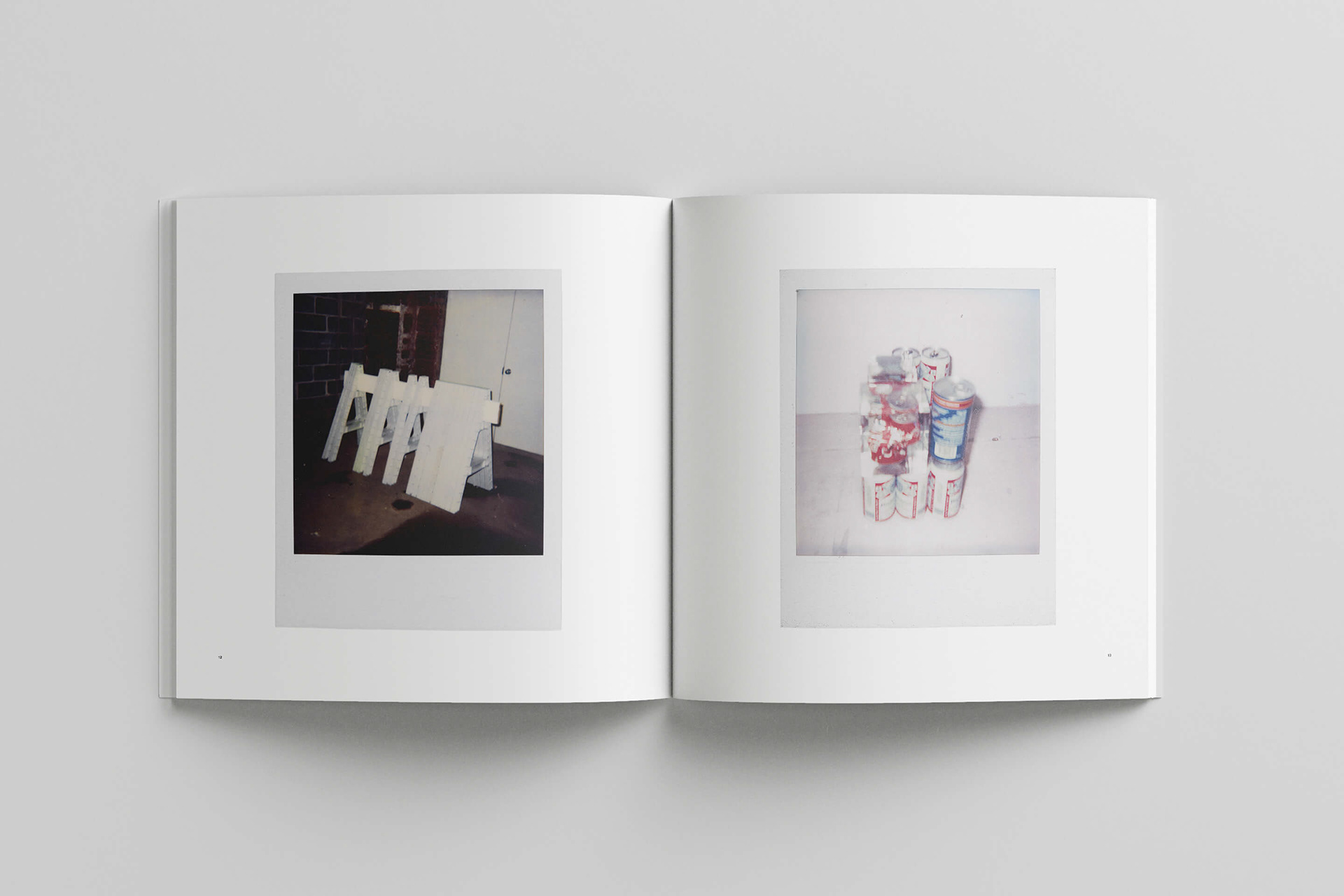
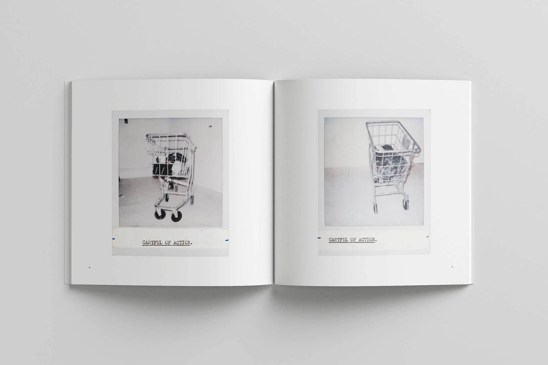
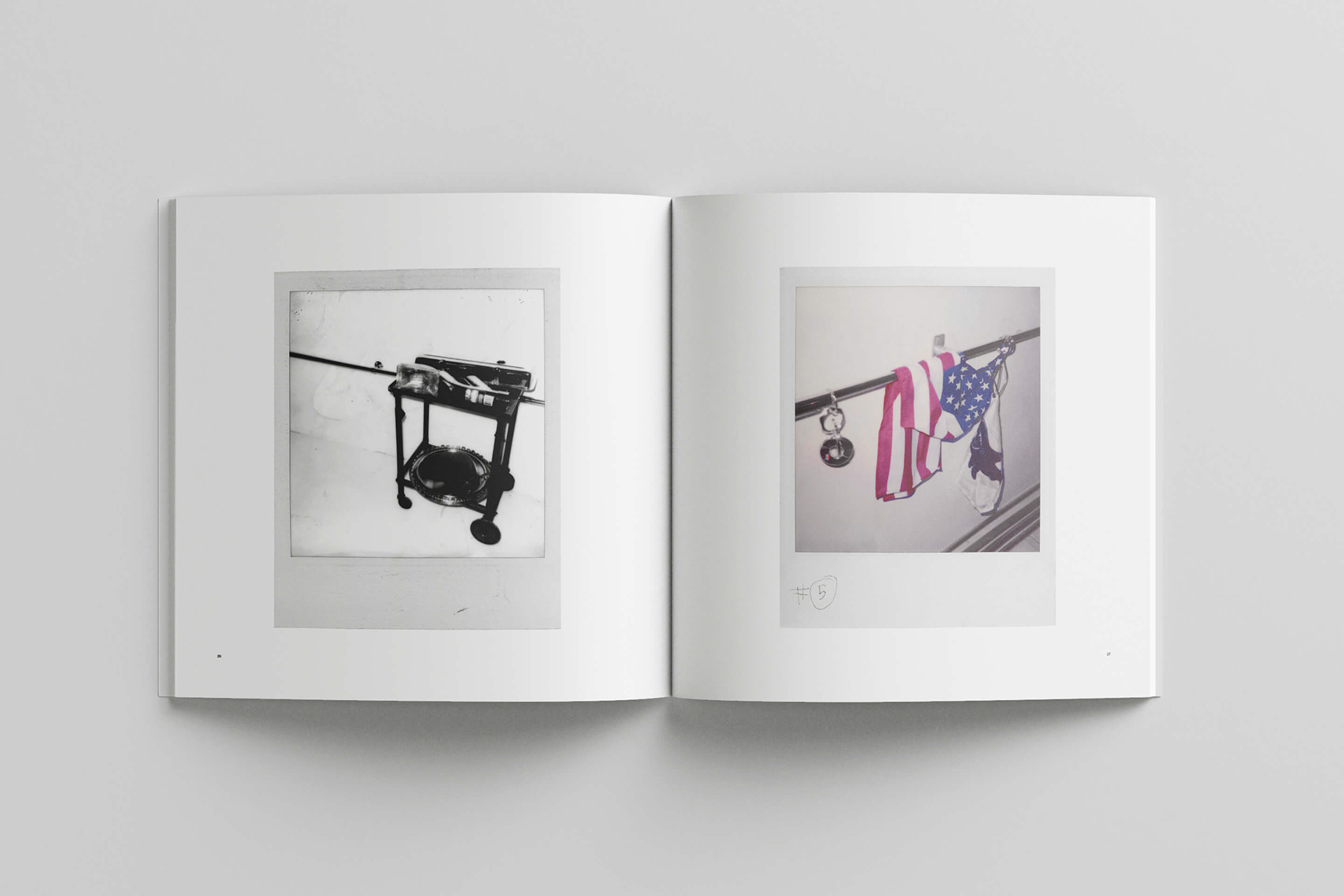
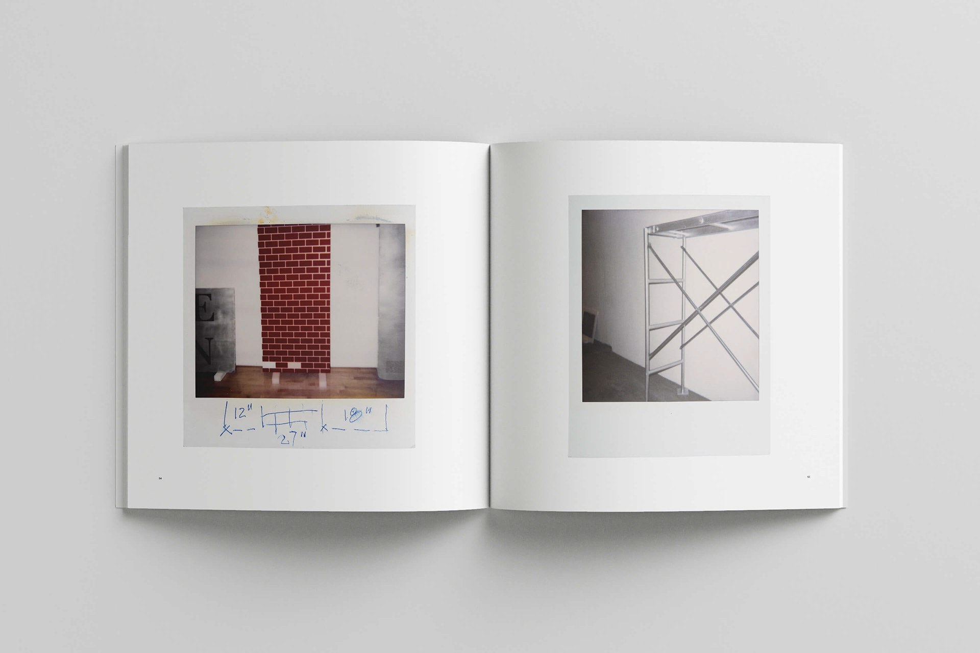
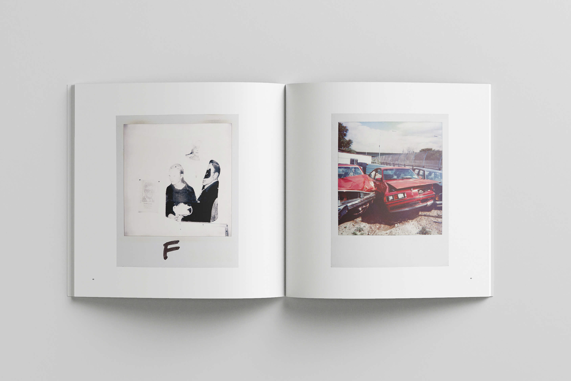
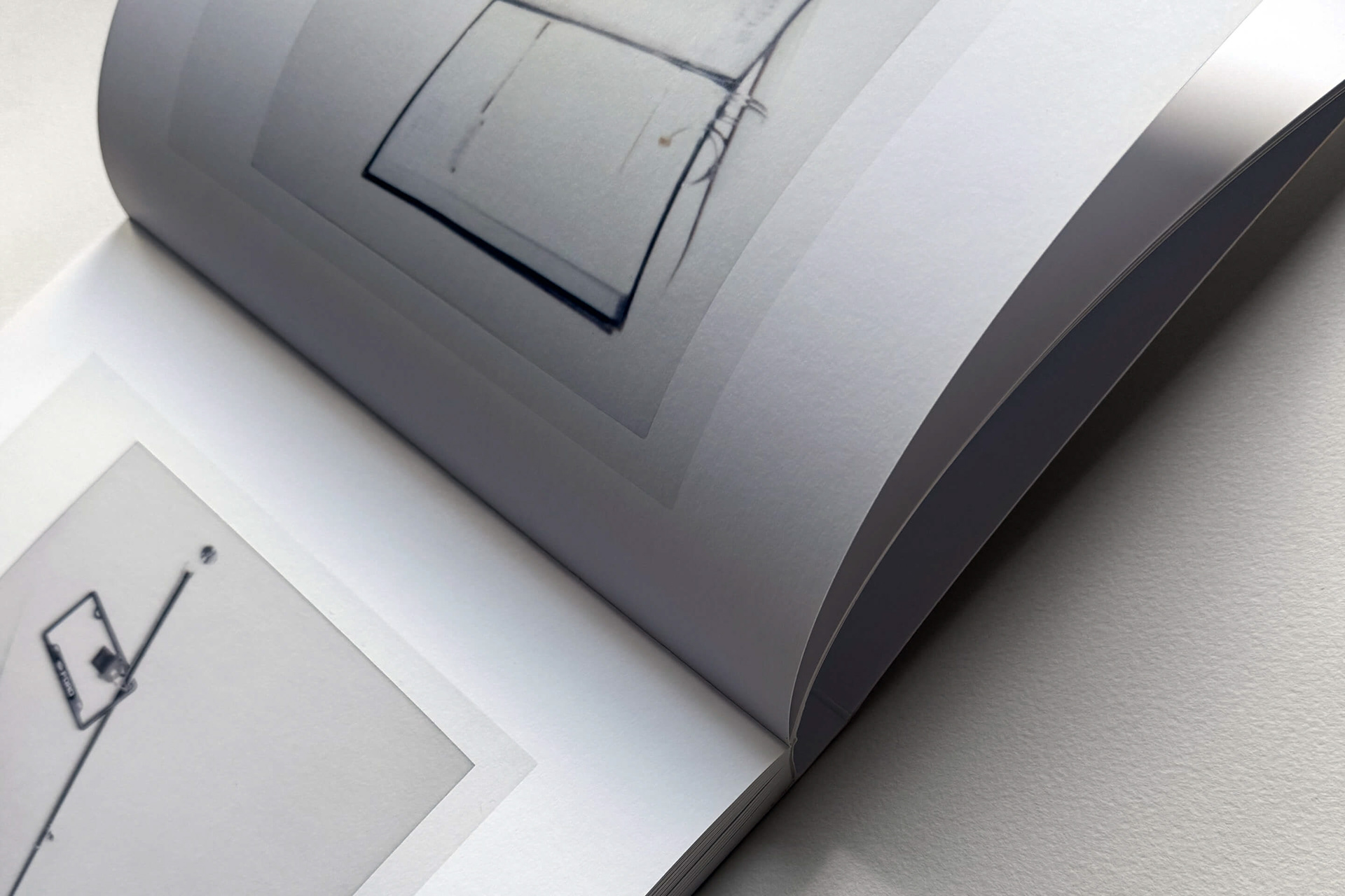
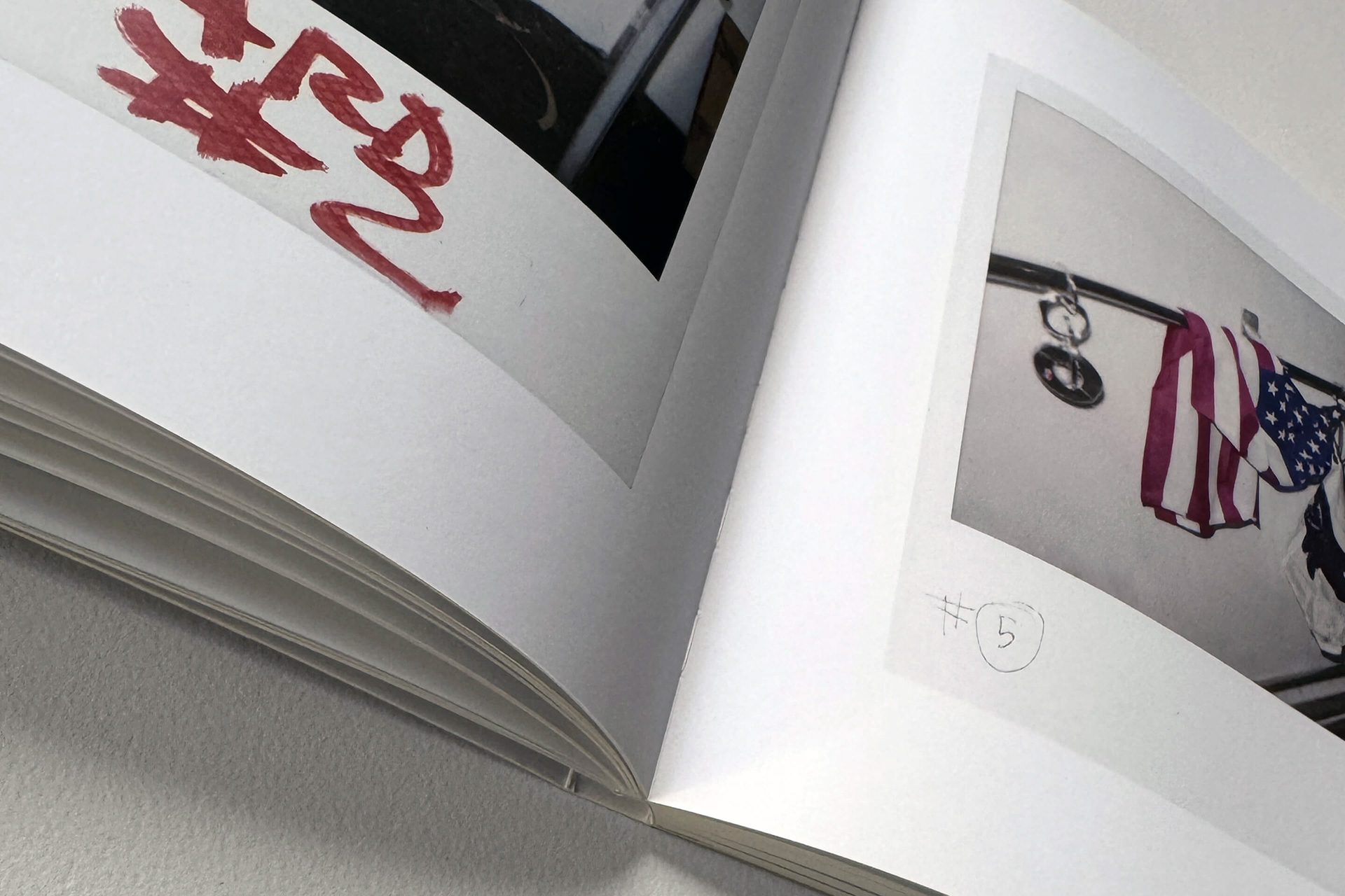
The book offers readers a voyeuristic glimpse into the behind-the-scenes social lives of Noland’s curated objects, presenting them outside their usual museum, gallery, or collector’s home contexts. Although people are absent, the Polaroids evoke an unsettling sense of presence or imminent arrival, creating an anxious and mysterious atmosphere through their sequencing and pairings.
THE IDEA
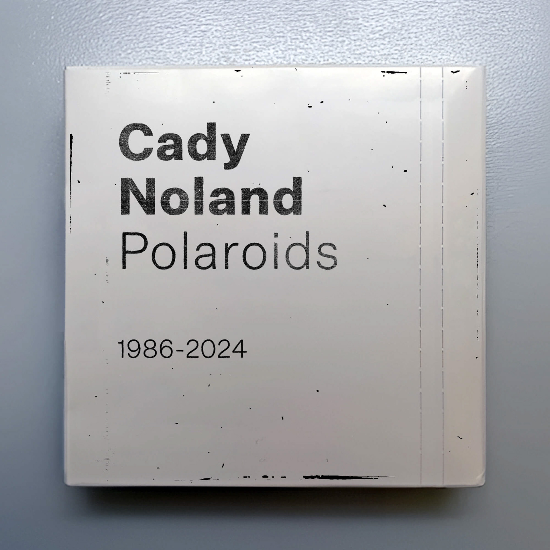
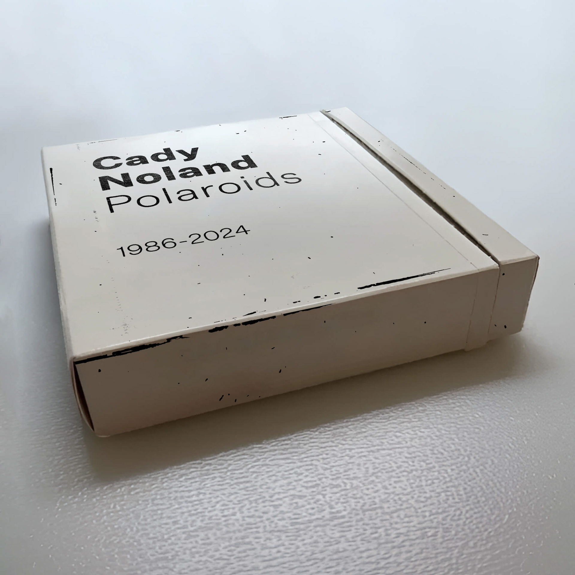
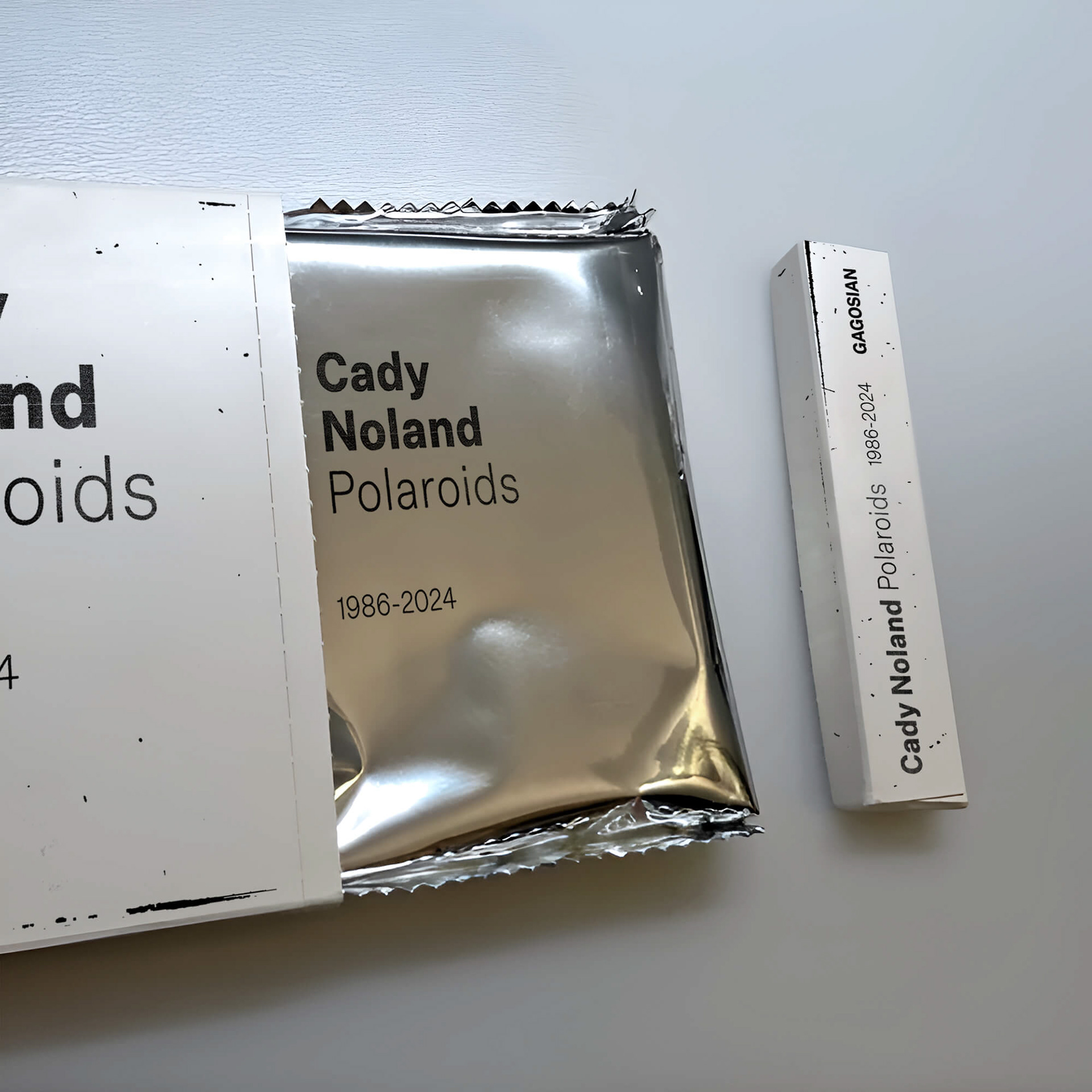
Iconic instant Polaroid cameras were introduced in 1948, allowing photos to develop in minutes and quickly becoming a cultural phenomenon throughout the ’60s, ’70s, and ’80s. We used the later single-sheet film that develops without peeling, introduced in the ’70s, and its packaging as inspiration for presenting the book project. The basic elements – an outer carton box, an inner silver mylar bag, and the high-gloss Polaroid film – became the foundation for the book, its cover, interior pages, and packaging. The entire book and outer box are white, each using different types of paper and printing techniques.


THE PACKAGING
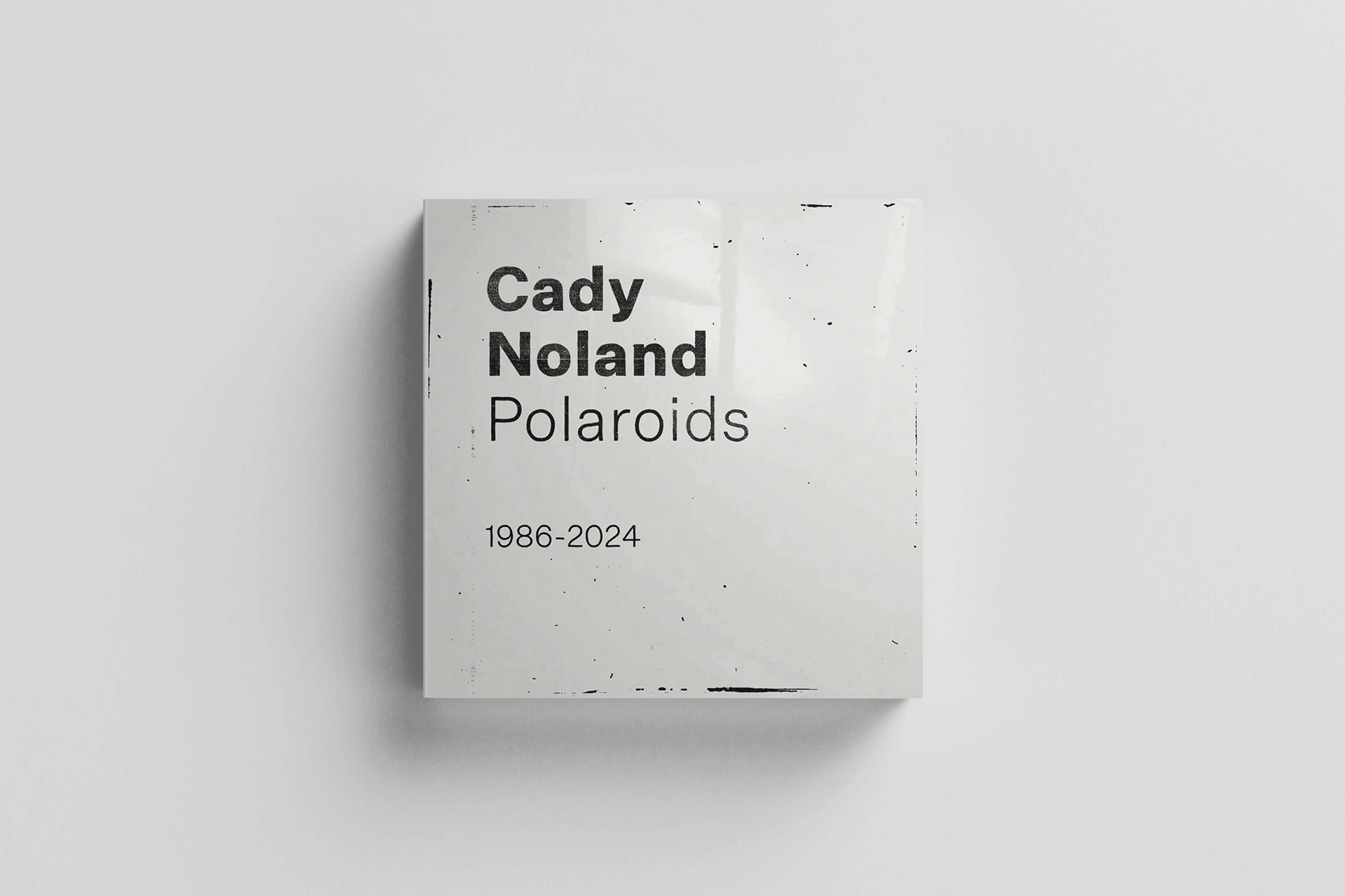
For the project, we adopted the Polaroid image’s signature square format. By analyzing the Polaroid’s packaging – specifically the black-and-white PZ600 Square – we designed an outer carton box with the book sealed inside a silver mylar bag, closely echoing the original Polaroid film packaging.
THE BOOK
The “Polaroid film gloss” inspired the cover. When unwrapped from the silver mylar bag, the book cover reveals a simple black title on a distressed background, printed on high-gloss white paper stock. Measuring 10x10 inches, the book simulates the classic Polaroid 600 square image area.
To reflect the evolution of the Polaroid logo, we selected Untitled Sans, a neo-grotesque typeface intentionally designed to appear plain and unremarkable. We customized it with a distressed, photocopied effect, referencing the art featured in the Polaroids. This style was also applied in other parts of the book.
The interior pages are kept simple and mostly feature a single Polaroid on each page. Without any text, the book’s interior becomes a continuous sequence of Polaroid images. A collection of Polaroids was meticulously arranged, retouched, or manipulated according to the artist’s instructions.

THE SPECIFICATIONS
For the packaging we used Magno Matt 350 gsm paper printed in 1/c, double hit of 100% black. The 118-page book, featuring 92 illustrations, is printed in 4/c with spot satin varnish on the Polaroid images using Magno Matt 200 gsm paper. It has a black-and-white softcover made from Fedrigoni Splendorlux 2HG 300 gsm paper, double-pasted to 600 gsm, and is swiss bound with Brillianta 4001 white cloth on the spine. The font used is Untitled Sans. Color separations by Die Keure, Bruges, Belgium, and printing by Pureprint Group, Uckfield, UK.
Published by Gagosian
ISBN: 978-1-951449-95-7
ISBN: 978-1-951449-95-7