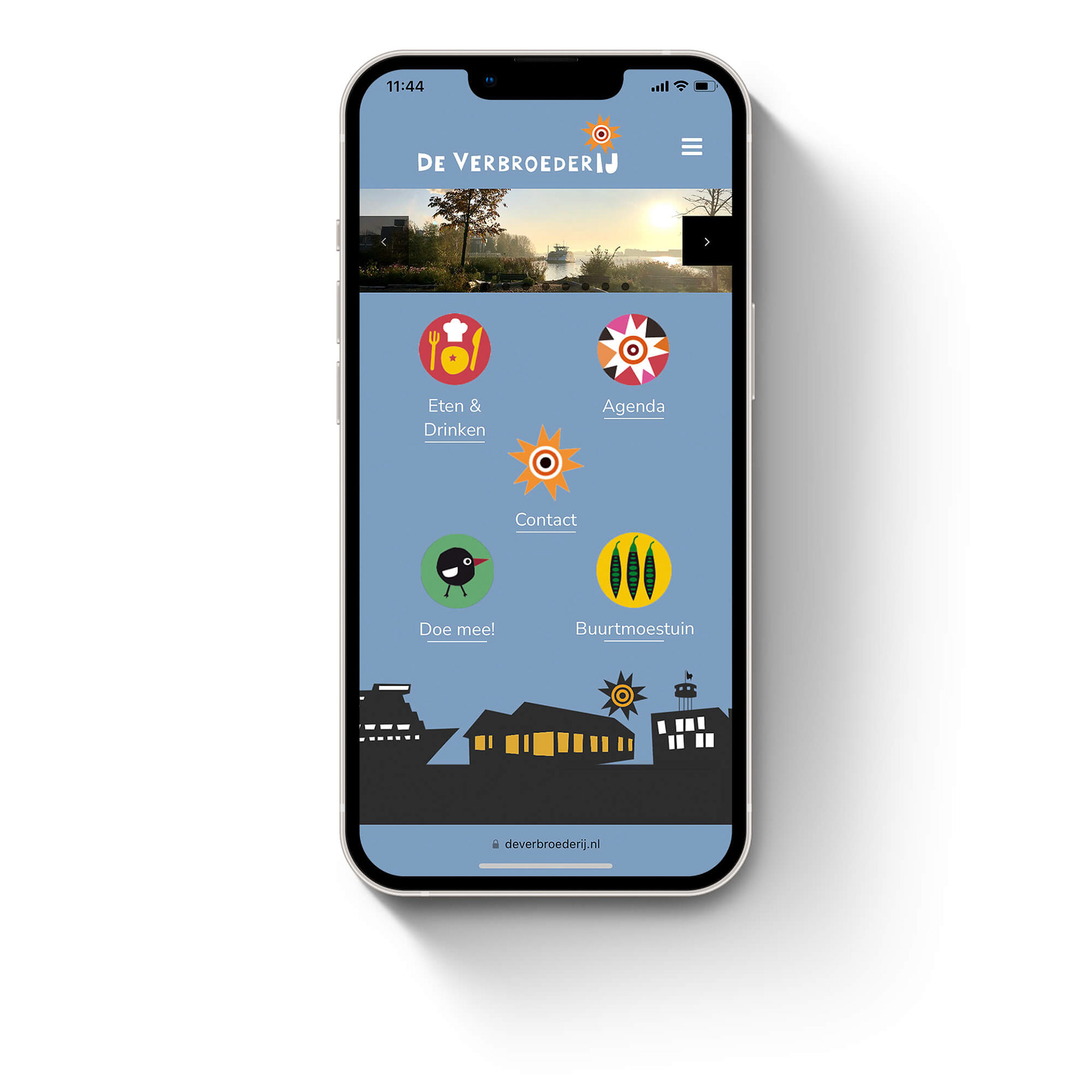
A SPACE FOR THE NEIGHBORHOOD
De VerbroederIJ (translated a Fraternize & Farm) is a place for the neighborhood, a café-restaurant, a neighborhood vegetable garden and a city beach. A meeting point to mingle, interact, socialize, organize, gardening and relax.
De VerbroederIJ (translated a Fraternize & Farm) is a place for the neighborhood, a café-restaurant, a neighborhood vegetable garden and a city beach. A meeting point to mingle, interact, socialize, organize, gardening and relax.
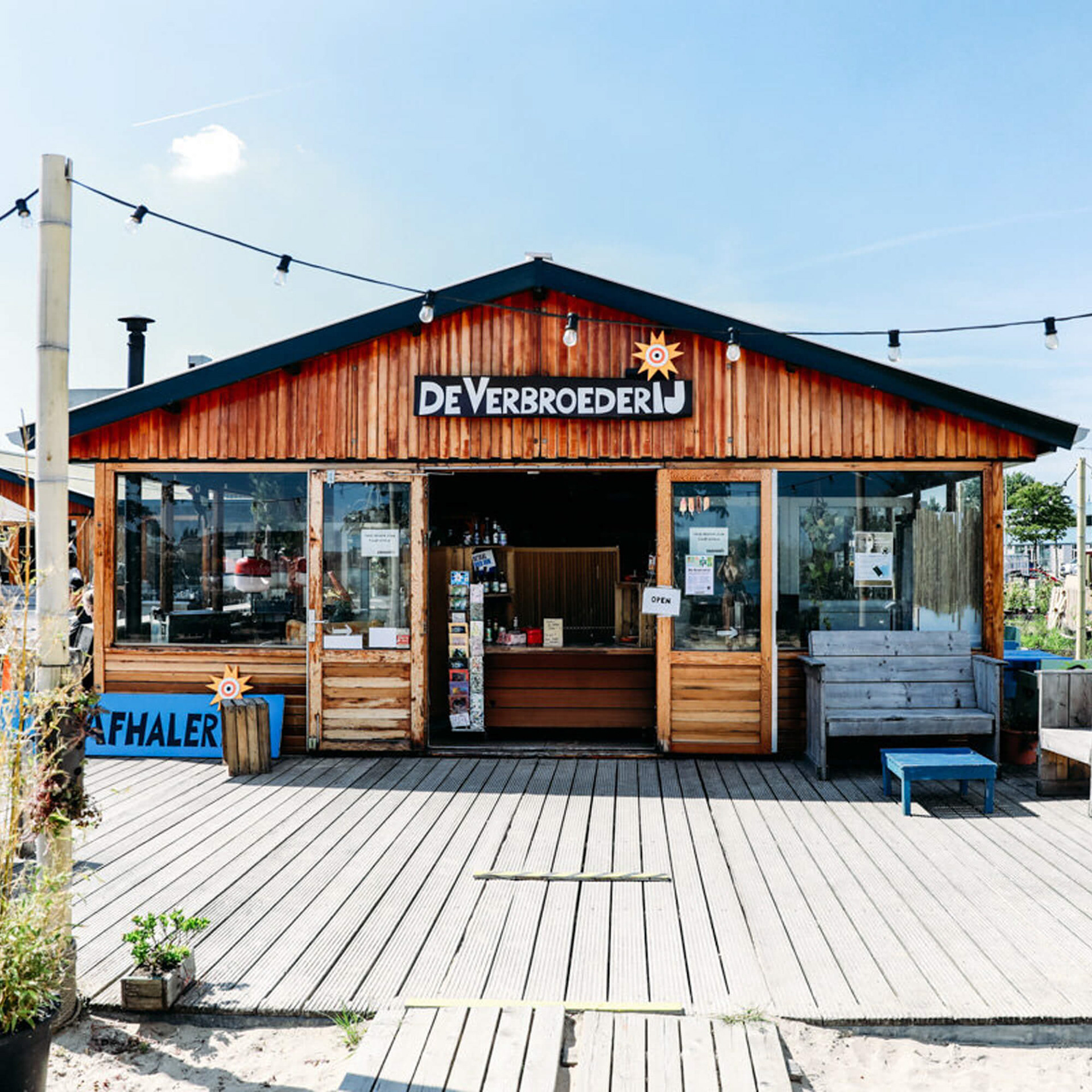
You can enjoy a drink, eat lunch or dinner with a spectacular view on the IJ, the main river in Amsterdam. Various activities are organized throughout the seasons taking advantage of the unique location. They offer the space to people from the neighborhood to organize events on their own.
HOME GROWN VISUALIZATION
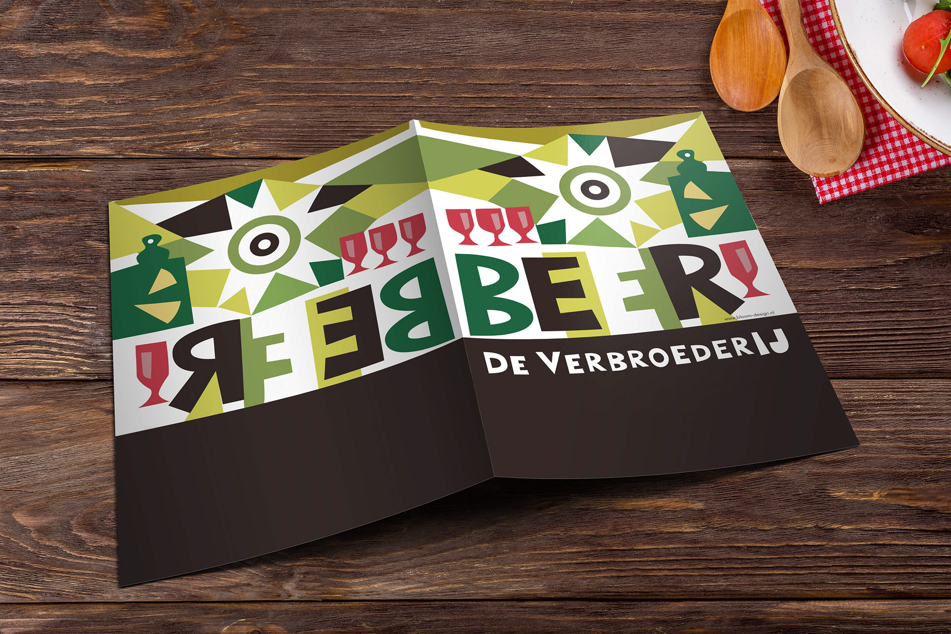
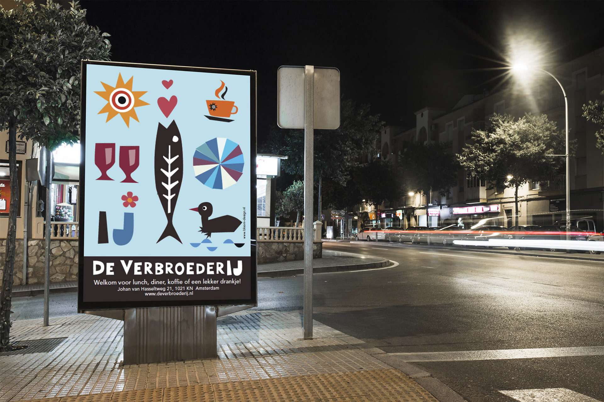
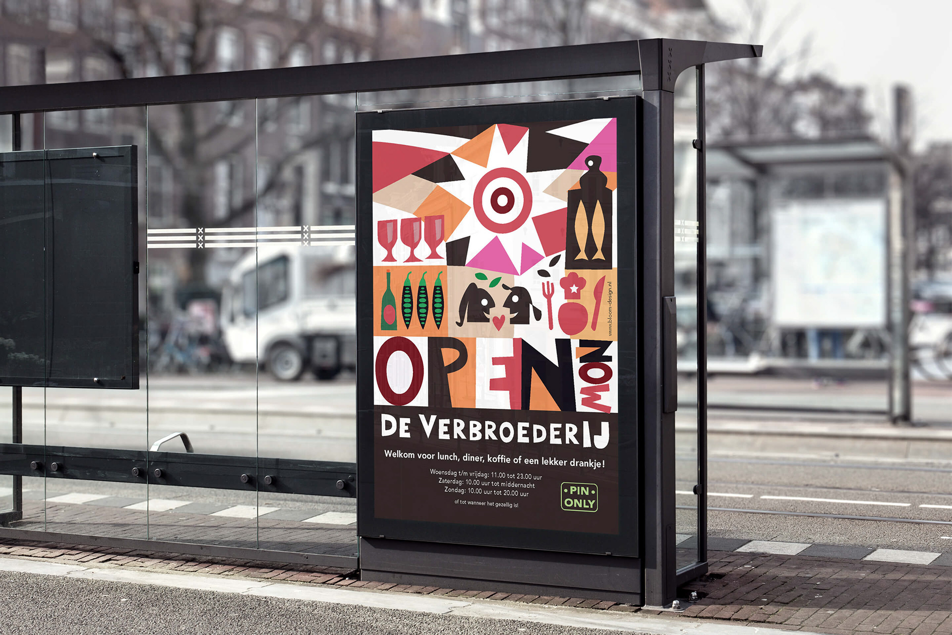
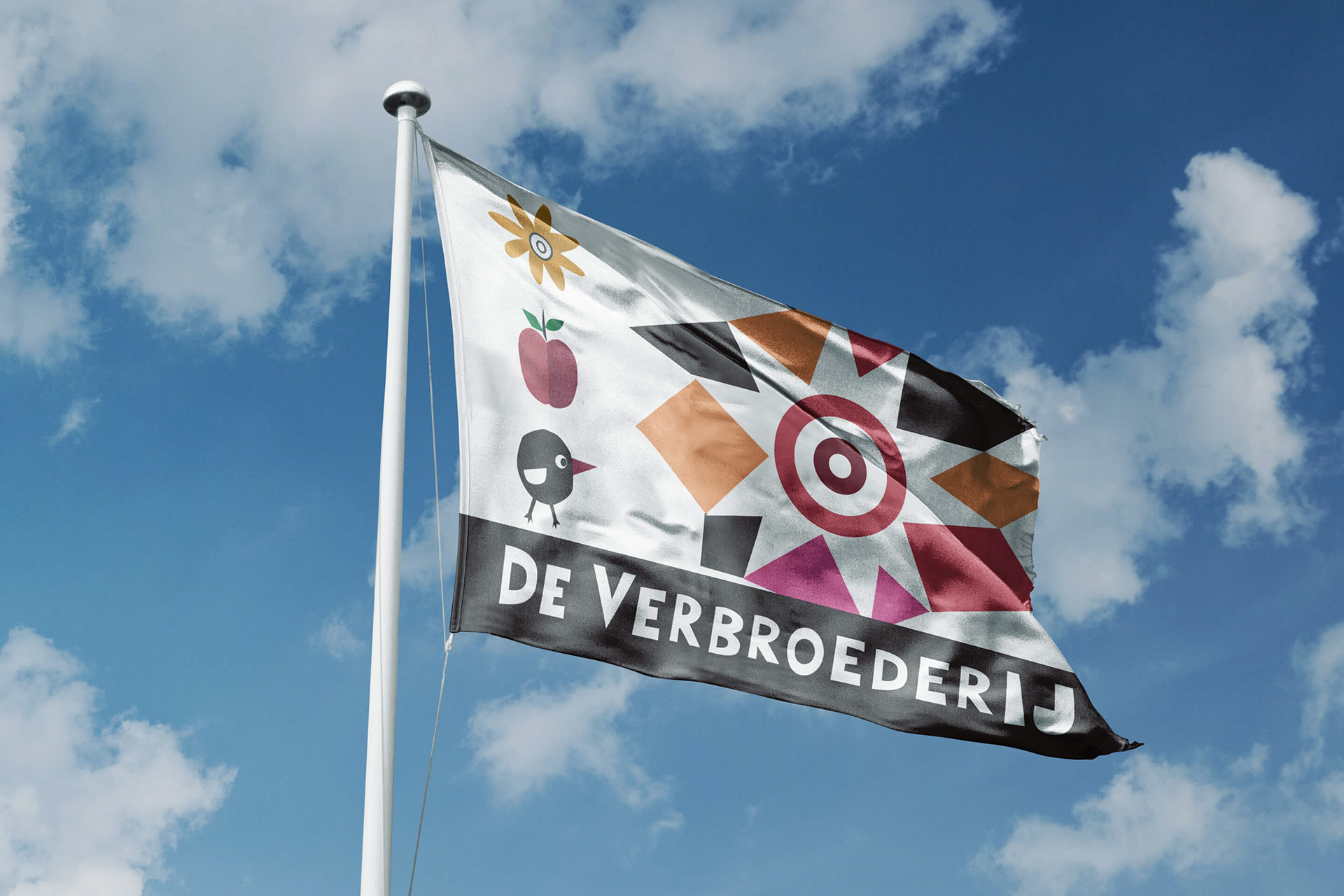
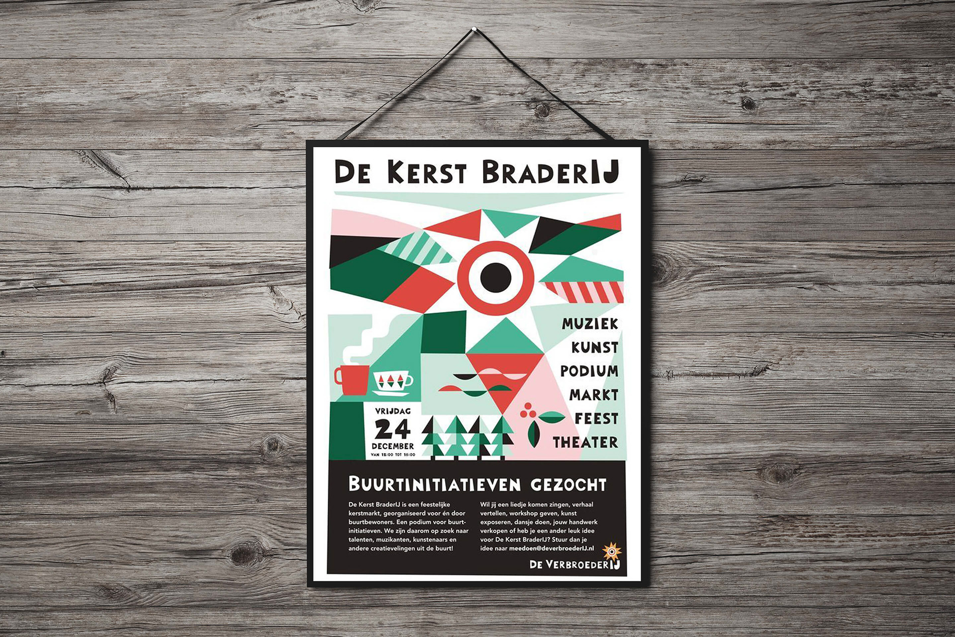
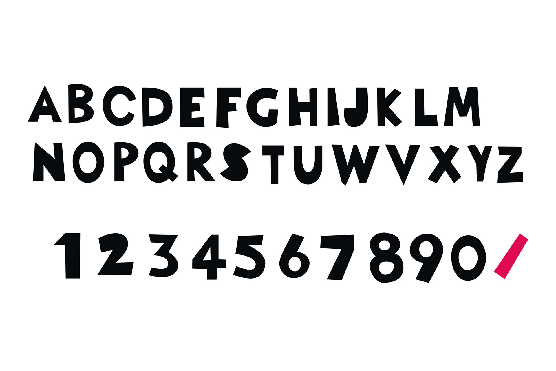
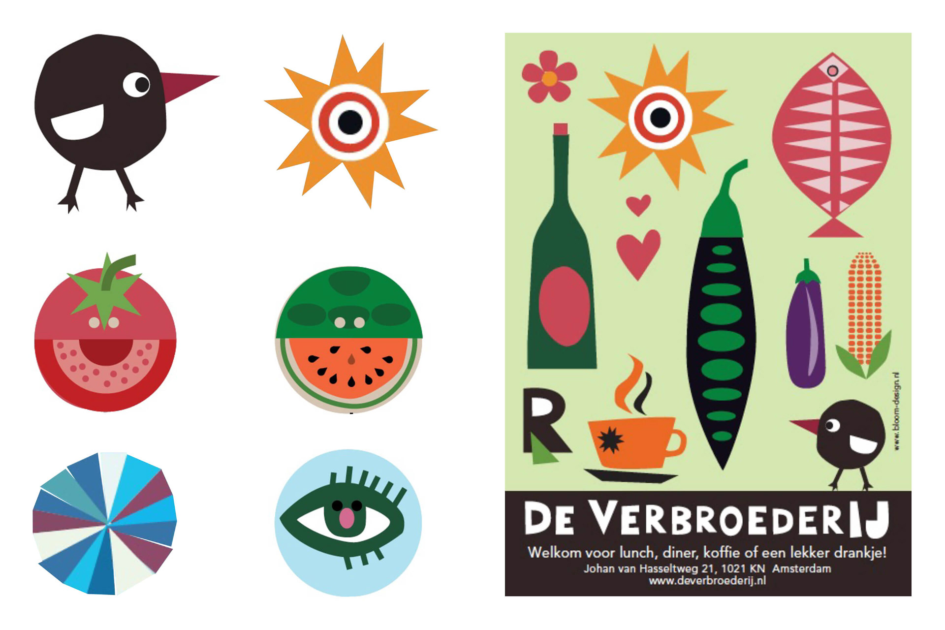
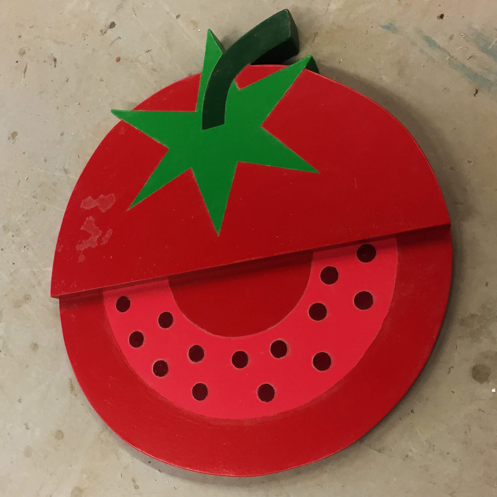
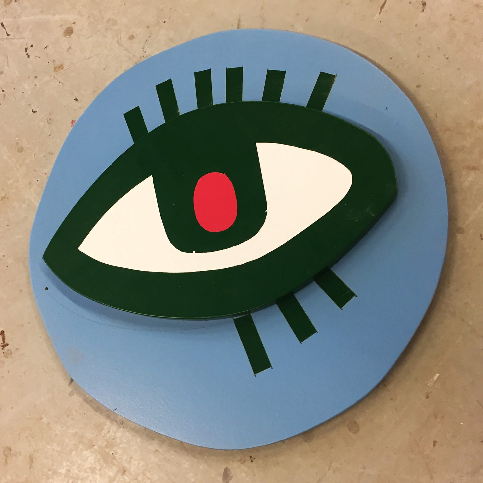
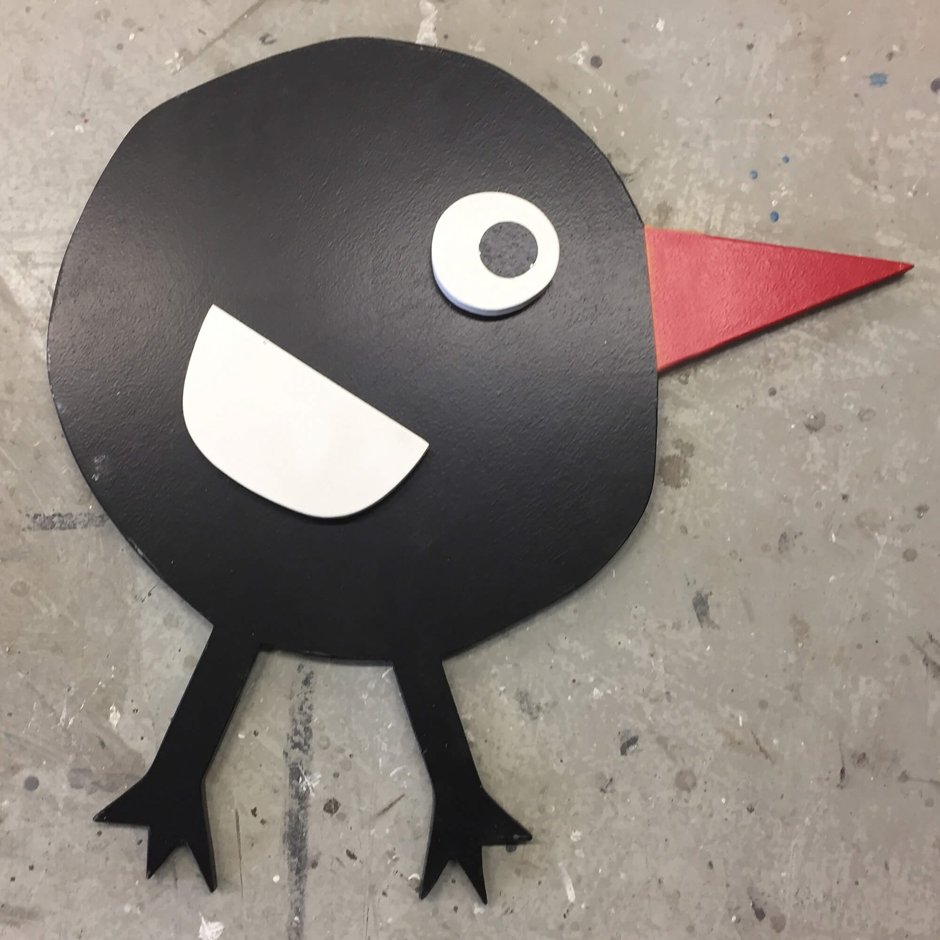
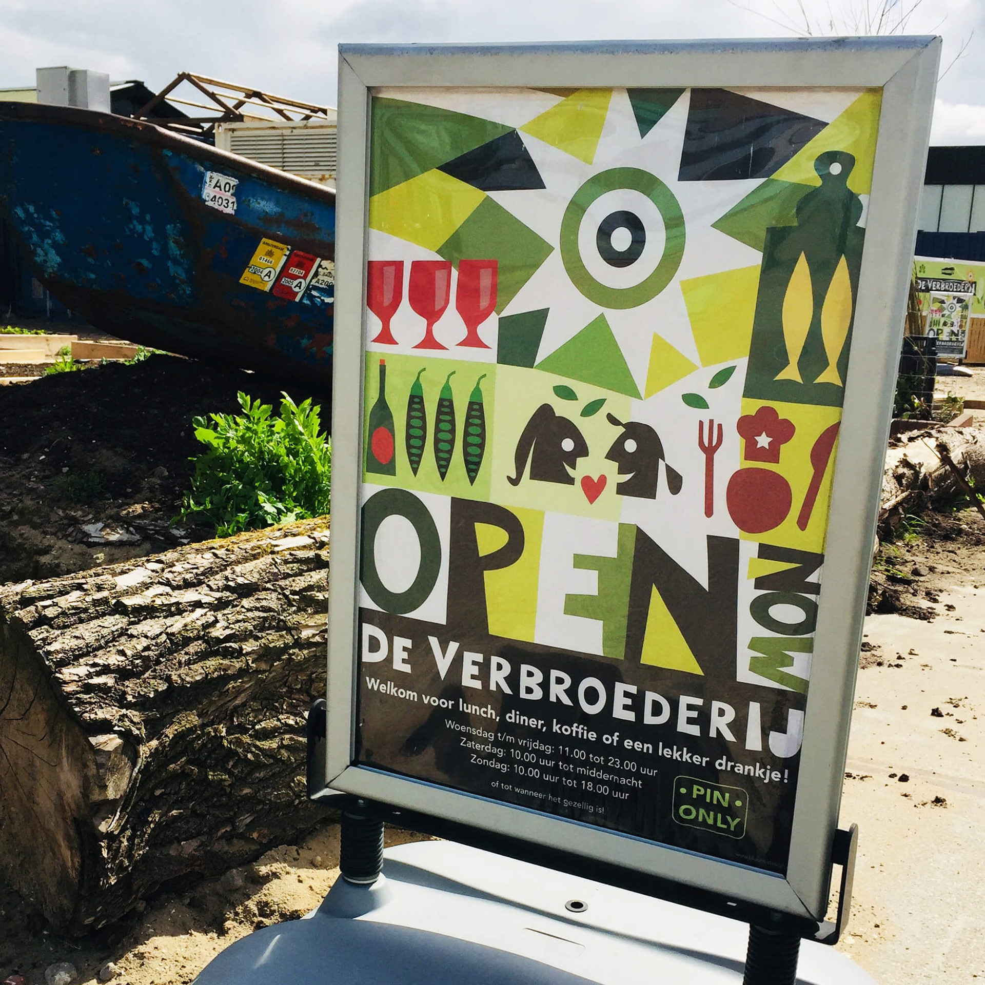
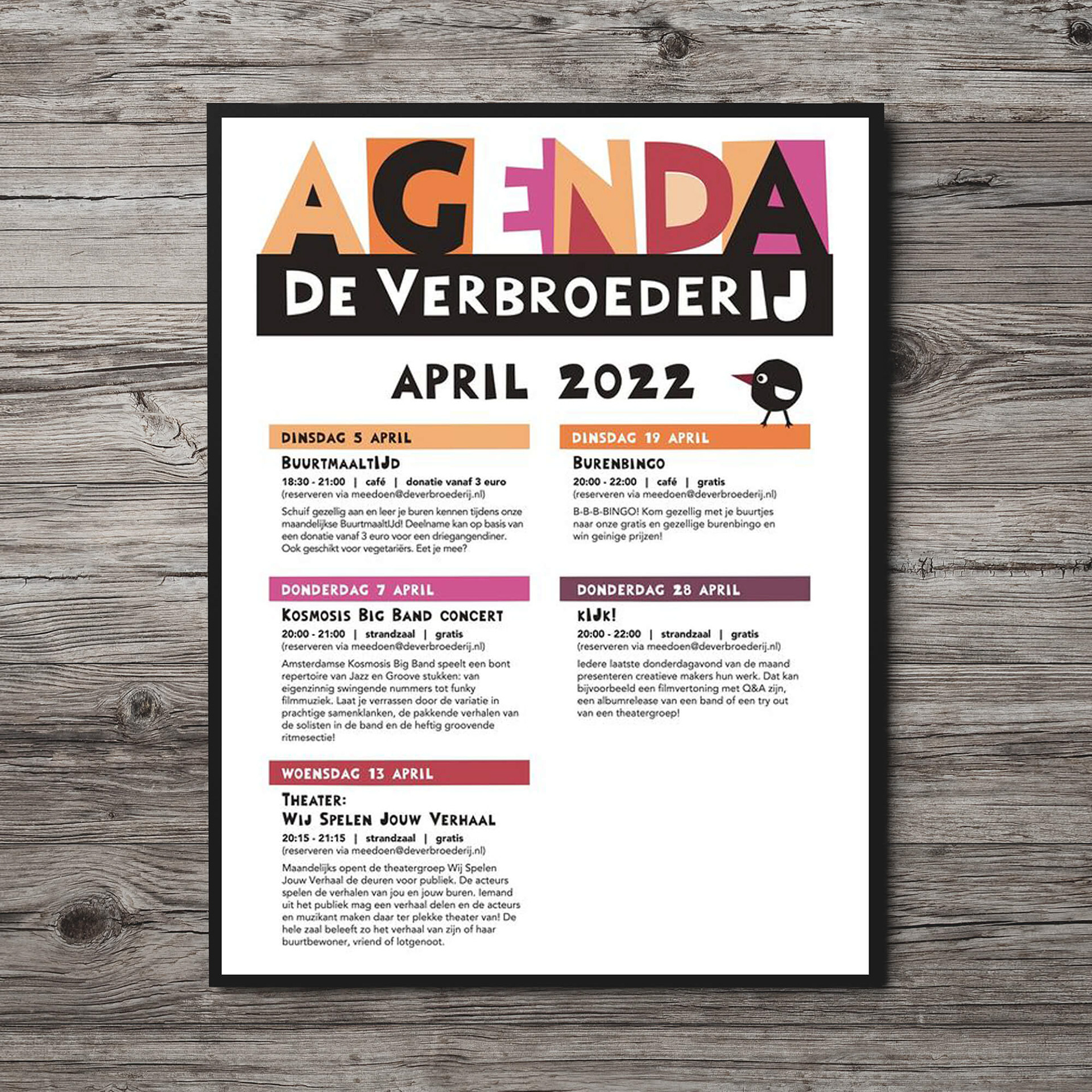
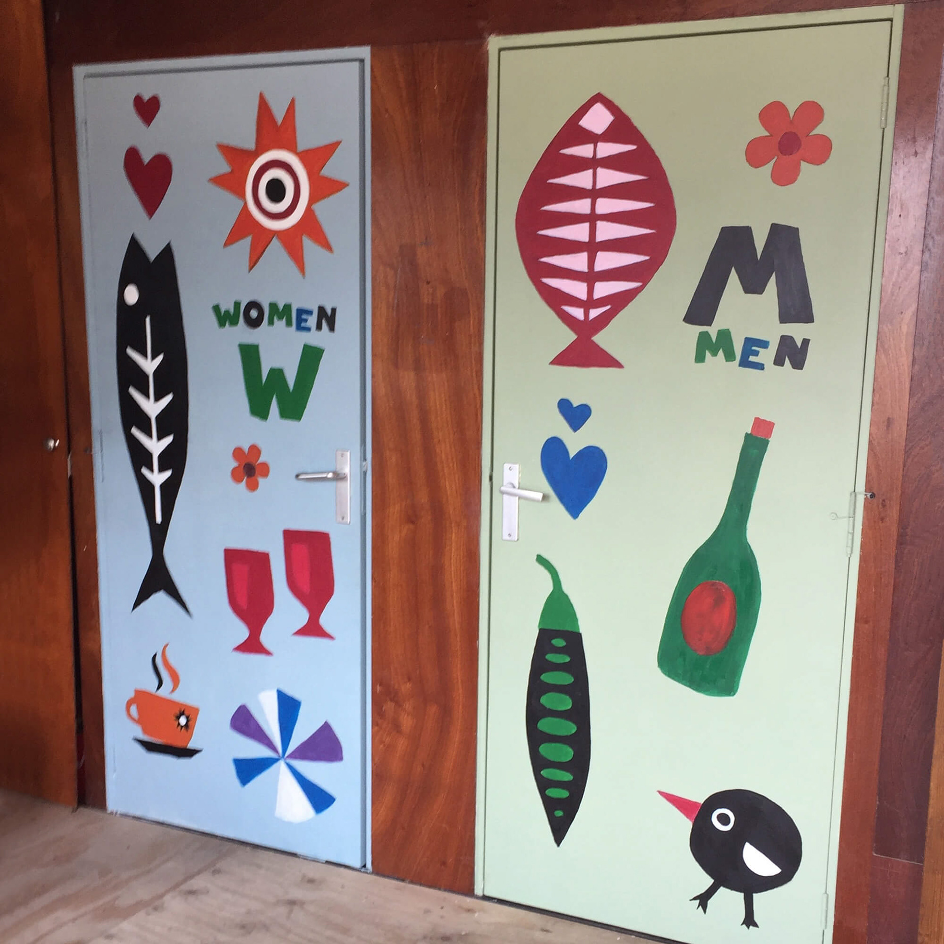
We developed artisan pictograms and a handmade font style with a look as if the neighbors themselves had hand drawn these fun and colorful elements. De VerbroederIJ is theirs and that needed to be visual communicated. They work in the gardens, they organize events, they come and socialize here. The images and typography are roughly cut and drawn and we designed an alphabet and library of pictograms that can easily be implemented by anyone to make flyers, posters or flags.
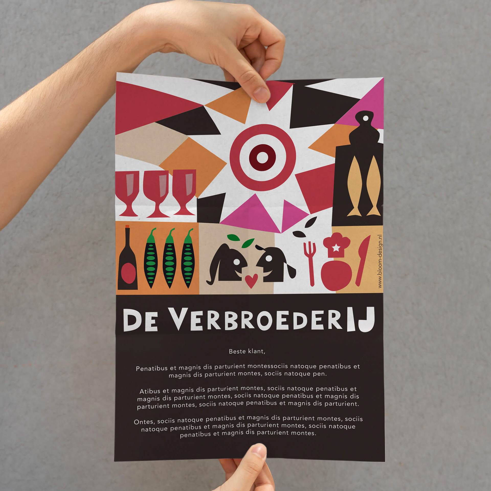
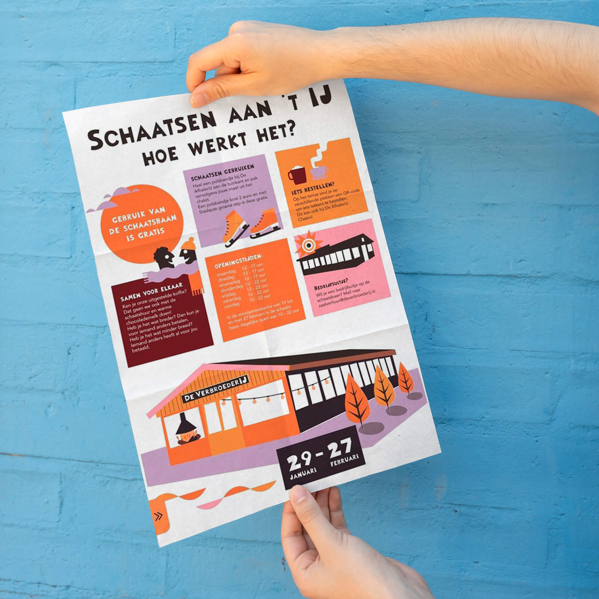
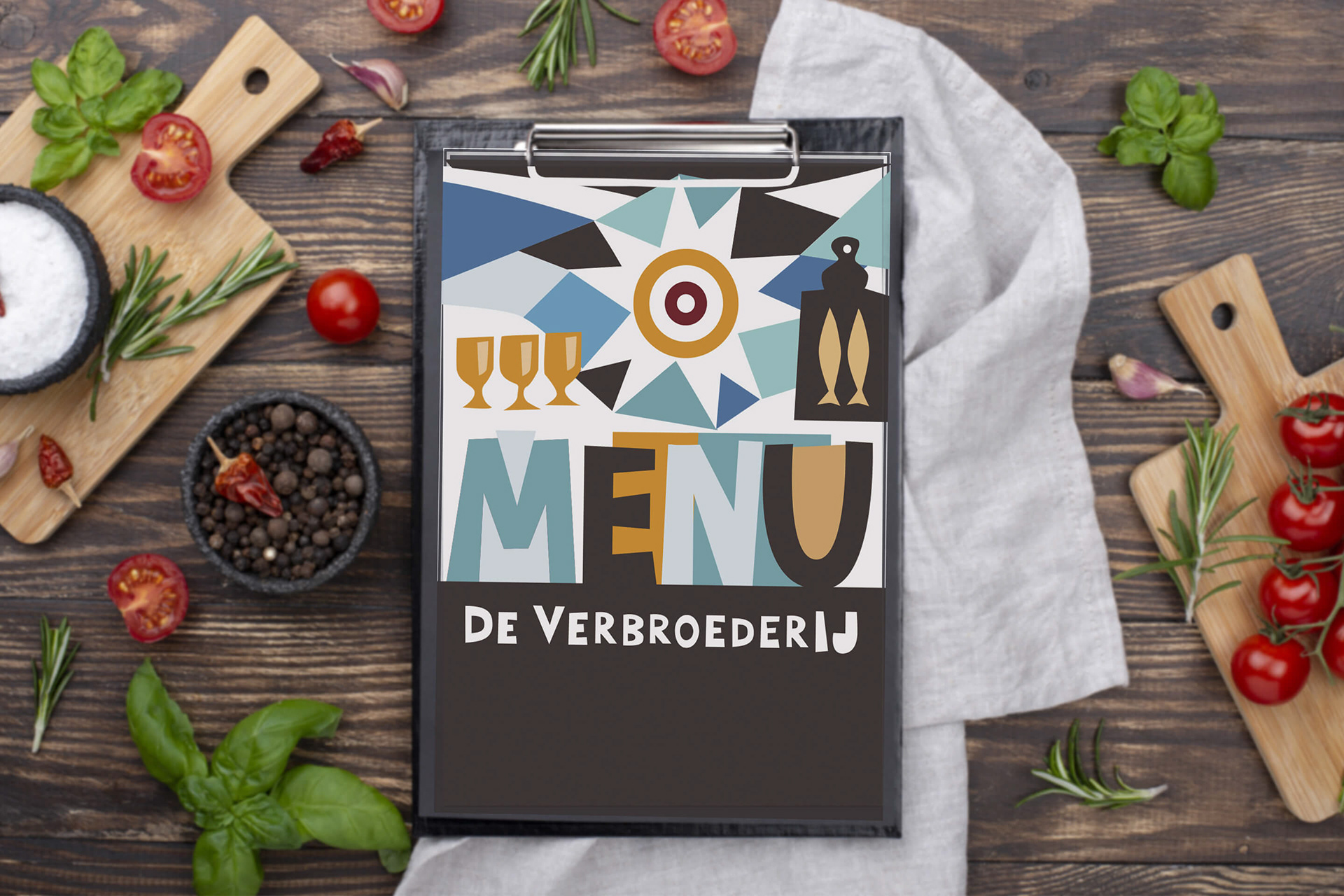
STRATEGY AND DESIGN: CUT-OUT SYMBOLS AND LETTERS
How to visualize a self made look and still present an iconic identity where people can find themselves in?
De Verbroederij is located on the sunny side of the IJ, or one can say the sunny side of Amsterdam’s waterfront. This is symbolized by the sun, a constant part and repeated in the different symbol compositions. Together with other symbols they become a language that represent beach, vegetable garden and café respectively and form individual compositions used throughout the design.
To highlight the different activities at De VerbroederIJ each composition has a particular color code. The color combination in light blue and beige represents the beach and the outdoor terrace. The combination in different green tones with a little red represents the vegetable garden and the red and brown tones stands for the café.
In the light of adding new compositions the color code system guarantees support for a continues branding effort within a loose design scheme.