DEAD FLOWERS
Dead Flowers represented an important exhibition that highlighted an intergenerational survey of “underground” alternativity in art-making.
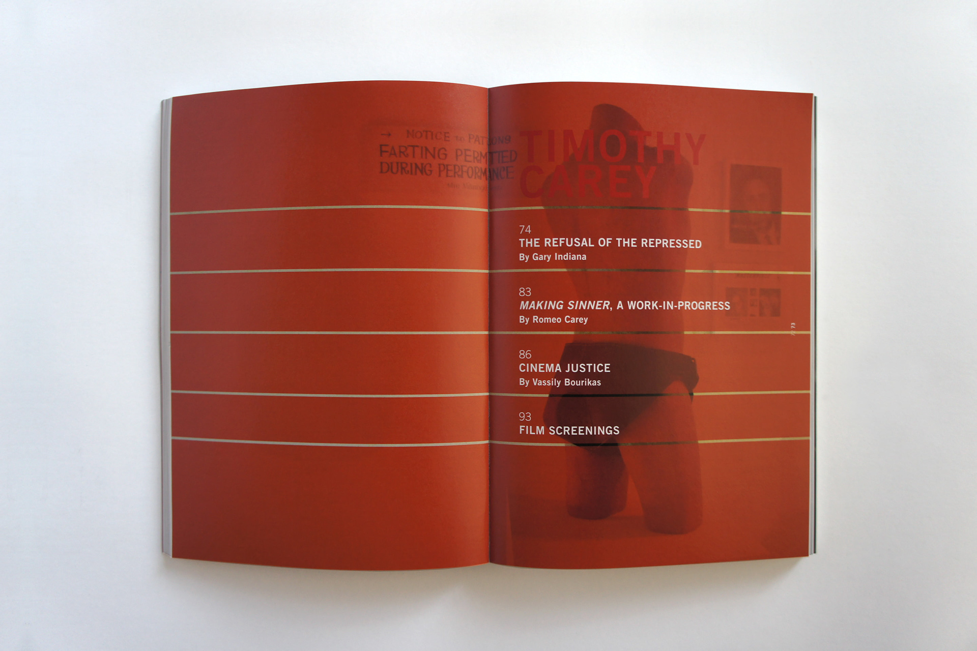
In an effort to understand a genealogy of influences reflective of the role of the non-commercial, non-institutional space, curator Lia Gangitano often look to artists who seem to have inspired, or instigated, their existence. The exhibition and book Dead Flowers, based on the work of actor/director Timothy Carey, is a manifestation of this inquiry.
Dead Flowers represented an important exhibition that highlighted an intergenerational survey of “underground” alternativity in art-making.
In an effort to understand a genealogy of influences reflective of the role of the non-commercial, non-institutional space, curator Lia Gangitano often look to artists who seem to have inspired, or instigated, their existence. The exhibition and book Dead Flowers, based on the work of actor/director Timothy Carey, is a manifestation of this inquiry.
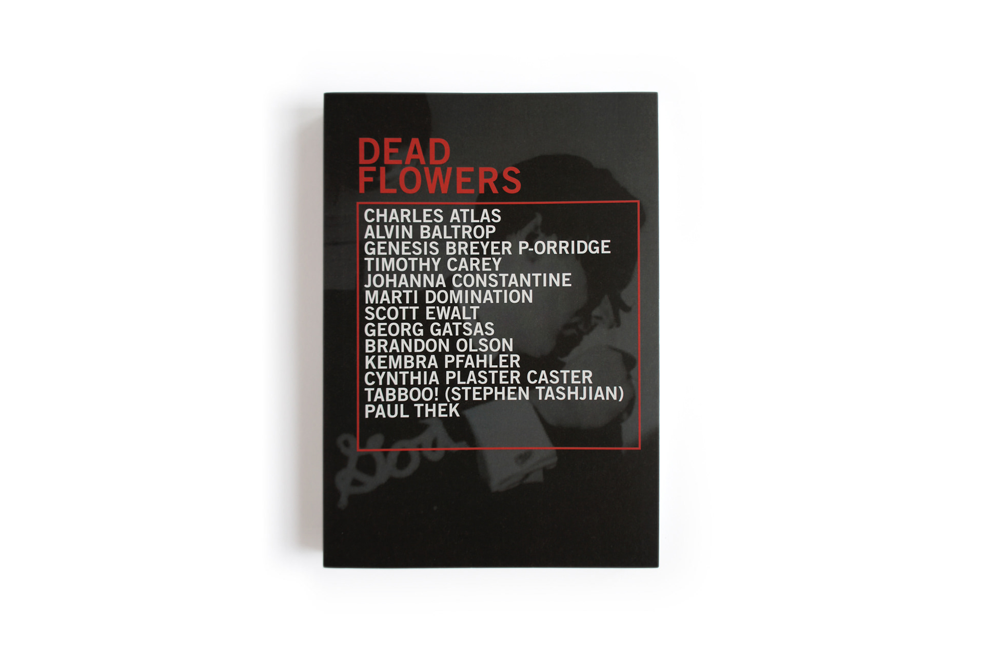
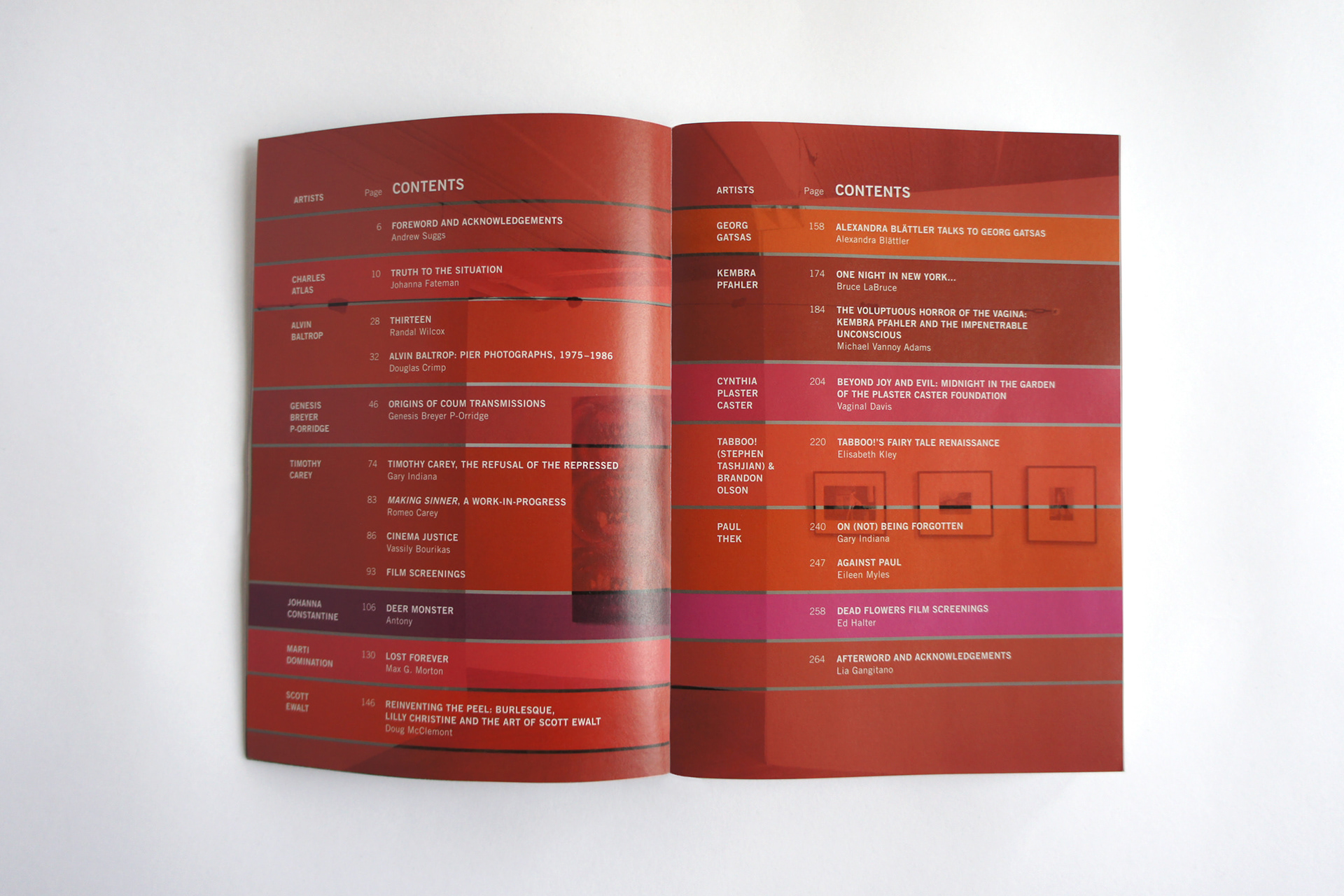
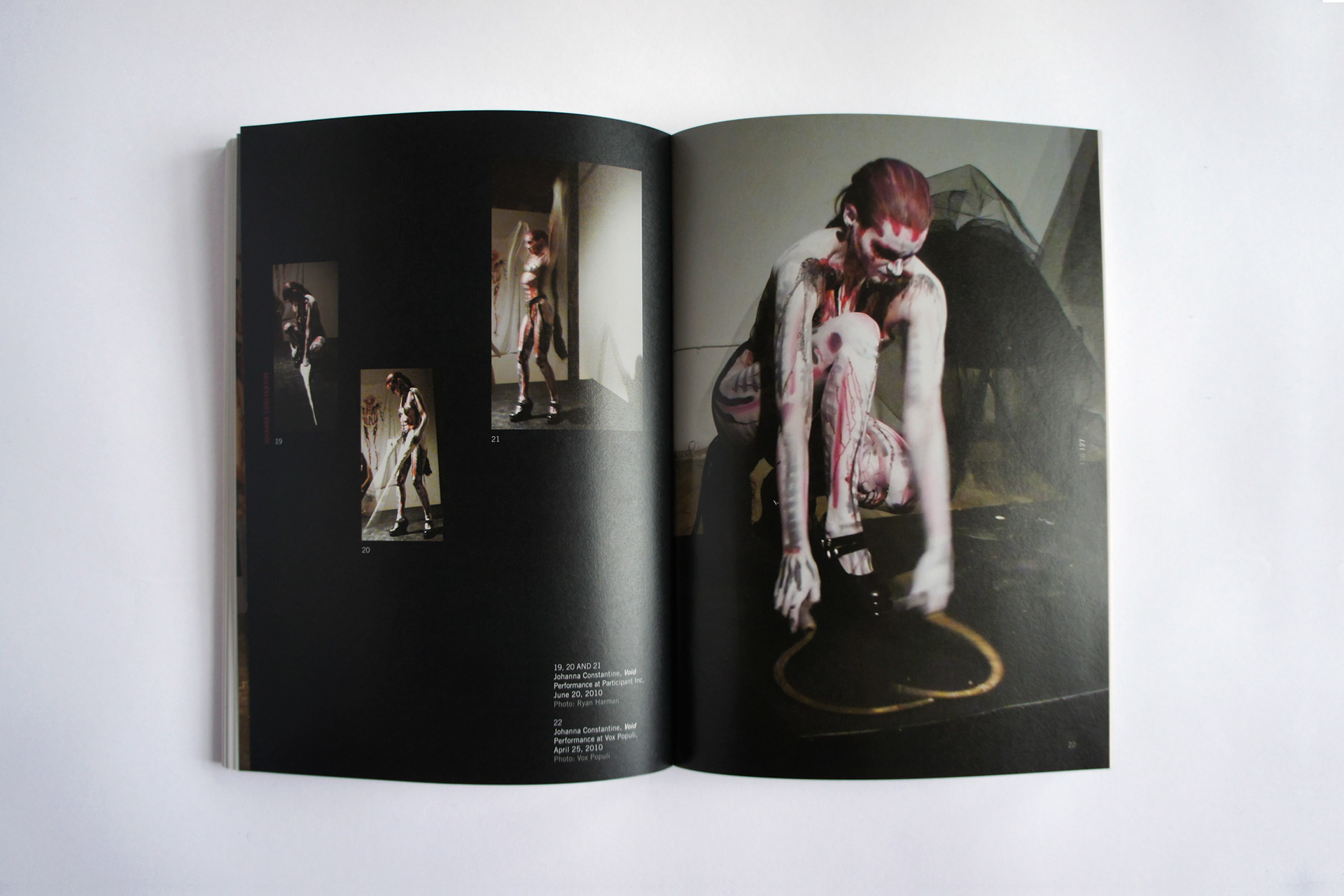
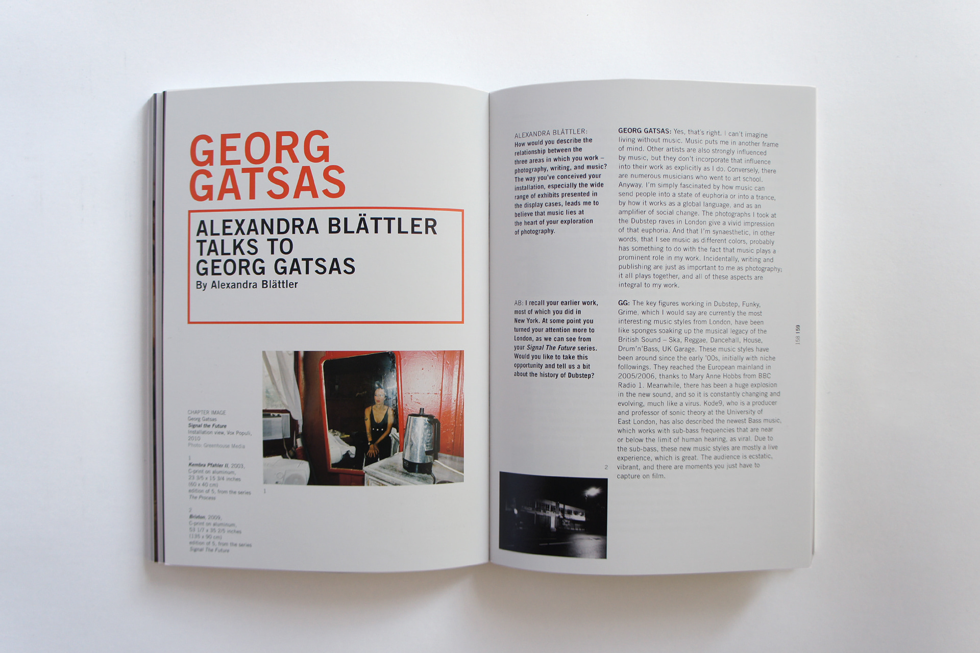
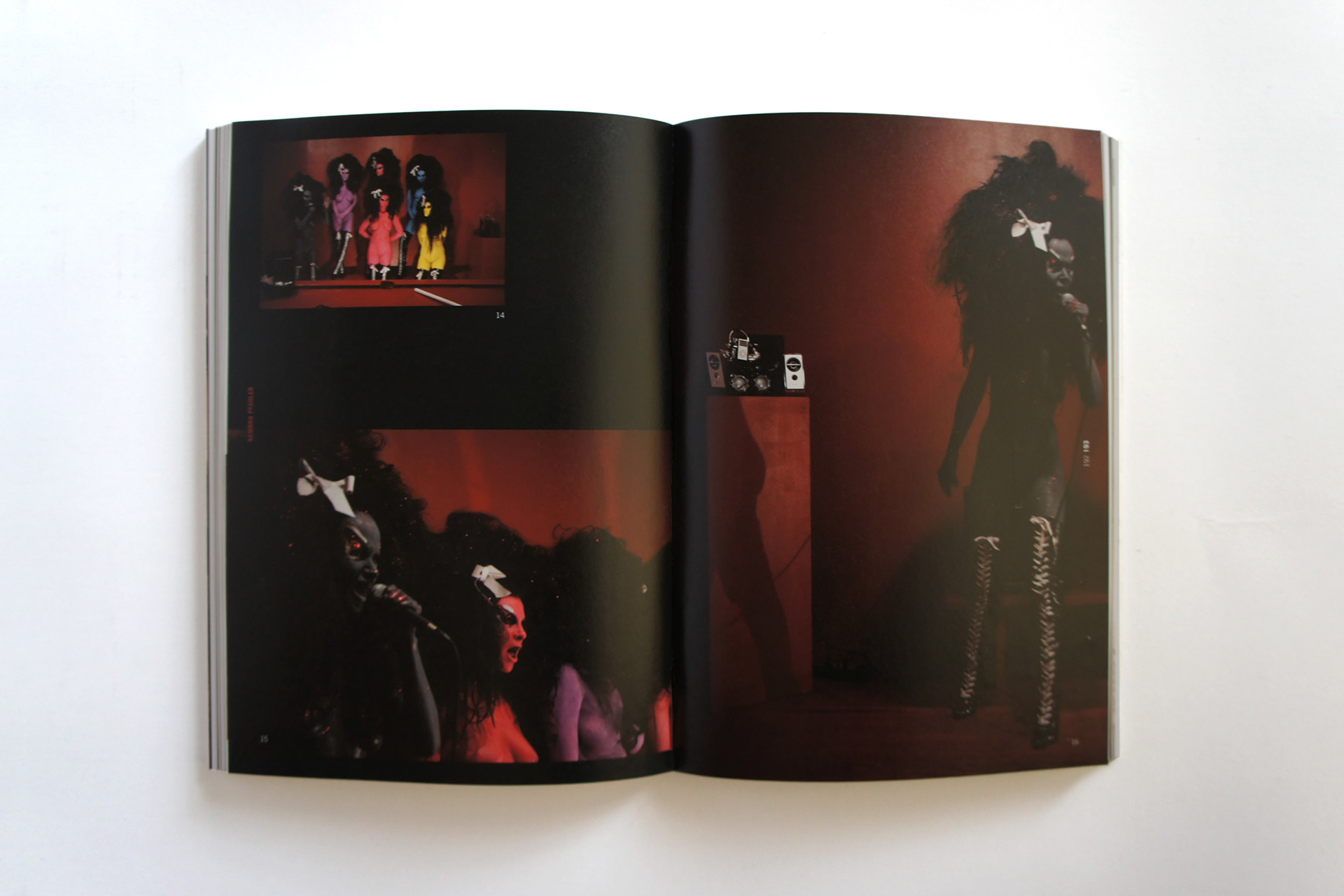
Dead Flowers examines related methodologies, ideals, aesthetics, and working models as expressed through works from the late 1960s and ’70s by Alvin Baltrop, Paul Thek, and Cynthia Plaster Caster, as well as contemporary works by subsequent generations of artists including Kembra Pfahler, Scott Ewalt, Marti Domination, Georg Gatsas, and Johanna Constantine; and those by artists whose work spans this entire period, for example Charles Atlas and Genesis Breyer P-Orridge.
The relationship between alternative and mass culture through the work of artists who, like Carey, have consistently aligned themselves with communities outside the mainstream, but who enter the dominant fields of art and film, sporadically and to critical effect, as uncompromising proof that other ways of working are still possible. This kind of ragged company requires a conscious economic and critical efficiency that has become a necessity for the alternative space as well, where we learn, again and again, that great achievements can often be made from the most modest resources at hand.
The importance of an acknowledgement of a prior underground moment is not realized through its selective or premature historicizing; rather, it is in the recognition that its ideological legacy continues to overlap with the present.
This was the idea for the book design. A refined typographic grid offers multiple choices and each artist an individual presentation. The initial chaotic appeal turns into the intricate placement of information. Inspired by the 1971 Andy Warhol designed album cover Sticky Fingers by the Rolling Stones, an interpretation of the cover title was used to form a thread throughout the book. Additionally the colors red and black (gray) in various shades provide another element of individual representation within a group. Without losing sight for the collective theme, every artist section has an assigned color of red, most likely taken from a signature artist-piece. This subtle distinction synthesizes each artist’s vision, a fascinating visual and typographic story line show a surprising flow of content, without falling into a rigid layout template. No technology frills but good, traditional printing. With this basic approach in support of the “underground alternativity” this book separates itself from a vast array of today’s “pandora box” publications.