PROVOKING SOCIAL TRANSFORMATION
LA Freewaves, a Los Angeles–based art nonprofit, is at the forefront of sparking social transformation through provocative and inclusive artistic expressions that challenge perceptions of race and gender.
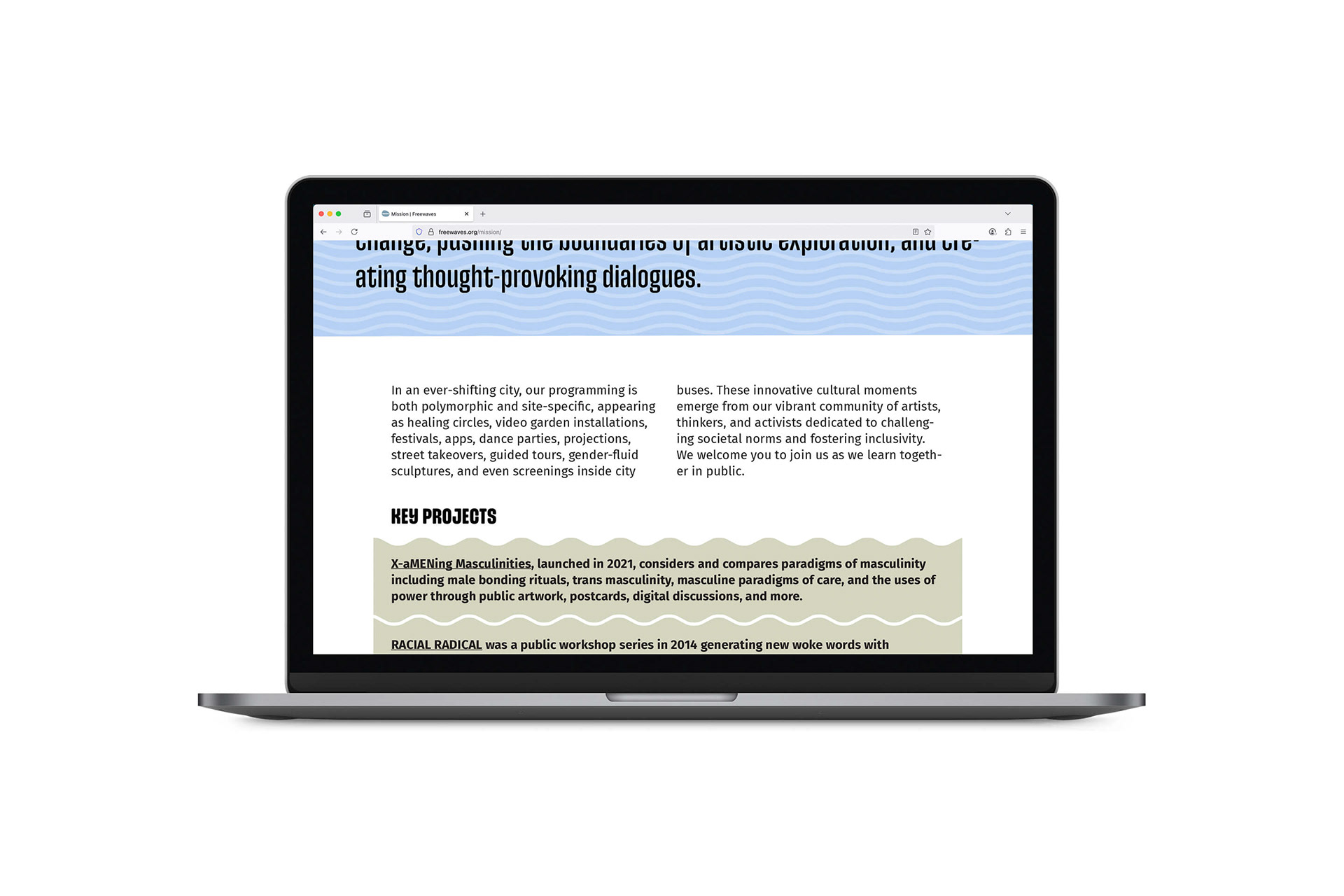
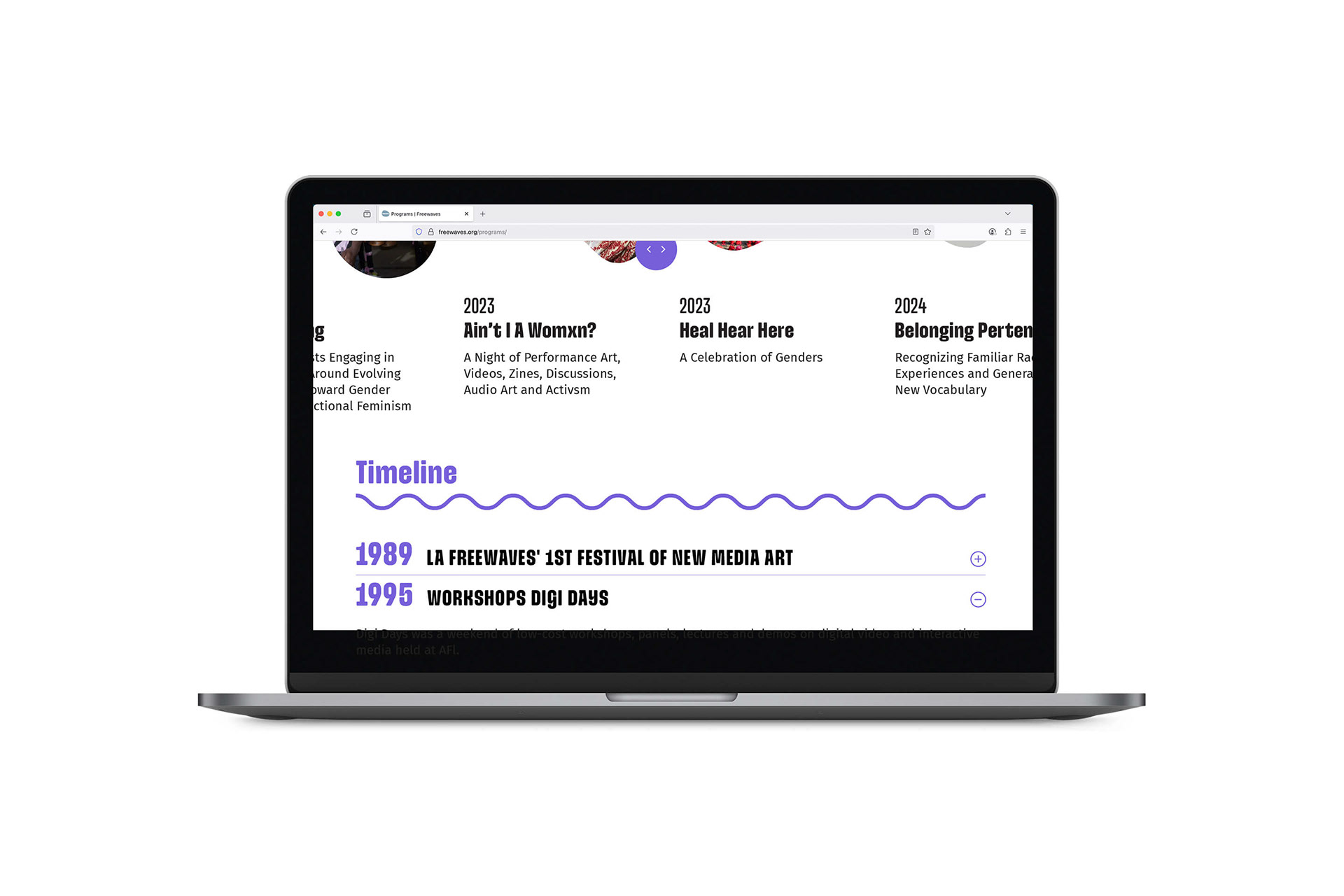
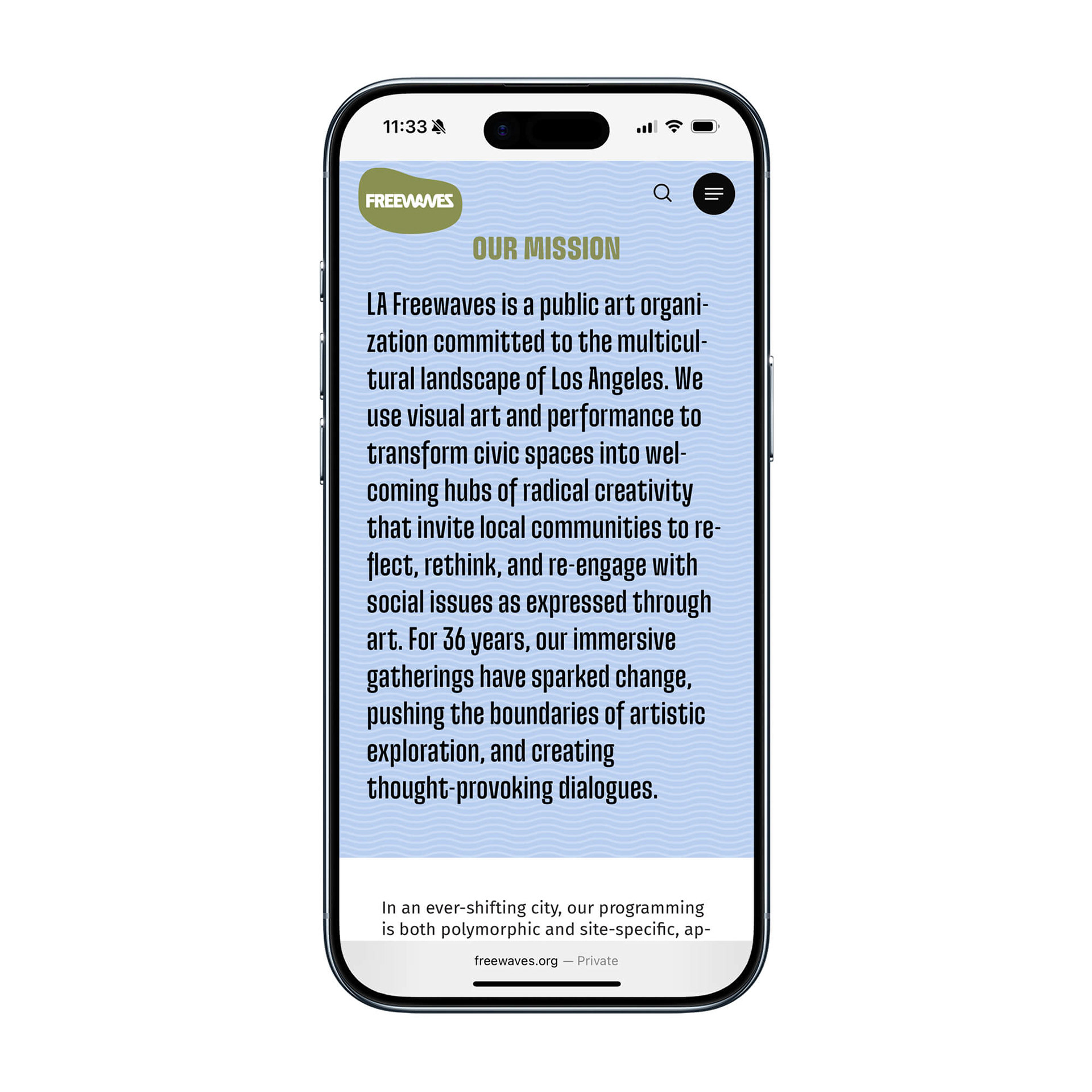
For over 30 years, since its inception in 1989, LA Freewaves – also known as Freewaves – has been a catalyst for change, pushing the boundaries of artistic exploration and creating thought-provoking dialogues. Through innovative programs, events, and exhibitions, Freewaves cultivates a vibrant community of artists, thinkers, and activists dedicated to challenging societal norms and fostering inclusivity, thereby reshaping the Los Angeles art scene with immersive, site-specific public art that confronts social issues related to race and gender.
LA Freewaves, a Los Angeles–based art nonprofit, is at the forefront of sparking social transformation through provocative and inclusive artistic expressions that challenge perceptions of race and gender.
For over 30 years, since its inception in 1989, LA Freewaves – also known as Freewaves – has been a catalyst for change, pushing the boundaries of artistic exploration and creating thought-provoking dialogues. Through innovative programs, events, and exhibitions, Freewaves cultivates a vibrant community of artists, thinkers, and activists dedicated to challenging societal norms and fostering inclusivity, thereby reshaping the Los Angeles art scene with immersive, site-specific public art that confronts social issues related to race and gender.
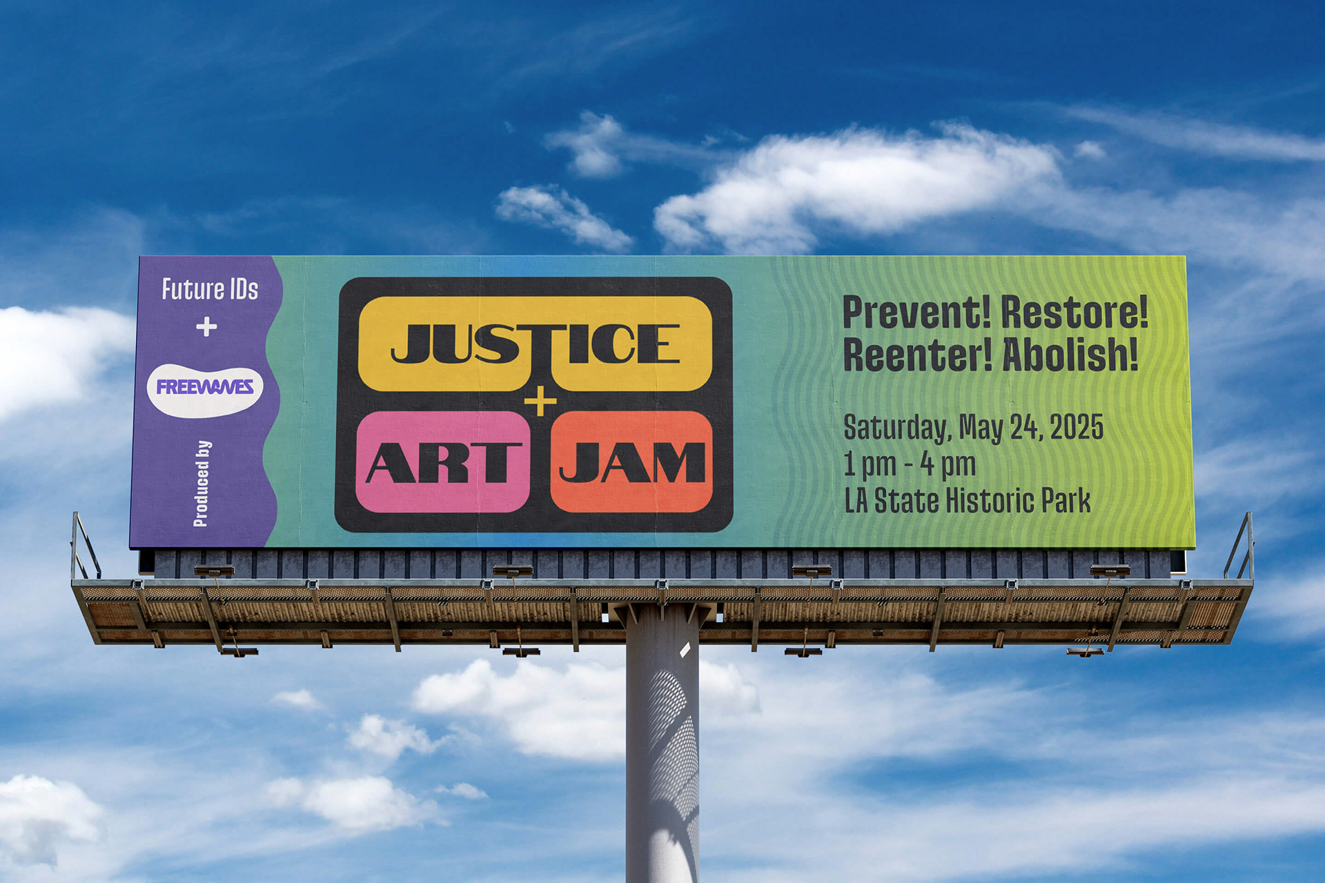
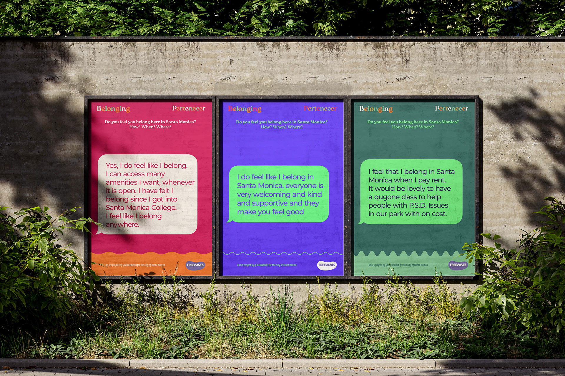
PRODUCING ART ONLINE AND IN THE STREET
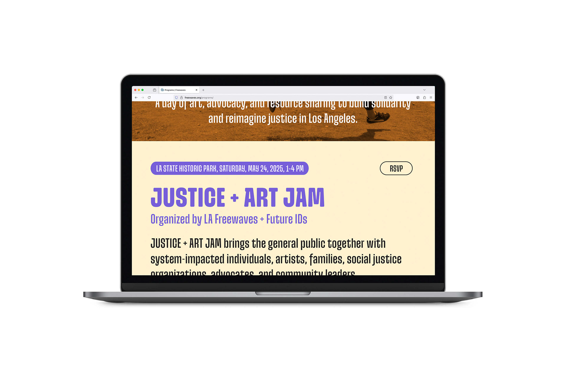
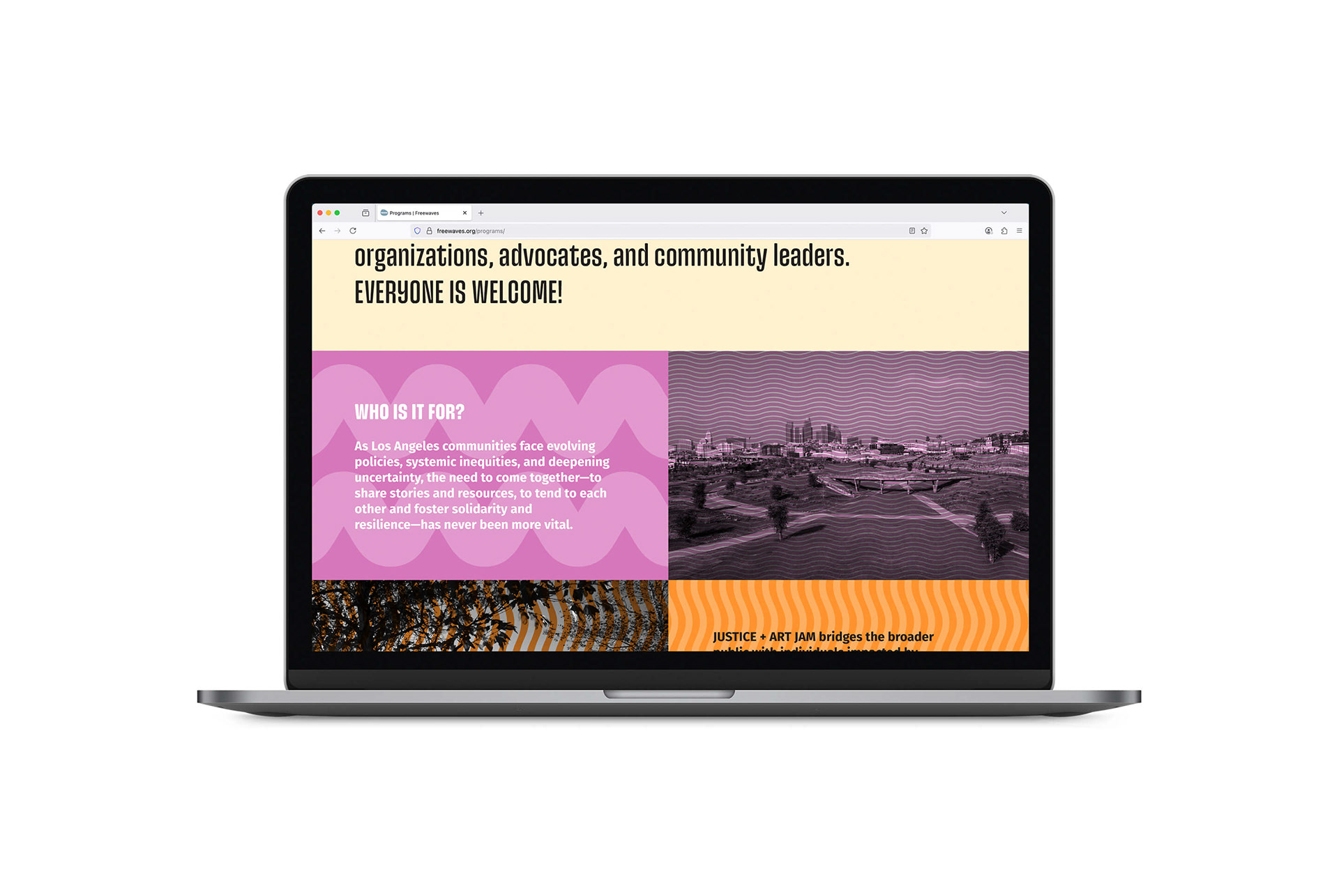
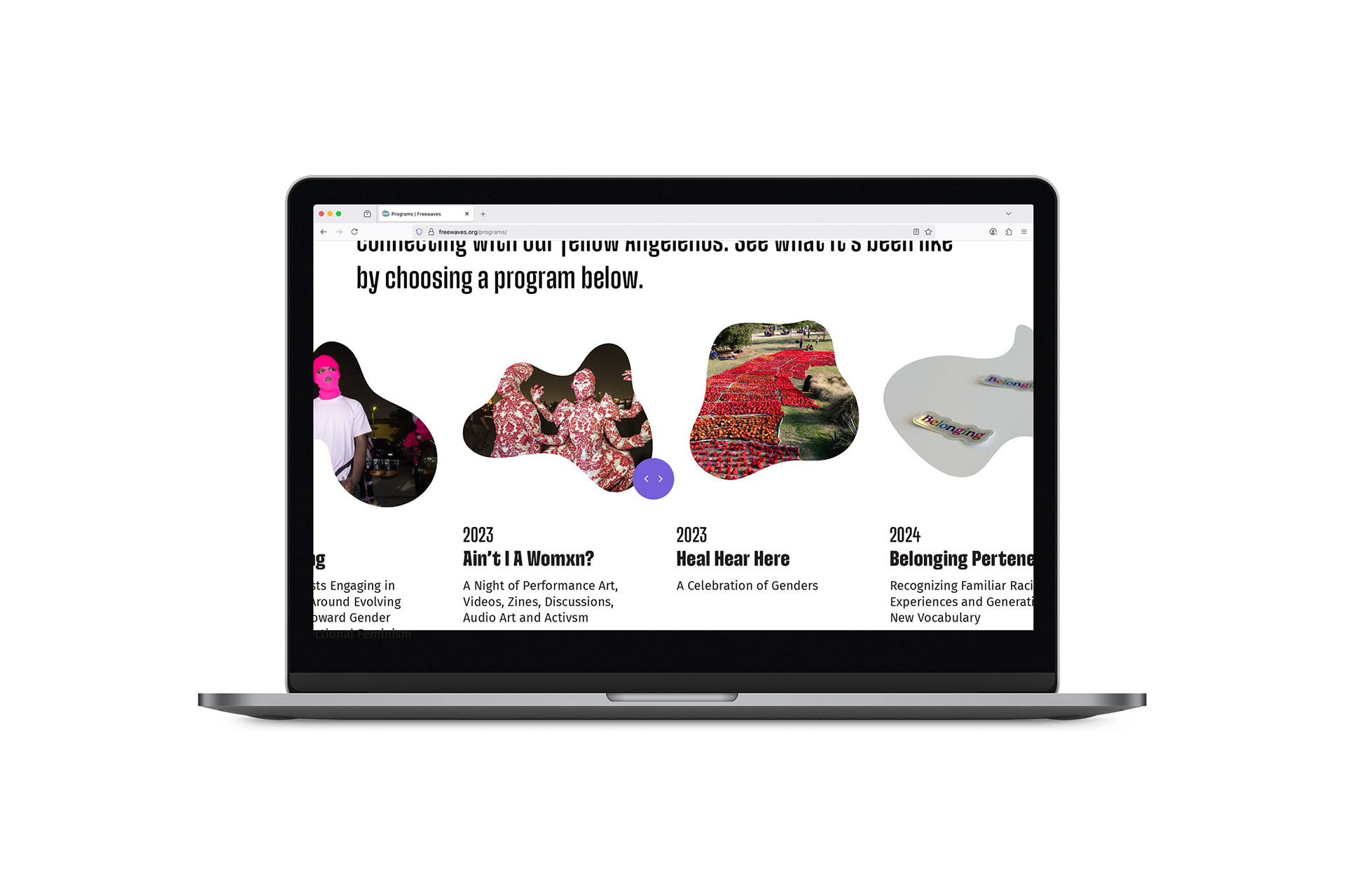
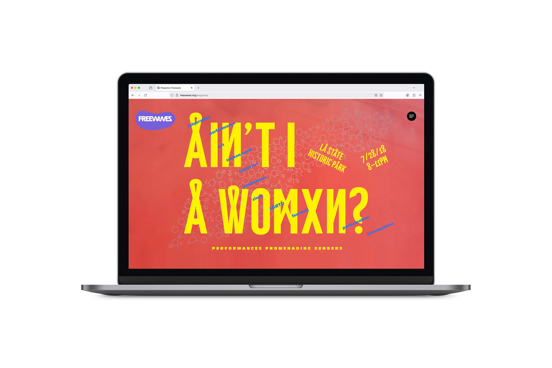
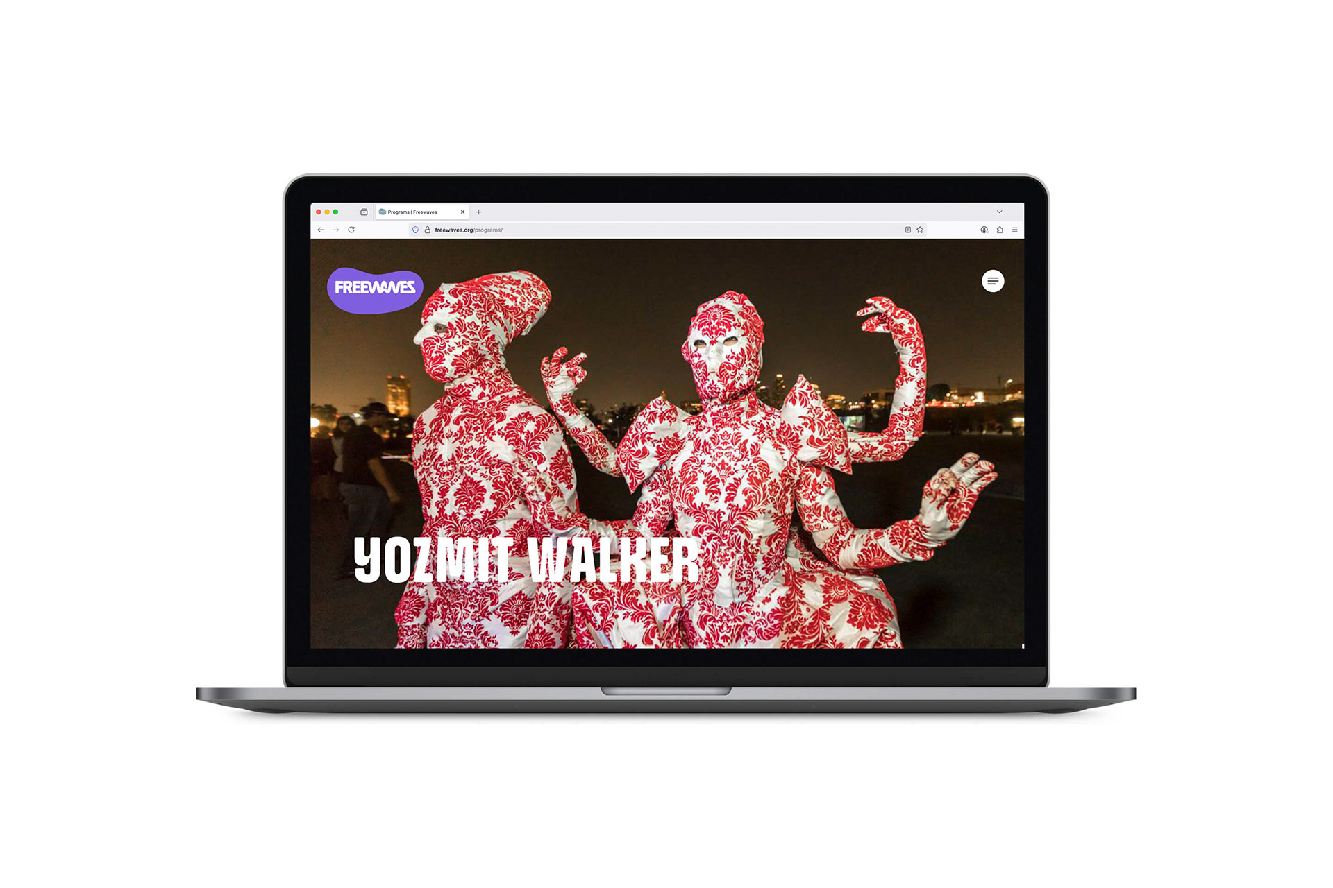
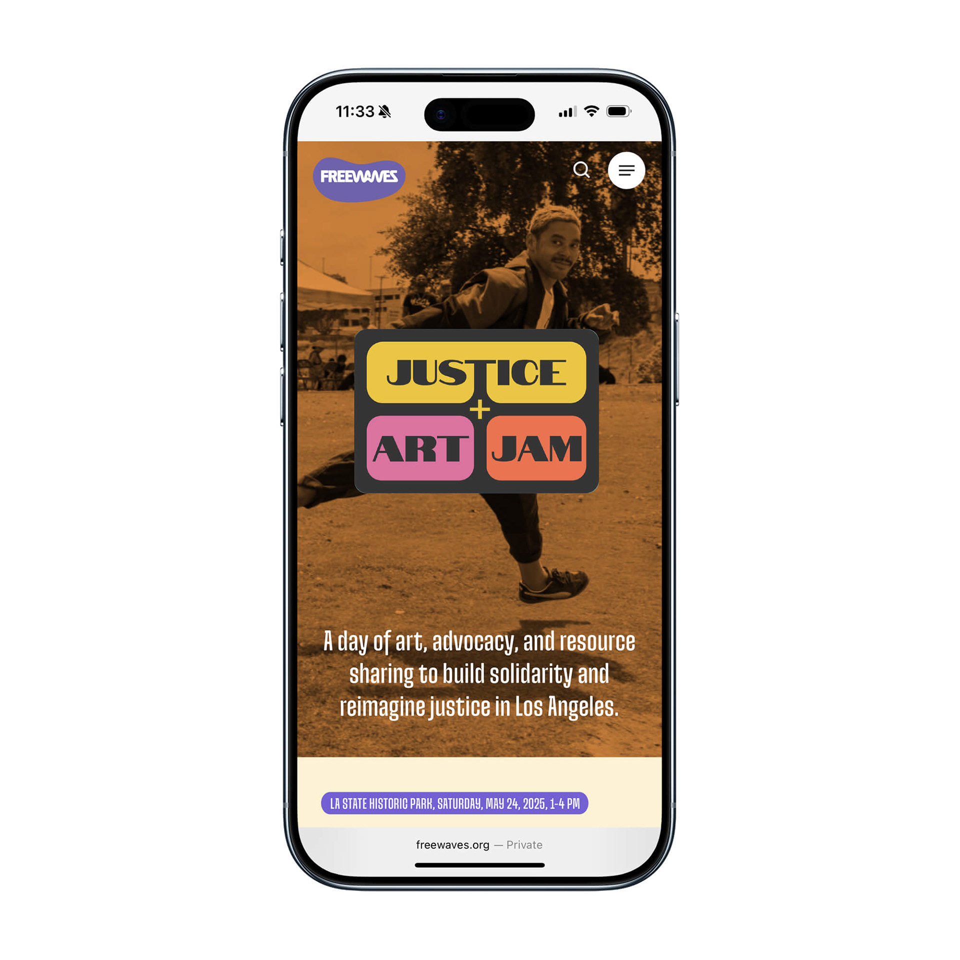
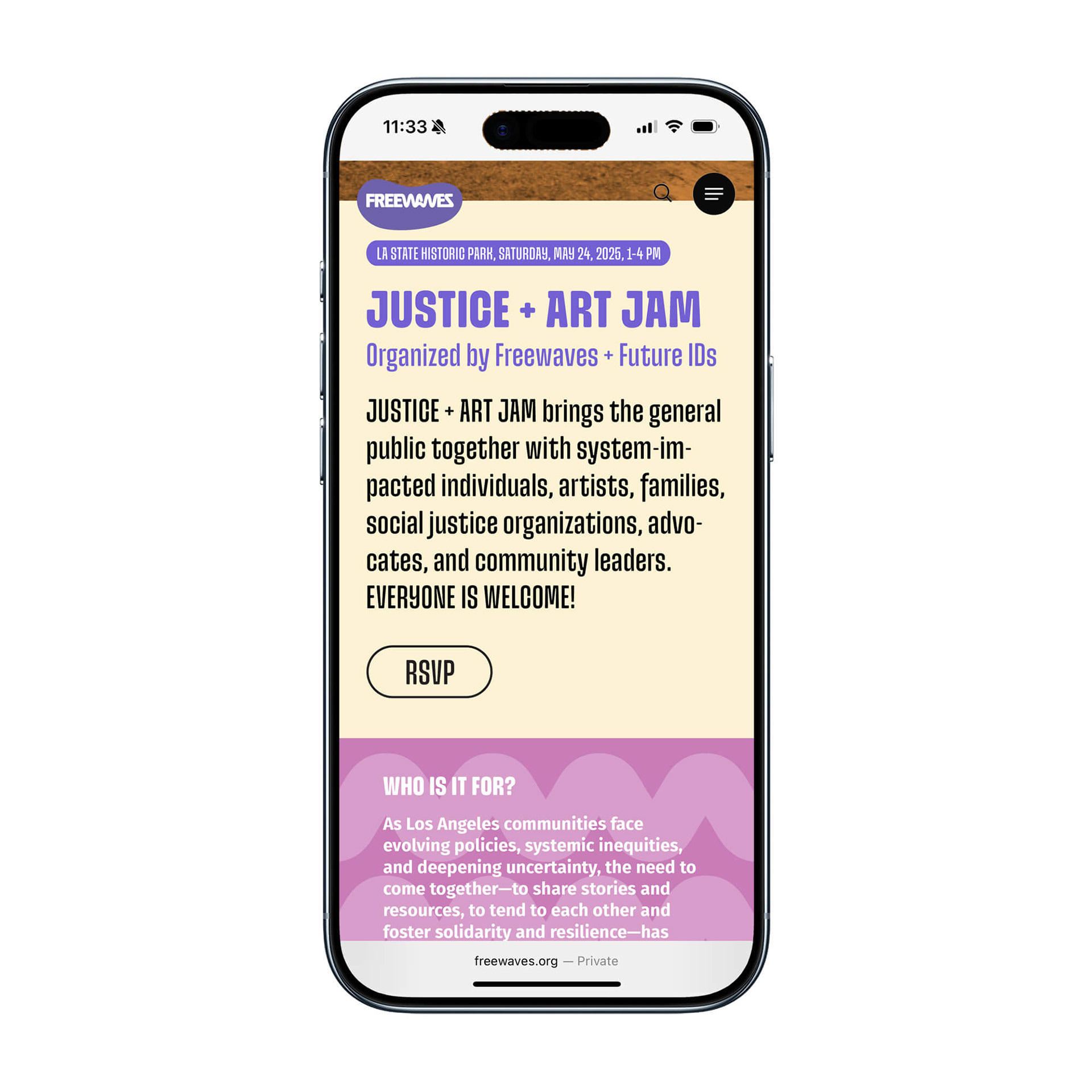
Freewaves produces free, site-specific public art to engage artists and audiences with current social issues.
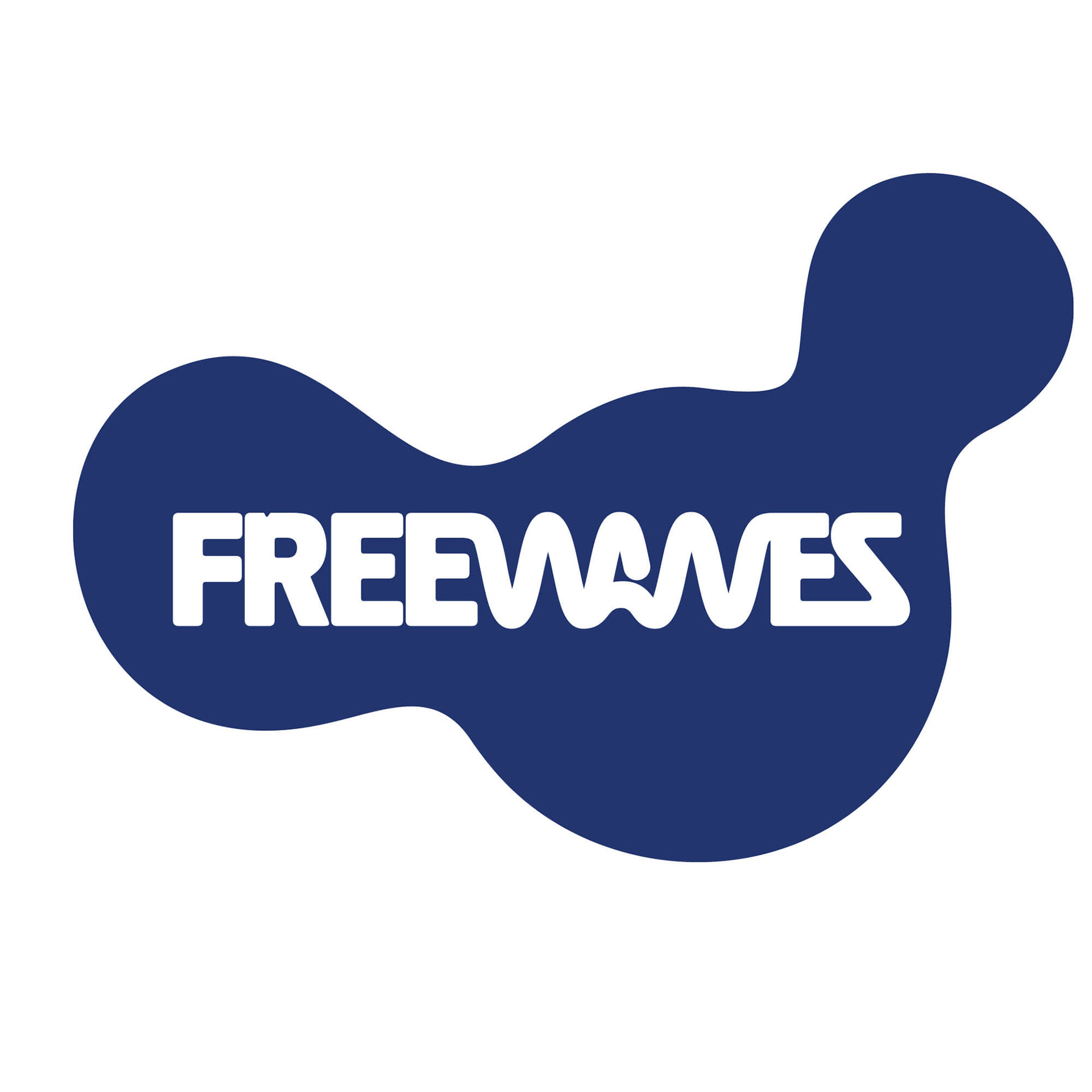
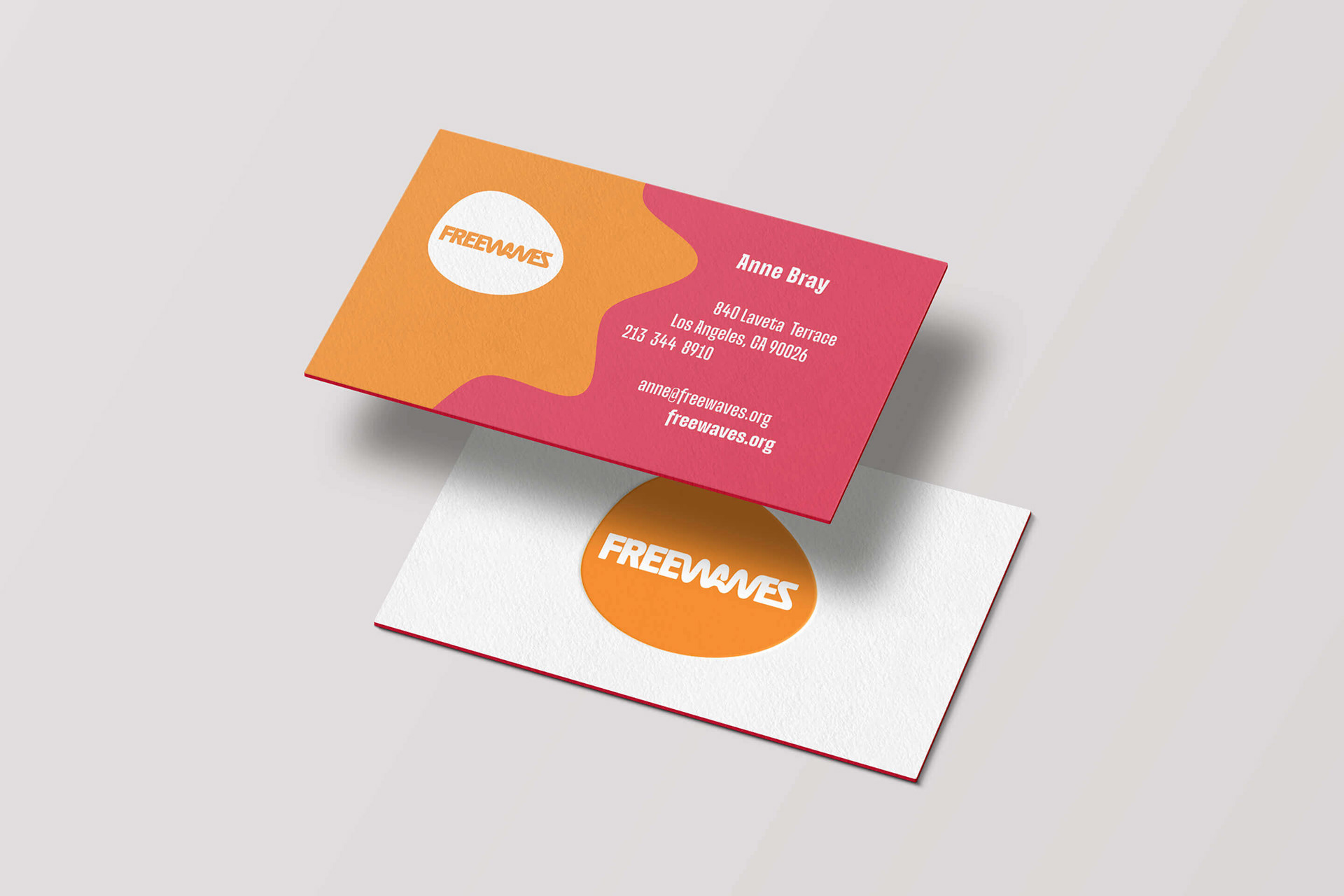
Based on the briefing, we presented a branding direction with the current logotype in mind. Over the years, the logotype had taken on a digitally altered look, and we eventually rediscovered the original logo artwork. Using the original hand-drawn logotype, we began exploring ideas for rebranding the organization.
The idea: Shape – connecting the dots. Color, cut, and paste – Wavy Line, and Aura – the fonts.
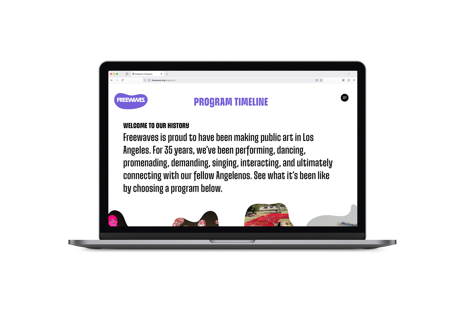
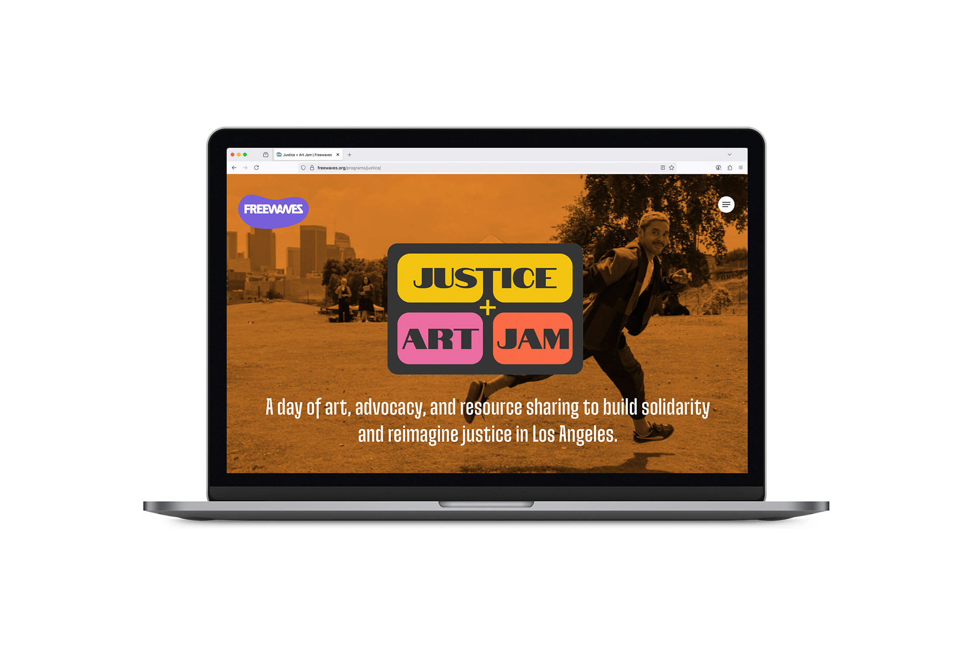
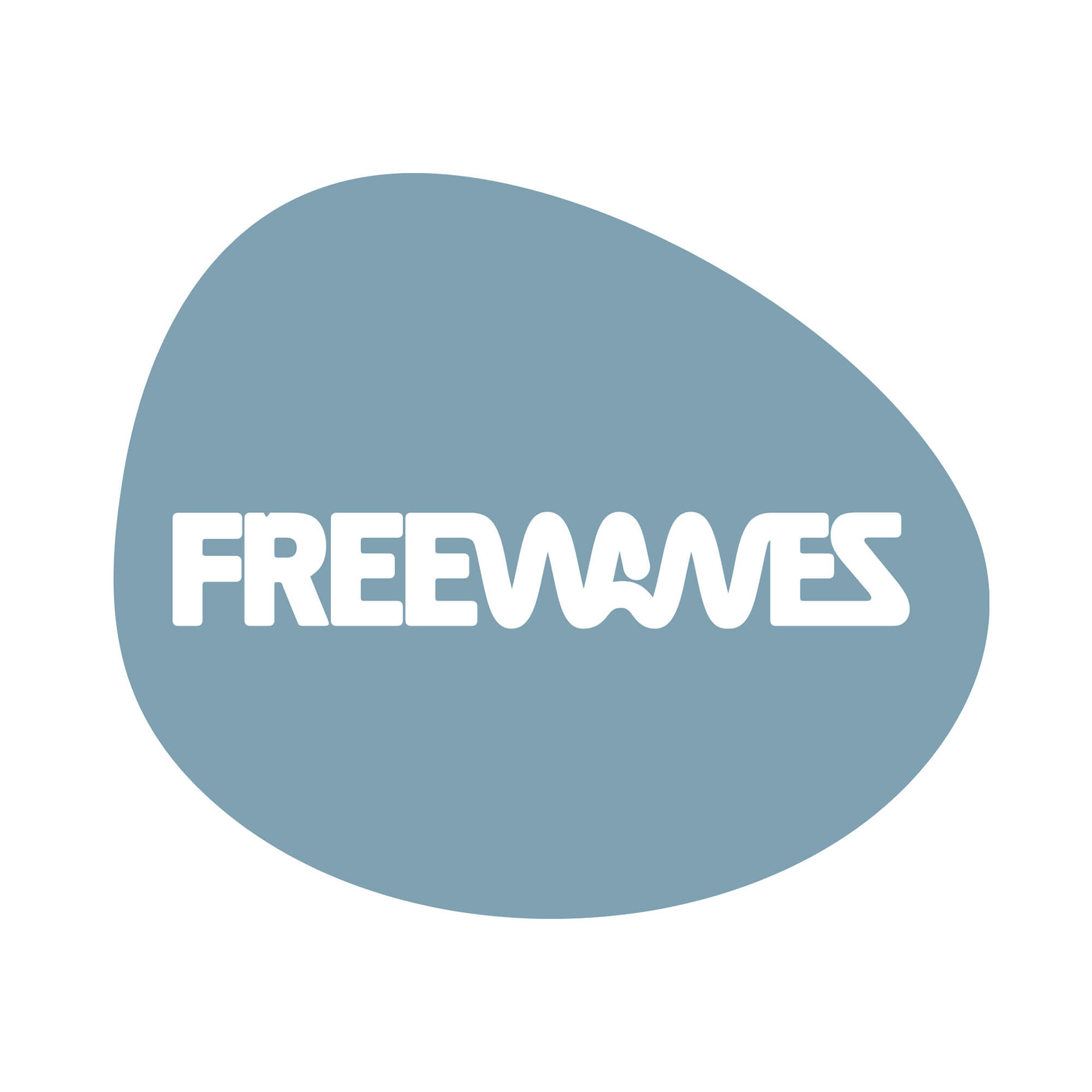
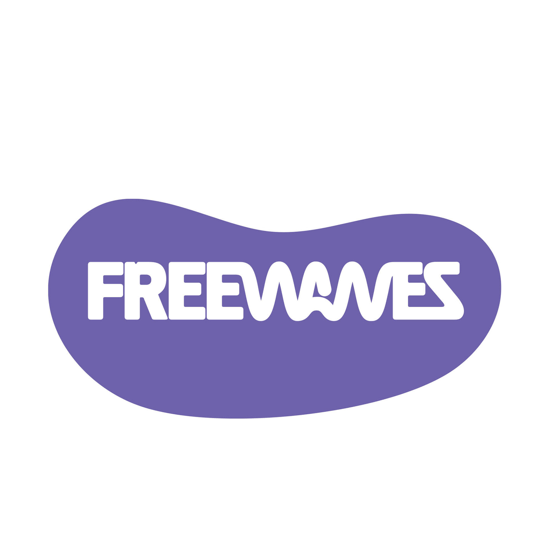
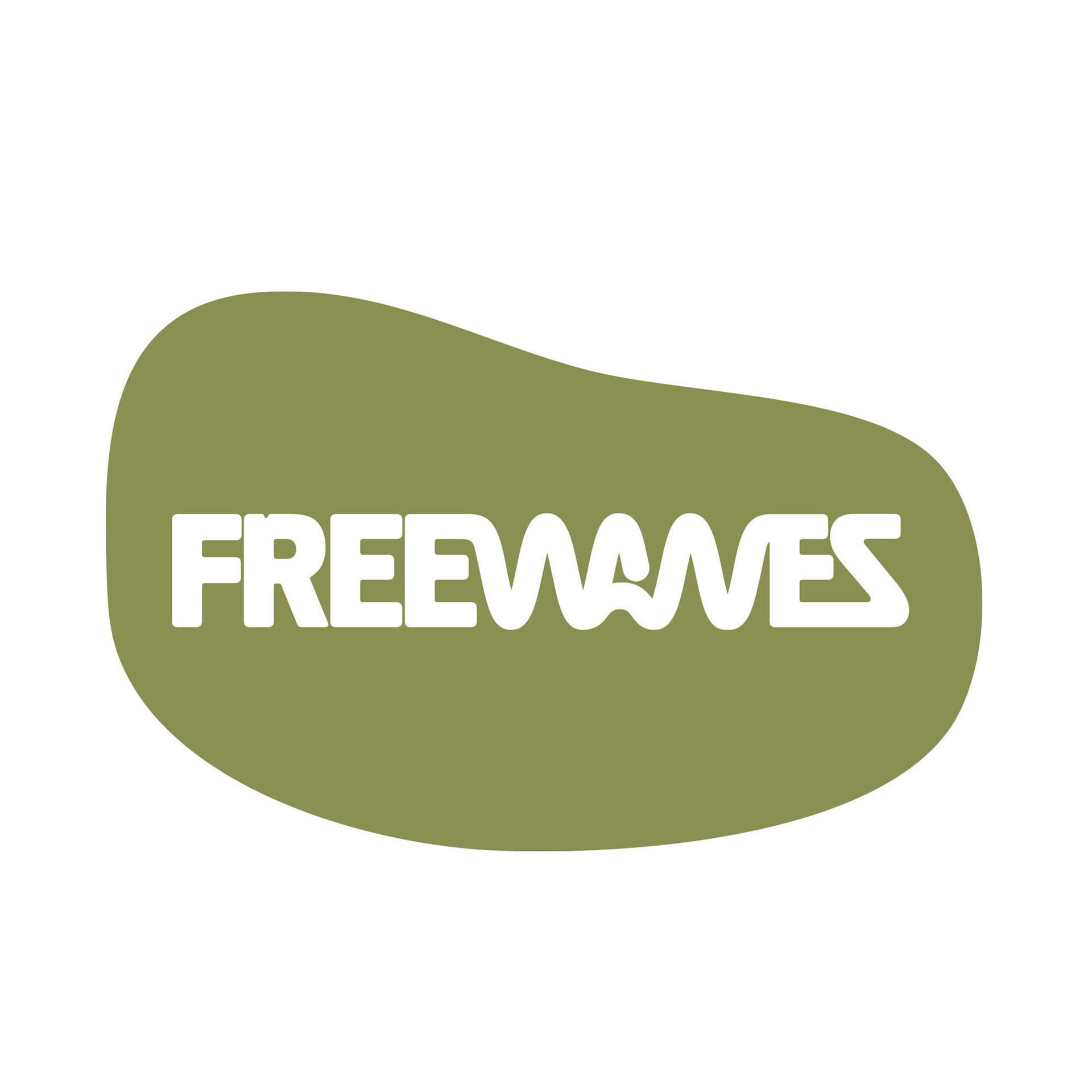
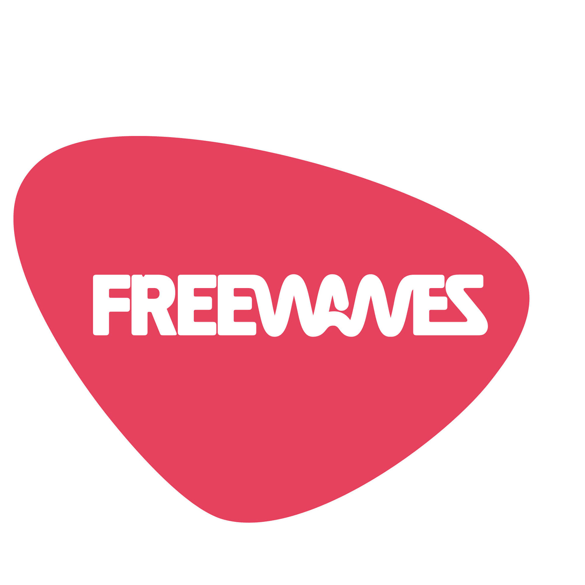
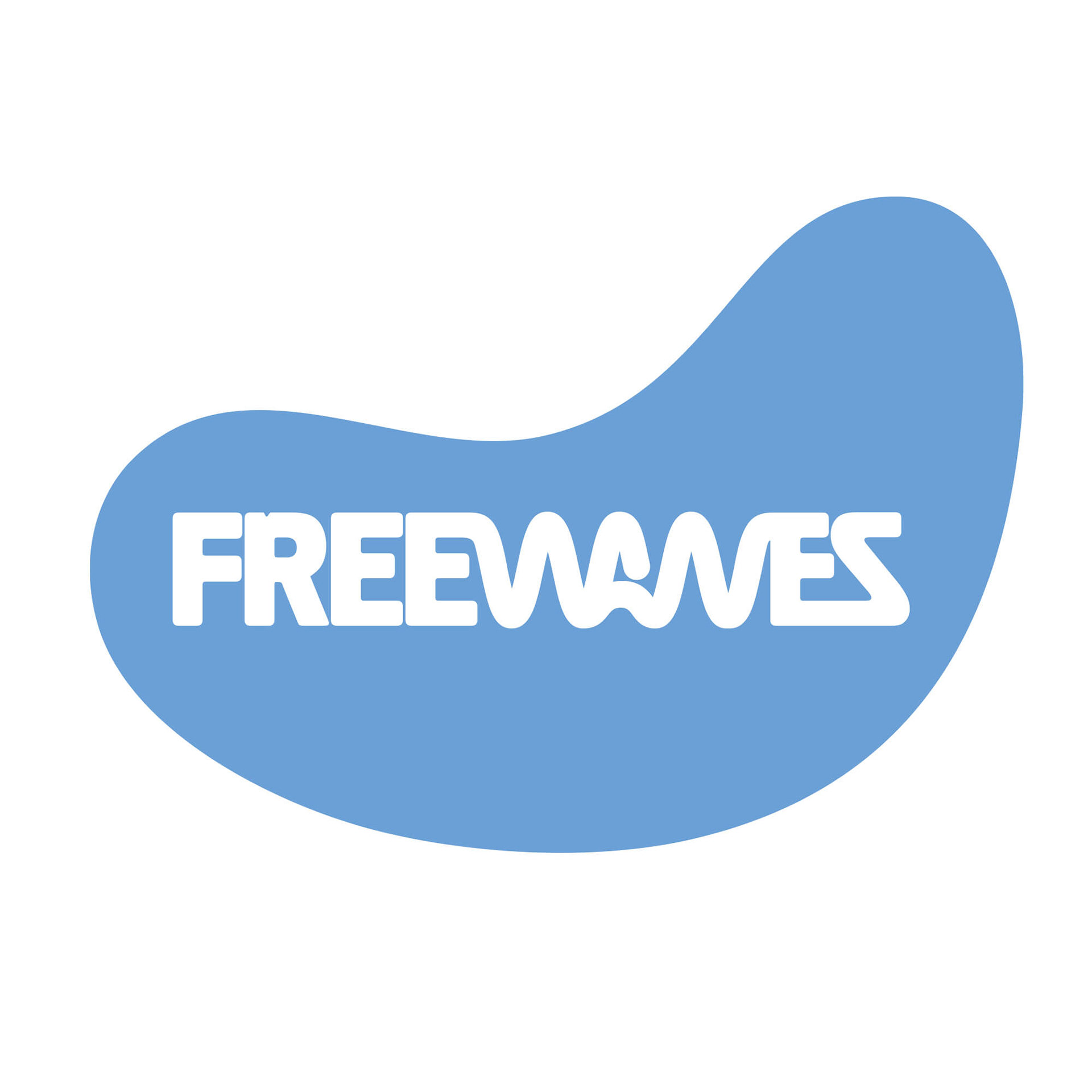
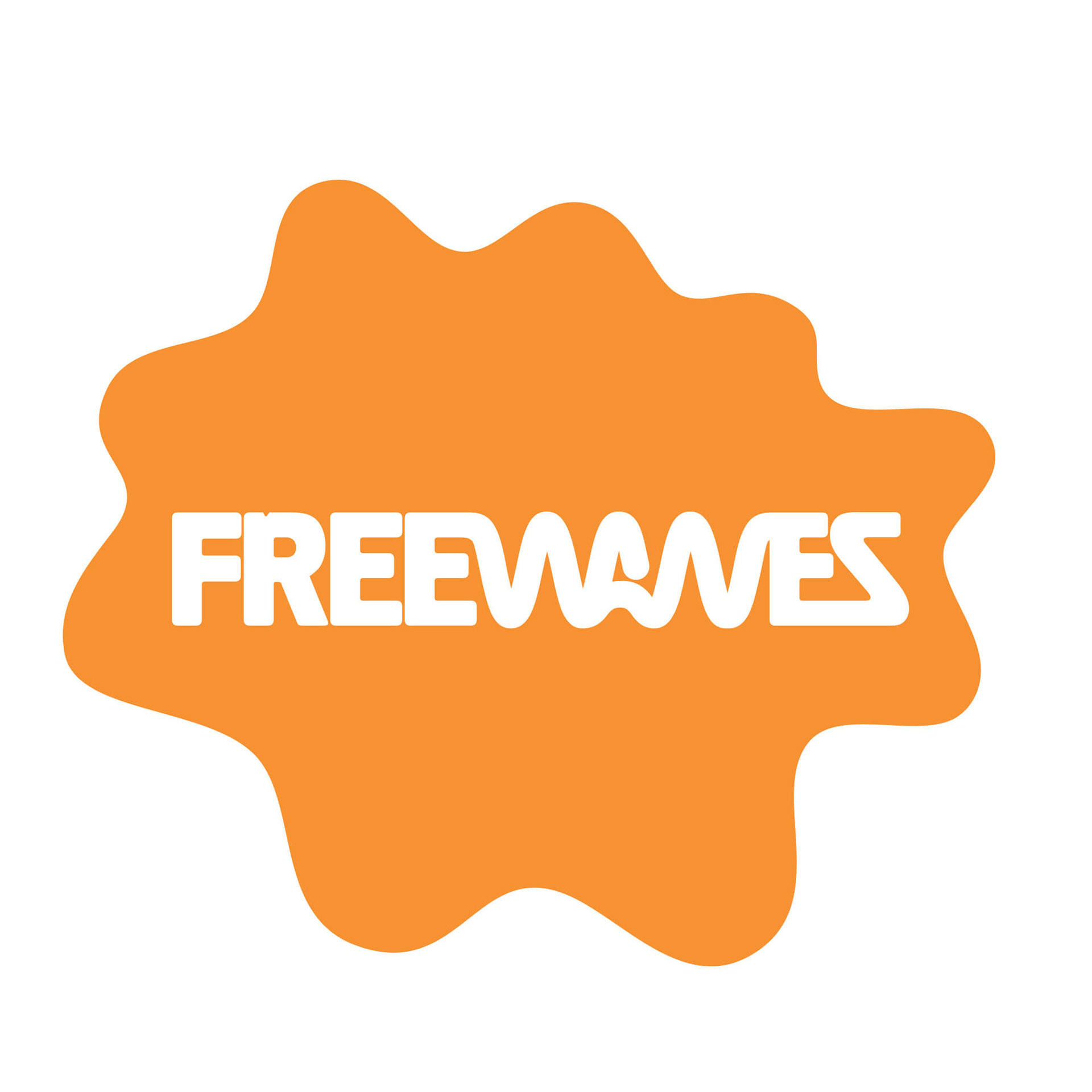
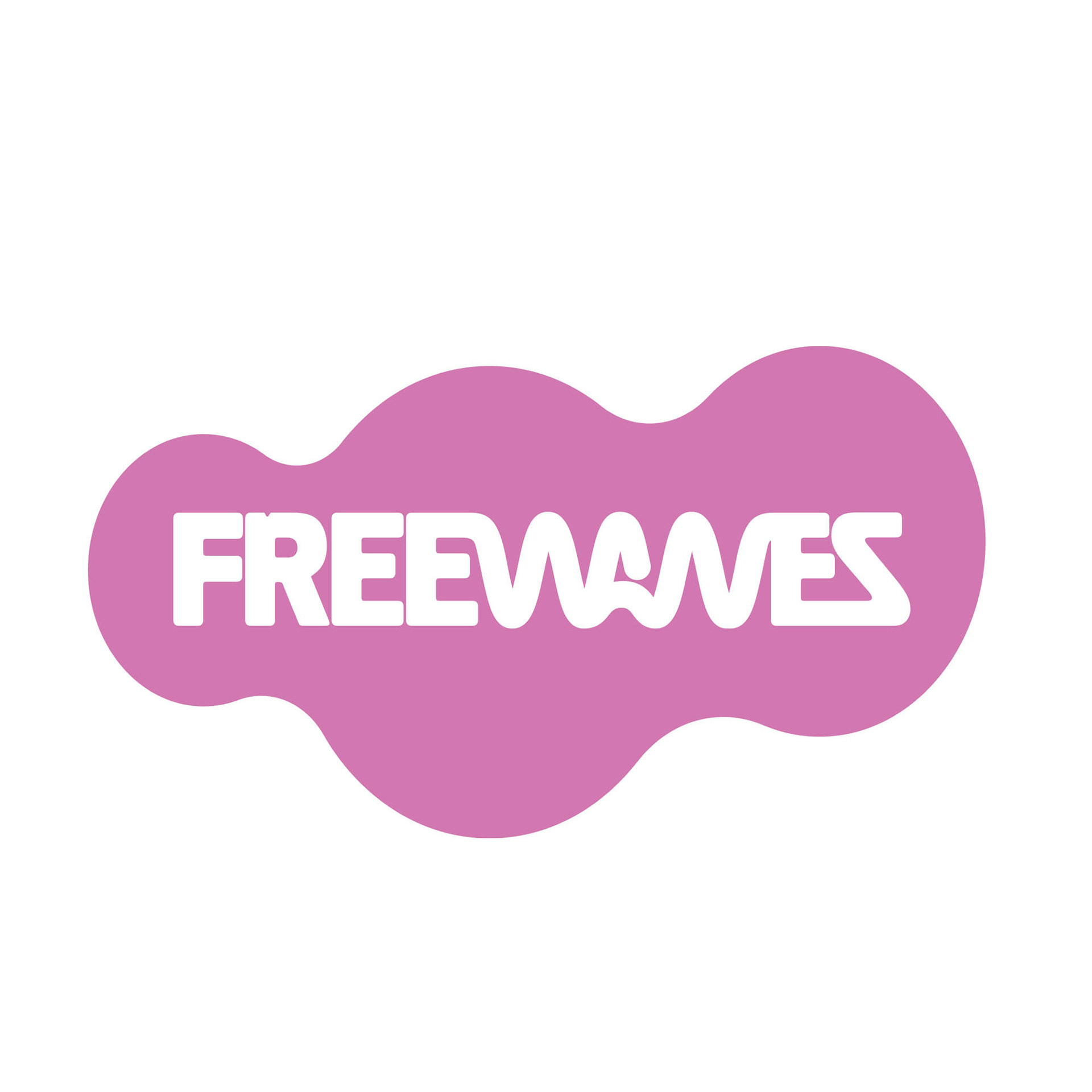
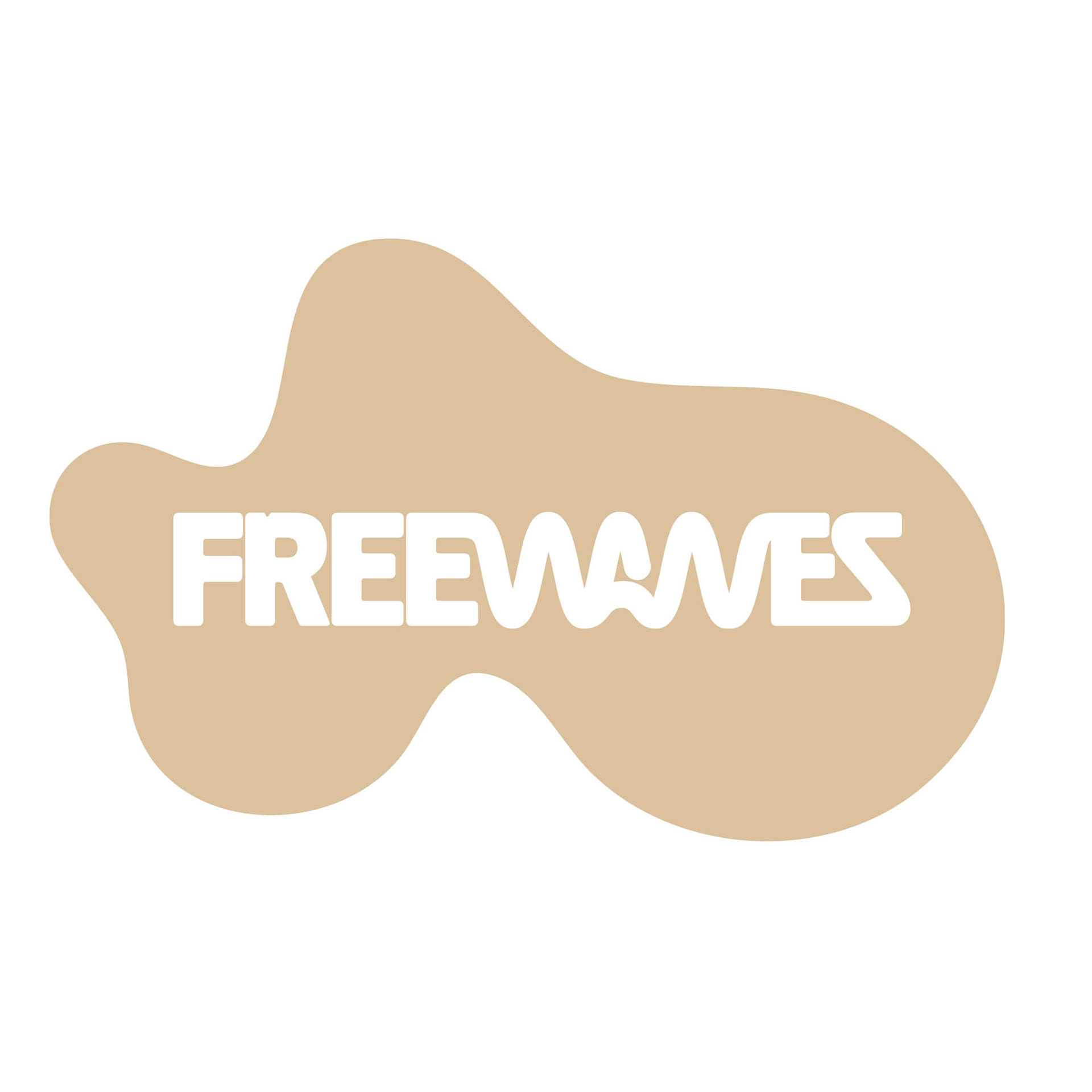
CONNECTING THE DOTS – ORGANIC MORPH SHAPES AND LOGOTYPE CASING
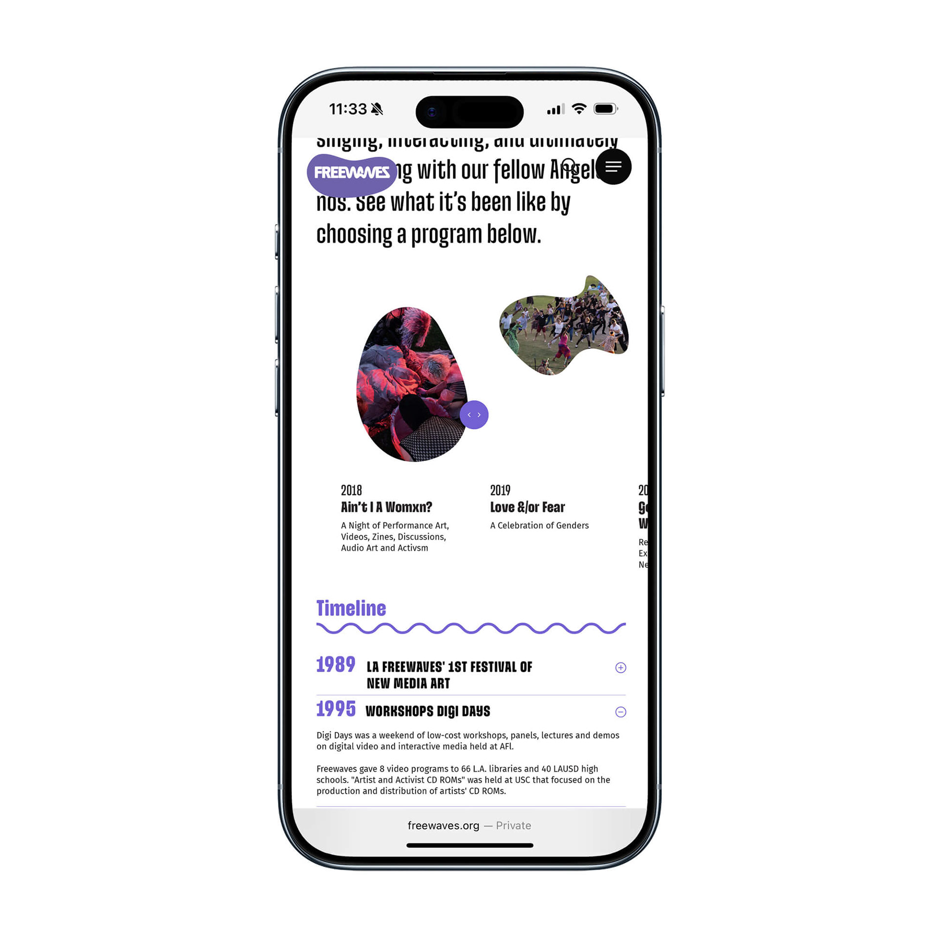
Mapping the different Freewaves program locations, dots on a grid indicate the programming schedule – an organization not bound to a single space, but actively exploring the regional opportunities of Los Angeles.
As an alternative to the white box, the identity morphs from one form to another, moving from A to B. The Los Angeles urban landscape becomes a canvas for artistic expression. By morphing the dots, we create organic shapes that act as visual identifiers for the different channels through which Freewaves interacts with its audience. At the same time, these forms serve as containers for the logotype, creating a bold visual language built from a set of unique identifiers.
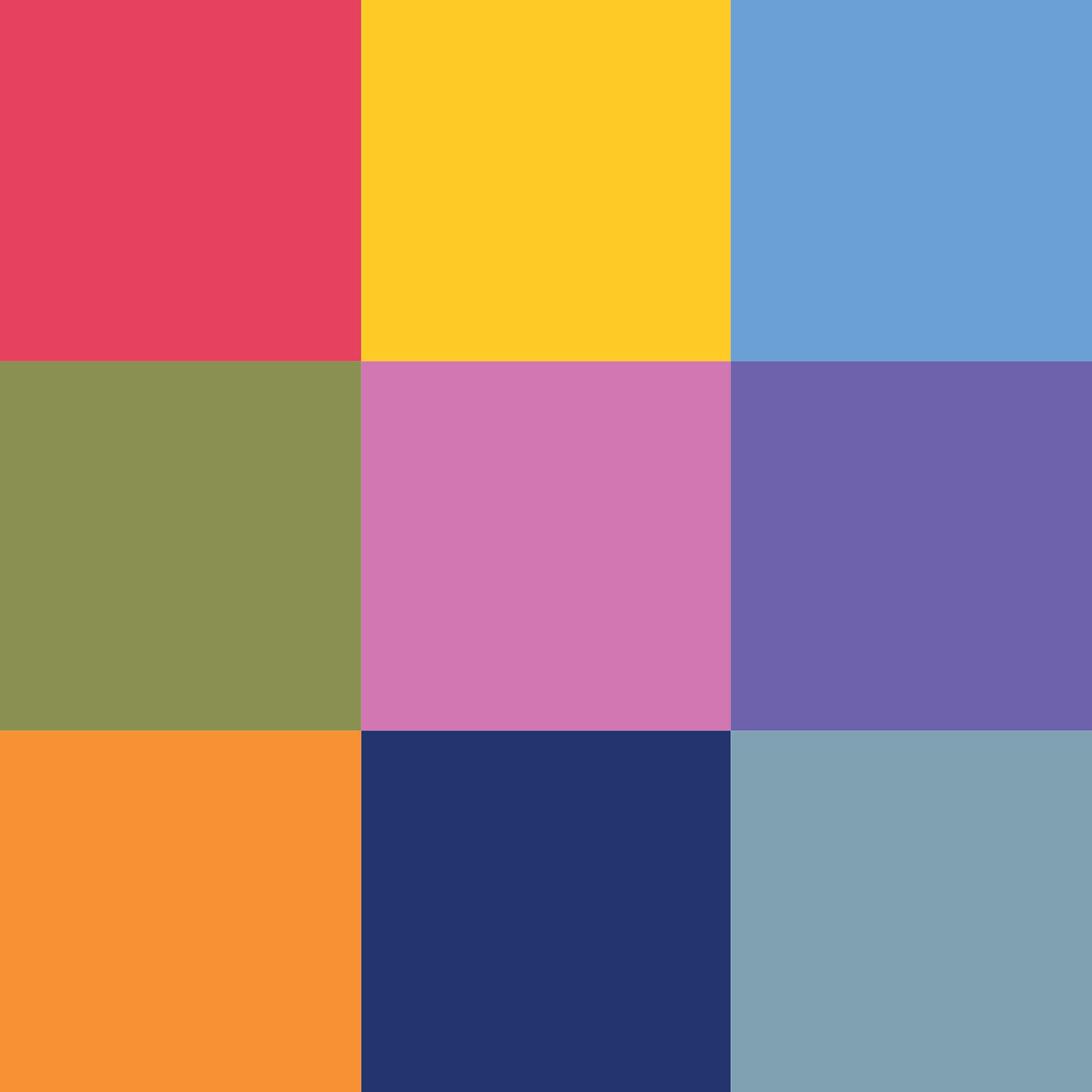
Whether used for programming, publishing, or video, each application is distinguished by its own combination of shape and color.
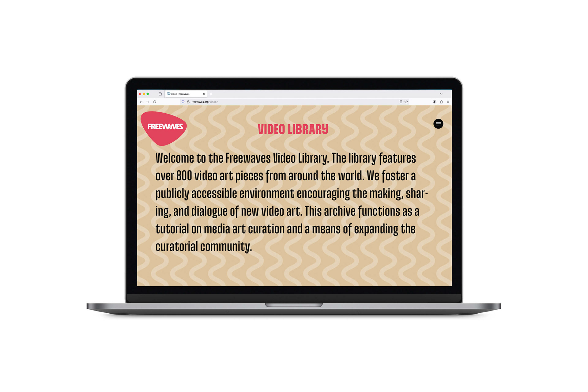
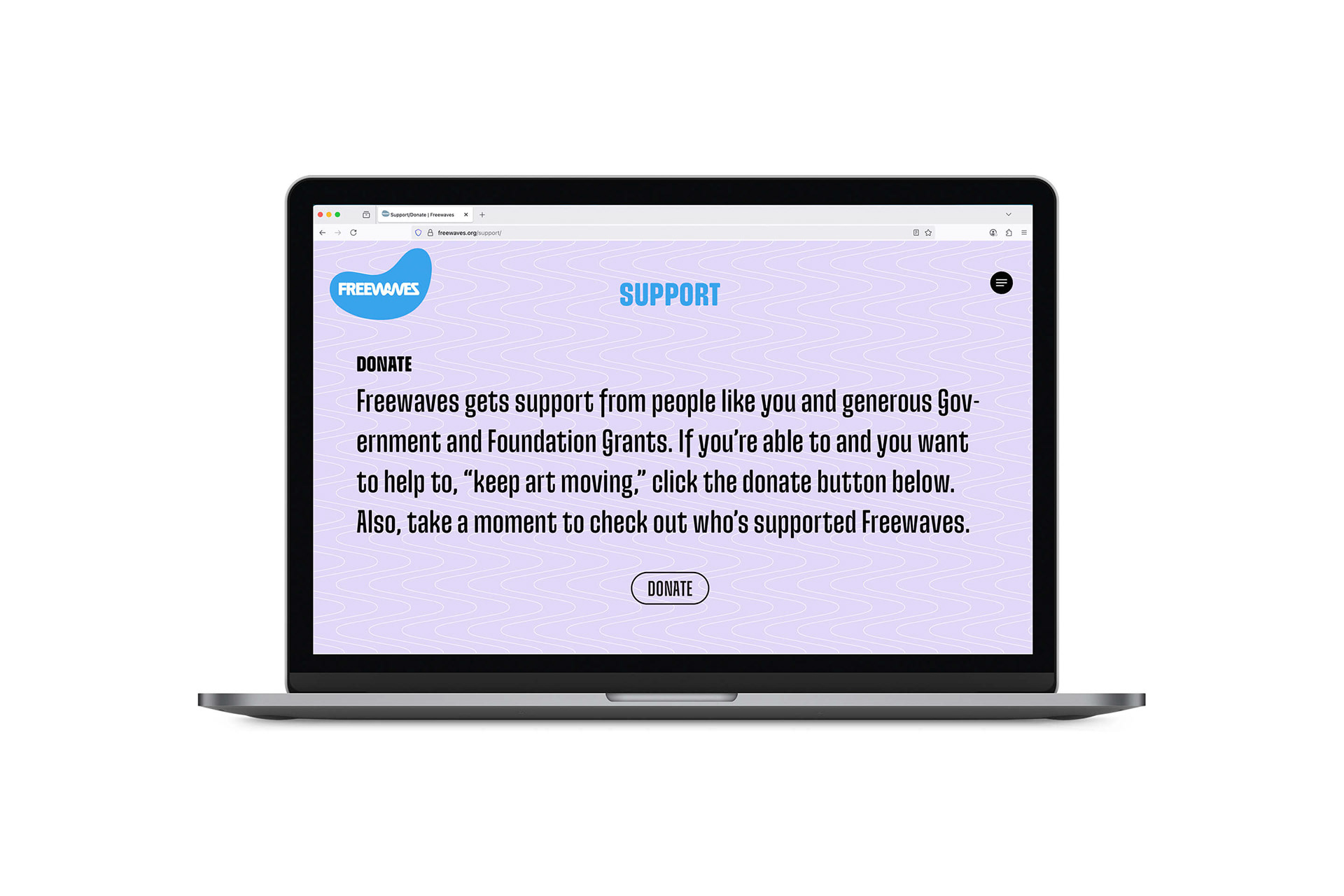
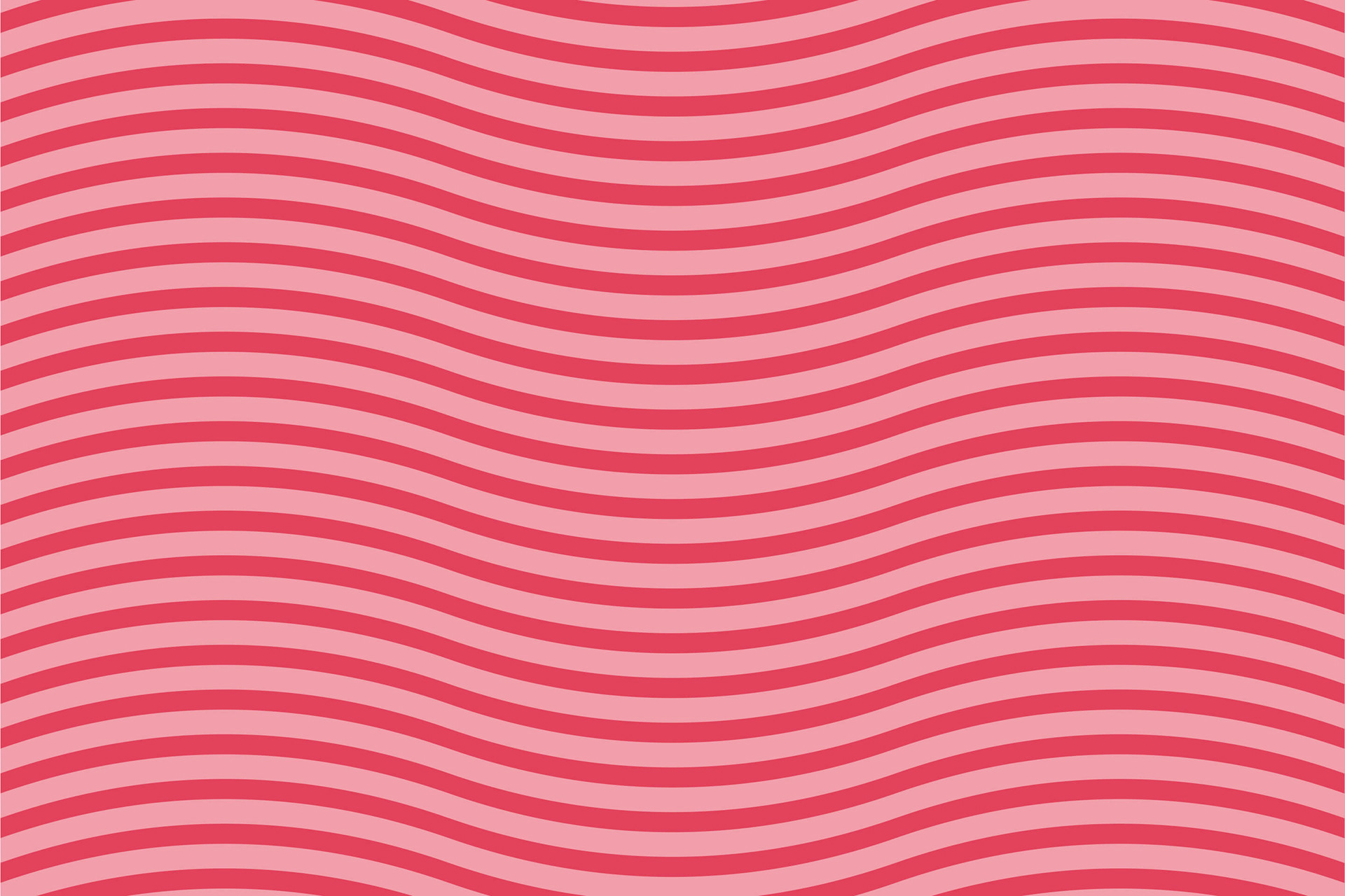
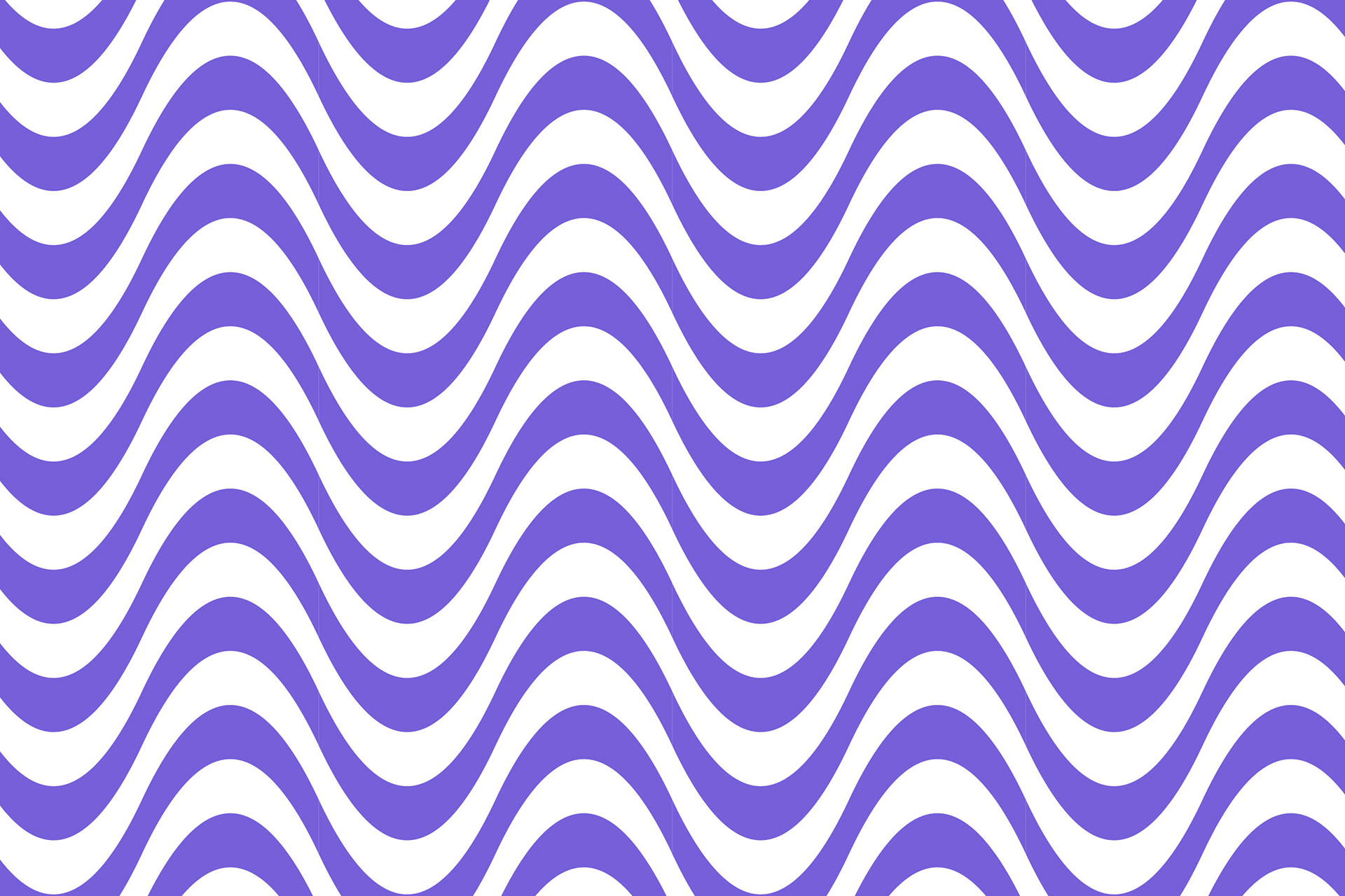
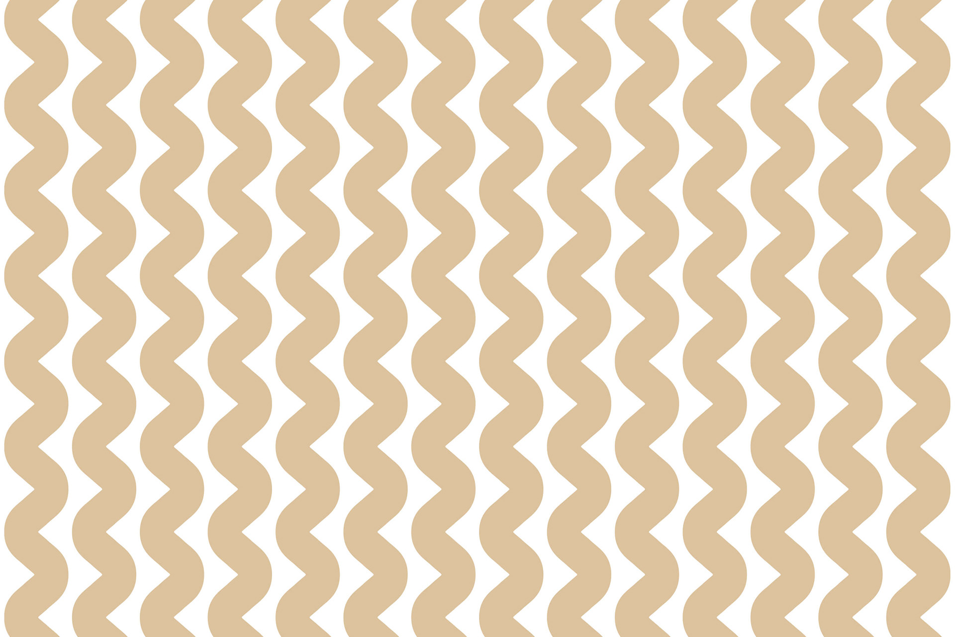
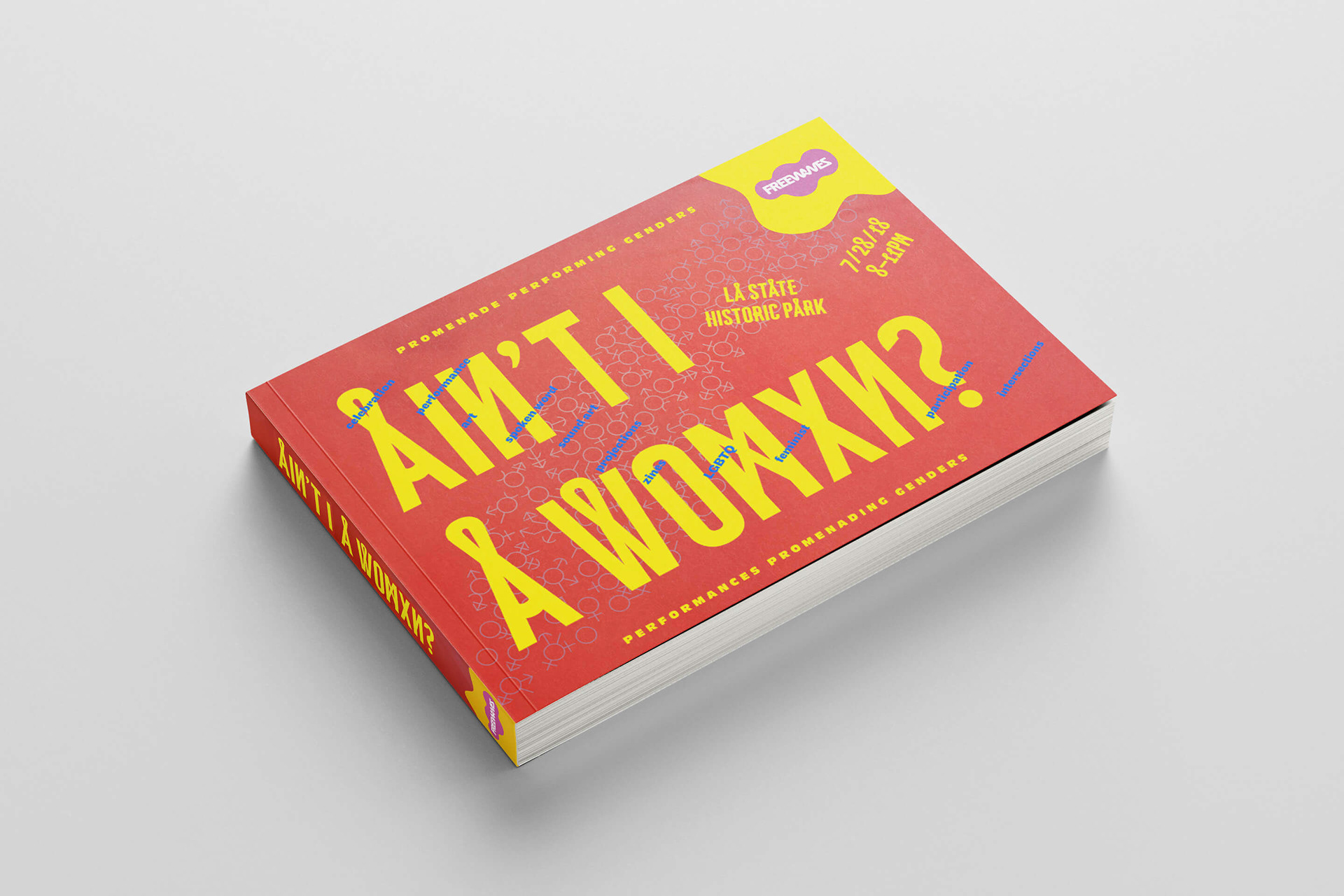
WAVY LINE – CONNECTING PATTERNS
A section of the logotype is used to form a wavy line. In its simplicity, the line acts as a connector. Linking shapes and forms, the wavy line works well with images and patterns. As a branding element, the line—short or long, large or small—creates a distinct look wherever it appears. With many options to “connect,” the line can adapt to any situation. In combination with the line, patterns were created to support the overall branding effort.
NOWHERE AND EVERYWHERE – THE SPIRIT OF FREEWAVES TO TRANSFORM
Freewaves offers a platform for expression and a stage for dialogue. The focus is on the visions of artists, thinkers, and activists, while Freewaves provides the logistics and support, radiating a distinctive aura. The structured outline gives form to ideas, with places and people at the center of this concept.
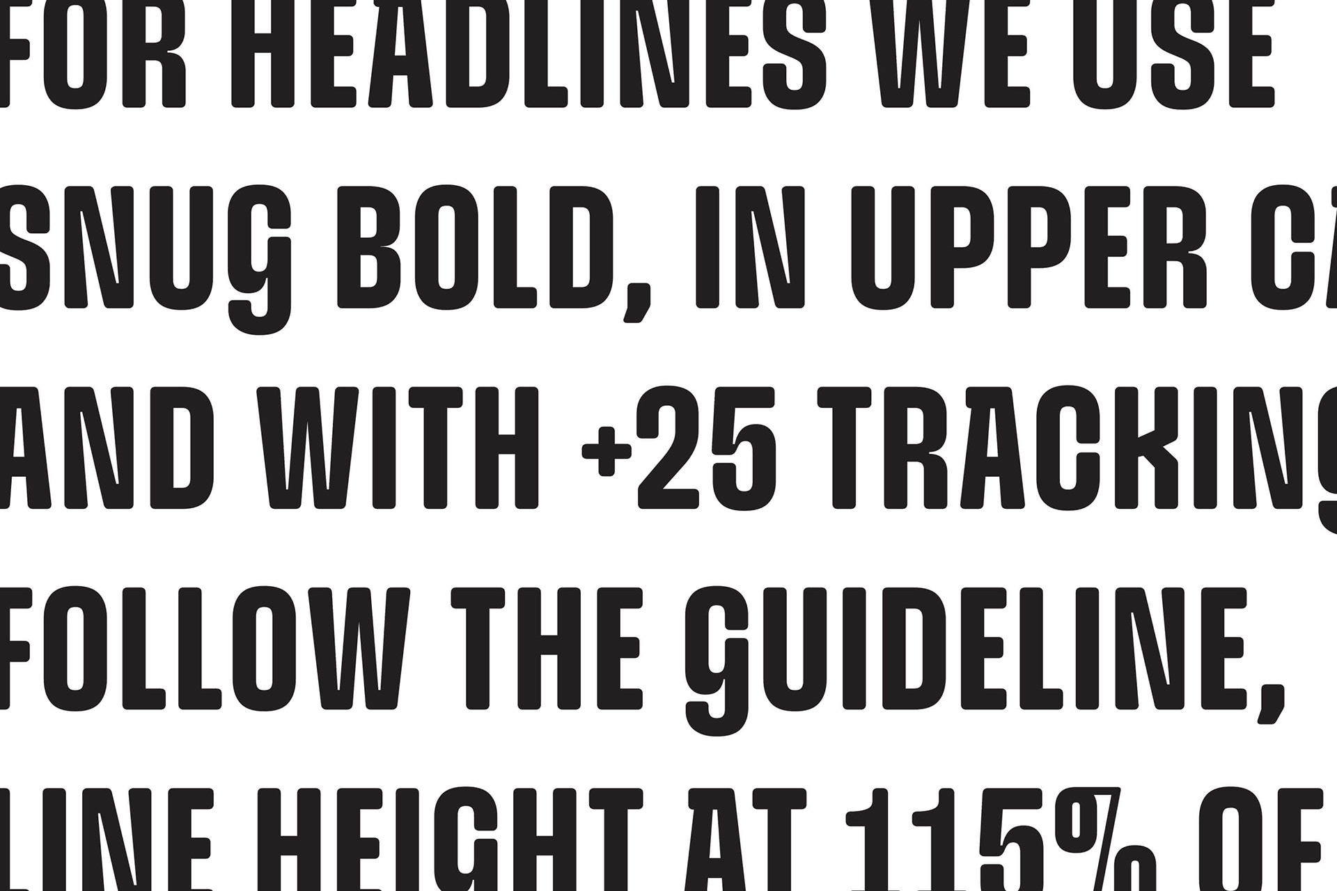
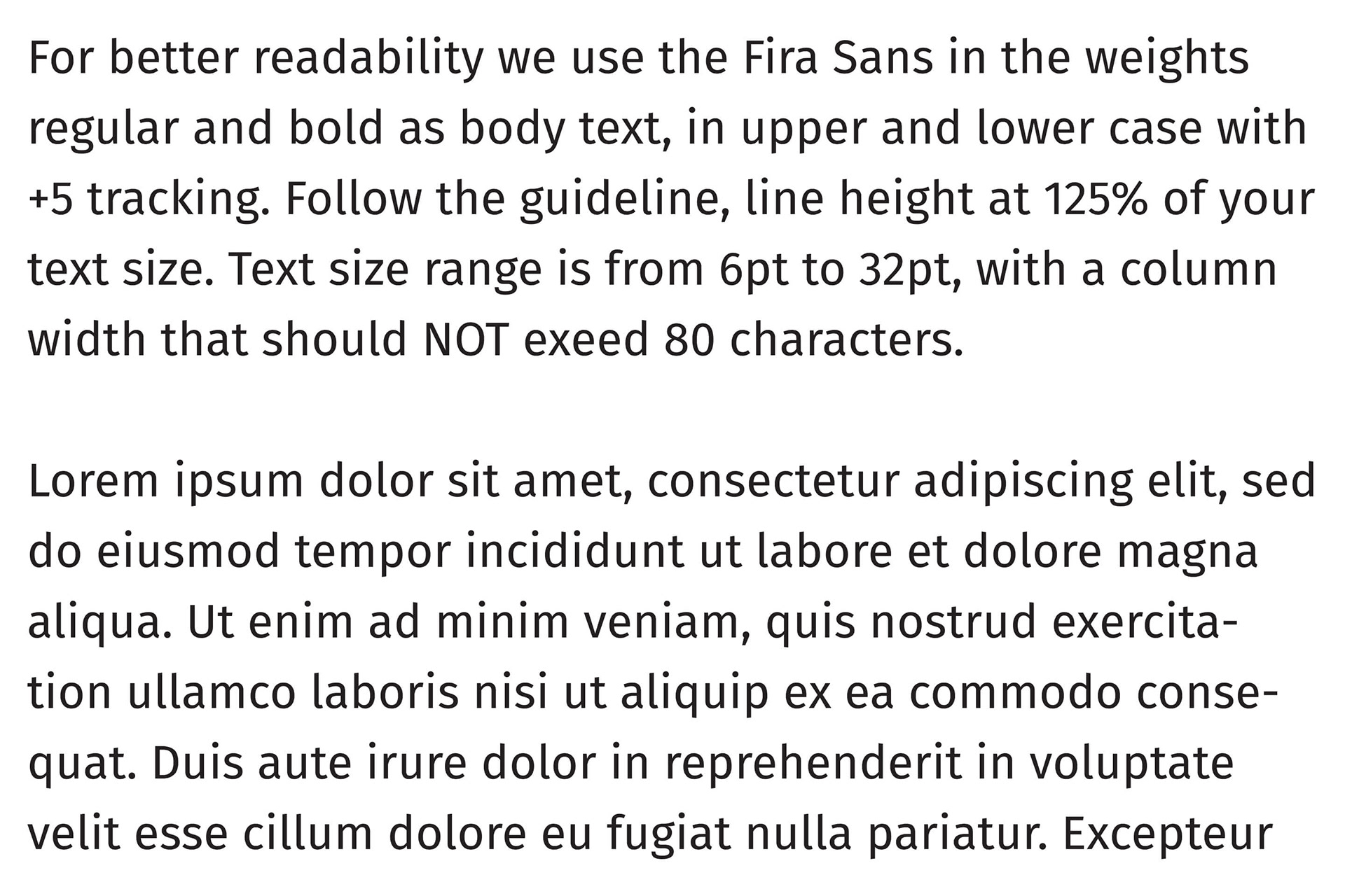
A unique typeface speaks the Freewaves language, serving as a key branding tool. Two typefaces define Freewaves: the Snug and the Fire Sans.
SNUG
Snug, an exuberantly weird font with fascinating terminal shapes. It's smart use of negative space adds a unique contrast to an otherwise bubblegum font, and each letter bursts with quirky personality while maintaining a strong legibility. While bespoke curves and natural soft edges make the typeface buoyant and approachable, it is bold and decisive at its thickest.
Snug, an exuberantly weird font with fascinating terminal shapes. It's smart use of negative space adds a unique contrast to an otherwise bubblegum font, and each letter bursts with quirky personality while maintaining a strong legibility. While bespoke curves and natural soft edges make the typeface buoyant and approachable, it is bold and decisive at its thickest.
FIRA SANS
Fira Sans is a humanist sans-serif typeface. It is a slightly wider and calmer adaptation of the typeface Meta. The name “Fira,” communicates the concepts of fire, light, and joy, but with connotatively agnostic language intended to signal the project's multicultural nature.
Fira Sans is a humanist sans-serif typeface. It is a slightly wider and calmer adaptation of the typeface Meta. The name “Fira,” communicates the concepts of fire, light, and joy, but with connotatively agnostic language intended to signal the project's multicultural nature.