BUILT IN...
Greg Vabre opens doors with an invitation and a very simple idea in mind. The company set out to make a difference and to help people improve the experience and the quality of their lives at home. A home connotes a multitude of visions and emotions: for some, it ought to be a comfortable space for a good summer read or an abode for romance; for others, a home encapsulates something playful and unexpected. Greg Vabre does exactly that - a love for an eclectic mix of modern lines, spontaneity, and fun!
Greg Vabre opens doors with an invitation and a very simple idea in mind. The company set out to make a difference and to help people improve the experience and the quality of their lives at home. A home connotes a multitude of visions and emotions: for some, it ought to be a comfortable space for a good summer read or an abode for romance; for others, a home encapsulates something playful and unexpected. Greg Vabre does exactly that - a love for an eclectic mix of modern lines, spontaneity, and fun!
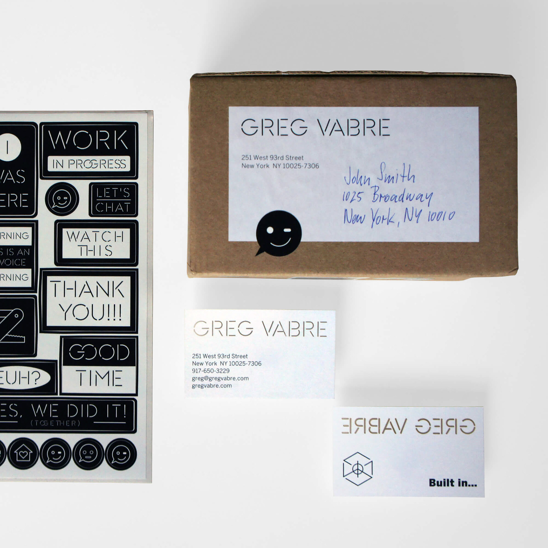
For Greg Vabre we were asked to create a new branded identity. The identity consisted of a logotype, logo symbol, tagline, few collateral pieces with a sticker-sheet and a website.
In addition the tagline “Built in…” was created to support all branded material. For the website, this was a useful tool to reiterate the companies brand. The “Built in...” tagline opened an array of variations for different slogan’s to strengthened the brand value and its recognition across multiple platforms. For example in the website we used “Let’s Build With Greg Vabre.”
LOGO
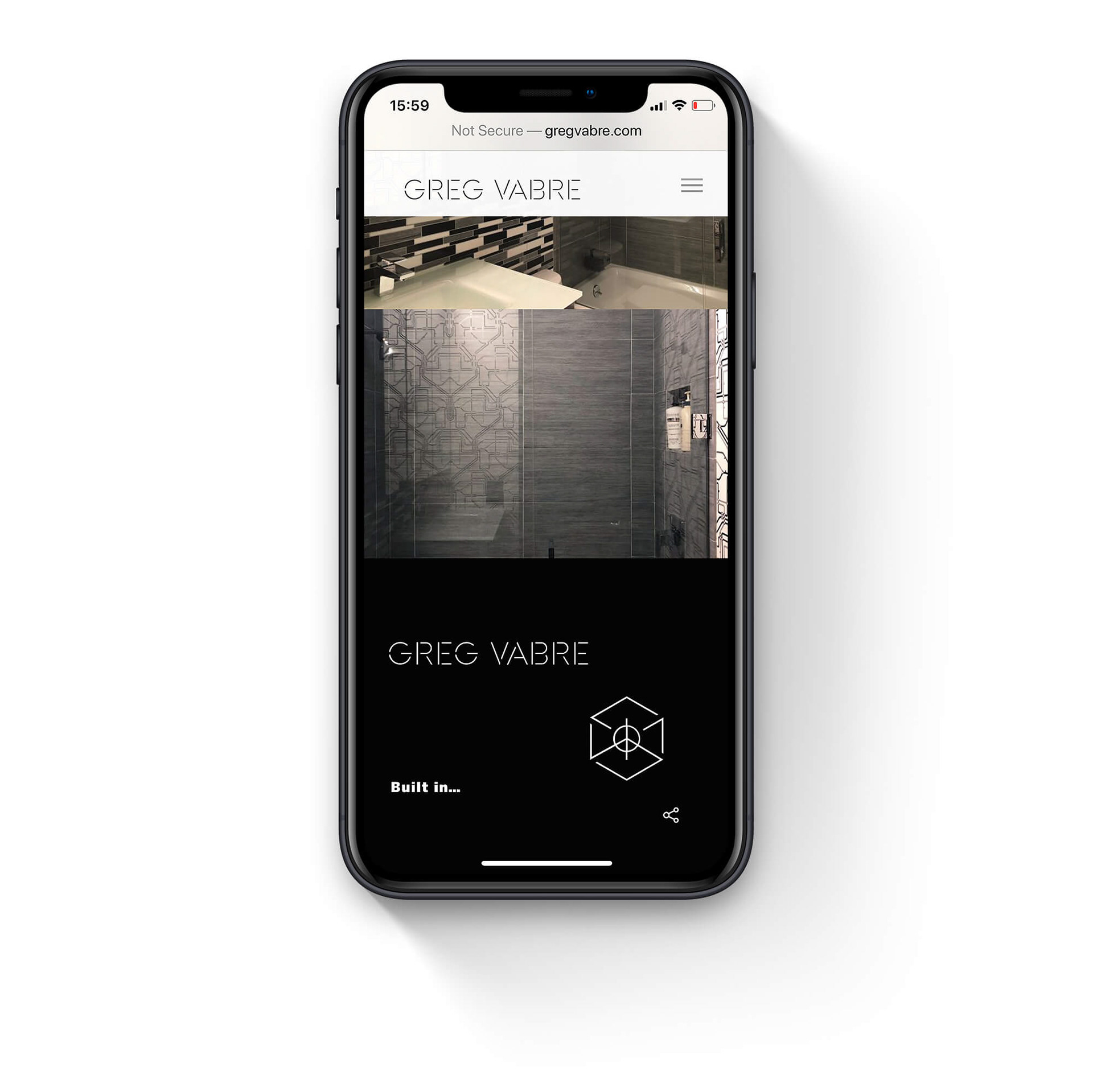
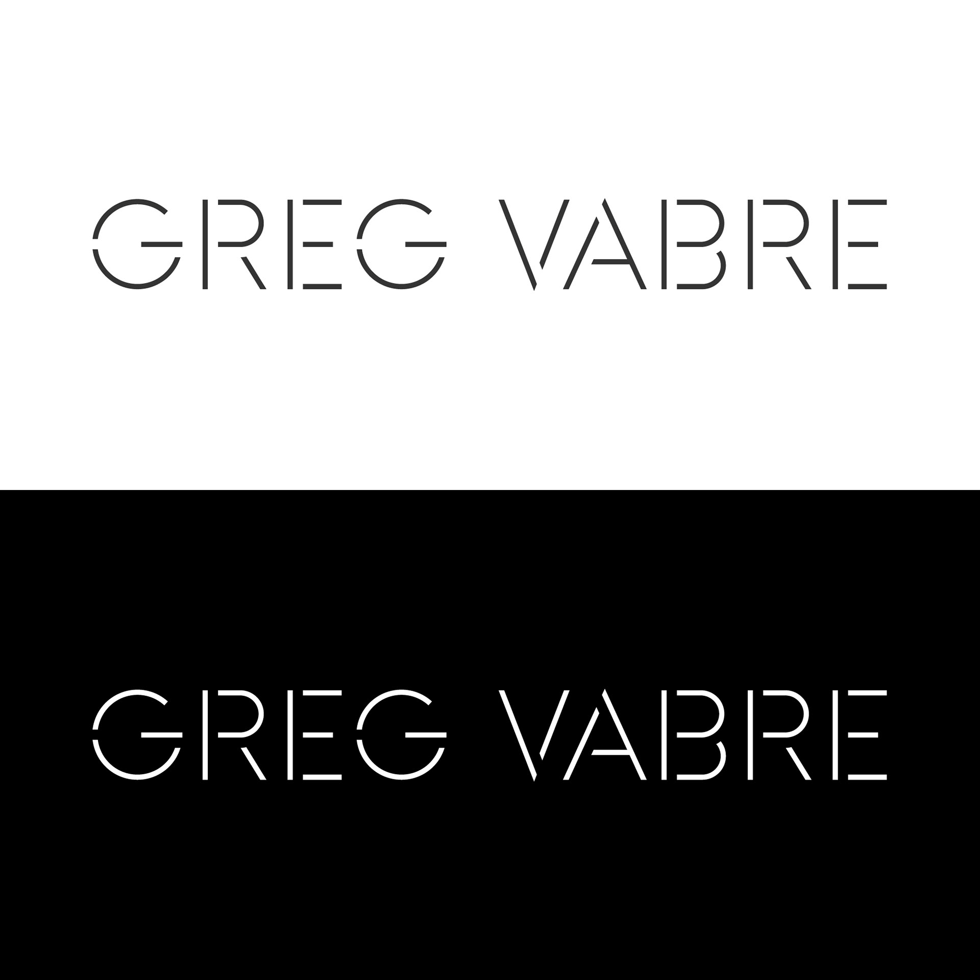
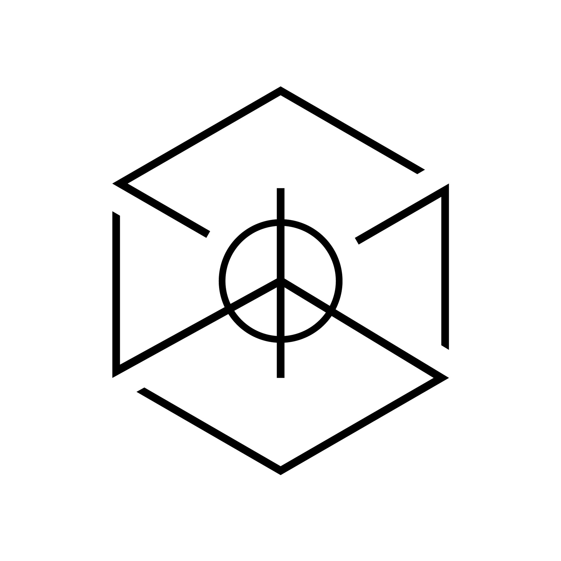
Looking at the core business of the company we wanted to give a constructed look and used a modern stencil font. The perfect font to di-cut into material and have a sense of space. After all, Greg Vabre is working with spaces. Next to the logotype of the name Greg Vabre there was a need for a supportive symbol. The logo mark has both a two and three dimensional character. Looking closer one will recognize the peace symbol in the center, a personal motto of Greg Vabre.
IDENTITY APPLICATIONS
To compliment the identity program a sheet of specific icons was designed to embellish the simple, black and white logo. Depending on mood and moment different icons can be applied to collateral and packages and give each item a personal message. With these visual items the branding can keep a fresh unique character for years to come.
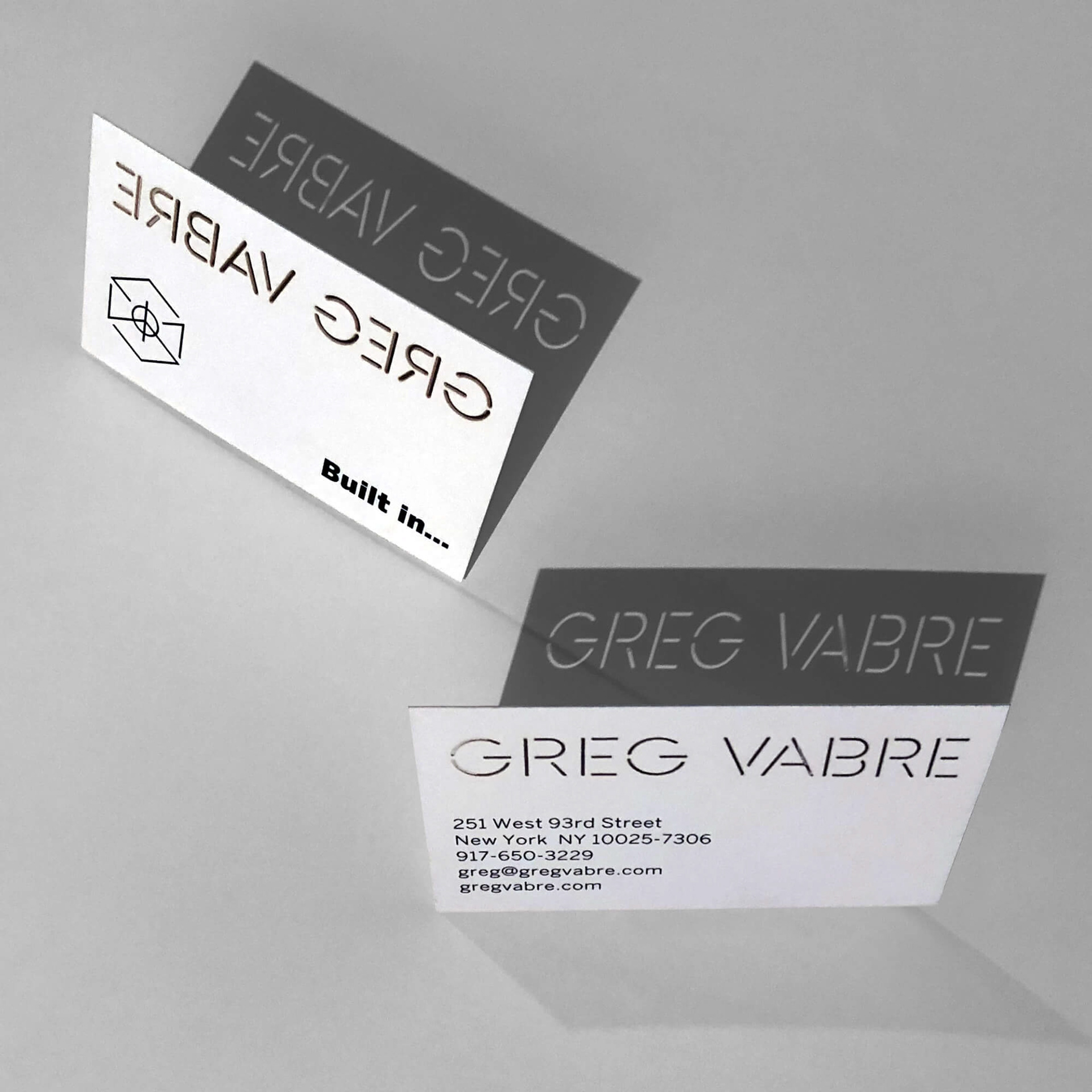
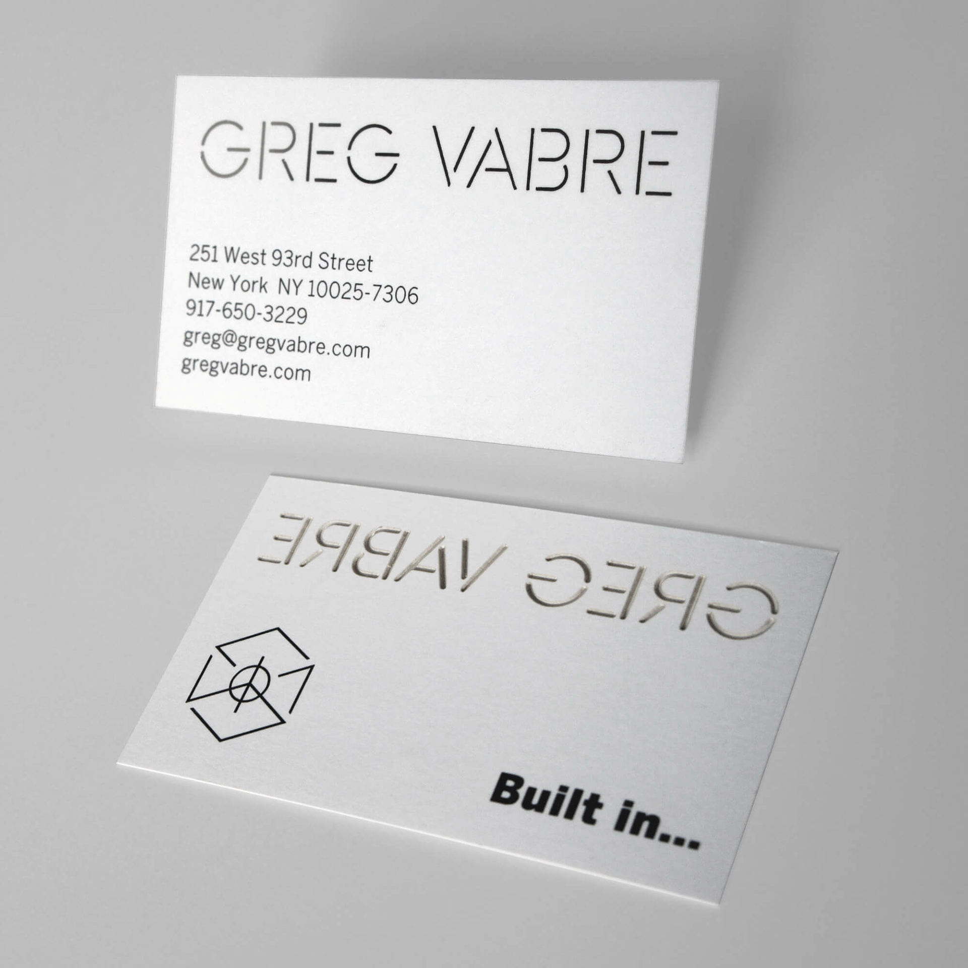
For the business card we used a laser di-cut technology to created the desired 3 dimensional optic on the logotype.
WEBSITE
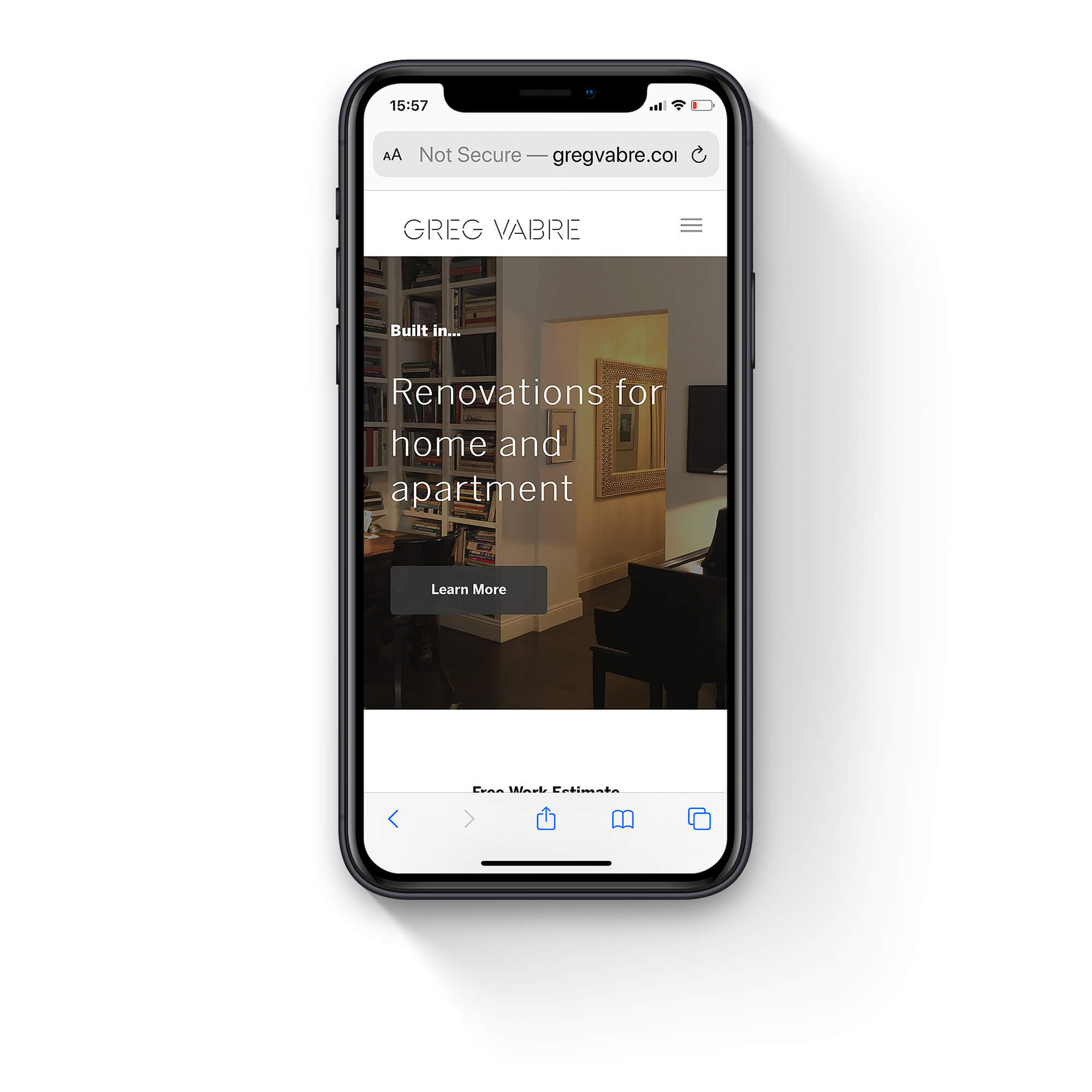
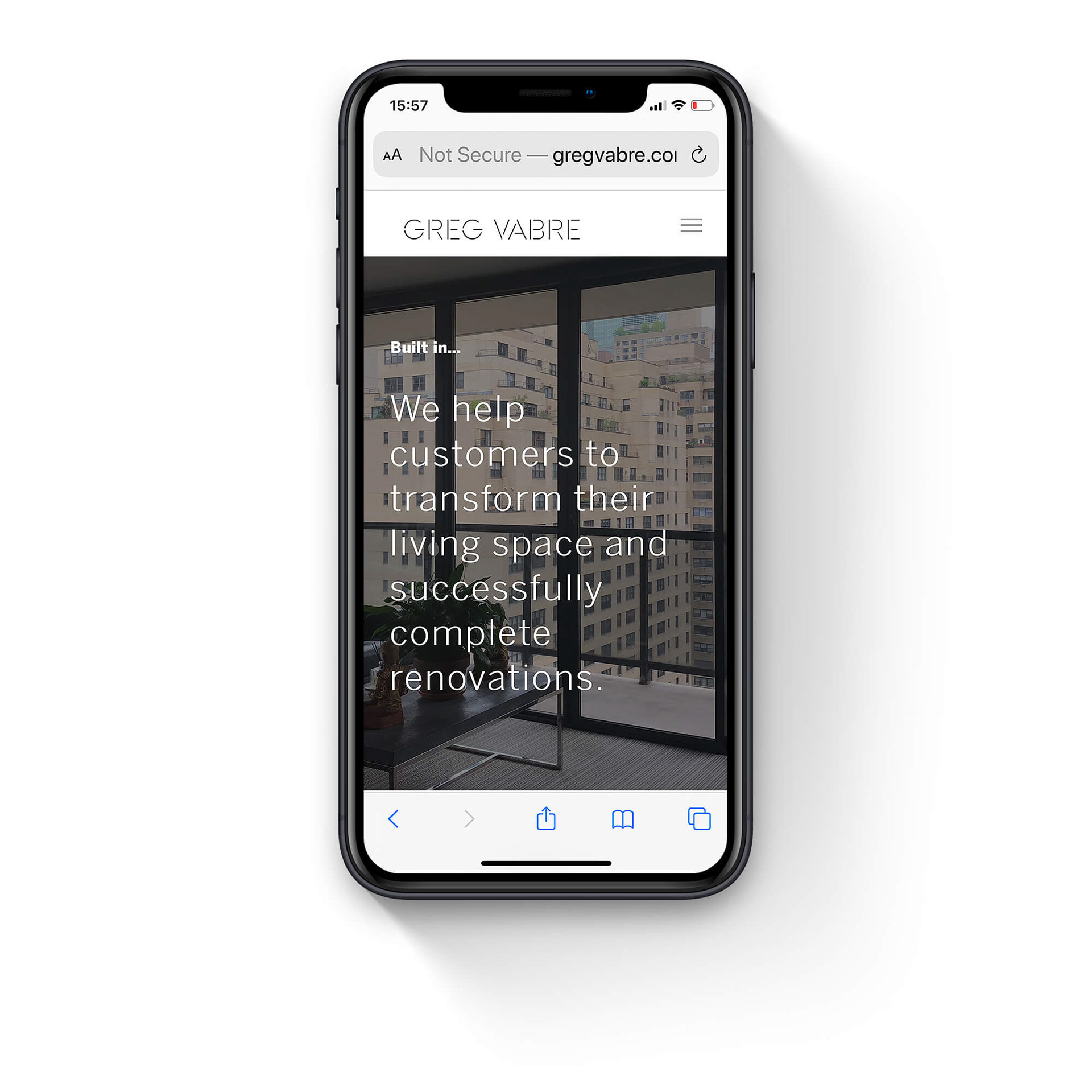
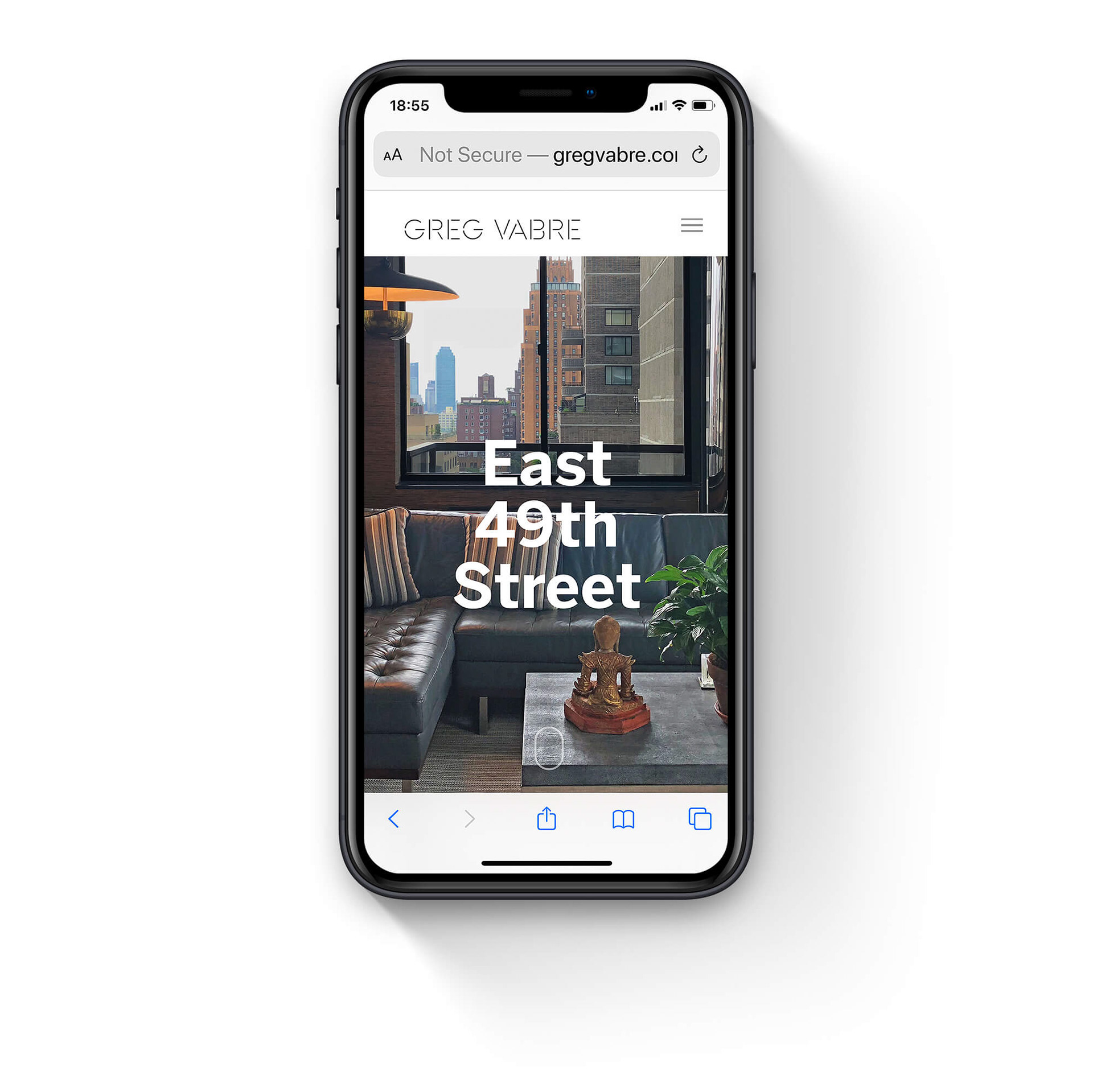
Part of the Greg Vabre branding is the presentation website. xSITE created a responsive website for all platforms to show work by Greg Vabre with portfolio images and detailed information. As an added feature there is a "We Like" section with inspiration and friends of Greg Vabre. Most importantly the site is easy to navigate within the different sections, together with comprehensive information about Greg Vabre.
