PLANT BASED PRODUCTS
The mission is to buy special and healthy products from developing countries for a fair price, so producers have a sustainable income and people around the world can enjoy these delicious products.
The mission is to buy special and healthy products from developing countries for a fair price, so producers have a sustainable income and people around the world can enjoy these delicious products.
Out of passion and love for the coconut products from the Philippines, Marianne van de Heuvel founded KokoKitchen (Food & Fabrics) in 2016. KokoKitchen is a Dutch Fair Trade Company, supplying cooking products based on coconuts from the Philippines.
The company import and distribute carefully selected products such as oils, aminos and nectars directly from farmers and cooperatives in the Philippines, meeting the highest producing standards.
From the start in 2018, the collaboration with KokoKitchen has been based on a shared vision for the brand, a great passion for the product and a love for design and patterns.
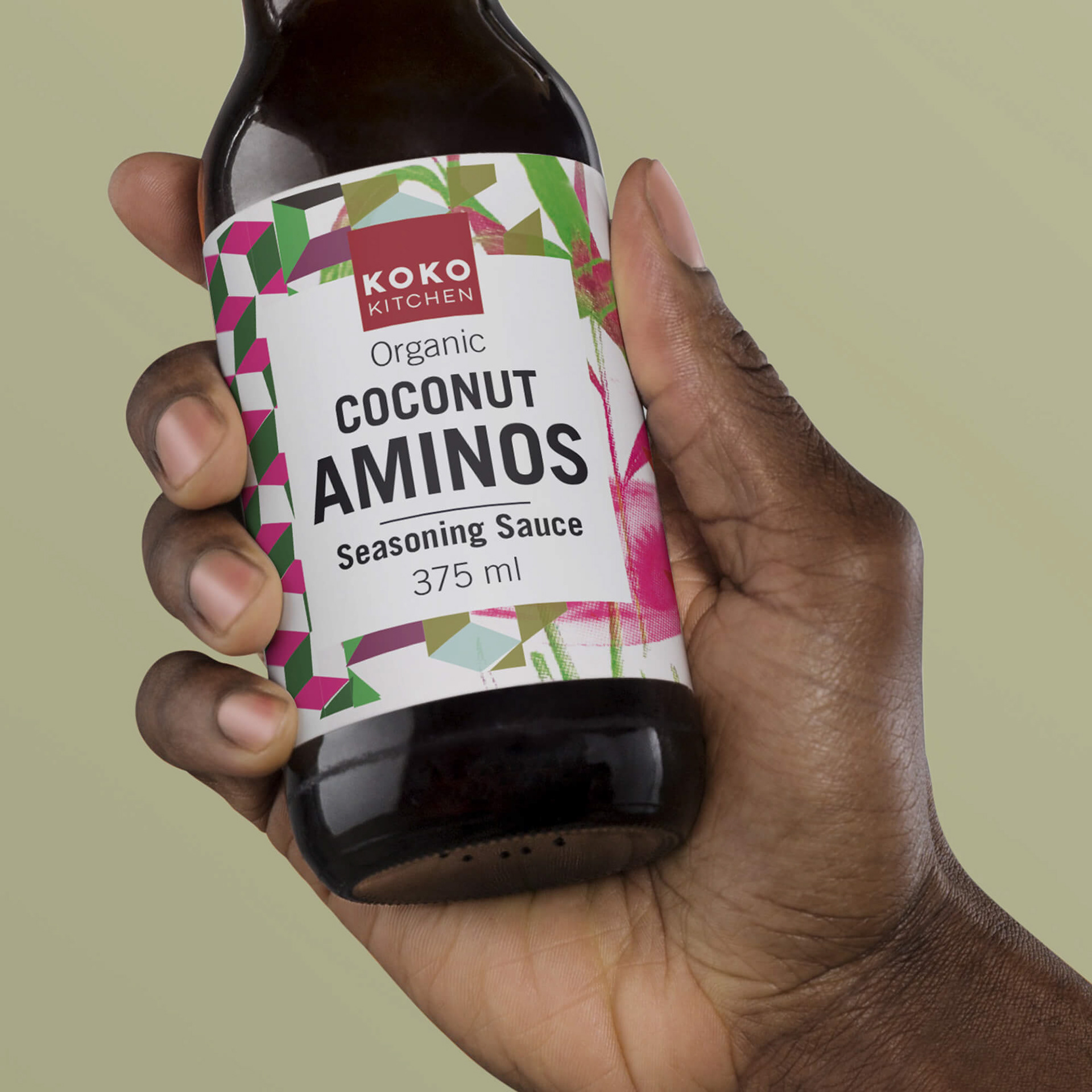
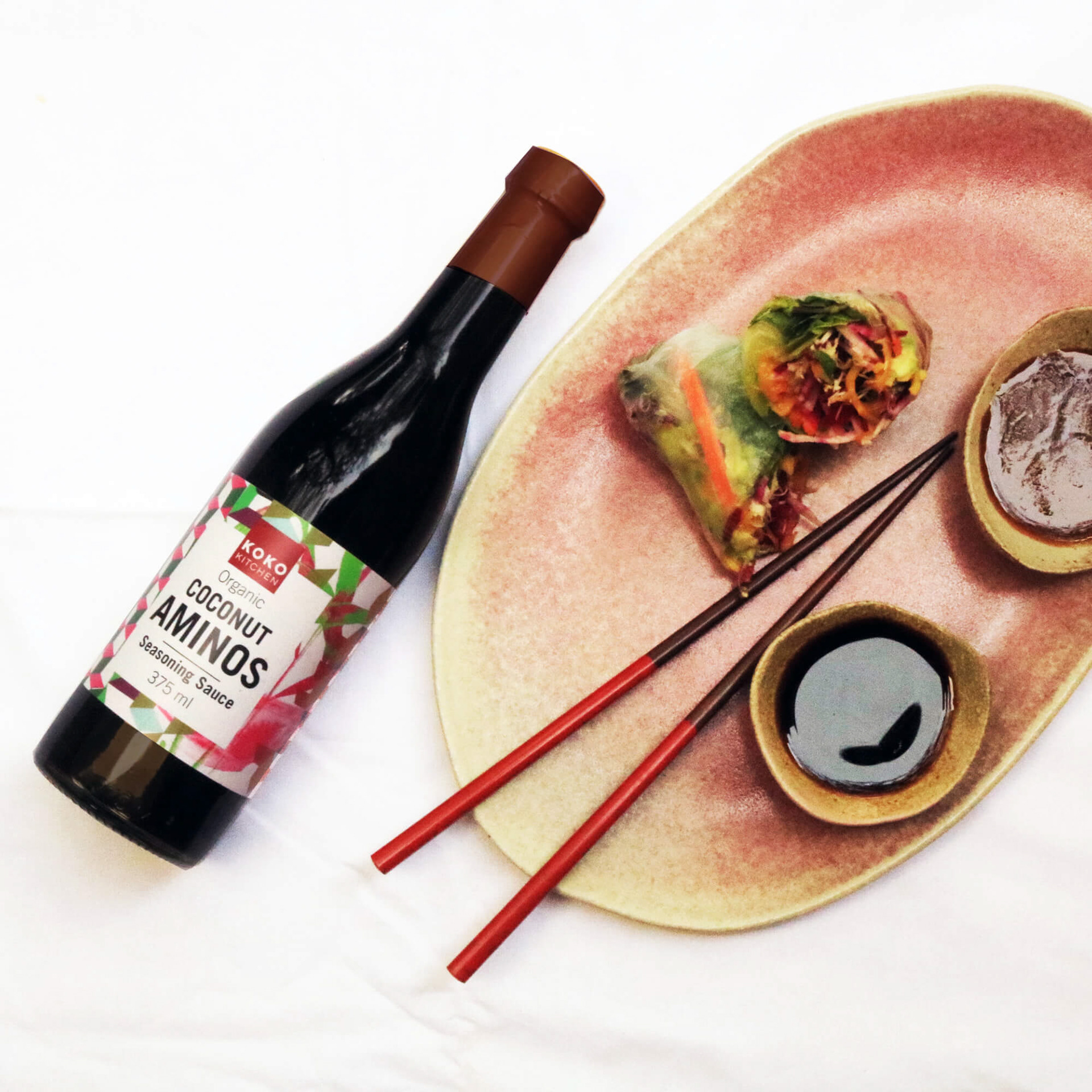
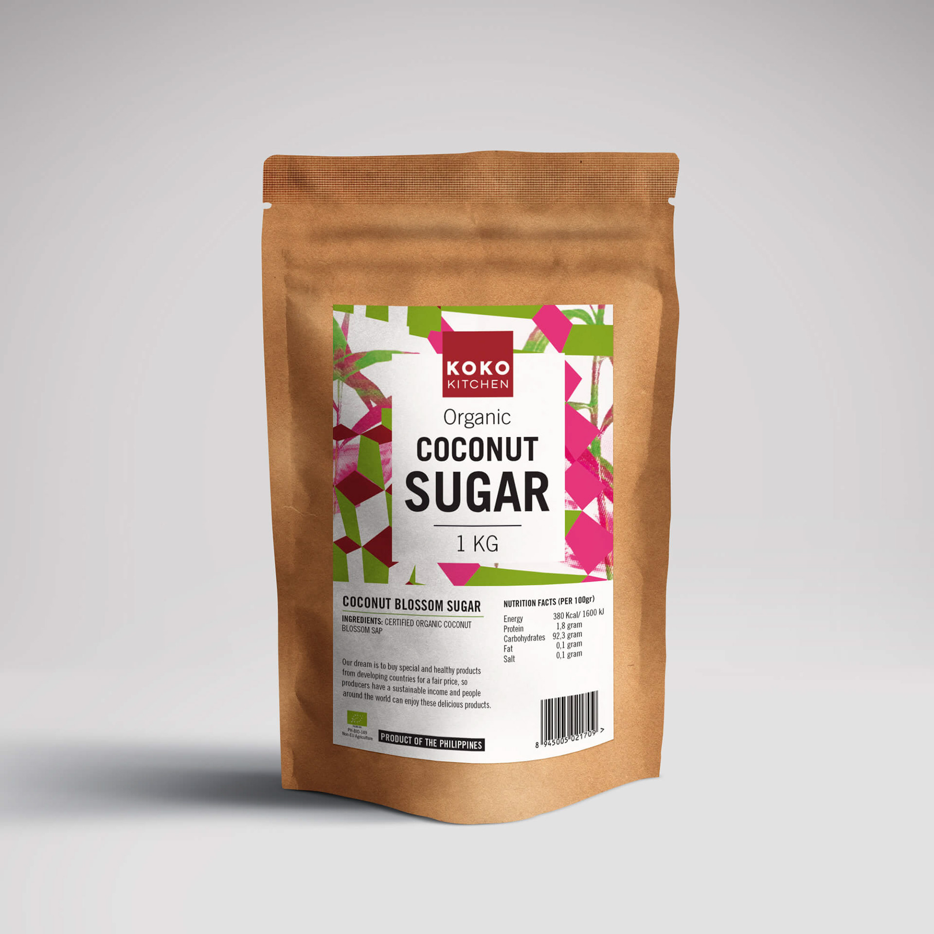
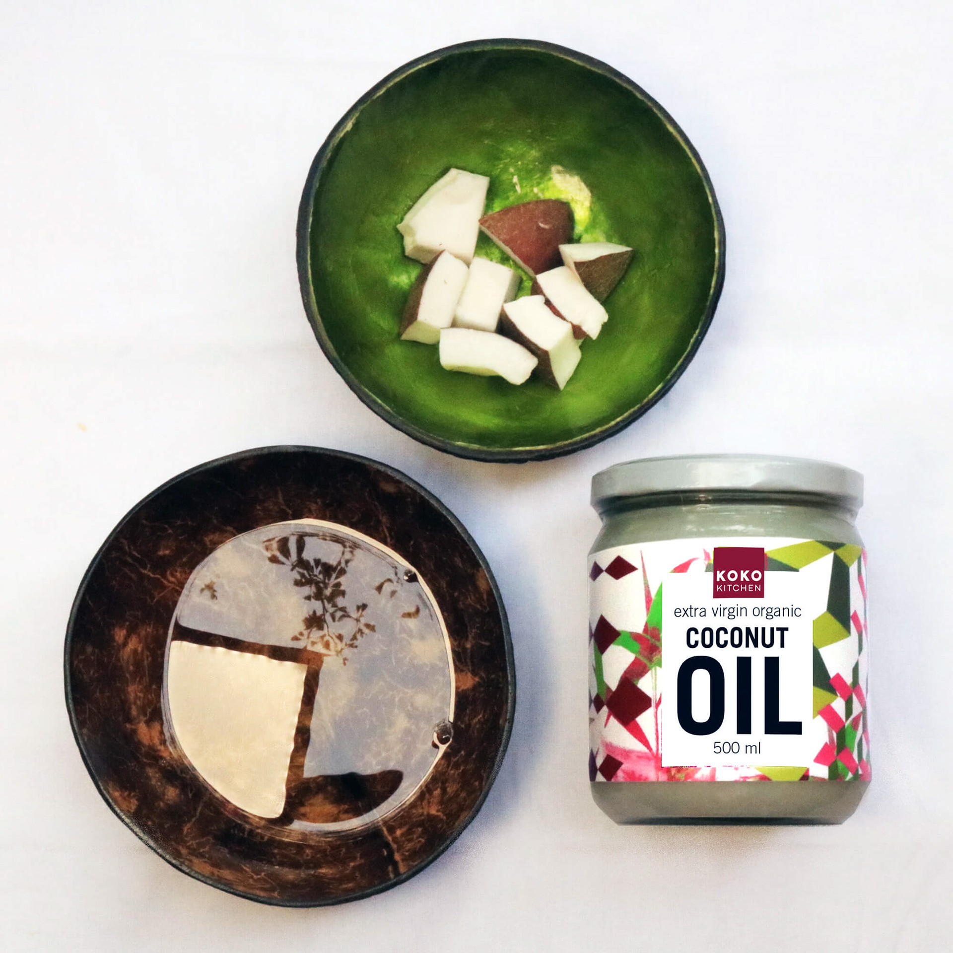
For their new line of coconut products we were asked to redesign the logo, identity and create a correspondent packaging design.
APPROACH
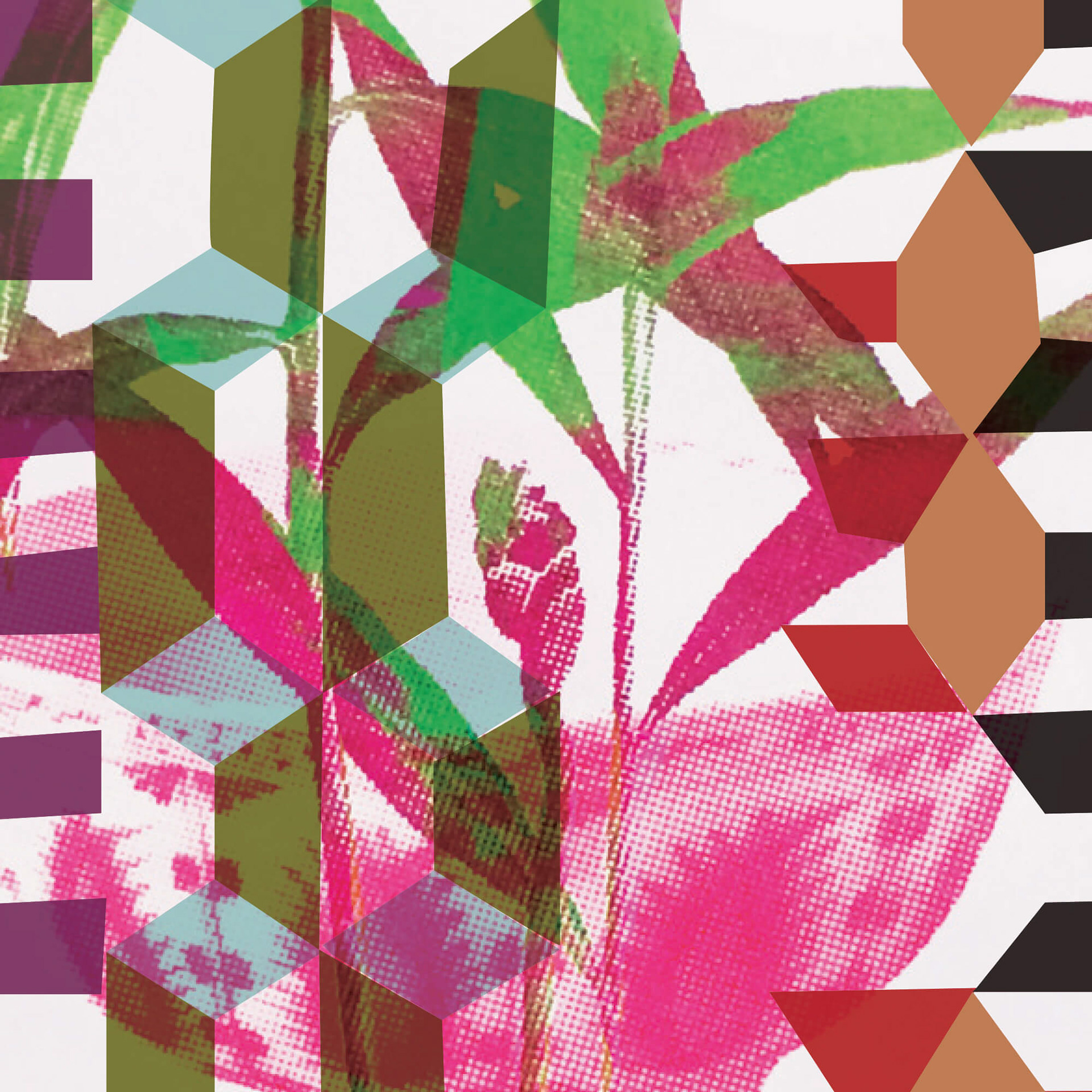
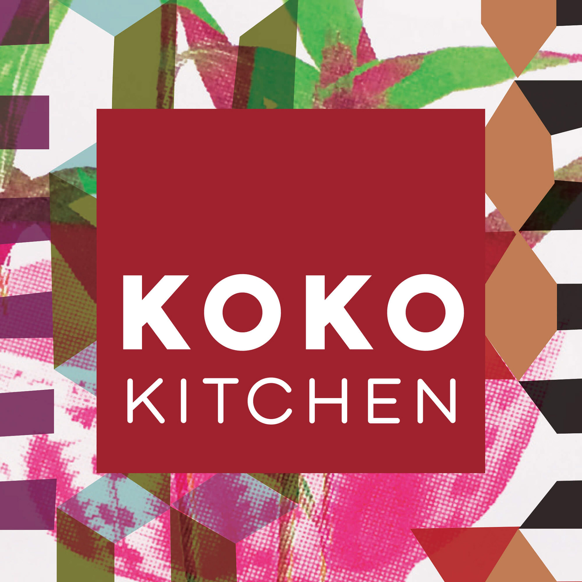
In reference to textiles from the Philippines and illustrations of coconut palm trees we created a unique recognizable pattern for the brand. In combination with the font Trade Gothic the branding distinguishes itself with a fresh and modern look and feel from other similar products imported from South East Asia.
In reference to textiles from the Philippines and illustrations of coconut palm trees we created a unique recognizable pattern for the brand. In combination with the font Trade Gothic the branding distinguishes itself with a fresh and modern look and feel from other similar products imported from South East Asia.
We stayed true to our original concept for the rest of the branding, creating a recognizable and clear signature across all touch points of the brand.
Currently we are working on textile designs for towels, dishcloths and aprons.
LOGO
With the idea that the expressive patterns would play a dominant and important role on all the products and their packaging, we kept the logo simple and pragmatic. A red square with the company name written in two lines, as knockout, works well on labels and other printed material alike.
With the idea that the expressive patterns would play a dominant and important role on all the products and their packaging, we kept the logo simple and pragmatic. A red square with the company name written in two lines, as knockout, works well on labels and other printed material alike.
