WHAT THEY DO
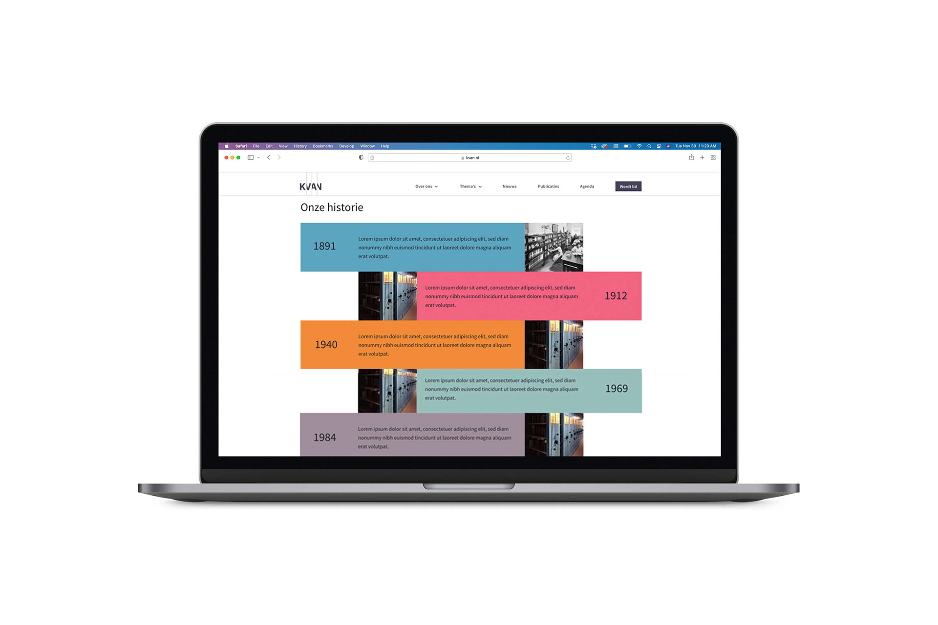
The Royal Association of the Archives Sector of The Netherlands (KVAN) is the professional organization of professionals in the archive sector. The KVAN is the oldest professional association of archivists in the world and was founded in 1891.
The Royal Association of the Archives Sector of The Netherlands (KVAN) is the professional organization of professionals in the archive sector. The KVAN is the oldest professional association of archivists in the world and was founded in 1891.
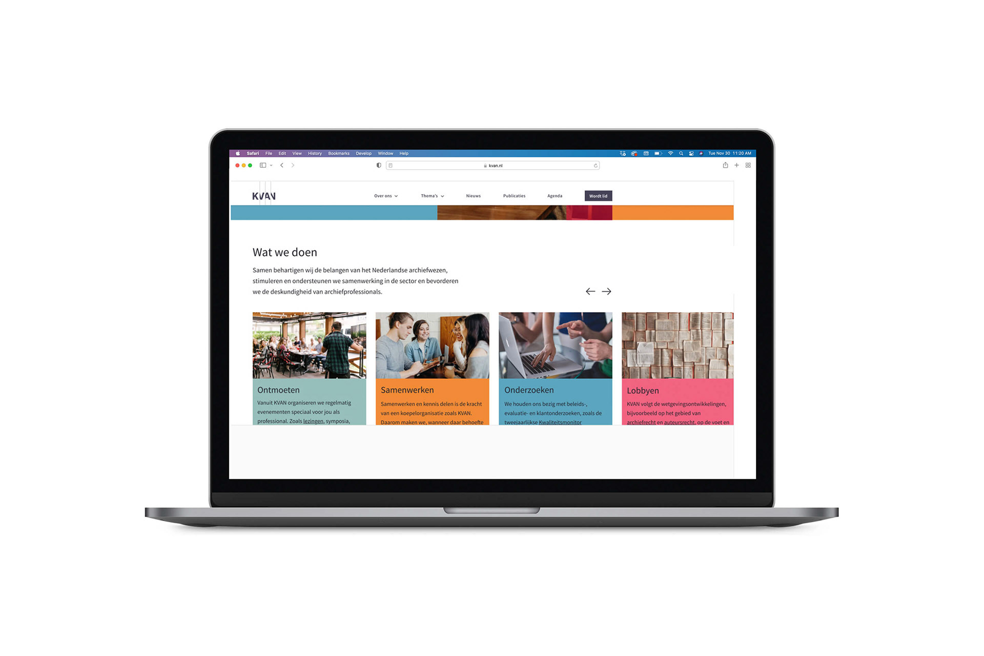
As organization the KVAN represent the interests of the Dutch archive system, they stimulate and support cooperation in the sector and promote the expertise of archive professionals.
WHAT WE WERE ASKED TO DO
The old visual identity of KVAN did not match the vision of the future and the current principles. As national Dutch organization, the KVAN want to be the authority in The Netherlands in the field of knowledge development, the transfer of knowledge and also the source of information for the archive sector.
KVAN promotes interests and encourages collaboration within the archive function and is also the guardian of quality. These are the new goals and interests of the organization that need to reflect their branding. xSITE was asked to develop a new identity and branding to have these goals and interests in mind.
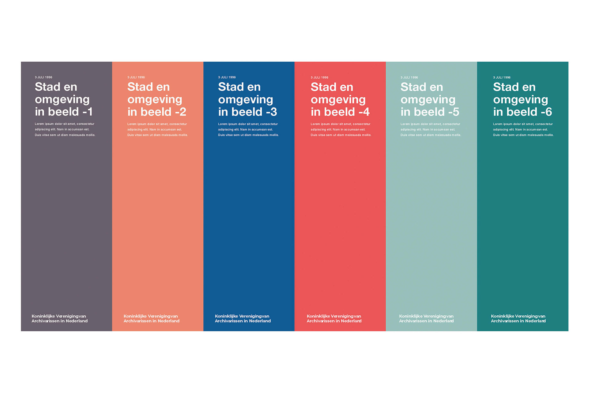
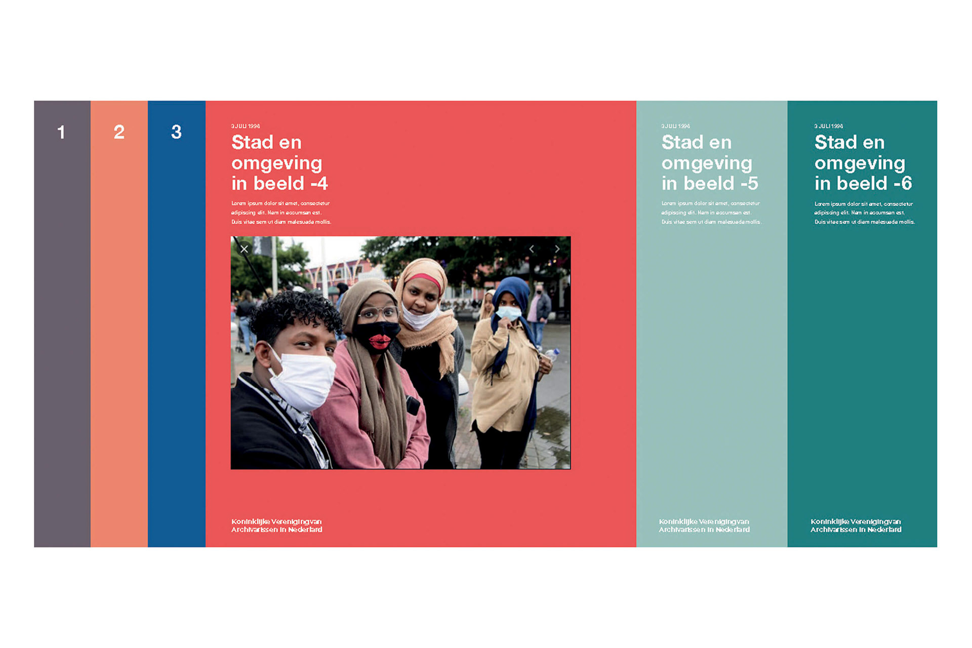
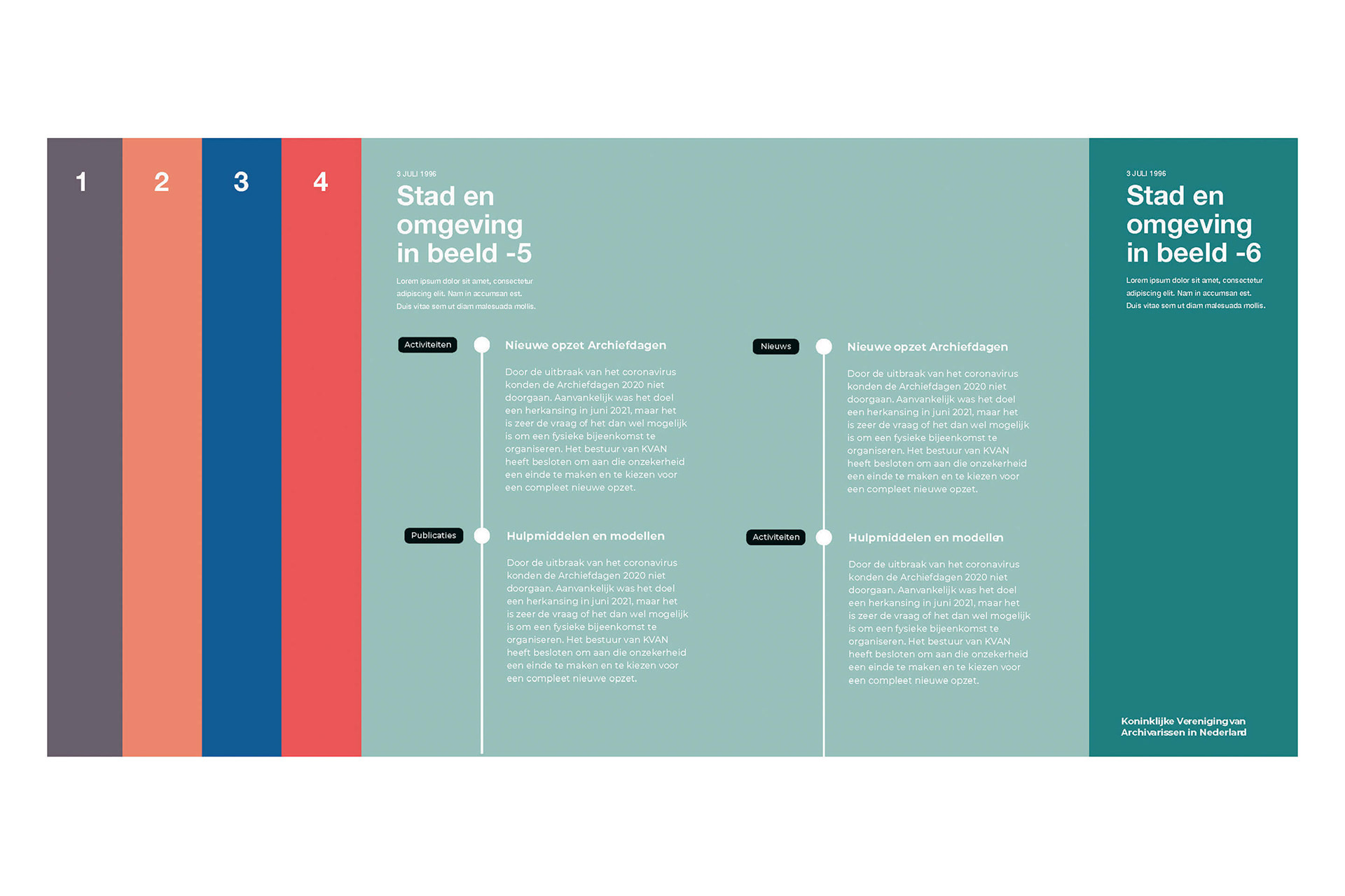
STRATEGY AND DESIGN: SLIDING DOORS
Our strategy and design is based on the “Sliding Doors” effect of opening and closing. Using this effect we are organizing information and are highlighting the following:
– Storing, organizing and disclosing information
– Organize and share knowledge and people
– Timeline, acquiring knowledge through different times
– Transparency and accessibility
– Building (building archive and building relationships)
– Connect
– Authority in The Netherlands
– Storing, organizing and disclosing information
– Organize and share knowledge and people
– Timeline, acquiring knowledge through different times
– Transparency and accessibility
– Building (building archive and building relationships)
– Connect
– Authority in The Netherlands
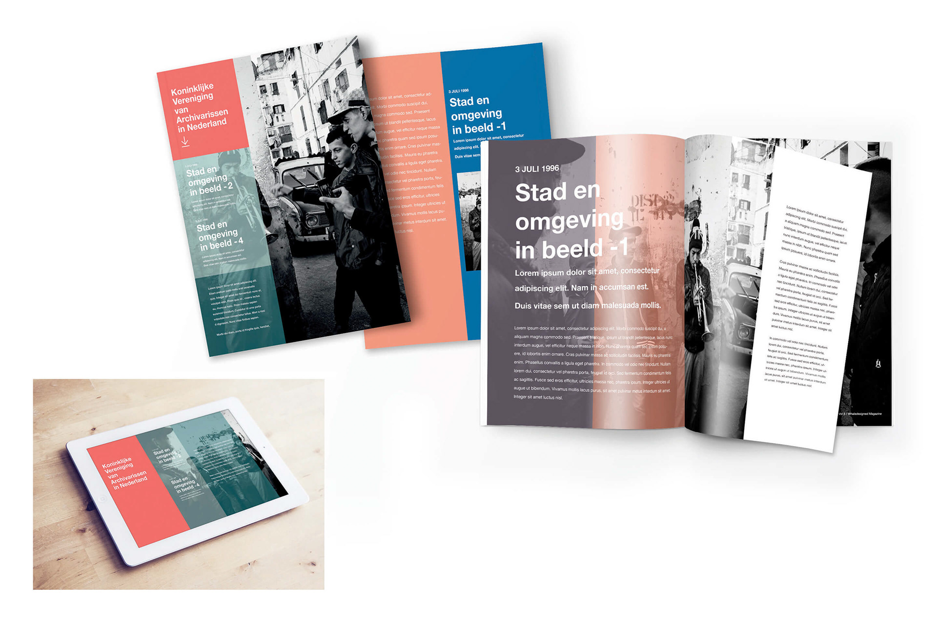
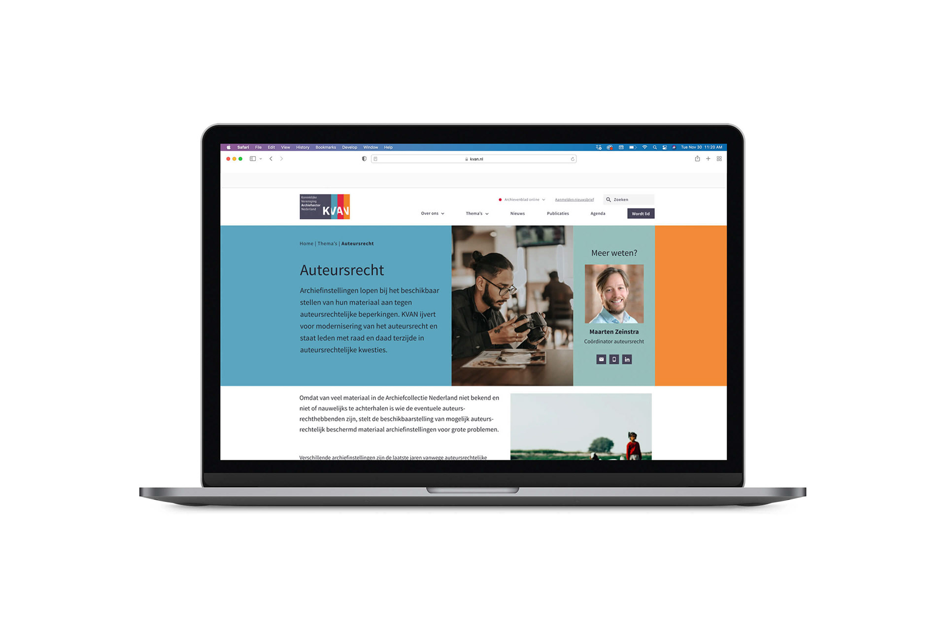
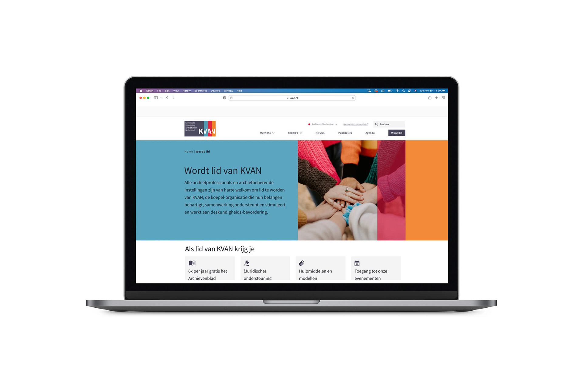
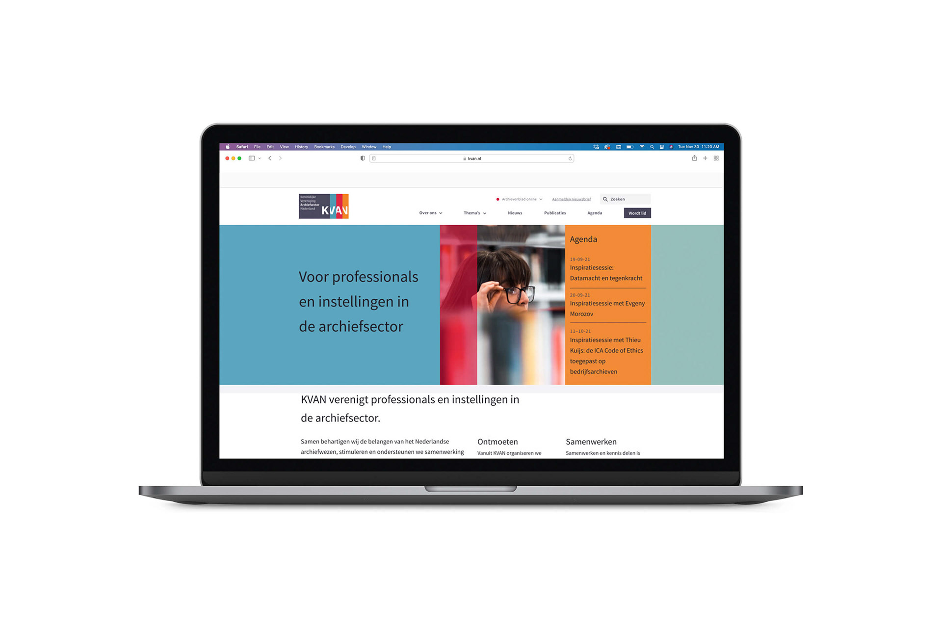
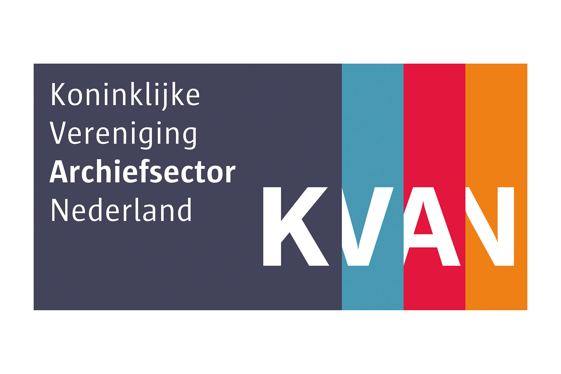
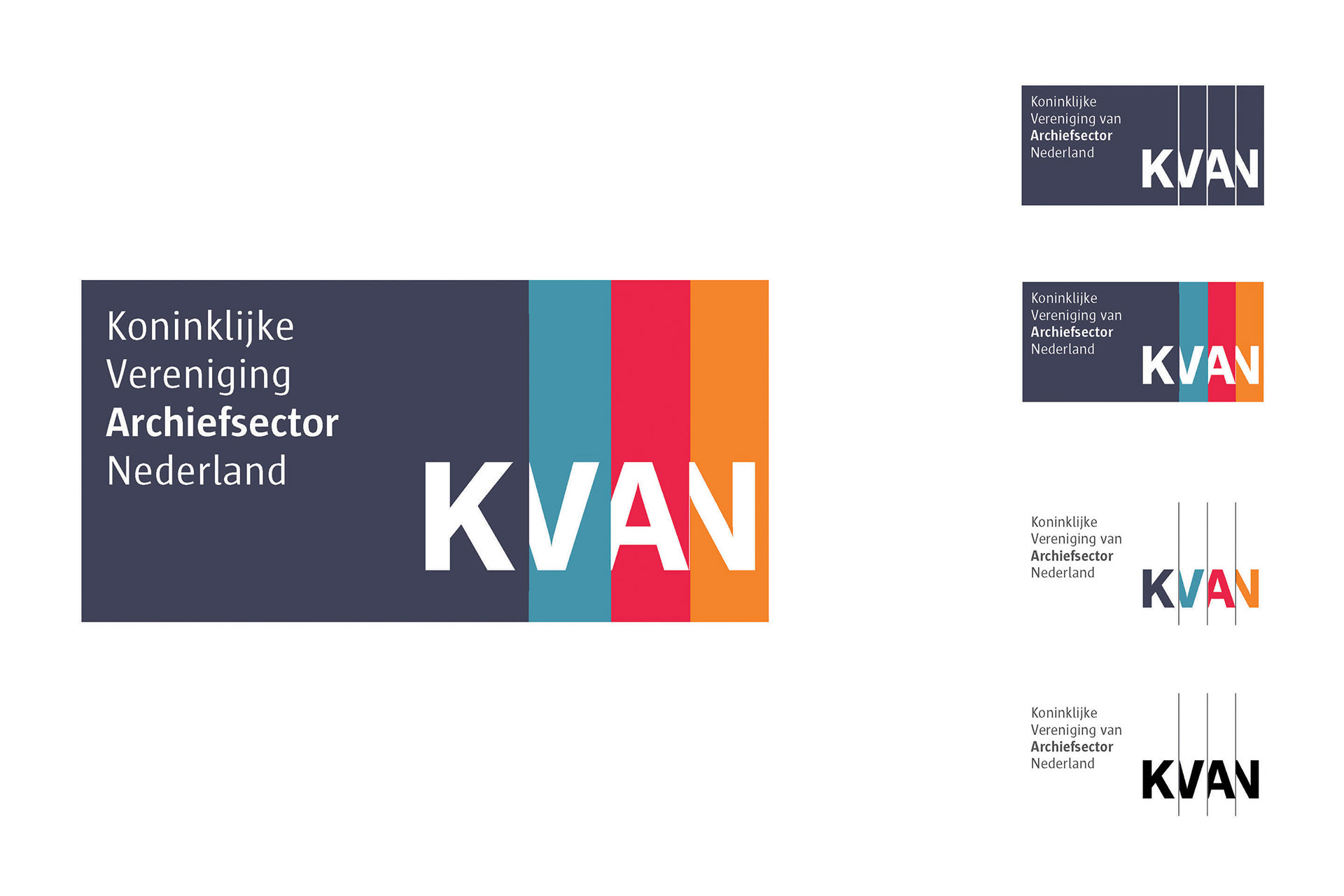
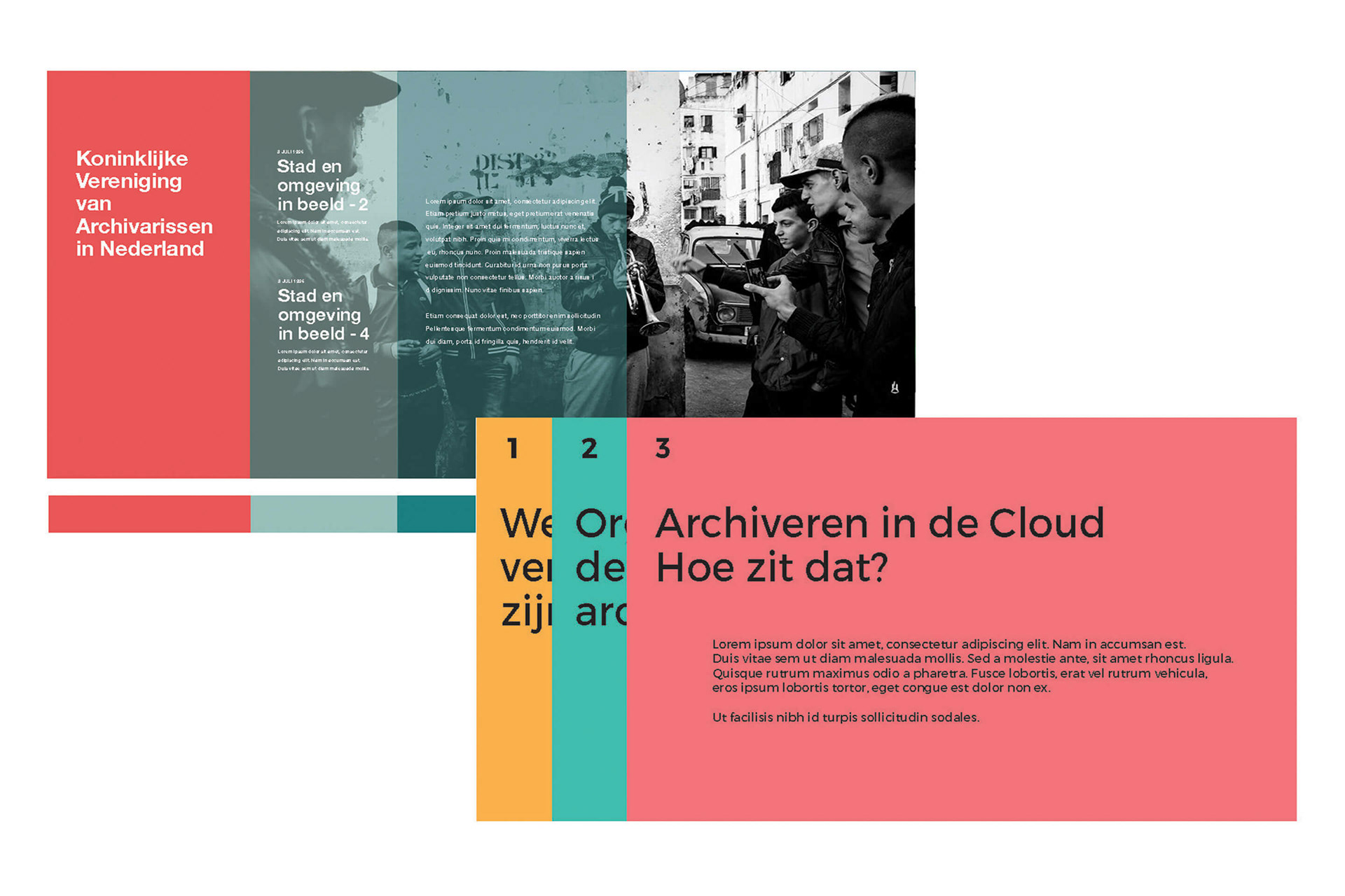
For the logotype the idea of “Sliding Doors” was taken up by hiding part of each individual letter of the letter combination K V A N behind a color block or a thin line. This treatment gave the logotype the illusion of sliding each letter of the organization name, which ultimately transformed into a static animation.
The same design idea works with information blocks. This is visible in the different branding items in print and digital. Working with this sliding concept we added transparency to the branding tools to achieve a dimensional value and another visual exploration to opening up.