WE BELIEVE BEFORE OTHERS UNDERSTAND
Lux Capital is looking for leaders with a vision, who see a radically different future and know how to make it happen. It’s about the big idea and the big brains behind them. They partner with companies and founders in effort to change the world, who want to upend paradigms, not just chase incremental progress.
Lux Capital is looking for leaders with a vision, who see a radically different future and know how to make it happen. It’s about the big idea and the big brains behind them. They partner with companies and founders in effort to change the world, who want to upend paradigms, not just chase incremental progress.
Lux Capital takes bets on frontier ideas that many firms tend to shy away from, as the opportunities are so novel and exist so close to the edge of what’s possible. With the idea that in order to have the biggest impact on the future, one should support the most scientifically and technologically ambitious ventures. Investing in companies that see radical potential in what they do.


THE CHALLENGE
How do you position a financial venture capital firm? The venture capital sector is a fast growing industry one and challenging to create a new way of presenting this expertise in this space. Lux Capital is a frontier investment firm, providing early-stage lead investment support to a wide range of once-impossible-sounding advancements. Their key competitor’s brands are predominantly black, navy and gray. These brands follow a traditional aesthetic that remains conservative across the board. Lux Capital needed to stand out but in an unusual, yet confident and meaningful way that reflects not only their values, personality, and style, but importantly resonates with their vision – bringing together the sharpest minds and most advanced technology.
THE SOLUTION: A RADICAL VISION TO CAPITAL
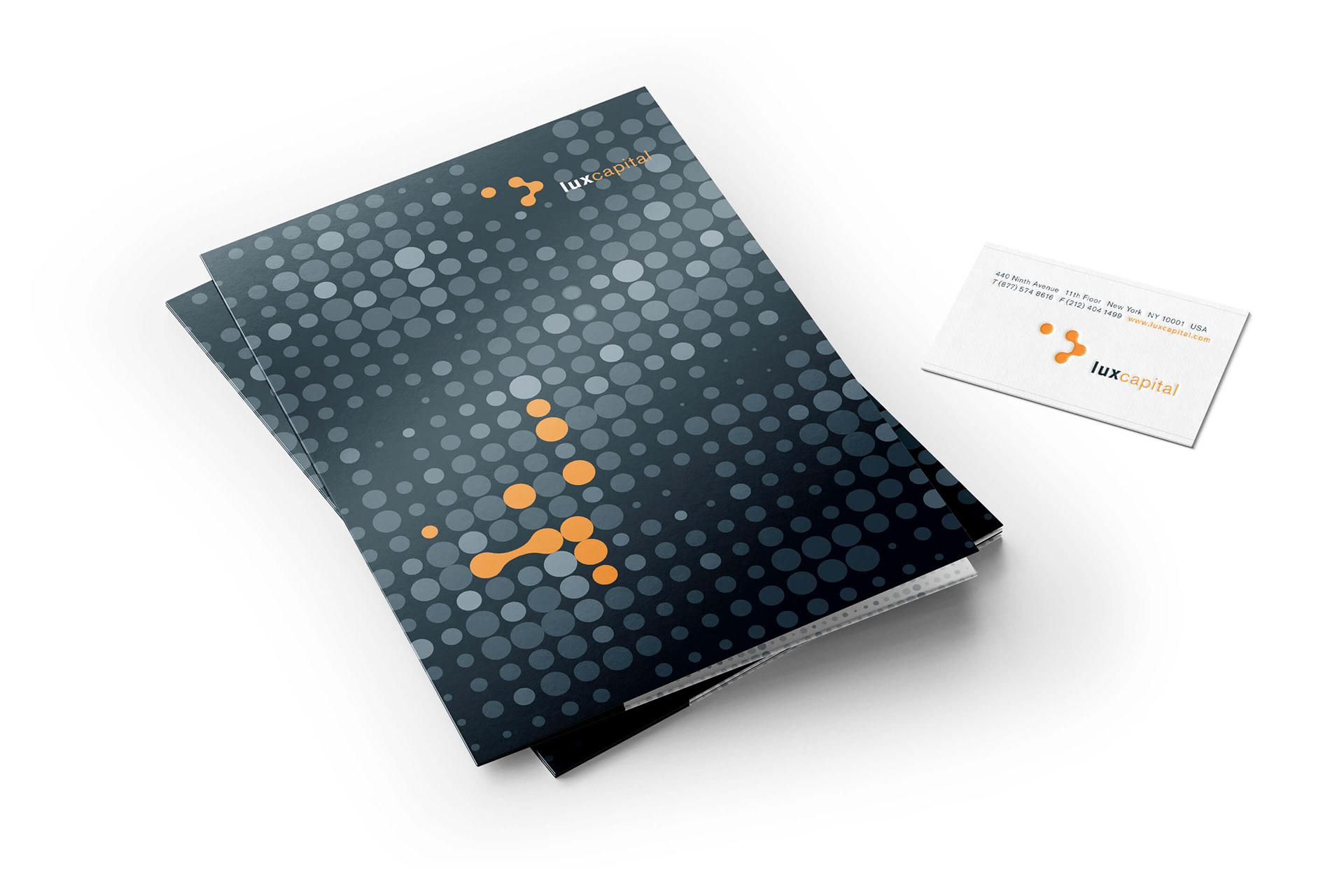
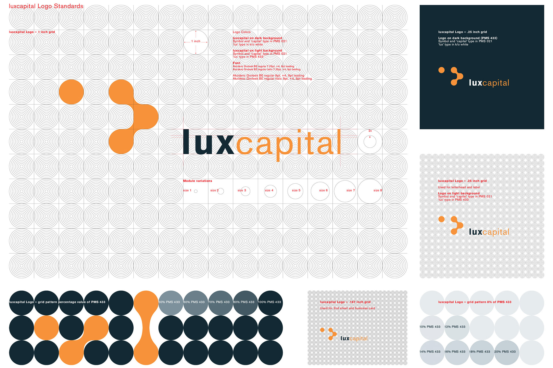
xSITE was at the beginning of this startup and helped them to visualize this idea by giving future oriented branding tools. We created a logo that was based on a changing fluid animated pattern of dots. Different sized dots on a strict grid appear interactive and fluid. Enhanced by color shades and round shapes the pattern is intended to give a futuristic space, with a multitude of application possibilities.
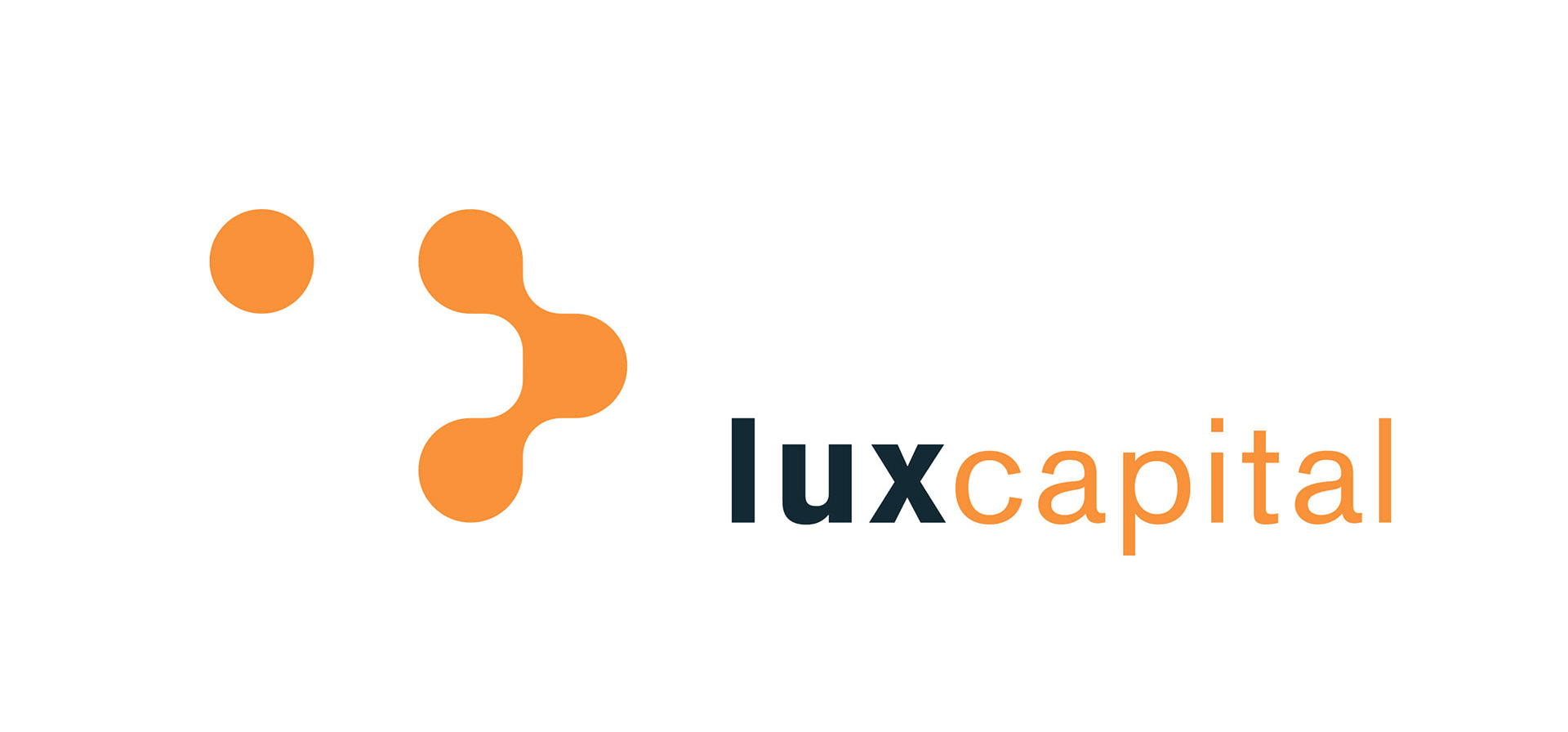
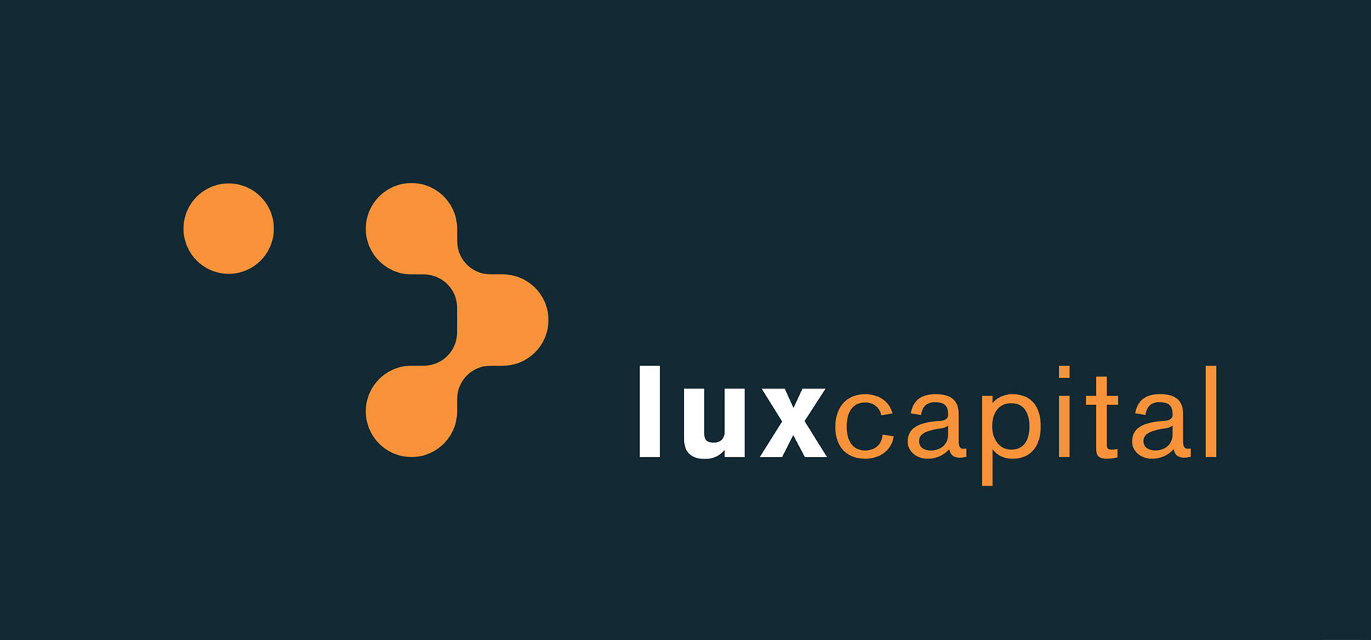
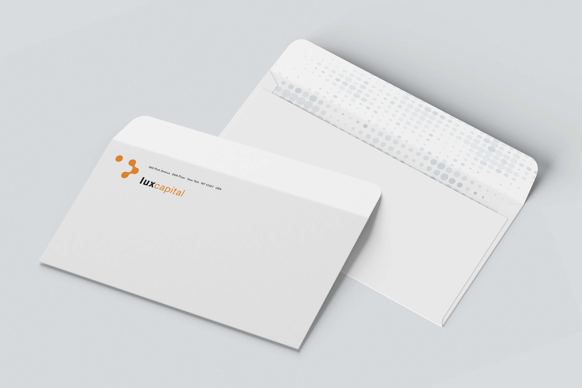
For the logo we merged the name, but divided the spelling into "lux" and "capital" by using font weight, size and color. Using the font Akzidenz Grotesk in all lower case it is positioned right to the logo. Logo and the word "capital" are always in orange, PMS 021. The word "lux" is in PMS 433 or k/o white depending on background color.
The branding was limited to stationary pieces only and was designed to add subsidiaries of future Lux ventures. For example Lux Research, the same approach but in a different color to set it apart and give it distinction.
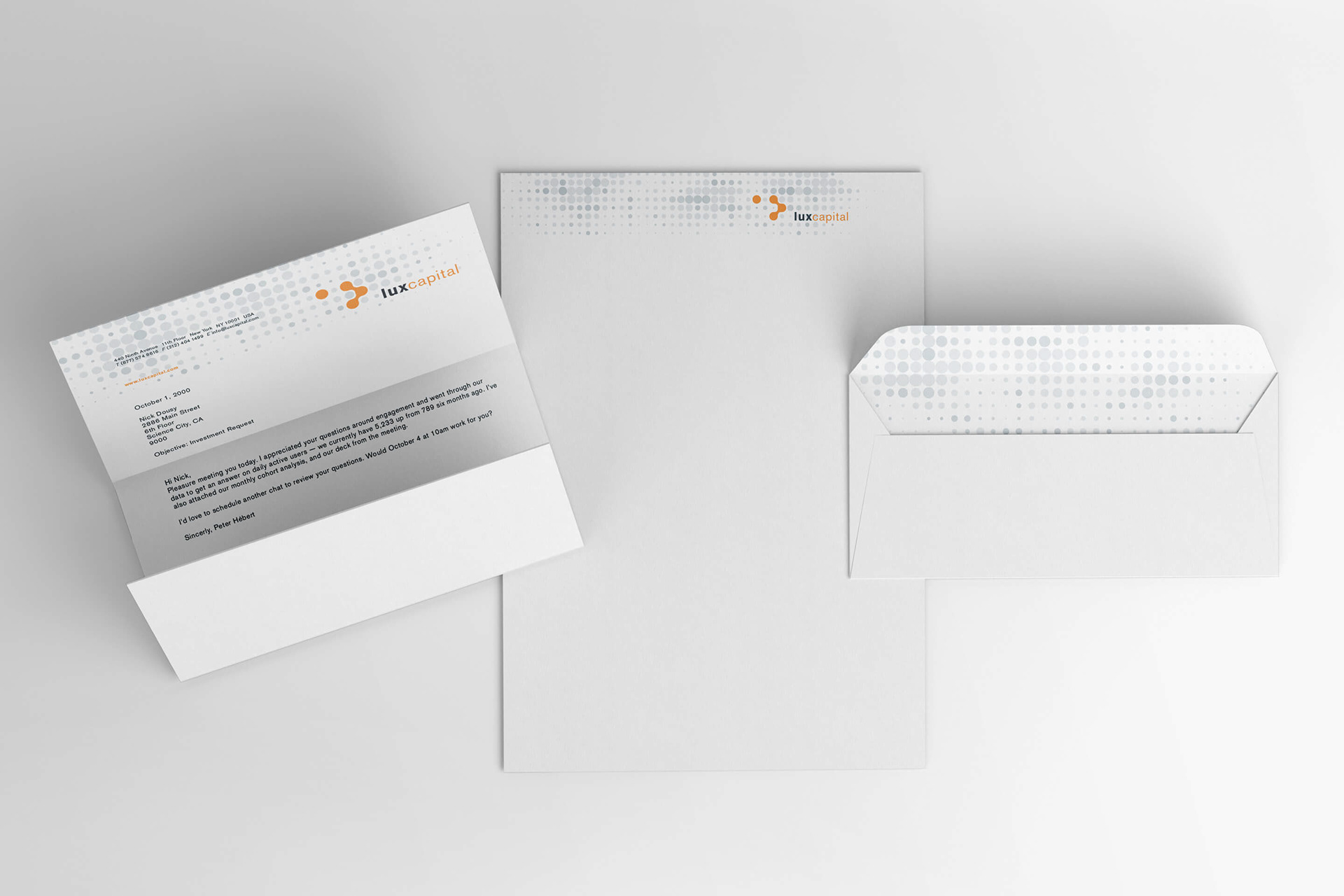
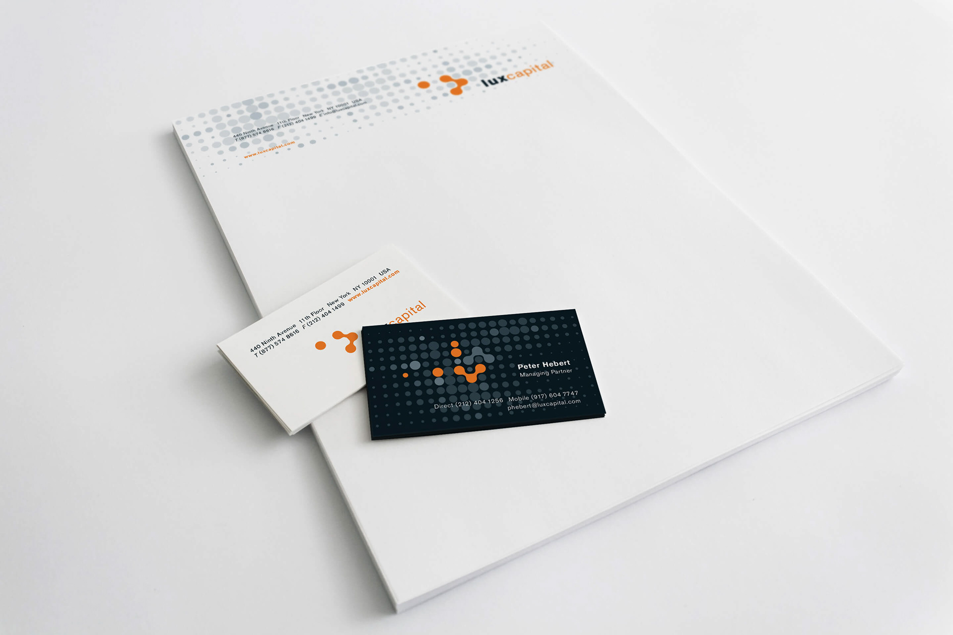
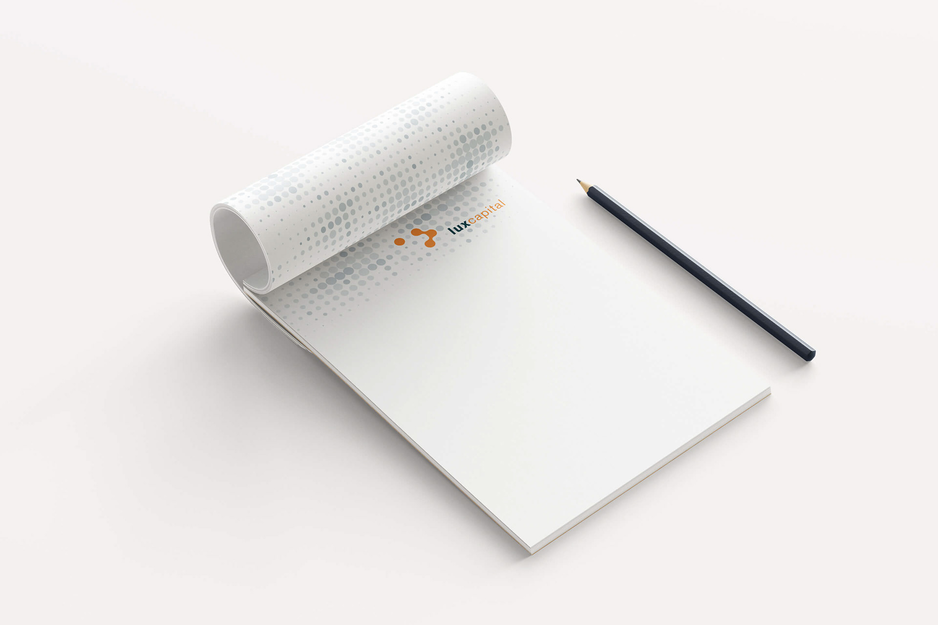
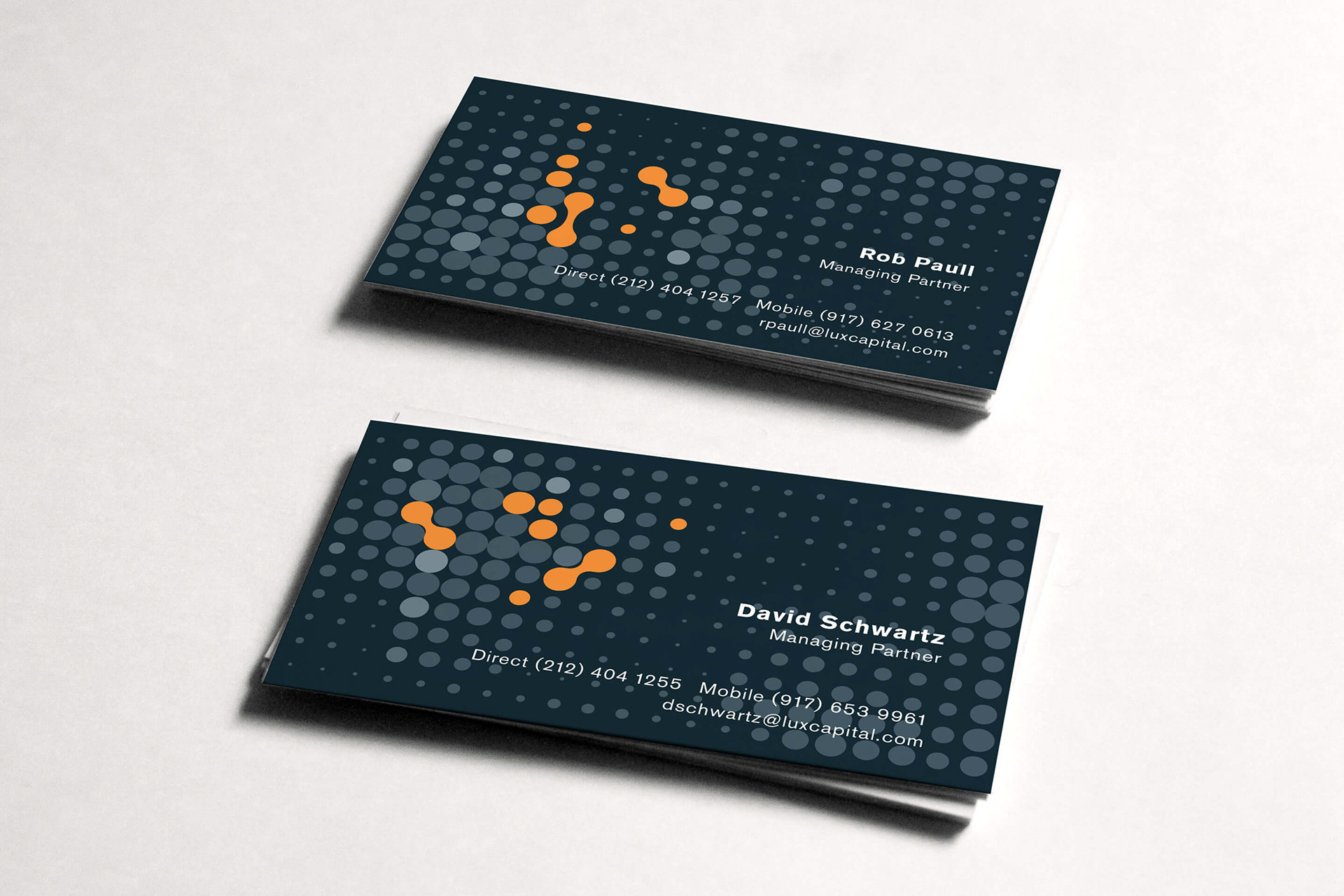

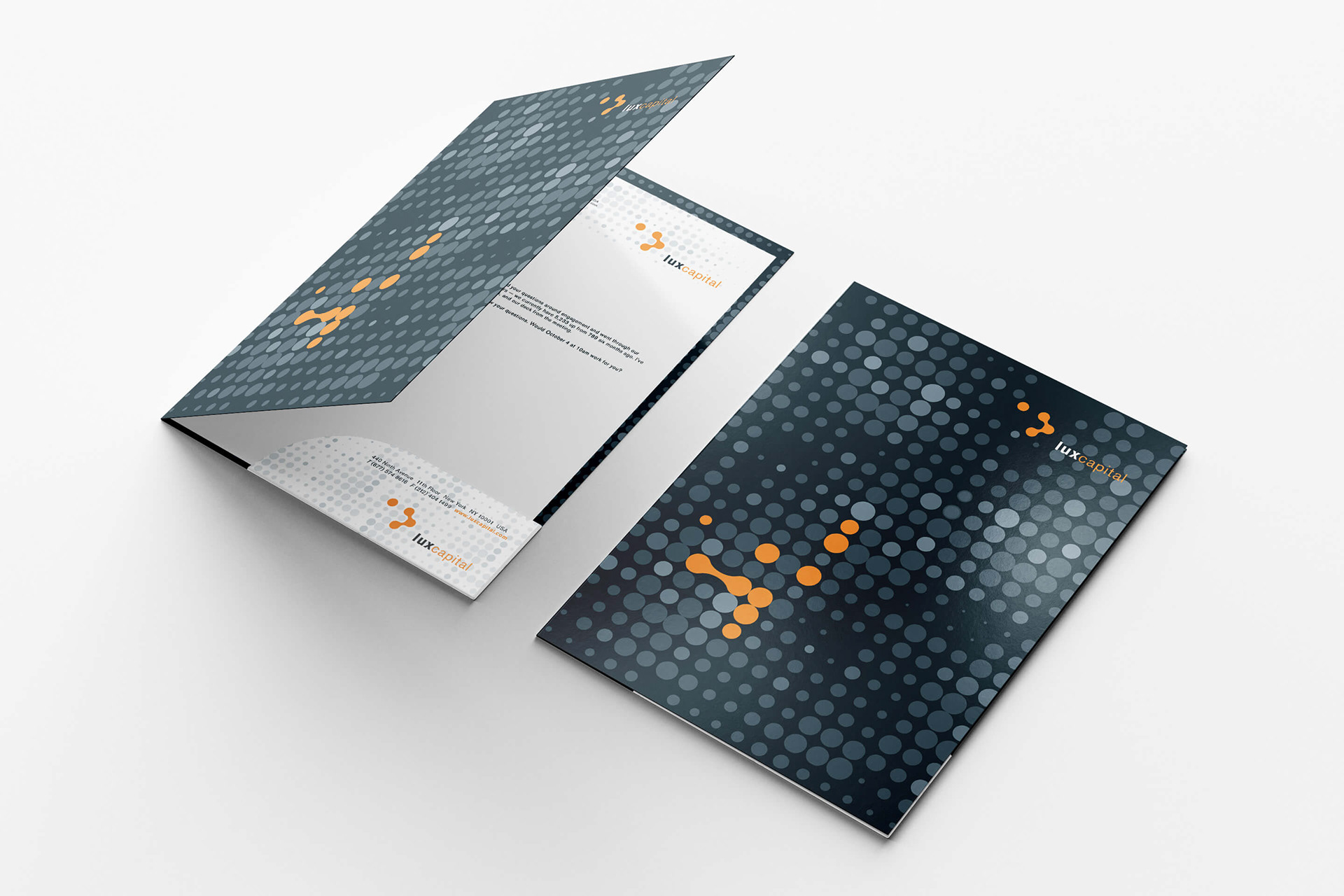
DESIGN ELEMENT: FLUID DOTTED PATTERN
The Lux Capital fluid pattern, an arrangement of different sized dotted, can change depending which item is used. Individual slate colored dot compositions, together with the fluid merged orange dotted shaped form the base for unique visual combinations. Each printed item has a specific pattern combination that speaks the branding language of Lux Capital. The fluid dotted pattern evokes a scientific approach and advanced high-tech ambition. In its ever evolving use, the visual result is breaking up static forms and conventional thinking. That is the criteria most identifying to Lux Capital.