WHAT THE ORGANIZATION STANDS FOR
The Dutch Association of Dietitians is committed to high-quality dietetics and responsible for the interests of dietitians.
The Dutch Association of Dietitians is committed to high-quality dietetics and responsible for the interests of dietitians.
Together with the members of the organization, they continuously draw attention to the importance of the dietitian in illness, health and quality of life.
WHAT WE WERE ASKED TO DO
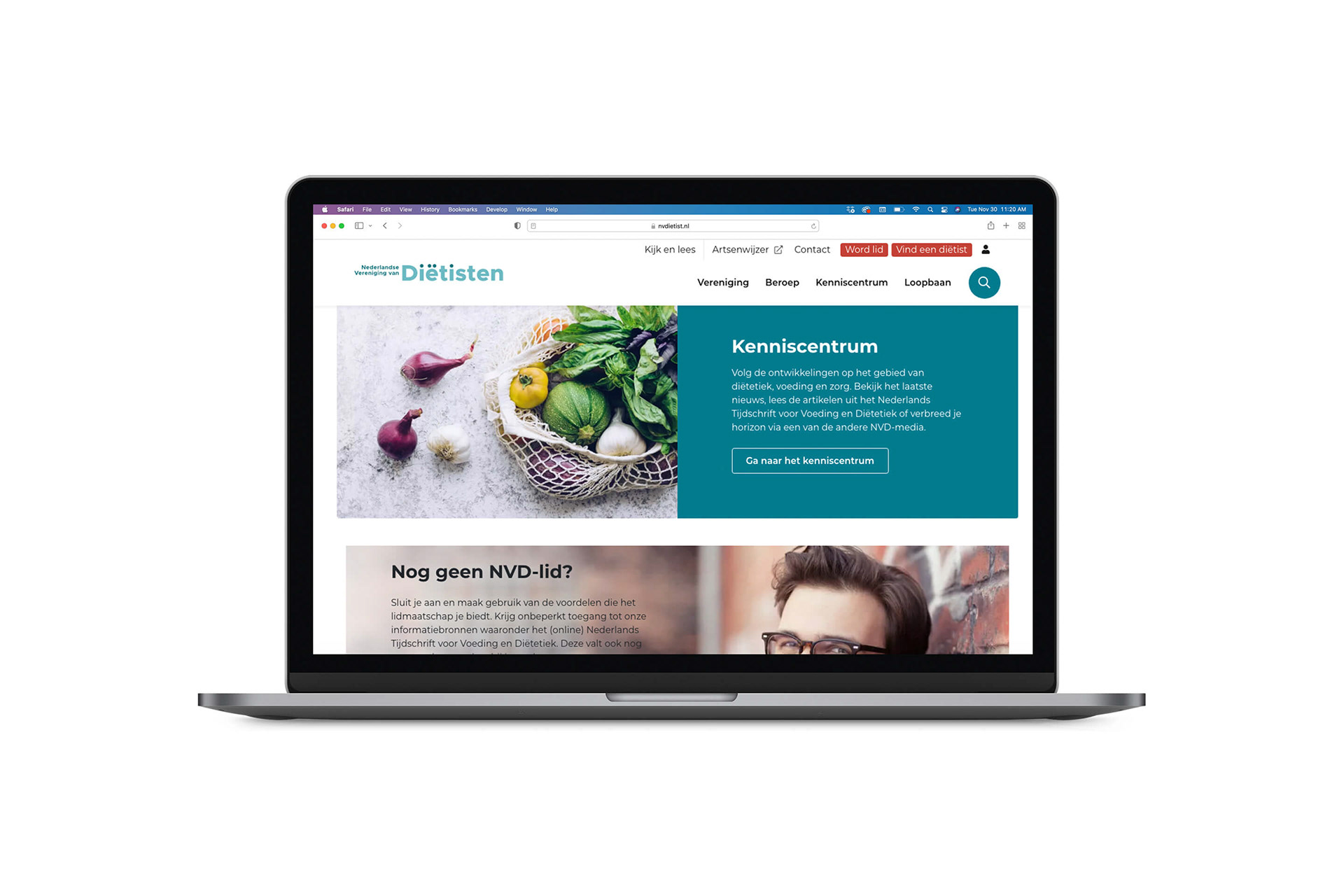
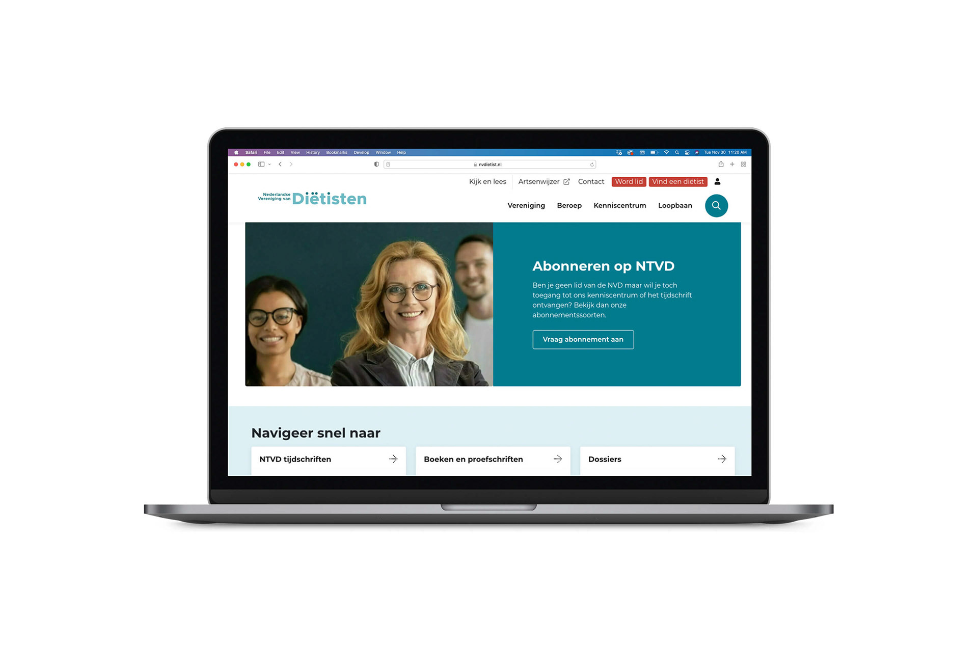
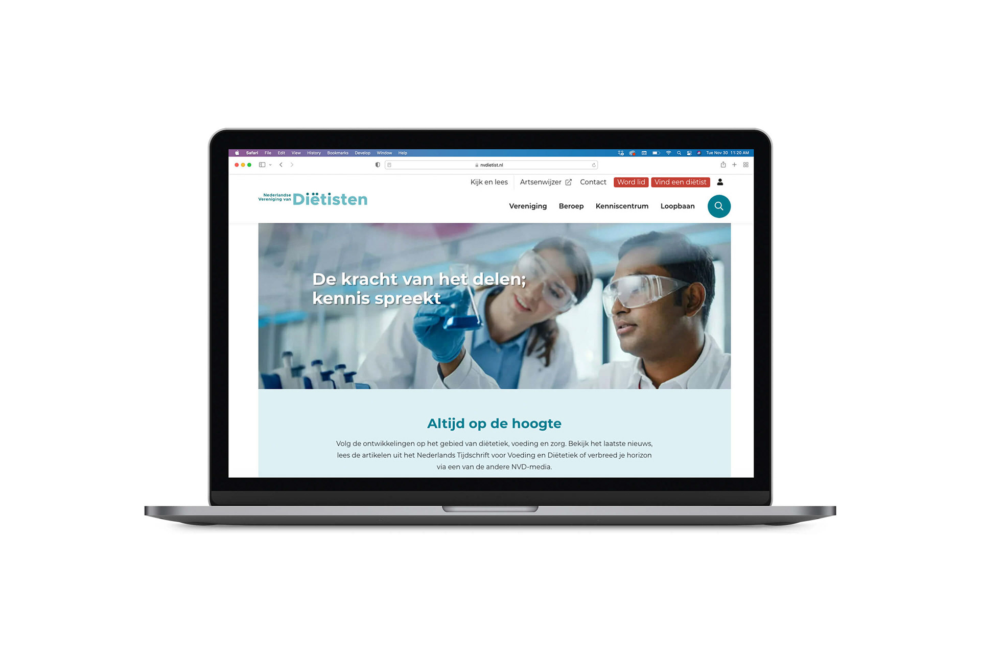
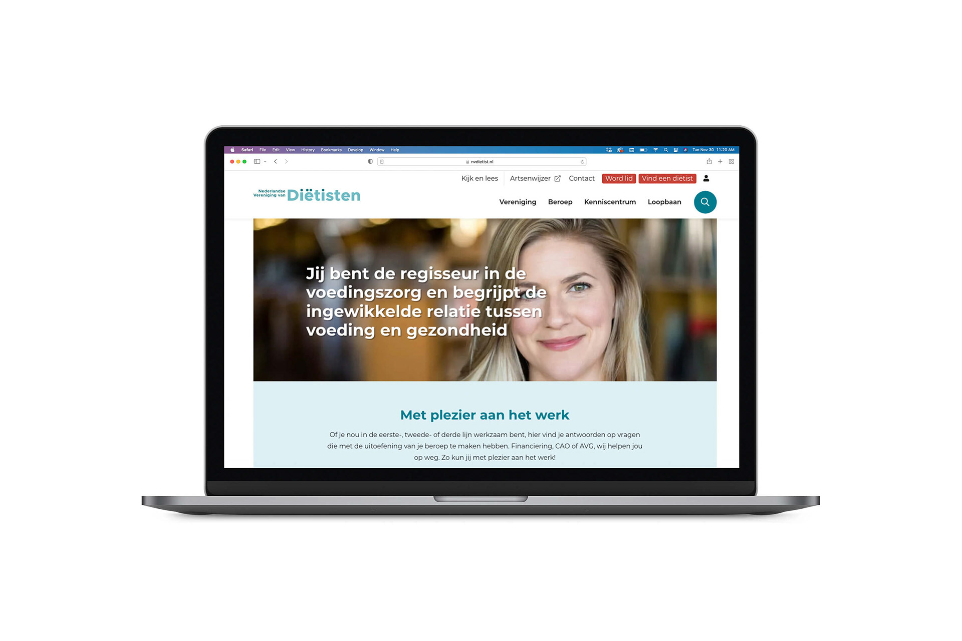
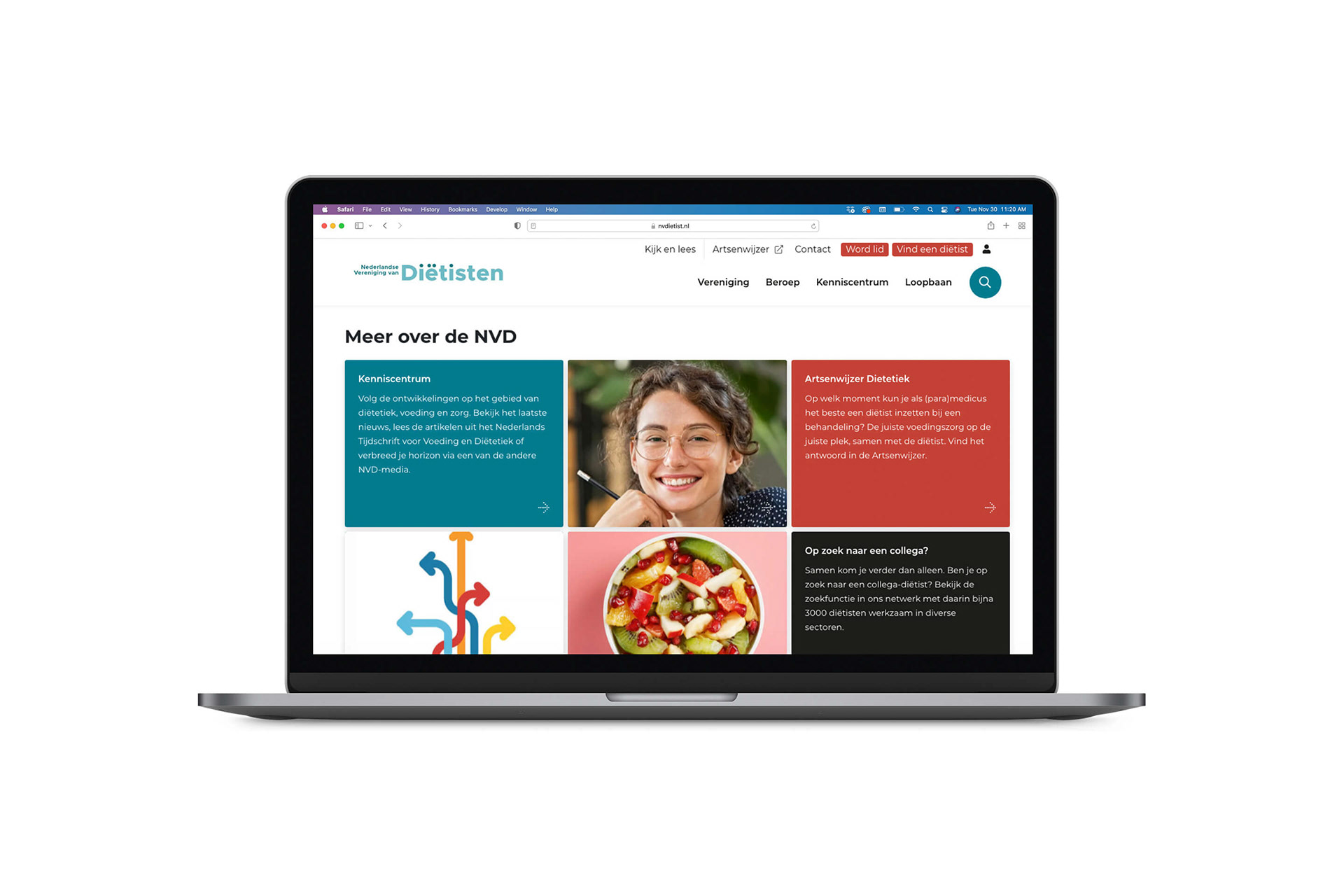
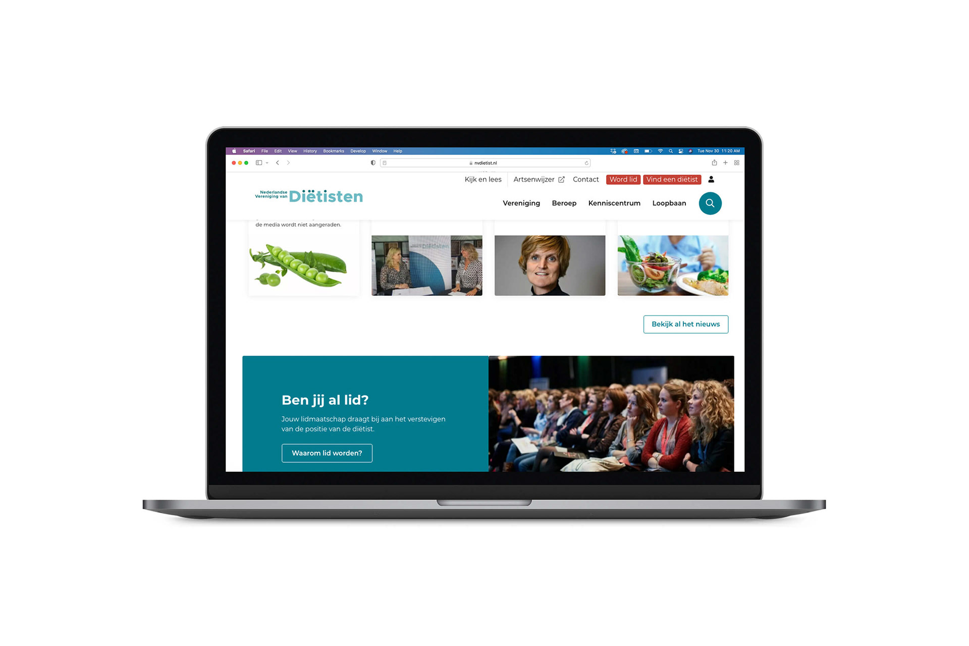
The association used the abbreviation NVD as its name. However the use of this abbreviation was not accessible, was hard to recognize and not transparent. In the years the website was very outdated and with the multitude of new content required a new approach.
STRATEGY
STRATEGY
Nutrition, dietetics and lifestyle are important factors within health care and the social domain. The dietitian's position as a pivot in this domain is essential. In order to be able to take on this role in the right way, it is important to continuously develop the quality of the work and the profession.
DESIGN: CONNECTING THE DOTS
For the word logotype we have chosen to write out the name completely: ”Nederlandse Vereiniging van Diëtisten”. Simple and very clear for the organization in order to be able to site at one table with important stakeholders. For everyone recognizable and easy to understand who they are dealing with.
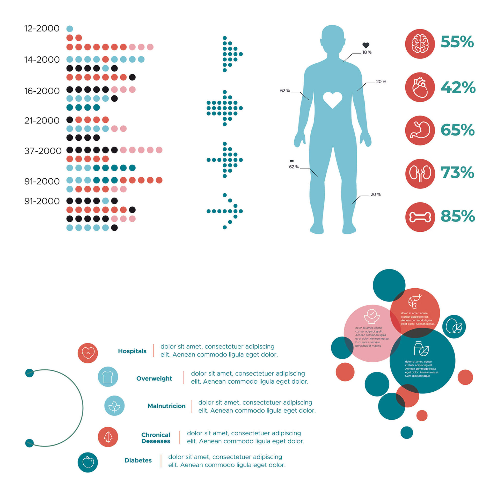
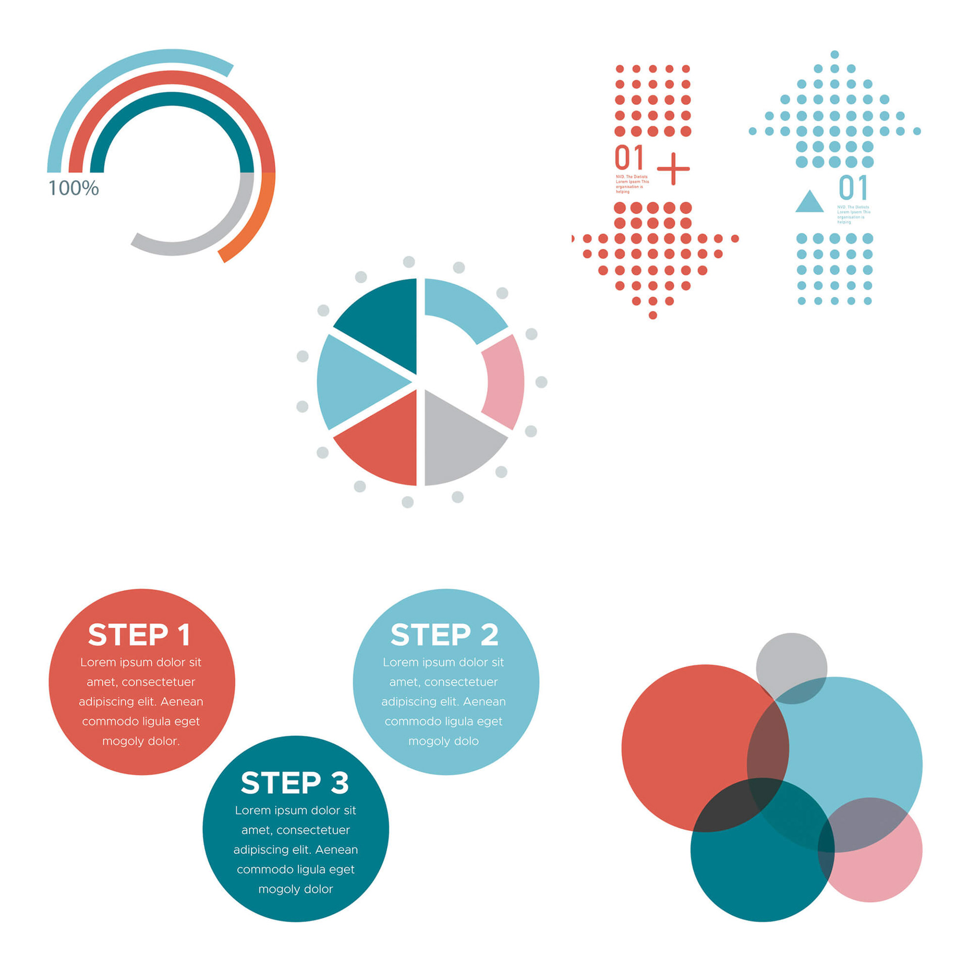
From a typographical point of view, it immediately became clear that the Dutch spelling of the word dietitians (diëtisten) contains four dots. These dots are used as visual elements and stand for “connecting the dots”. The association brings dietitians and nutritionists together and forms a professional network.
Especially in info-graphics one can clearly see how this visual language works. The dots can also be seen as the well-known step-by-step plan for clients of dietitians. The color blue is used for the paramedical scientific appearance.
