FIRST IN MOBILE VIDEO
oplayo is the world-leading provider of streaming video and rich media solutions for wireless devices. They have also been providing fixed internet video solutions. oplayo’s technology gives end-users an easy-to-use, “instant play” rich-media experience.
oplayo is the world-leading provider of streaming video and rich media solutions for wireless devices. They have also been providing fixed internet video solutions. oplayo’s technology gives end-users an easy-to-use, “instant play” rich-media experience.
Mobile operators, content providers, and content aggregators are developing mobile services built around video. oplayo has developed products that enables streaming of high quality video images over low speed networks of mid-range and low-end mass market phones. Together with its content creation tools, oplayo provides the most cost effective video streaming solution, and the only one that reaches the mainstream mobile markets.
Founded in 1996, oplayo is headquartered in Helsinki, Finland, with additional presence in London, Munich, and Prague.
THE CHALLENGE
The Streaming Video space is a vast landscape of different technologies that work within a common aesthetic. oplayo wanted a fresh and unique brand to reflect their expertise in providing streaming video solutions that can be enjoyed by a mass market audience and will engage, motivate and inspire. Our desire was to reflect this philosophy to give the brand the right framework for how their products work and connect with their users and importantly to create standout amongst other industry competitors.
THE SOLUTION: INTERACTION AND MOVEMENT
oplayo commissioned xSITE as its brand partner to elevate the brand in the globally competitive environment of video streaming and rich media technology. We developed a creative strategy and designed a new visual identity that sets them apart and confidently resonates across all touch points to connect with their variety of customers and attract new ones. This came to life through the ‘Control Buttons’ identity which became a key signifier, a simple but visually descriptive way to present their complex technology solutions effectively.
Based on the ‘Control Buttons’ everyone is familiar with in day to day life the message was simple and provided a easy reading process of the logotype. Using this interaction effect in combination with movement we had the organizing tools apply on the different branding items.
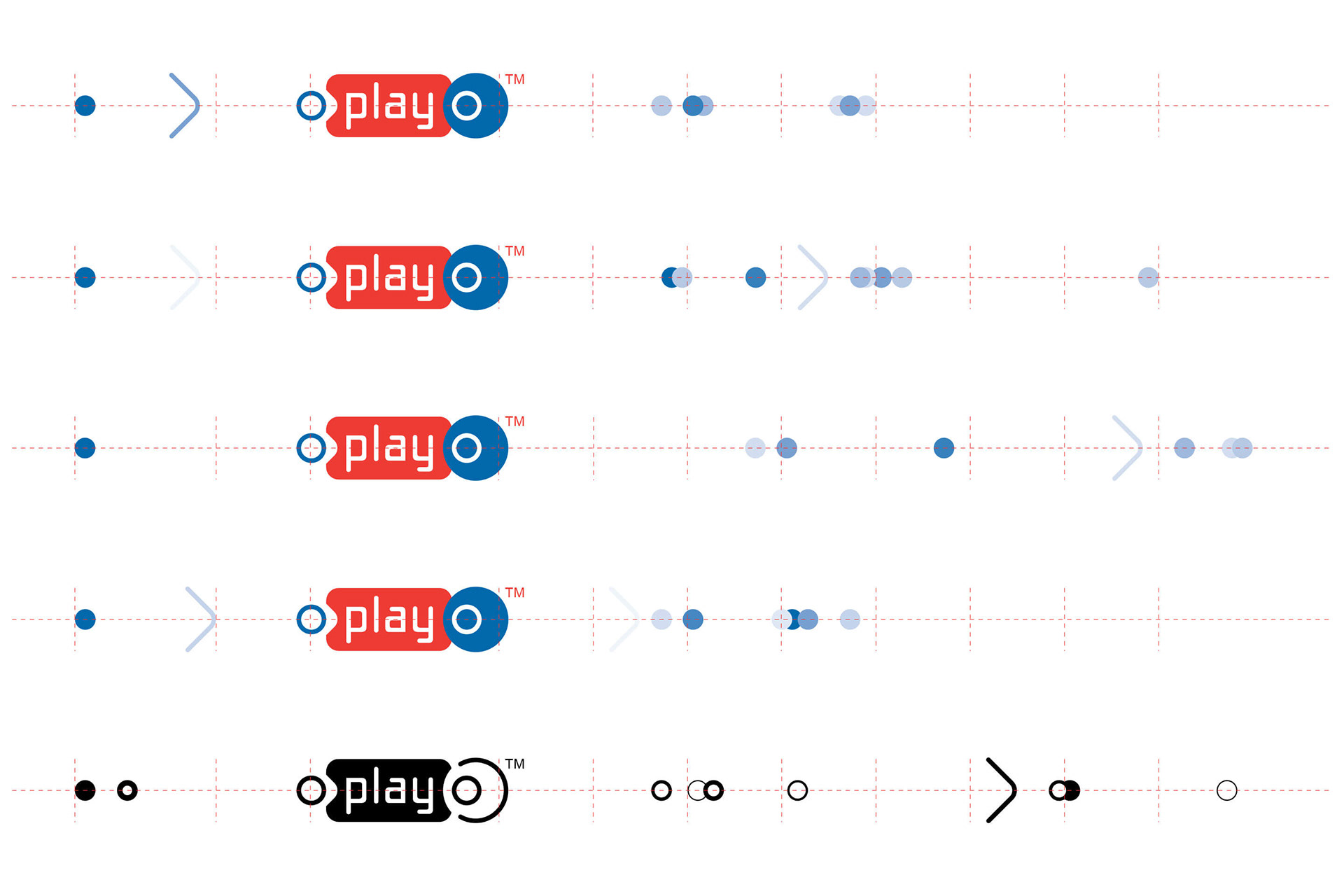

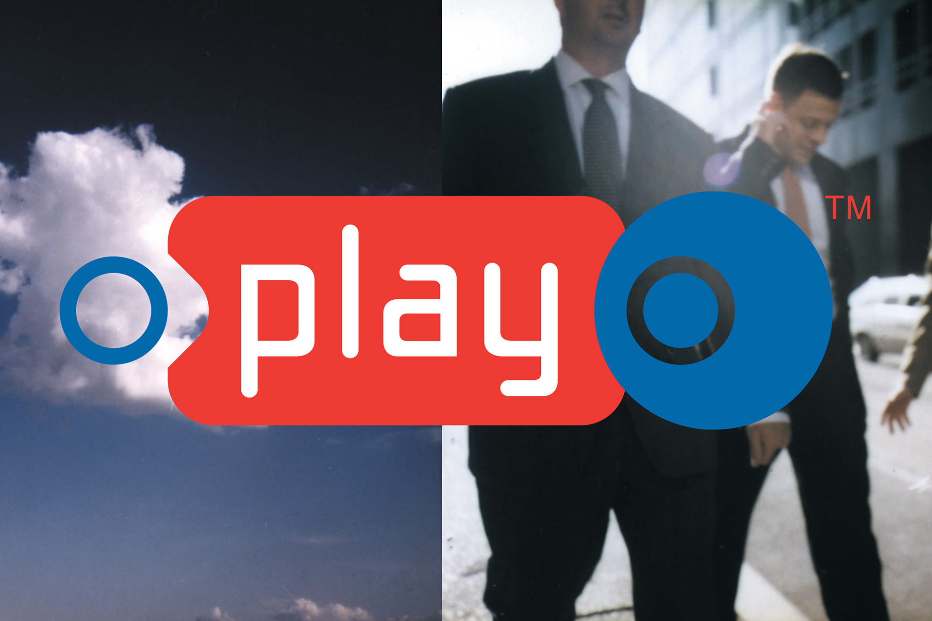
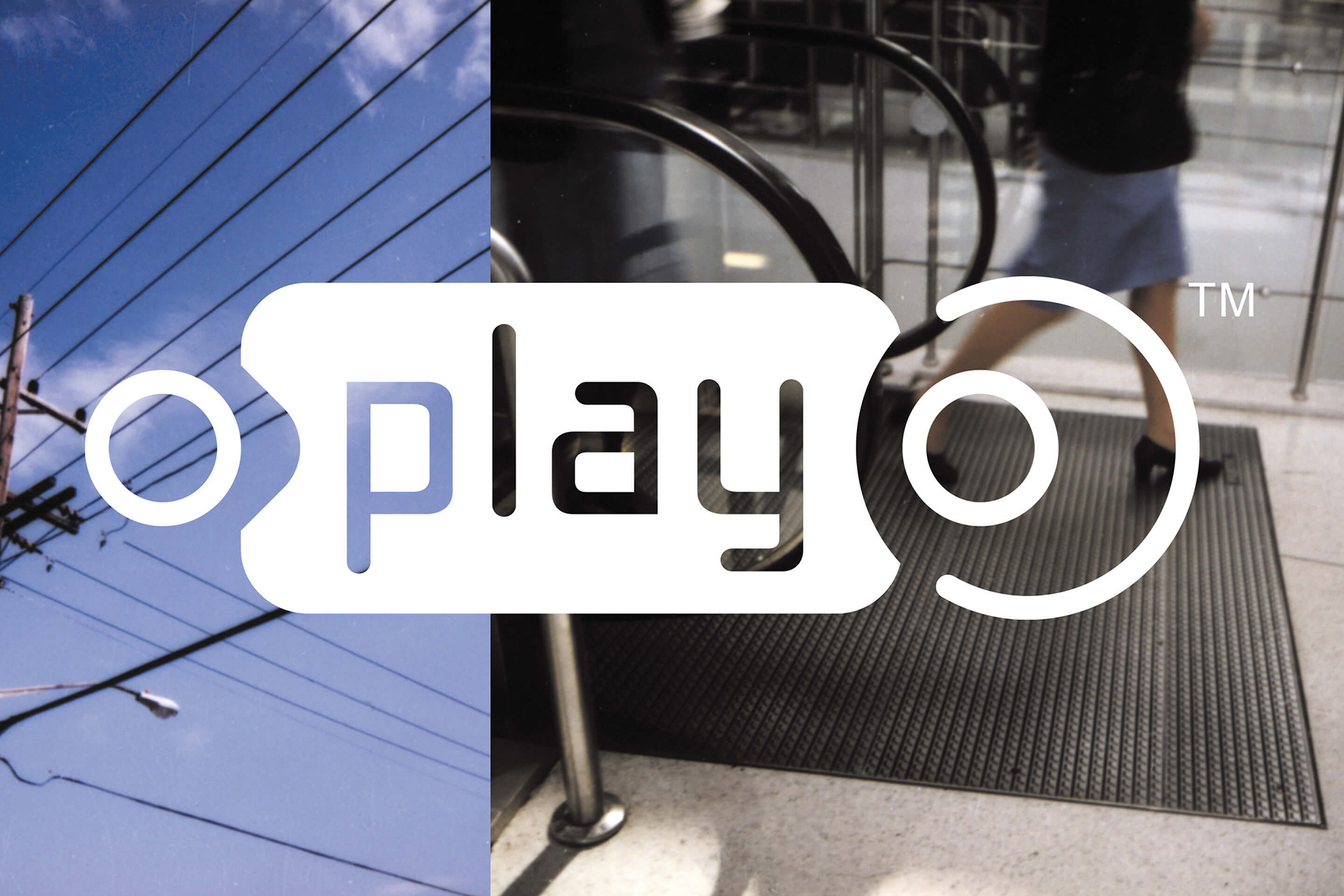
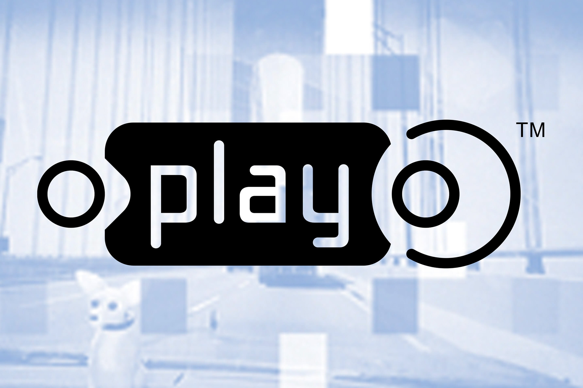
DESIGN ELEMENTS: MARKINGS
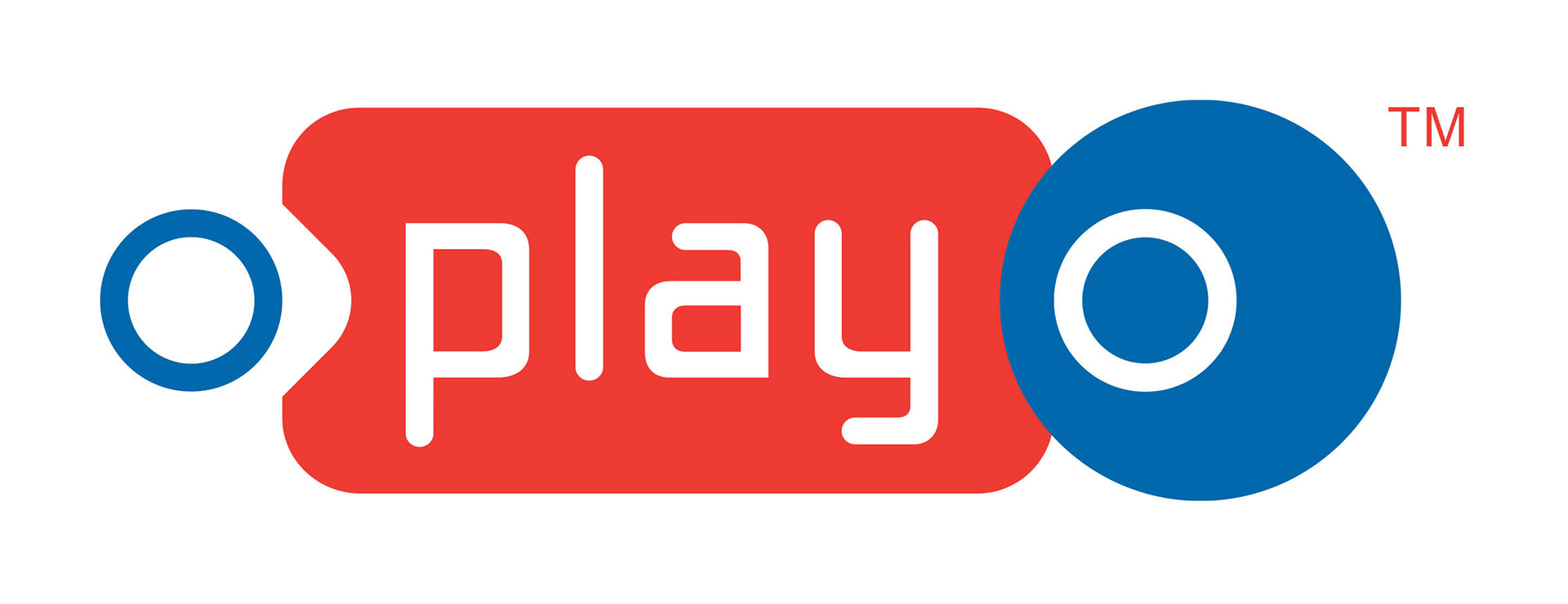
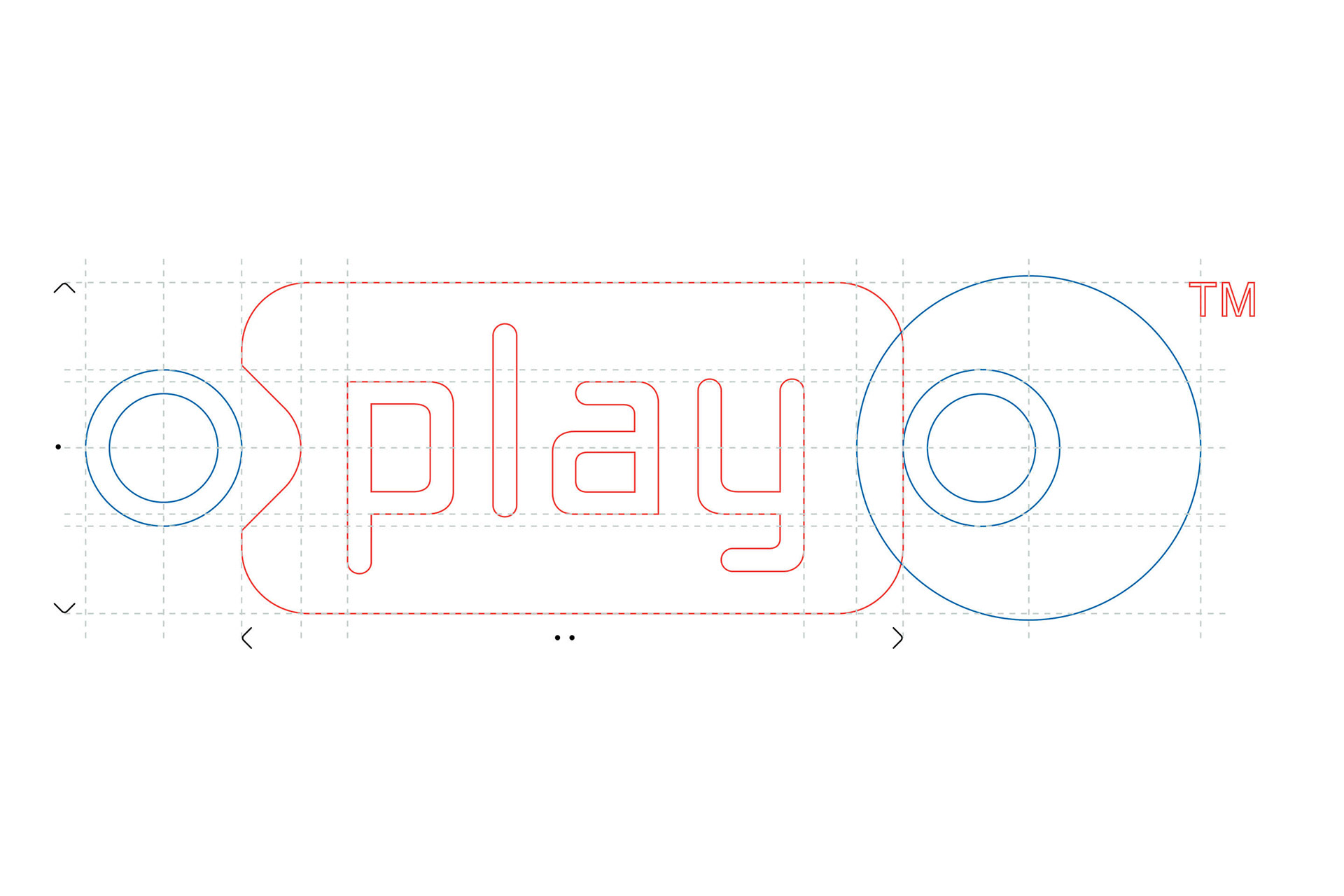
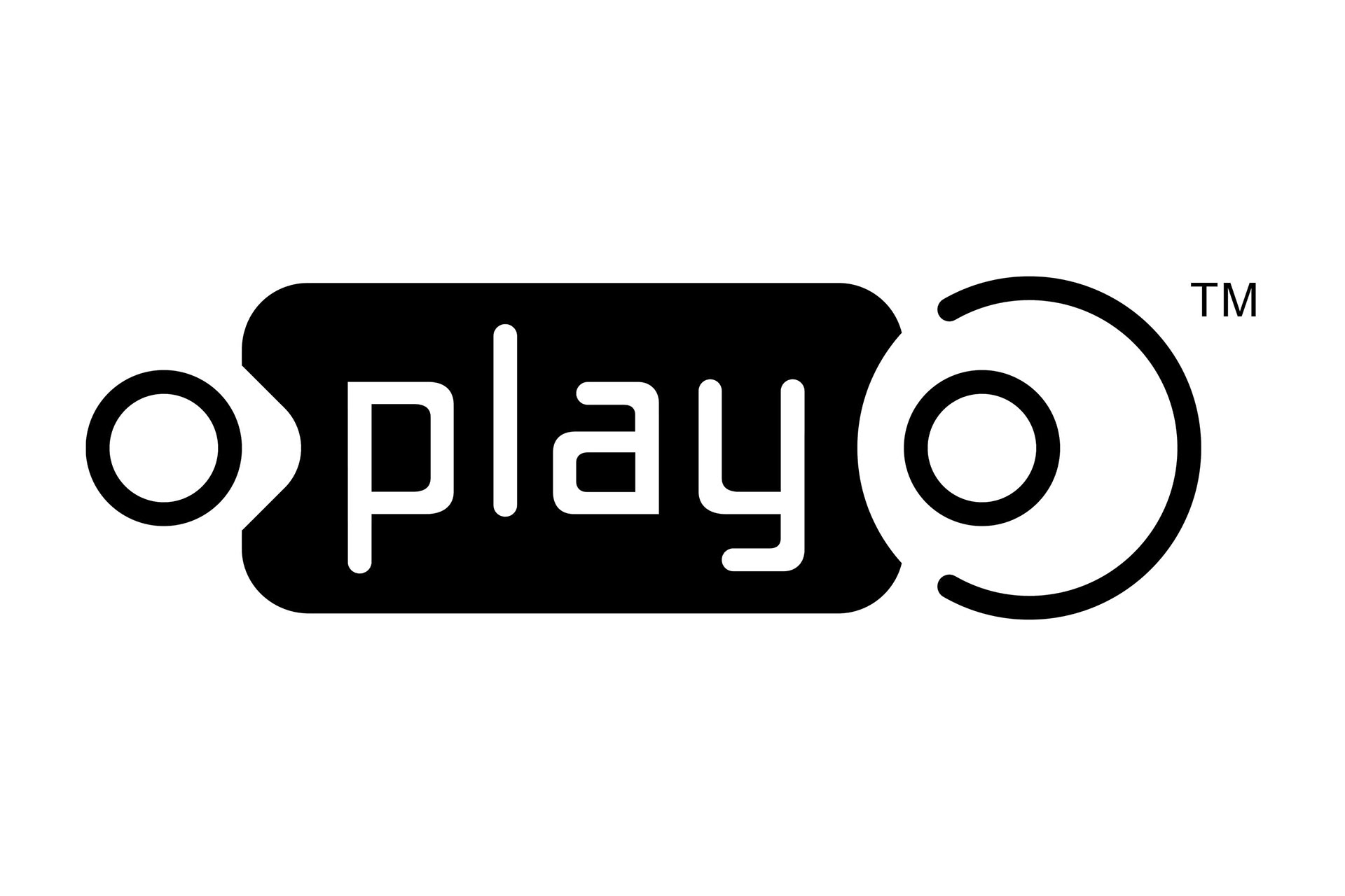
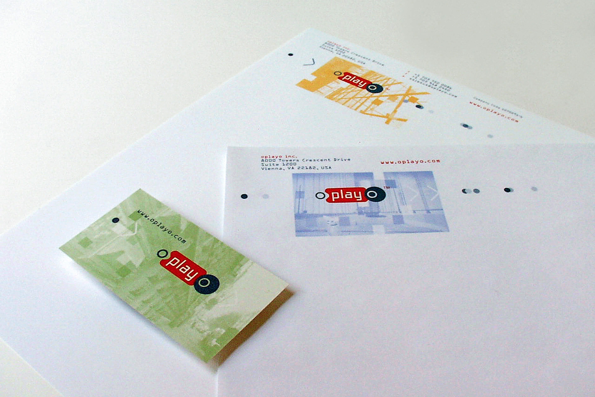
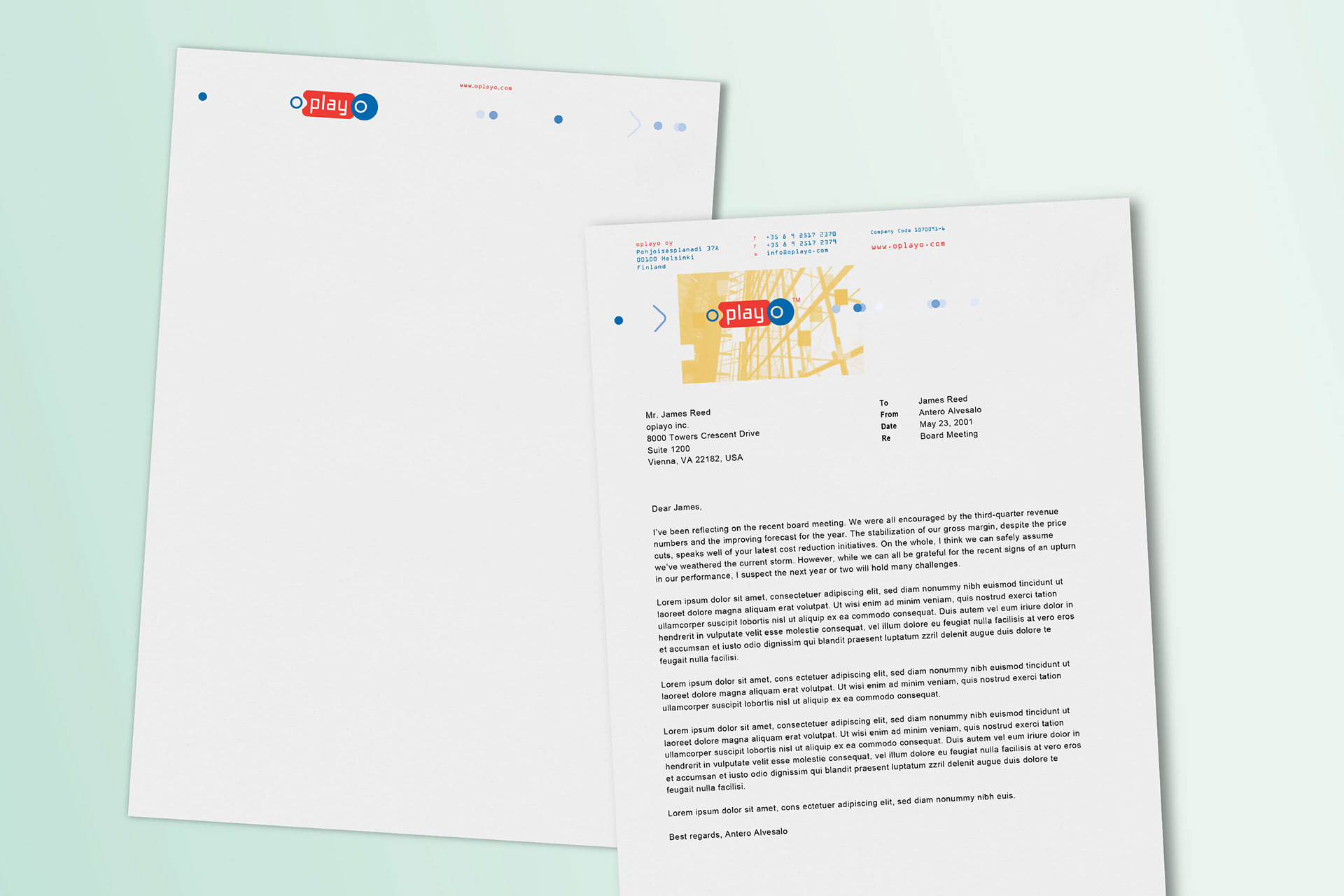
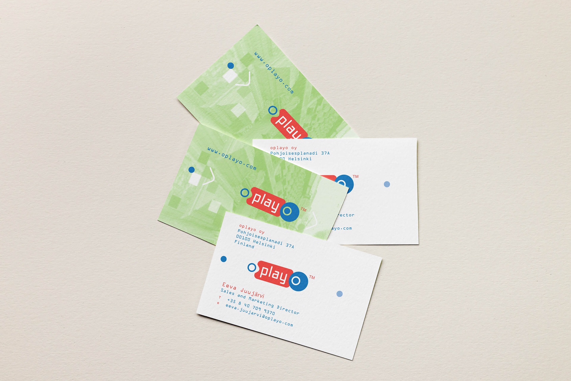
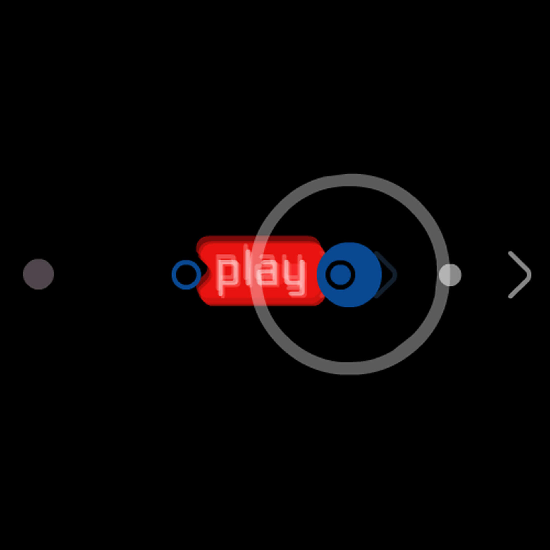
The oplayo logo is a composition of three elements. Based on the o, play and o, shapes were established to direct the reading process and to give the feeling of movement and animation. At the same time a color coding sequence support the movement of the different elements, starting with the “o” in blue - positive (static/start/end,) “play” in red (active/motion) and the “o” again in blue - negative (static/end/start.) Suddenly an optical cycle emerges of letters, shapes and color. Special drawn letters were created, conform the digital base of the product. With the last circle outlined and the “o” positive placed, the black/white version is slightly different from the colored one.
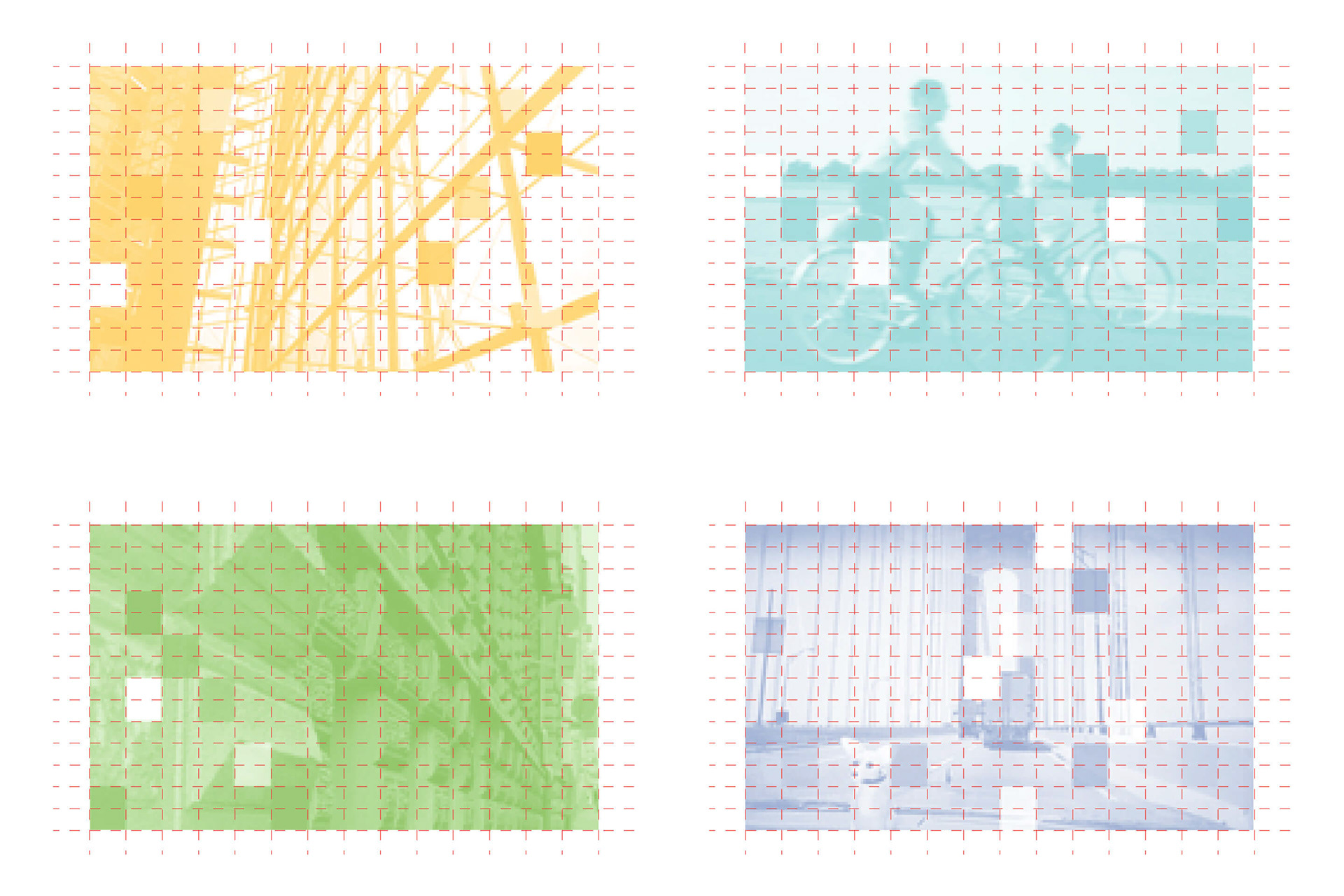
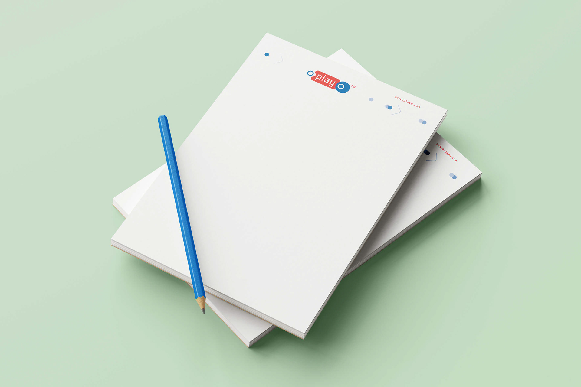
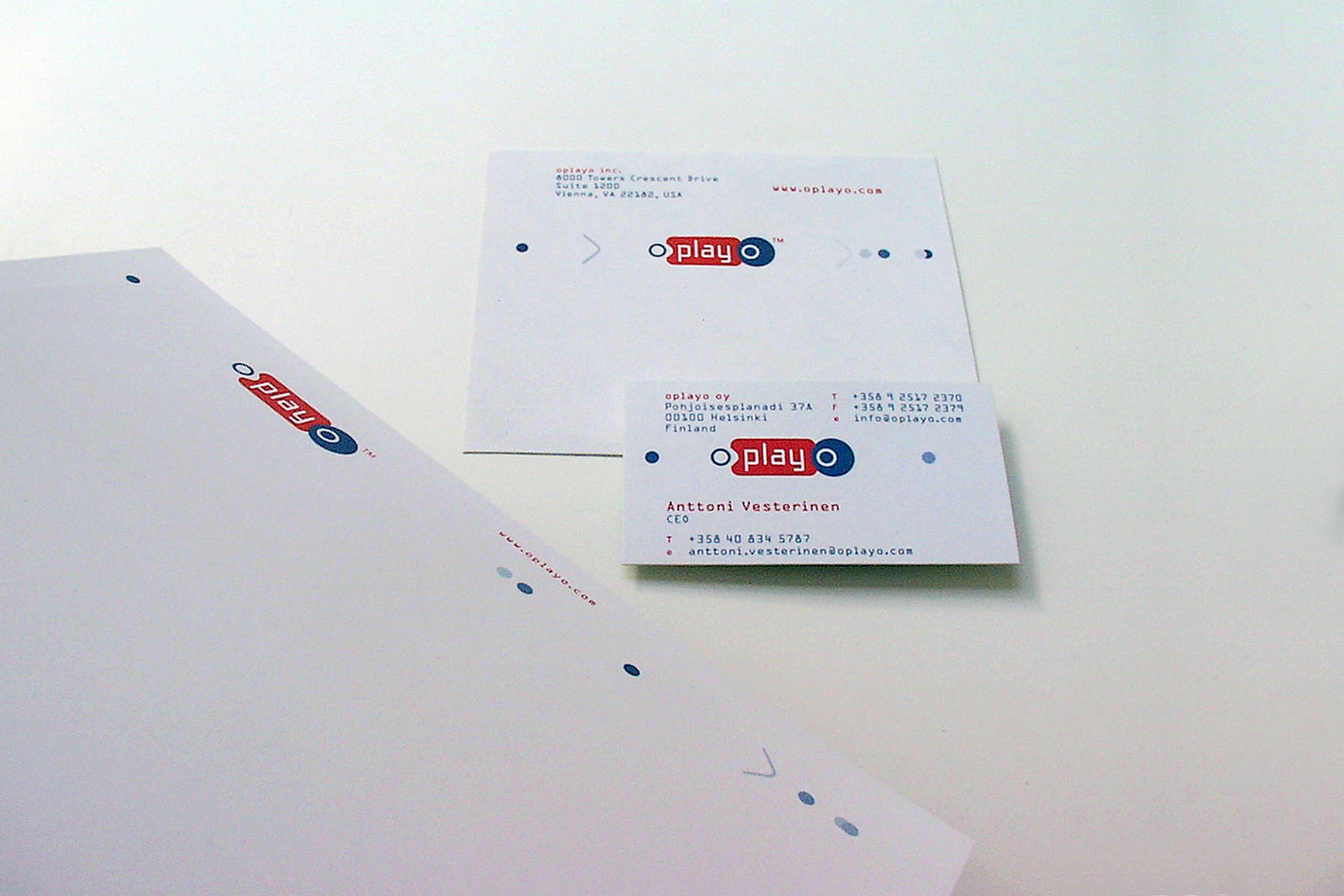
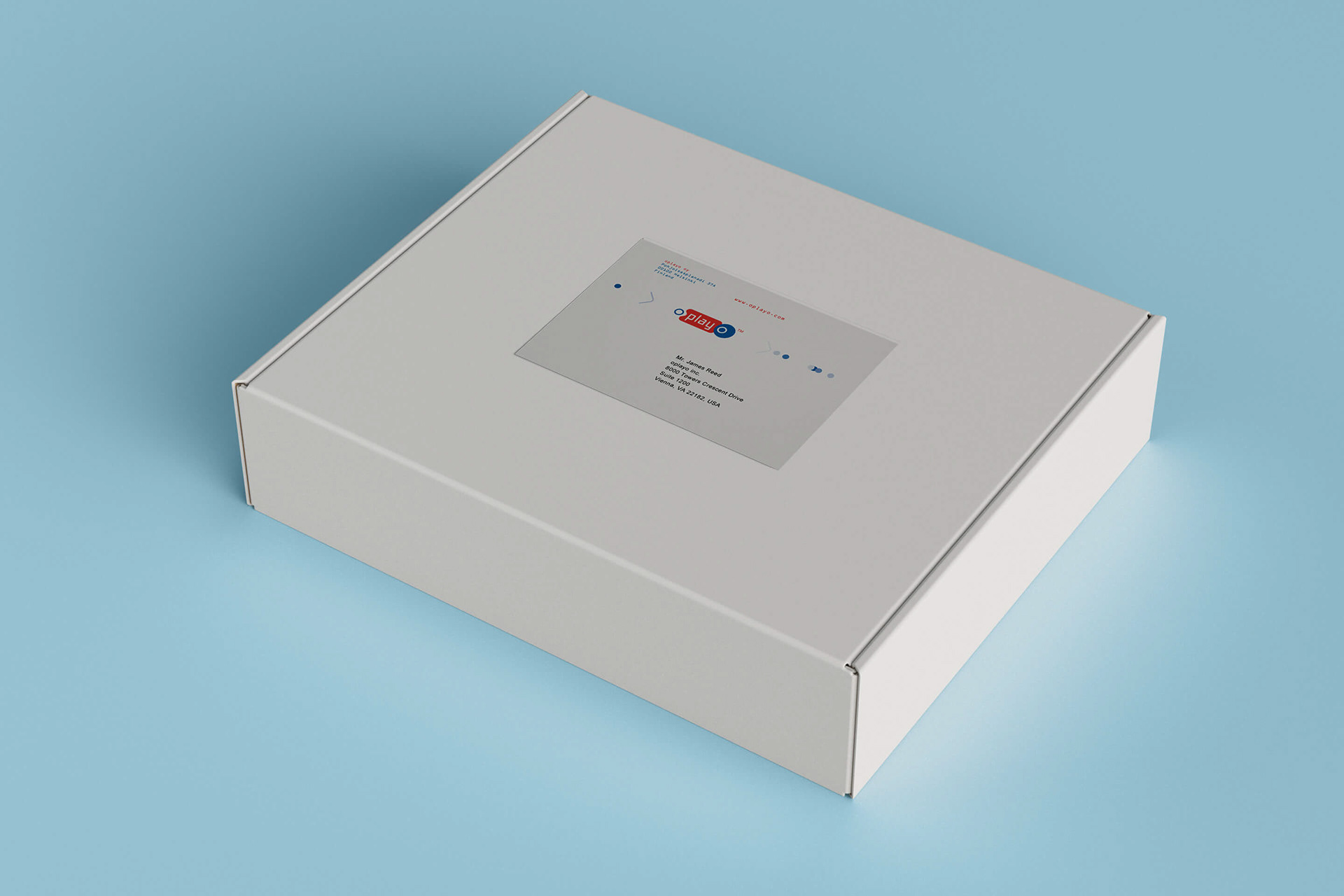
Two colors are used for the oplayo logo. For the start and end “o,” the color is blue (PMS 7462) and for “play” as well as the TM (Trademark symbol) the color is red (PMS Red 032.) These two colors, referred to as standard, primary oplayo colors. Next to the standard colors a range of supporting colors are available. The six supporting colors are of secondary order and are used for monotone images, like on the letterhead, envelope, etc., or similar supporting identity items.
Based on the oplayo logo, negative forms are creating logo environment markings. Circles and direction arrows are positioned on the grid in playful combinations. Layered and next to each other, they give a sense of movement, direction and space. By using different stroke weights the black and white version accomplish that same feeling on a graphic level.


ANIMATION
For the introduction to the oplayer we established a vanity logo and fanfare to start each viewing and to brand the product. In the oplayo logo animation the “markings” play an important role and change from the movement static role in print into interactive motion on screen.
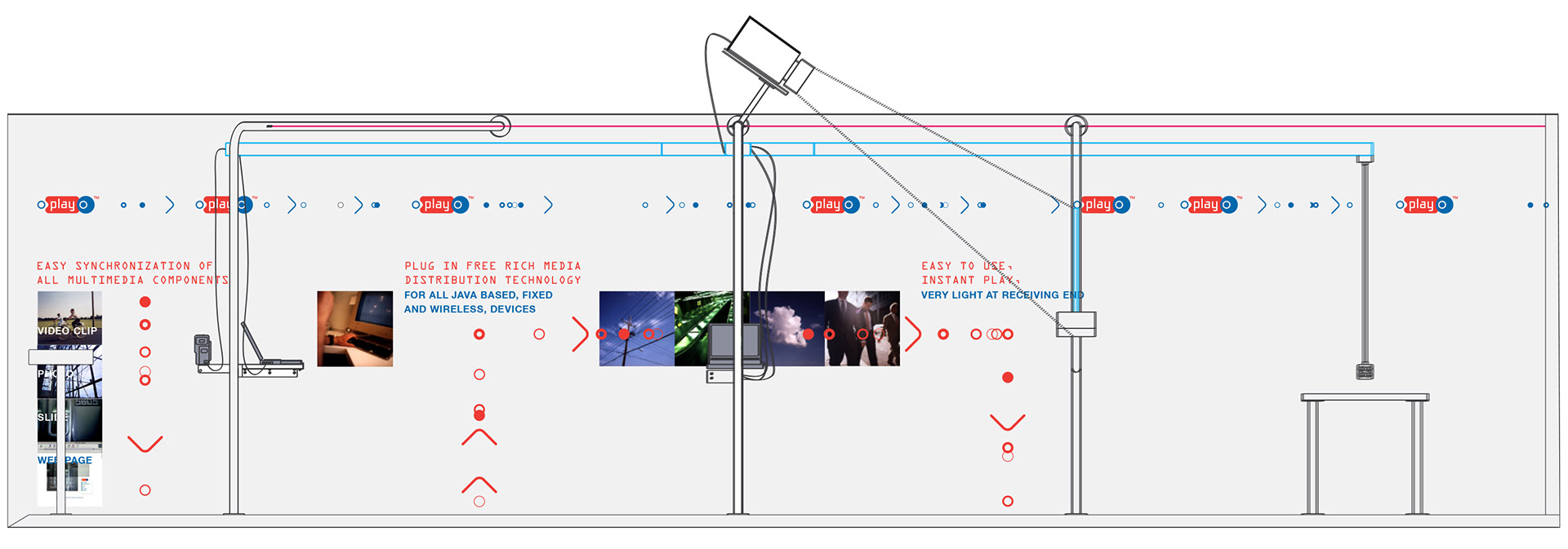
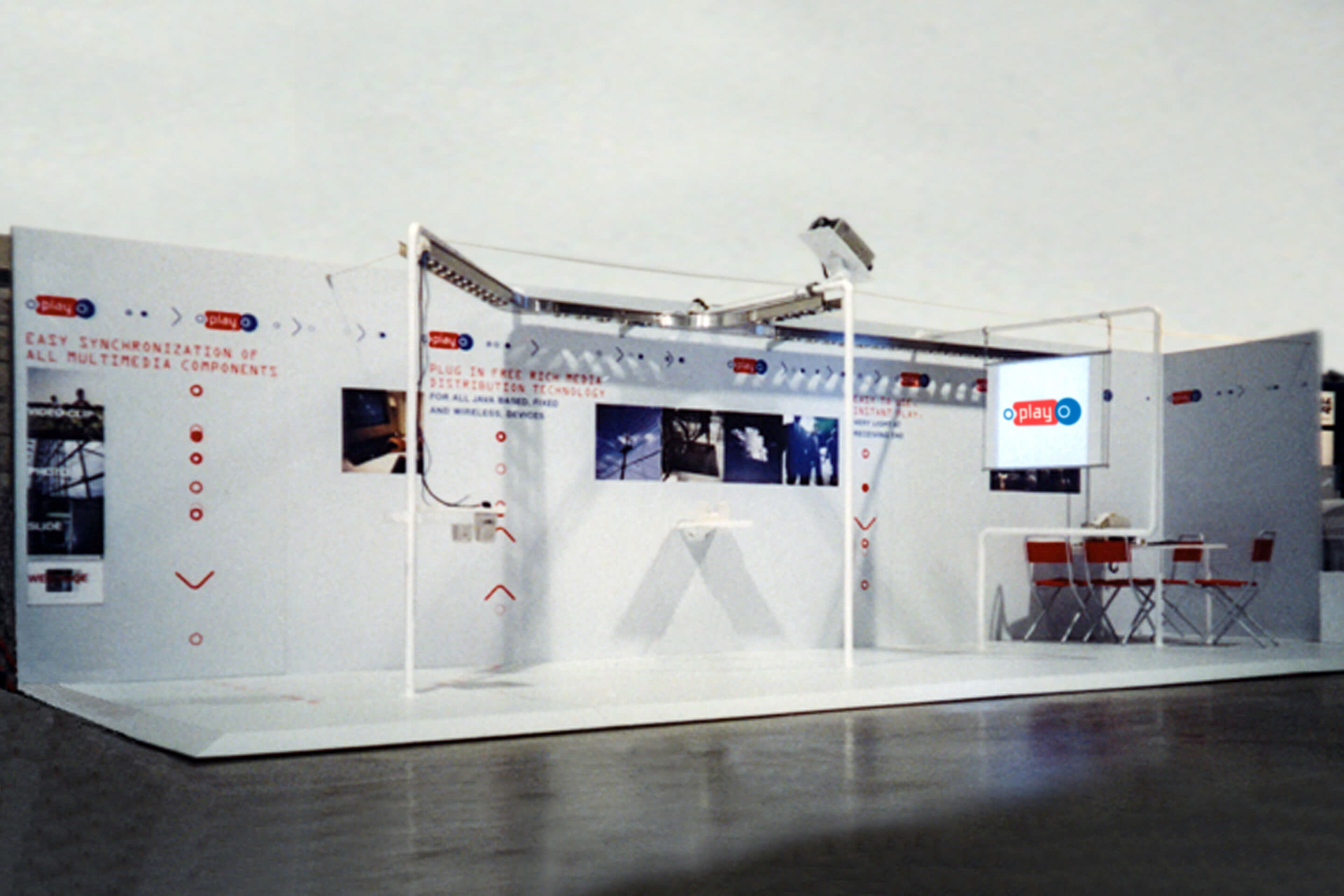
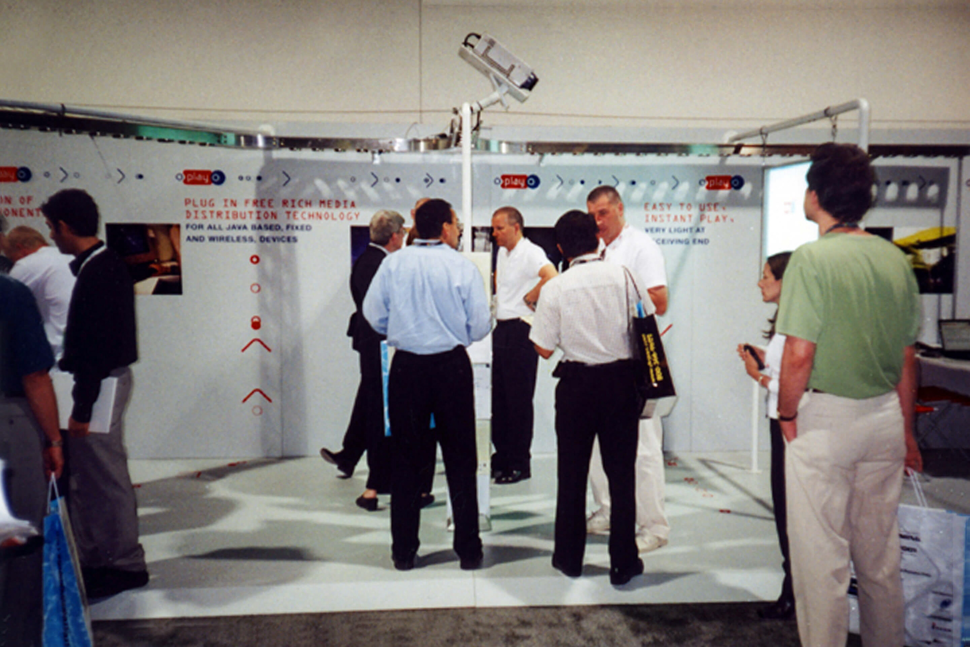
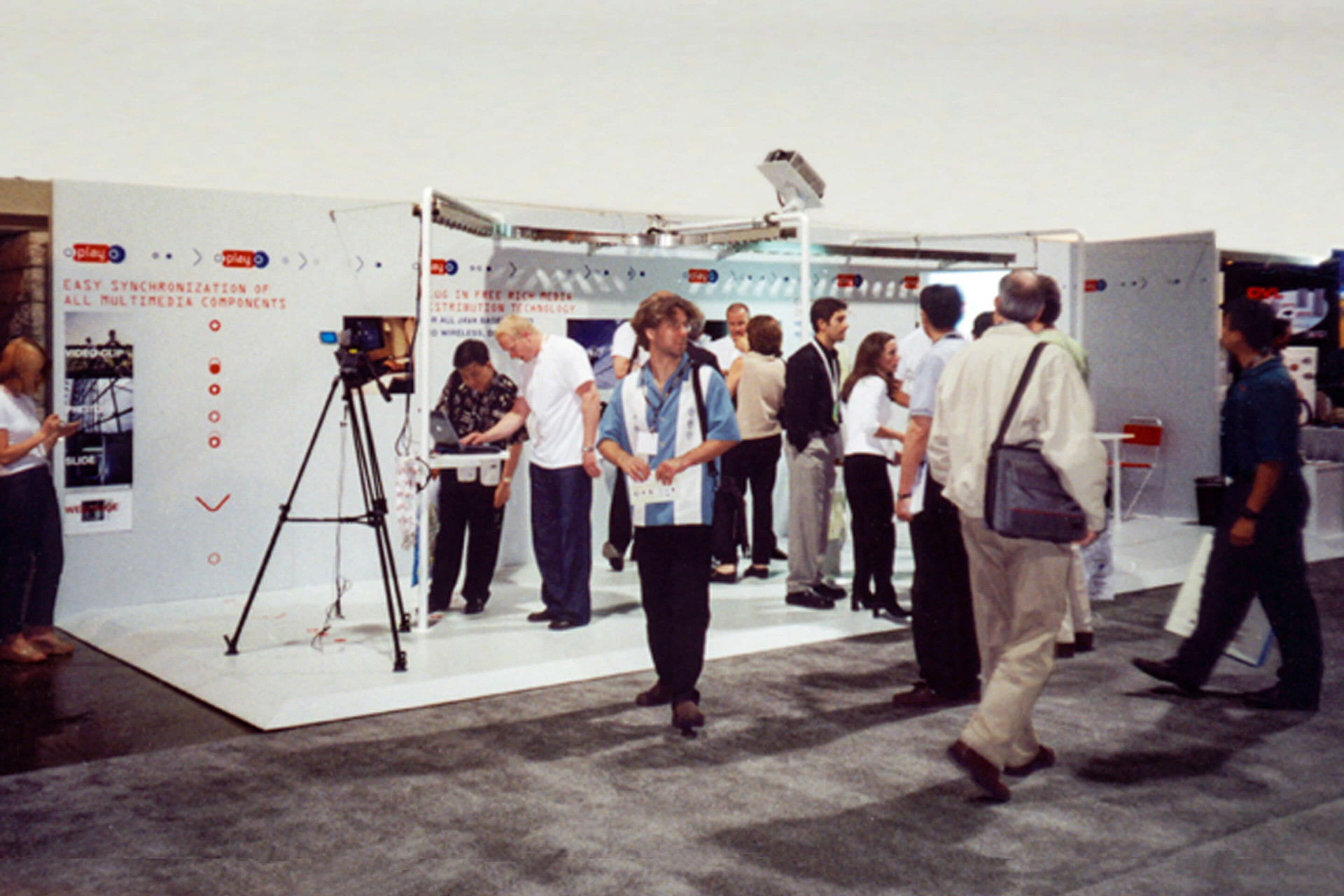
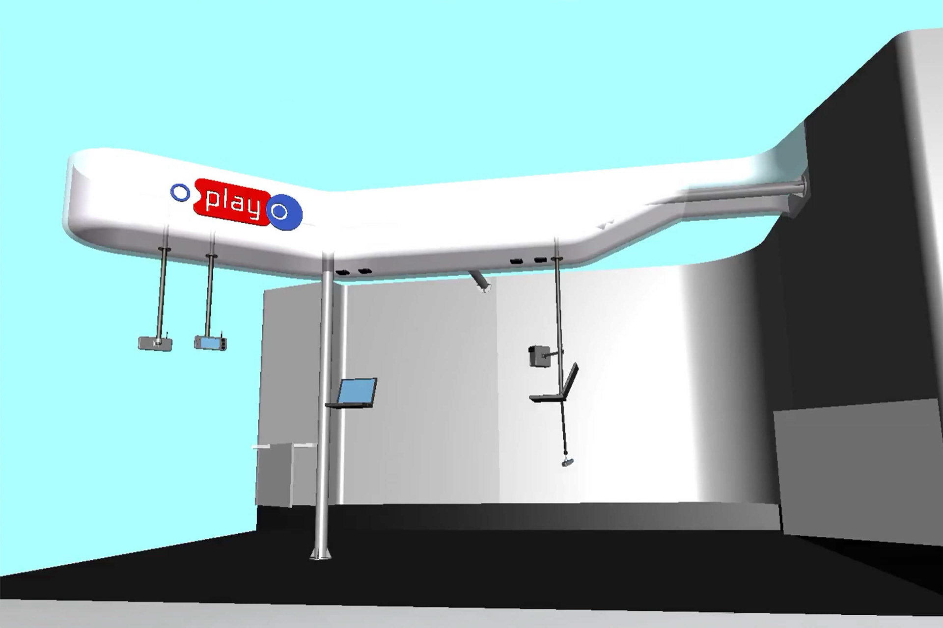
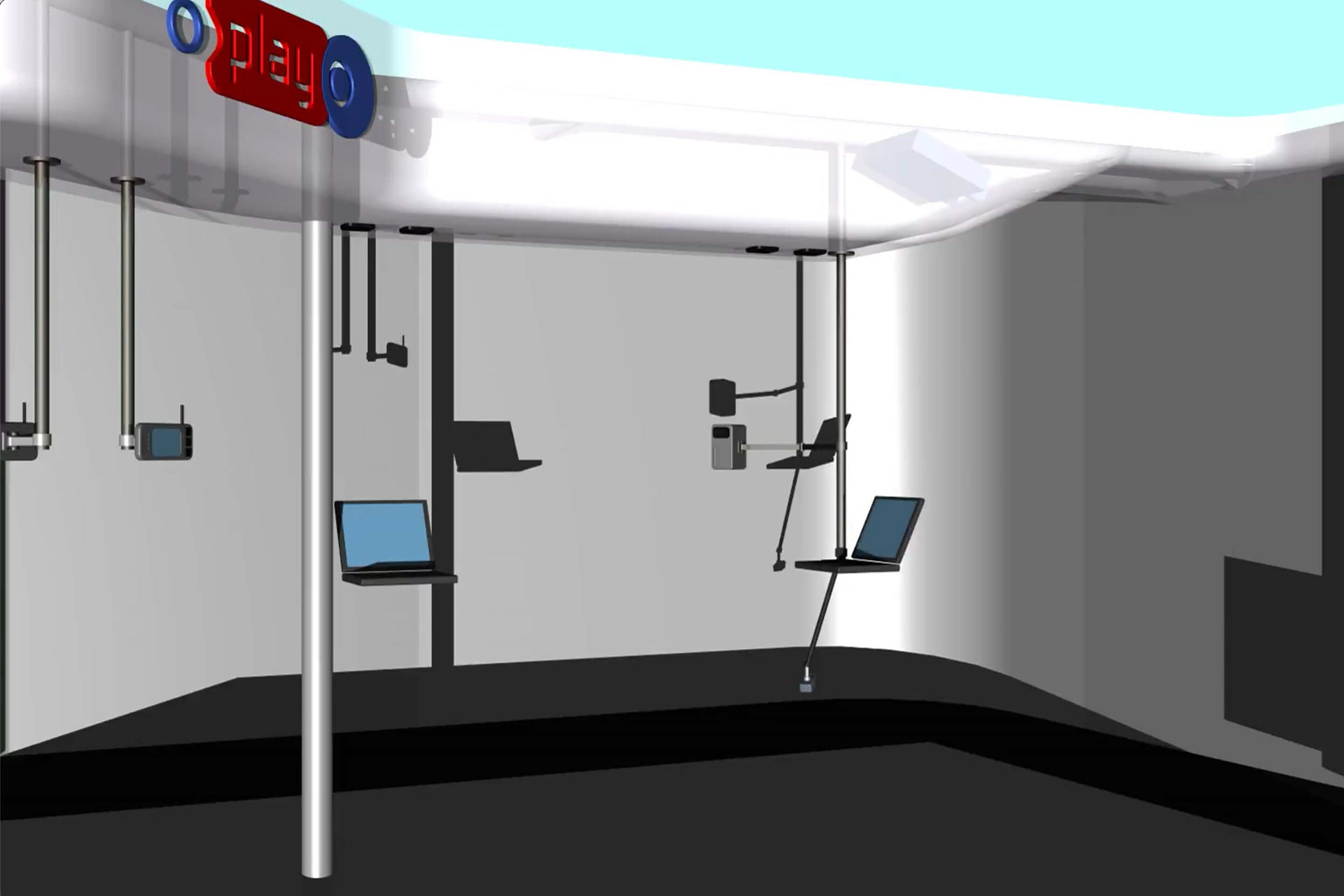
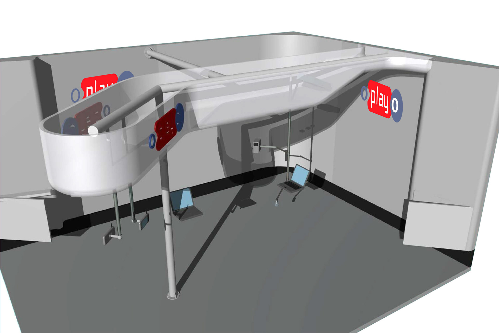
TRADE SHOW STAND
Similar to the oplayo logo we created an active and adaptive design for their trade-show presence. The trade-show stand had several sections that could work on their own as well in a specific order combination. Depending on the size requirements of the particular trade-show the diffrent sections and parts were assembled to customize the stand.