

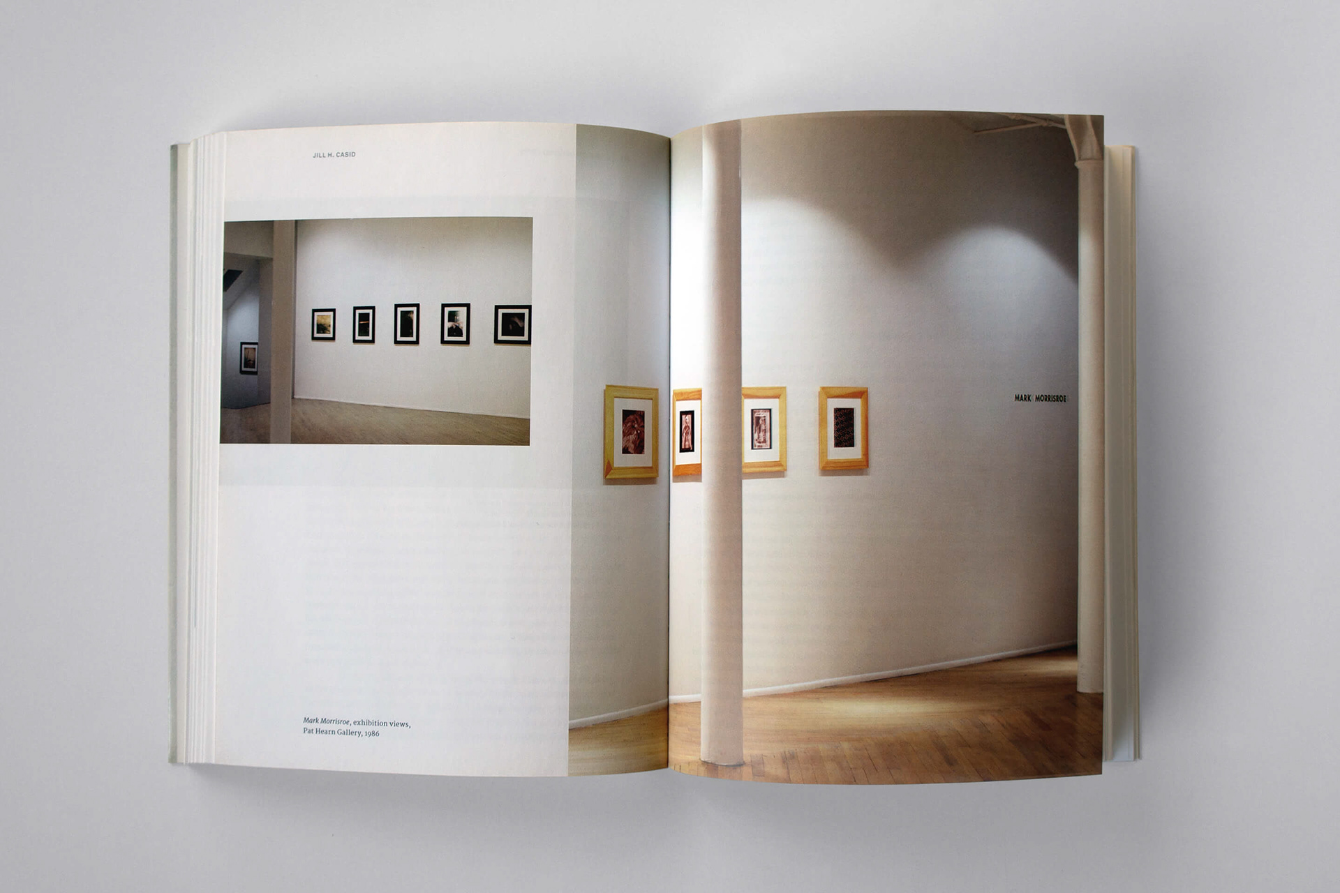
PAT HEARN GALLERY AND AMERICAN FINE ARTS, CO.
Art dealers Pat Hearn and Colin De land were both, independently, legendary players on the New York art scene of the 1980s and ’90s. Together they formed one of the great love stories of the art world.
Art dealers Pat Hearn and Colin De land were both, independently, legendary players on the New York art scene of the 1980s and ’90s. Together they formed one of the great love stories of the art world.
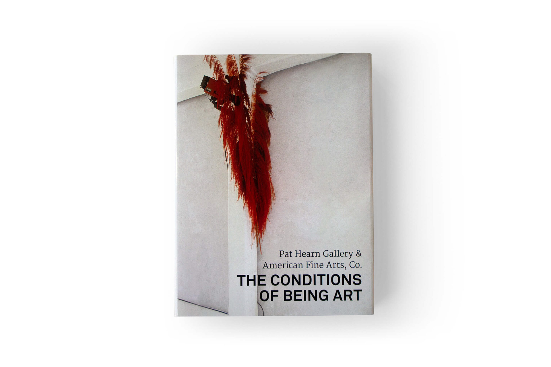
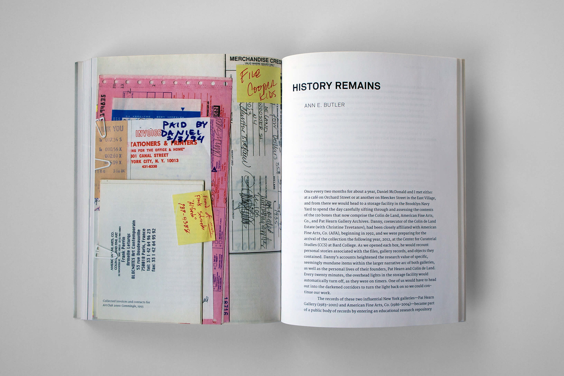
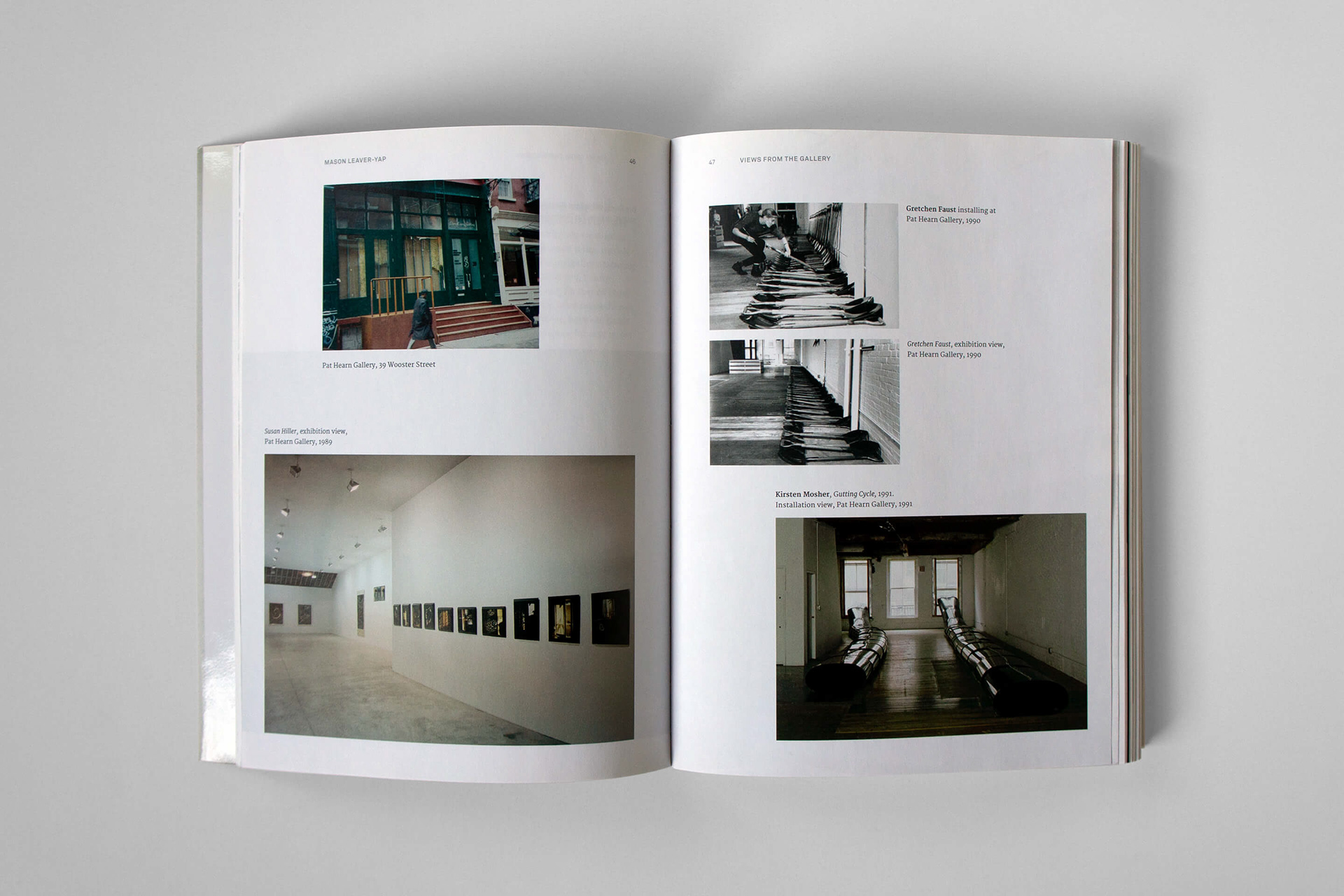
The Conditions of Being Art is the first book to examine the activities of groundbreaking contemporary art galleries Pat Hearn Gallery and American Fine Arts, Co. (1983–2004), and the transnational milieu of artists, dealers and critics that surrounded them. Drawing on the archives of dealers Pat Hearn and Colin de Land this publication illustrates their distinctive artistic practices, significant exhibitions and events, and daily business. Hearn and de Land's gallery practices explored new experimental and ethical possibilities within the selling of art, testing the relationship of contemporary art to its markets. In this volume, full-color images, in-depth scholarly investigations and detailed gallery histories vibrantly document how Hearn and de Land tested new notions of what an art gallery could be.
THE DESIGN
xSITE invited the Dutch design studio Gebr. Silvestri, widely known for their expertise on art publications, to collaborate with us on the design of the book to commemorate these two art legends. Both Hearn and De Land championed the art that challenged the business side of owning a gallery. The artists they featured employed conceptualism in the form of installations, providing both social and institutional critique.
We use a 5mm grid with 6 columns. One reading column of 5 grid columns with left aligned text with smaller footnotes at the end of each essay in three columns, by using the total of 6 grid columns. The images are loosely arranged in page layout compositions, depending on text flow and the number of images. The character of this design layout coincides with the unconventional working model the two galleries explored independently from each other to pilot new practices of representing contemporary art to its markets.
We use a combination of “awkward” fonts to tie into the aesthetics of the original gallery graphics. For body text and captions we use the serif font Merriweather. All other text (titles, footnotes, etc.) are in the sans serif font Akkurat.
SPECIFICATIONS
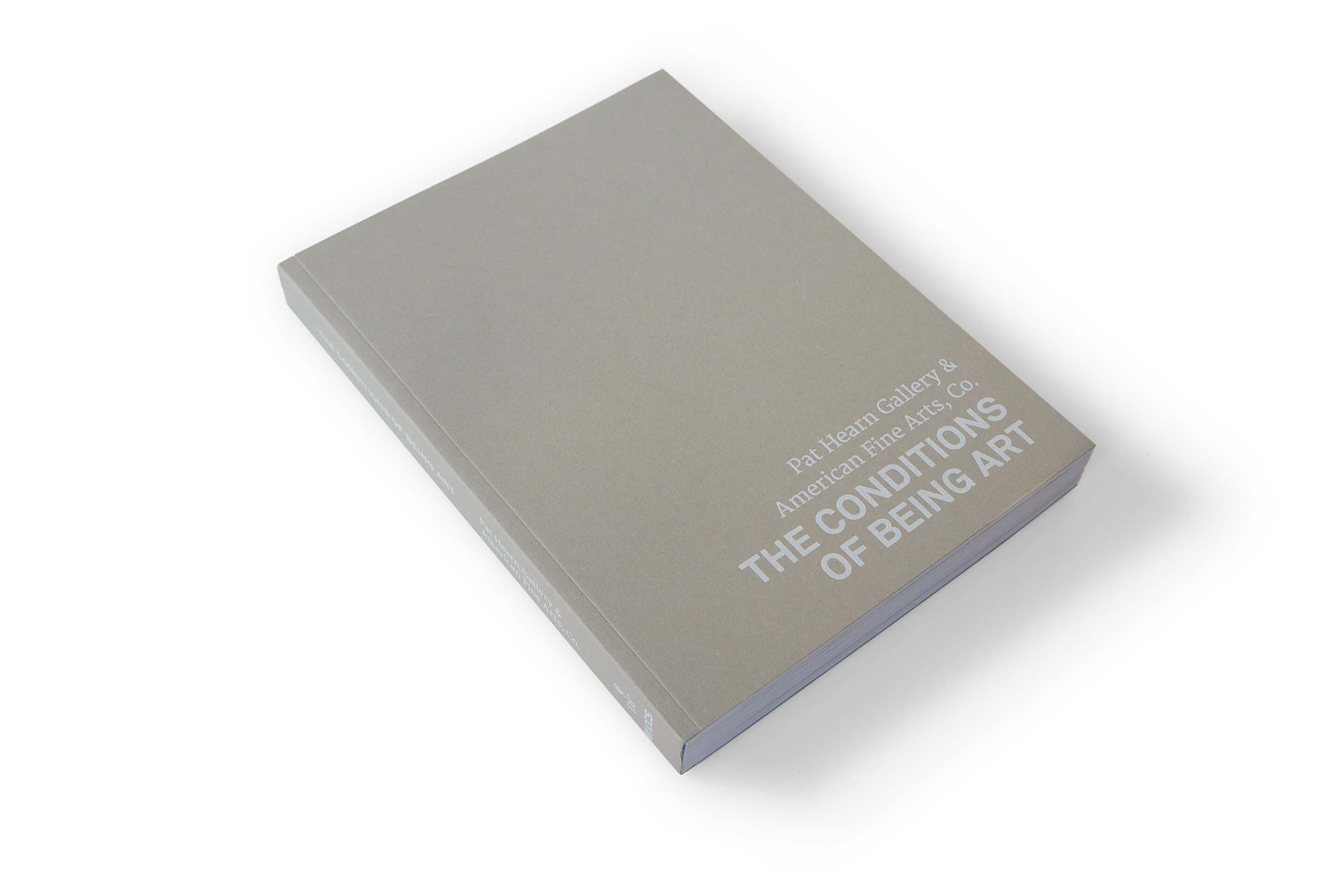
The 296-page book with 240 illustrations is printed in 4-color on Munken Artic Volume 115gsm paper. It has a softcover, perfect bound, in gray cover stock and comes with a 4-color, gloss-laminated book jacket of the same interior paper. We used the font Akkurat in combination with the Merriweather.
Printed by Die Keure (Bruges, Belgium).
Published by CCS Bard (Annandale-on-Hudson, NY) and Dancing Foxes Press (New York).
Edited with text by Jeannine Tang, Lia Gangitano, and Ann E. Butler. Text by Johanna Burton, Jill H. Casid, Lauren Cornell, Diedrich Diederichsen, Jennifer King, Mason Leaver-Yap, and Kobena Mercer.
Published by CCS Bard (Annandale-on-Hudson, NY) and Dancing Foxes Press (New York).
Edited with text by Jeannine Tang, Lia Gangitano, and Ann E. Butler. Text by Johanna Burton, Jill H. Casid, Lauren Cornell, Diedrich Diederichsen, Jennifer King, Mason Leaver-Yap, and Kobena Mercer.